Disney.. respectfully, we gotta stop doubling down on the controversial 1999 & 2002 Honey I Shrunk-themed Sham redo versions of Journey Into Imagination…
for the Disney Destiny rep..:
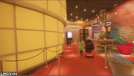
That cage used to have musical notes in there, to represent a birds’ singing escaping its cage in a whimsical abstract way… it got replaced with a square one with a butterfly in it.. (yeah.. uh.. they made it not make sense anymore...

) And in regards to the new Festival of the Holidays AP slushy cups, I honestly love them, but the Pavilion’s original blue & purple building color scheme would’ve made much more sense in this context, with the winter theme and all. Also his sweater has the original ride’s spiral logo on it, so again, that color scheme on the building would’ve fit with it better.
And the new adult zip hoodie, totally would’ve bought but I was sadly deterred by the HISTA themed Institute inspired design on the front rather than it being anything from the original which would’ve complimented the back.:
Again, LOVE the bigger effort to include Figment on new merchandise in general, I couldn’t state that more. But, could we maybe make some more adjustments going forward to focus on scenes & iconography from the version folks ‘do’ like (not to mention, the one Figment’s creator approves of) rather than the weird Honey I Shrunk themed ones we/they don’t? Thanks!


 *Right?* *Right?* *Anyone..??* *crickets*


 Totally something I (and I’m sure many others, even here) would purchase. Right?!

 “The original ride’s spirit returned!” I swear man, the sooner we get to getting answers on ‘why’ they did what they did with this current horrible sham/fraud redo of this once genuinely iconic, favorite ride, the better. I really want folks (current Disney execs & Imagineers included) to see how much of an absolute screw up, how horribly unfair, baffling & scummy this Honey, I Shrunk-ified “upgrade” to the once 2nd most popular attraction in the park really was and still is to this day (despite its incredibly deceiving title & description) and why it ‘needs’ to be restored back to its former non-Film IP based glory with the tech & spfx enhancements we expected all those years ago.