Eddie Sotto's take on the current state of the parks (Part II)

KevinYee

Well-Known Member
Oh, as for Kevin, he's not as astute as he looks!:ROFLOL:
(But I think I smell another book in this thread!)

Does that mean I'm MORE astute that I look? :p

I said a few posts back that I have, indeed, been working for three-plus years on a 'reality' book about Disney parks (not just WDW)
 

HMF

Well-Known Member
You've said in both one and three that they are "loud", so really we can lump reasons one and three together. And to be frank, you've said nearly the same thing in reasons two and three, so instead let's clear the clutter and see what you're saying:

1. It's loud and obnoxious
2. It ruins the build-up of the ride by showing the ghosts to be friendly before they're supposed to be revealed as such rather than keeping the sense of foreboding prior to entering the HM.
3. It's poorly designed, only slightly better than a McDonalds' playground

Reasons one and three are, to me, not valid reasons to show why the new HM queue is bad. Those are individual value judgments based on the opinion of YOU. Simply because you think the queue is loud, obnoxious, and poorly designed does not actually make them so. I personally don't find the HM queue loud, obnoxious, or poorly designed - so who is right? Me? You? Hence why neither reason can be considered - they're too subjective.

The second reason has a bit more weight and can be considered. One thing to keep in mind is that the Imagineers could never truly come to a consensus between the HM being scary or funny because the person who could break the tie, Walt, had died. Which is why the HM has both elements within it. The other thing to keep in mind is the location of the HM - the Magic Kingdom. While I personally love things that are quite scary, the reputation that the Magic Kingdom has is for family-style rides and attractions. Nothing too fast, nothing too scary. Do we need to re-hash the entire fiasco with Alien Encounter to show what happens when something *really* scary is put into the Magic Kingdom? An attraction called "The Haunted Mansion" already has a built-in scary factor into it - a musical organ and some moving books are not going to take that away. And if it can re-assure some smaller younger guests that the HM isn't terrifying (just slightly creepy, IMO) and get them to experience it, I'm all for it.
Everything before Leota should be considered the "Coats side" of the Mansion which is dark and foreboding. After Leota or the "Davis side" we discover the ghosts are friendly. (The Bride notwithstanding) The Interactive Queue completely spoils this by shoving too much Davis into what is supposed to be the Coats portion of the experience. The Interactive Queue is a thematic disaster.
 

lazyboy97o

Well-Known Member
I think i said this when it first came up, I would also argue that the queue for the Magic Kingdom's Haunted Mansion was already themed, and the first really themed Disney queue.
 

Eddie Sotto

Premium Member
I was asked a few posts back if I think you need to travel to convey a given place. You don't have to, but it sure helps if you do. For example, after living in Paris I not only understood the audience better, I got a sense for what the quality of life was like and what was taken for granted. Main Street was programmed to take that into account. I noticed that parents like to take their kids to museums and felt good about that. Main Street was much more of a museum than a retail mall.

Experiences are not what you see in a book, they are the sounds, smells, textures, and feelings of the cultures that made them. They are sensory. I think if you are spending hundreds of millions on replicating something and the lead designer has never been there, then it's almost reckless for them to not have been as it is such a small piece of the overall budget and may make the difference in getting it right or not. There's a reason for the popular expression for something that falls flat due to translation or delivery. "I guess you'd have to have to be there". WDI used to sponsor trips to places to inside you as well with no project attached. Experiences are powerful.

I was involved in designing a Ferrari showroom/store/cafe for the Las Vegas Wynn Resort and only upon the design being complete went to the Ferrari Factory to present it. WOW. If only I had been there prior I would have understood the culture and wow factor of those cars and their heritage. I had lots of books, sat in the cars, etc. but seeing the the artisanal assembly line and Michael Schumacher the racing driver made it real. I would have done more to embrace the culture of Ferrari, not just the Red leather and the Horse.

Bolna (a German poster on our thread) sensed the intellectual fakeness of DL's Fantasyland because he knew the real thing. It was good but off. I doubt WED sent the designers to Europe just to research it. They used books and the films. Tom Morris travelled extensively and really got the sense of the real "Fantasyland" of Europe, the right textures, colors and finishes before tweaking it into being the Disney DLP version and really satisfied Bolna's European expectation.

What I have not heard on the thread is the comparison to the Matterhorn, which was the result of Walt's own boondoggle trip to Europe to see them make "Third Man on the Mountain". He only brought back an idea. No themed queue to speak of and later it got it's own Yeti! The only pre show was the footprint plaque. EE seems to outdo the classic by quite a bit.

The only serious critique I have of Everest is that the bridge and train are out of scale with the mountain. So are the Bobsleds but less obvious.
 

KevinYee

Well-Known Member
There's a stop-startness to Everest that is lacking in the Matterhorn. Remember the alpine slide you linked to, Eddie? That was relentless and looked exhilirating. I think the track layout of Everest takes away some of the relentlessness of the Matterhorn.

I'd attempt a sports analogy of soccer/hockey (mostly nonstop) and football (stop every minute), but that might just alienate some readers :)
 

CBOMB

Active Member
I was involved in designing a Ferrari showroom/store/cafe for the Las Vegas Wynn Resort and only upon the design being complete went to the Ferrari Factory to present it. WOW. If only I had been there prior I would have understood the culture and wow factor of those cars and their heritage. I had lots of books, sat in the cars, etc. but seeing the the artisanal assembly line and Michael Schumacher the racing driver made it real. I would have done more to embrace the culture of Ferrari, not just the Red leather and the Horse.


The only serious critique I have of Everest is that the bridge and train are out of scale with the mountain. So are the Bobsleds but less obvious.

How would you have embraced the culture of Ferrari, and translated it into the design of the showroom? What would have been different?

Is there anything that could have been done concerning the scale in Expedition Everest, other than drastically enlarging the footprint of the attraction?
 

Eddie Sotto

Premium Member
There's a stop-startness to Everest that is lacking in the Matterhorn. Remember the alpine slide you linked to, Eddie? That was relentless and looked exhilirating. I think the track layout of Everest takes away some of the relentlessness of the Matterhorn.

I'd attempt a sports analogy of soccer/hockey (mostly nonstop) and football (stop every minute), but that might just alienate some readers :)

As rides they are very different and the Matterhorn is less predictable and more interesting, EE more intense and follows the modern coaster formulas.
 

Eddie Sotto

Premium Member
How would you have embraced the culture of Ferrari, and translated it into the design of the showroom? What would have been different?

Is there anything that could have been done concerning the scale in Expedition Everest, other than drastically enlarging the footprint of the attraction?

I would have done more of a Museum level artifacts with the cars and displayed more engines instead of just dropping you into the gallery/showroom. the original set of Enzo Ferrari's tools, something sacred like that as a pre-show.

As to EE, hiding the coaster train in reference to the mountain would have been a priority and just glimpsing the train as a tease. Maybe bringing it out toward the guests in the foreground and not showing it going up the mountain.
 

choco choco

Well-Known Member
Hi Eddie,

I'm fascinated by these light up pillars on Main Street USA in DLP.

tumblr_lw64nxMBxl1qbqnp4o1_500.jpg


The only park in the world with those on Main Street. Very pretty. Were they there originally? Where did the idea for it come from? Is there a specific reason they are put in?
 

dagobert

Active Member
I've been to Disneyland Paris during the 15th birthday and I really liked the lampposts with the birthday banners. Just to let you know, the banners did sparkle and the effect was really nice. This picture was taken during Christmas time, because there are the princesses and the crowns on top instead of a simple golden ball.

These lampposts are used as Christmas decorations for quite some time now. I don't know exactly when they arrived at DLP, but they were already used during our visit in 2006.

I think it's time for something new. I also don't like the fact that the Disney princesses are used, becuase they have nothing to do with a turn of the century Main Street. I really dislike the heavy use of the princess franchise at DLRP.
 

Eddie Sotto

Premium Member
Hi Eddie,

I'm fascinated by these light up pillars on Main Street USA in DLP.

tumblr_lw64nxMBxl1qbqnp4o1_500.jpg


The only park in the world with those on Main Street. Very pretty. Were they there originally? Where did the idea for it come from? Is there a specific reason they are put in?

The light poles are not original to the park. They used to have a series of giant decorative metal arches that spanned the street with rim lights installed for the holidays. My assumption is that they installed these poles into the holes left from the arches. My guess is that someone in the entertainment department came up with them as it looks more event driven to make the street more festive and a promenade extension of the Castle as you lose the facades in favor of a court of flags, (which to me dilutes MSUSA as it's own land). I think they are way better than the arches which looked super cheap and made the rest of the street look at way in daytime.

Here's a picture of the arches. See what they did to the castle? At least the poles allow the Castle to be a wow.
http://www.laughingplace.com/files/DLPChristmas2001/Castle.jpg
 

techgeek

Well-Known Member
Here's a picture of the arches. See what they did to the castle? At least the poles allow the Castle to be a wow.
http://www.laughingplace.com/files/DLPChristmas2001/Castle.jpg

Wow Eddie - never expected Epcot's now lost "Lights of Winter" to show up years ago in Paris! I always had wondered if they were built for Epcot, or came from somewhere else. If they weren't these exact arches, they were cut from the same cloth.

I agree they don't work as well on Main St, and the poles don't seem to fit theme either... Why this and why not copy the classic swag garland / wreath look from CA and FL?
 

LuvtheGoof

DVC Guru
Premium Member
The light poles are not original to the park. They used to have a series of giant decorative metal arches that spanned the street with rim lights installed for the holidays. My assumption is that they installed these poles into the holes left from the arches. My guess is that someone in the entertainment department came up with them as it looks more event driven to make the street more festive and a promenade extension of the Castle as you lose the facades in favor of a court of flags, (which to me dilutes MSUSA as it's own land). I think they are way better than the arches which looked super cheap and made the rest of the street look at way in daytime.

Here's a picture of the arches. See what they did to the castle? At least the poles allow the Castle to be a wow.

Those arches really kill the look of the castle from the front of MS! Glad to see that they are gone, and hope they stay gone. We are looking at a trip to DLP in 2013 or 14 at the latest, and those arches really would have detracted from the first impression of the castle walking up MS.
 

KevinYee

Well-Known Member
Eddie,

Do you know anything about Mission:Space removing a slight grade at the entrance? My memory insists we had to walk uphill slightly to get into Horizons. Is that a faulty memory? Or was that grade removed? (and if so, any interesting reason for it?) Or is the grade still there but more artfully done (there *is* a ramp of sorts just before the Orange/Green split).
 

Eddie Sotto

Premium Member
Eddie,

Do you know anything about Mission:Space removing a slight grade at the entrance? My memory insists we had to walk uphill slightly to get into Horizons. Is that a faulty memory? Or was that grade removed? (and if so, any interesting reason for it?) Or is the grade still there but more artfully done (there *is* a ramp of sorts just before the Orange/Green split).

I have no recollection of that, but it's quite possible. I recall a grade to get into Horizons too and Space does seems to be a pretty level entry. It does have a serpentine type ramping so, yes it may be more discreet. I left the company before that ride was completed, so there were many things that were developed after my time.
 

Mansion Butler

Active Member
There's a stop-startness to Everest that is lacking in the Matterhorn. Remember the alpine slide you linked to, Eddie? That was relentless and looked exhilirating. I think the track layout of Everest takes away some of the relentlessness of the Matterhorn.

I'd attempt a sports analogy of soccer/hockey (mostly nonstop) and football (stop every minute), but that might just alienate some readers :)

Well since football is better than soccer and hockey, I can assume you are saying Everest is better than the Matterhorn. I agree with eveything you just said for once, Kevin!

:animwink:
 

ChrisFL

Premium Member
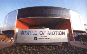
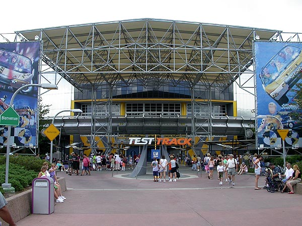
Eddie, thoughts on Test Track...I don't mind the attraction, and I'm glad they plan to update it next year, but one thing that does bother me is the large overhang out front.

I really liked the simplicity of the old World of Motion building.

worldofmotionfront.gif


On the other hand, the new covering is a great place for shade/cover from bad weather.

wdw_epcot25.jpg


I wonder if they'll find a happy medium, or if they are planning to change the exterior at all.

Any thoughts on this from an Imagineering standpoint?
 

RandySavage

Well-Known Member
As to EE, hiding the coaster train in reference to the mountain would have been a priority and just glimpsing the train as a tease. Maybe bringing it out toward the guests in the foreground and not showing it going up the mountain.

This is both frustrating and enlightening.

I am a big fan of Everest (when fully working), but from some angles, something has sort of felt off about the mountain itself, and it seems so obvious now that you bring it up.

Having a full-sized train moving through the miniaturized monastery temple and into mountain peaks completely throws off the scale & perspective of what should be a Himalayan peak, hurting the realism of the experience both before and during.

The train should have entered a "lift cave" well below the monastery, and then stayed within an enclosed mountainside emerging in the icy mountain peaks, out-of-view of the people on the ground. The train could later enter the foreground out of the big drop cave, never being directly visible against the things that are supposed to be high above. I did a couple mock-ups of what I mean:
6560648277_e13aa66255_b.jpg


6560648201_b8002ef1cb_b.jpg


This is frustrating because you've nailed it, and from now on I will always see Everest as lacking in this respect.
 

Register on WDWMAGIC. This sidebar will go away, and you'll see fewer ads.

Back
Top Bottom