Eddie Sotto's take on the current state of the parks (Part II)

Pixiedustmaker

Well-Known Member
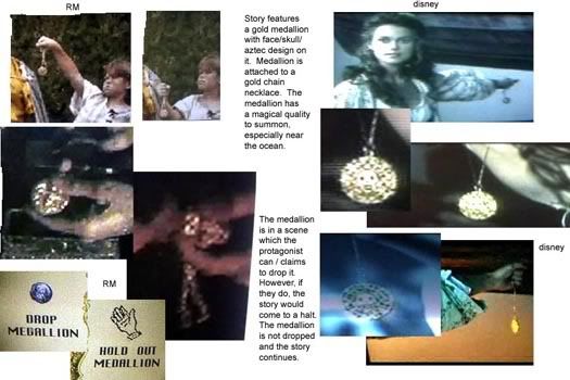
I think this page http://disneylawsuit.com/2.html is the most revealing. The screenshot comparisons, story arcs, cast of characters and even dialogue parallels (including the 'Black Pearl' ship) are too much to be coincidence. I don't know what it takes to prove copyright infringement, especially against the muscle of Disney, but I would hope all of this would be enough.
MEDALLIONONCHAINa-1.jpg


Wow. This really changes my perception of this case, looks, at face value, way too much for Disney to have just thought up on their own. If there is one mistake in this guy's claims it is that the first movie didn't have anything to do with the attraction . . . obviously, the makers of the films put it a lot of little nods to the attraction in the films.

I think that for the last Pirates film Disney bought the rights to a supernatural pirate novel . . . I guess they don't have a very deep bench when it comes to in-house creative script writing.
 

Pixiedustmaker

Well-Known Member
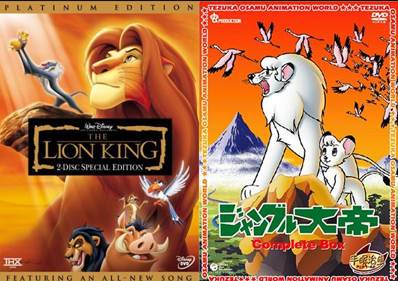
I wonder if Disney ever paid of the guy who created "Kimba".

lion-kimba1.jpg


"Kimba the White Lion" was a Japanese manga (comic book) from the 1950s that became a cartoon show (anime) in the 1960s. In addition to having a similarly-named protagonist ("Kimba" as opposed to "Simba") the "Kimba" cartoon and "The Lion King" feature extremely similar characters: a wise monkey character, hyenas as comic-relief villains, a dead father who appears to his son in the clouds, and an older relative (an aunt in "Kimba" and an uncle in "Lion King") who serves as the main antagonist.

Early screenshots from preproduction work on "The Lion King" show that Simba was intended to be an albino, just like Kimba. The cartoons were so similar that when Matthew Broderick was hired to be the voice of Simba he had assumed he was playing Kimba in a theatrical interpretation of "Kimba the White Lion".

It really hurts writers when Disney rips off stuff like this. Yes, Walt trolled the library for fairy tales, but I'm guessing that the copyright had run out on Snow White when Walt used it.
 

Eddie Sotto

Premium Member
Wow. This really changes my perception of this case, looks, at face value, way too much for Disney to have just thought up on their own. If there is one mistake in this guy's claims it is that the first movie didn't have anything to do with the attraction . . . obviously, the makers of the films put it a lot of little nods to the attraction in the films.

I think that for the last Pirates film Disney bought the rights to a supernatural pirate novel . . . I guess they don't have a very deep bench when it comes to in-house creative script writing.

He kind of had my interest when his story had a ship named
black pearl.
 

Pixiedustmaker

Well-Known Member
He kind of had my interest when his story had a ship named
black pearl.

Unbelievable. Either the IP thieves at Disney couldn't come up with a better name, or they were so arrogant that they didn't care if this guy found out. It would be like your neighbor stealing your car, but not bothering to change the paint job, or take down your tree air freshner or scrap off your I love New York bumper sticker.

Grand Theft film script
 

Eddie Sotto

Premium Member
Sounds like it. To be fair, we are only reading his side of the story. Where on his site is the Eisner memo? I'd like to read the actual correspondence, more testimony and what the Disney company discredited him with, and proof of him pitching his story to the company.
 

Pixiedustmaker

Well-Known Member
I read that this guy says that he also invented the characters of "Elizabeth" the daughter of a british governor who falls in love with a blacksmit/swordsman named Will Turner!

http://www.nydailynews.com/archives/news/disney-pirated-film-suit-article-1.613641

Disney settled with him years ago, for an unspecified amount, I guess he rightfully got upset when he found out that they distorted the Ben Gunn's cave concept work. The whole supernatural thread has been used quite successfully through the films, so quite possibly this guy came up with an idea that has made Disney billions. They were also going to use a supernatural angle to the Lone Ranger film, something involving silver bullets and werewolves.
 

Eddie Sotto

Premium Member
I spoke to a friend who made it to Tony Baxter's tribute party at Club 33. It was truly historic and wonderful. He gave me a "play by play" and said it was both funny and touching. Most of the guests were those who Tony worked with and enjoyed and of course tributes and war stories were swapped, along with some rewritten songs tuned to his career, performed in his honor. Well deserved. I'm sorry to have missed it, but all went well.

Tony, like many Imagineers give their lives (and the passion that goes with it) to their careers and so it is vitally important that they are appreciated, as they have dedicated themselves to the preservation and the evolution of the Disney product. We all enjoy that in their collaborative efforts. Club 33 is the highest honor I can think of and so it was great to have done something of that caliber.

Here's something simple he taught me about design. People remember "things" or iconic objects more than architecture. So you always want to do the "Pirate Ship", the "Rocket" or the "Mountain" and not the building. Simply obvious, but in a big way ignored by architects. Frank Geary now makes his buildings into "things" by making them sculptures, just as Gaudi did in Barcelona. The Eiffel Tower is one of those "things", it iconically separates itself in your mind from the city, you will fly to see it, and it's still there! A simple truth.

I hope they continue to use Tony in ways that are good for both parties in the future and if nothing else, his instincts and knowledge is what needs to be passed on. John Hench did that when I was there. I truly appreciate everything Tony did for me. I was turned down twice by WED and he hires me right into a senior position! Tony learned alot from Claude Coats and many of the 1G Imagineers, and like all of us, we add our own experiences to season what we glean. There are still those at WDI that grew up in Tony's cadre, like Tom Morris, who knows so much about dark ride design it would stun you. Tony's protege Michel is really talented too.

Keep Calm and Carry on.
 

Nemo14

Well-Known Member
I spoke to a friend who made it to Tony Baxter's tribute party at Club 33. It was truly historic and wonderful. He gave me a "play by play" and said it was both funny and touching. Most of the guests were those who Tony worked with and enjoyed and of course tributes and war stories were swapped, along with some rewritten songs tuned to his career, performed in his honor. Well deserved. I'm sorry to have missed it, but all went well.

Tony, like many Imagineers give their lives (and the passion that goes with it) to their careers and so it is vitally important that they are appreciated, as they have dedicated themselves to the preservation and the evolution of the Disney product. We all enjoy that in their collaborative efforts. Club 33 is the highest honor I can think of and so it was great to have done something of that caliber.

Here's something simple he taught me about design. People remember "things" or iconic objects more than architecture. So you always want to do the "Pirate Ship", the "Rocket" or the "Mountain" and not the building. Simply obvious, but in a big way ignored by architects. Frank Geary now makes his buildings into "things" by making them sculptures, just as Gaudi did in Barcelona. The Eiffel Tower is one of those "things", it iconically separates itself in your mind from the city, you will fly to see it, and it's still there! A simple truth.

I hope they continue to use Tony in ways that are good for both parties in the future and if nothing else, his instincts and knowledge is what needs to be passed on. John Hench did that when I was there. I truly appreciate everything Tony did for me. I was turned down twice by WED and he hires me right into a senior position! Tony learned alot from Claude Coats and many of the 1G Imagineers, and like all of us, we add our own experiences to season what we glean. There are still those at WDI that grew up in Tony's cadre, like Tom Morris, who knows so much about dark ride design it would stun you. Tony's protege Michel is really talented too.

Keep Calm and Carry on.


Nice to hear that Tony had such a great night.

I know you mentioned a couple of talented up and coming imagineers, but on the whole do you see hope for 21st century imagineering?
 

Eddie Sotto

Premium Member
Nice to hear that Tony had such a great night.

I know you mentioned a couple of talented up and coming imagineers, but on the whole do you see hope for 21st century imagineering?

I do. WDI was in a very dark place when I quit. It is in far better hands today. Creative has a much stronger position now as Pixar is part of the mix and Carsland has done so well. The method of doing it bigger and better is even obvious to the finance folks via Harry Potter. Lots of work is going on at WDI right now and when I was there they were cutting labor and attractions. What show will we eliminate next year to save money? DCA 1.0 was the wave of the future, the new, cheaper way to do parks. "Disneyland Lite" in HK. All that thinking is over. The heat is on. Sure there are big issues (maintenance and new shows, etc. franchises dominating, etc.) and those are discussed here, but overall and by comparison, it's way better now than before.
 

Nemo14

Well-Known Member
I do. WDI was in a very dark place when I quit. It is in far better hands today. Creative has a much stronger position now as Pixar is part of the mix and Carsland has done so well. The method of doing it bigger and better is even obvious to the finance folks via Harry Potter. Lots of work is going on at WDI right now and when I was there they were cutting labor and attractions. What show will we eliminate next year to save money? DCA 1.0 was the wave of the future, the new, cheaper way to do parks. "Disneyland Lite" in HK. All that thinking is over. The heat is on. Sure there are big issues (maintenance and new shows, etc. franchises dominating, etc.) and those are discussed here, but overall and by comparison, it's way better now than before.

That's good to hear - sure hope it continues.

Sounds like the famous "Spirited" changes?
 

SherlockWayne

Active Member
Here's something simple he taught me about design. People remember "things" or iconic objects more than architecture. So you always want to do the "Pirate Ship", the "Rocket" or the "Mountain" and not the building. Simply obvious, but in a big way ignored by architects. Frank Geary now makes his buildings into "things" by making them sculptures, just as Gaudi did in Barcelona. The Eiffel Tower is one of those "things", it iconically separates itself in your mind from the city, you will fly to see it, and it's still there! A simple truth!

I find that very fascinating. I agree that many architects will ignore this principle, I saw it many times in architecture school. But, to be fair, sometimes making "things" can be a risky proposition. I was fortunate to go to school in a city with a Gehry designed museum (the prototype of Bilbao and Disney Concert Hall), and I personally love the building. However, there are many, many people who do not like it, and even some that downright loathe it. Here in Florida, I look at the Swan and Dolphin. It's certainly a pair of buildings with a sculptural presence, but they are not universally loved like the Eiffel Tower. Maybe, like the tower, they will gain more respect as time goes on, but in my opinion, they are a product of their time, and I have a hard time picturing them as timeless icons of Walt Disney World.

I will 110% agree that all of these buildings are definitely memorable, the trouble is they may not be remembered in a way a designer hopes. There's a fine line between famous, and infamous. i believe it's all a matter of knowing who you are designing for, and knowing your context. The museum on my alma mater's campus was designed to reflect and resemble the river flowing before it, but compared to the other buildings in town it's sticks out like a sore thumb. It's easy to see that it was done intentionally, but I know it's the heart of much of the negativity it receives. The Swan and Dolphin, which I personally have nothing against architecturally, really do create an unfortunate contradiction in the World Showcase skyline. Again, it's clearly an intentional choice.

I personally feel that the best use of "things" in design will accomplish two things: first, it needs to look like it was meant to be where it is, and it needs to remove people's ability to picture it's site without it. Without these factors, it's so easy for a structure to just become a goofy looking building.
 

EPCOTCenterLover

Well-Known Member
If DLP does not count, then it's Big Thunder Mountain in Paris
It is a pretty amazing version of the attraction! With its centerpiece on the island placement, its a visual icon as well as a thrilling adventure right from the start! I can't ride it enough when I'm there! For me, I was most captivated by Journey into Imagination, but BTMRR is my favorite mountain at DL.
 

BlueSkyDriveBy

Well-Known Member
I personally feel that the best use of "things" in design will accomplish two things: first, it needs to look like it was meant to be where it is, and it needs to remove people's ability to picture it's site without it. Without these factors, it's so easy for a structure to just become a goofy looking building.
This is how I view Swalphin. Given their surroundings, they're just goofy looking buildings to me. They stand out in an obtrusive manner, not complementary. I've hated those resort exteriors from the beginning. If they had been built someplace other than WDW, I'd probably be more accepting.

Compared to the Dominick masterpiece of Wilderness Lodge, Swalphin is an embarrassment. There is nothing more irritating to my aesthetic sensibilities than misplaced architecture! Environment is everything. FLW knew that down to his bone marrow. Fallingwater is the epitome of this rule, which far too many architects continue to ignore to the detriment of the public they serve.

Imagineering gets this. Time traveling through architecture. Everyone is comfortable in the park environment because nothing is out of place. Everything belongs. Yes, there are exceptions like BAH and the now defunct wand and tombstones, but for the most part, the stage is perfectly set.

I hope that Eddie is correct in that WDI will continue to stay on course and keep this design legacy alive. I can't imagine another Disney park like DCA 1.0 getting the green light. Those days should be gone for good.
 

Eddie Sotto

Premium Member
I find that very fascinating. I agree that many architects will ignore this principle, I saw it many times in architecture school. But, to be fair, sometimes making "things" can be a risky proposition. I was fortunate to go to school in a city with a Gehry designed museum (the prototype of Bilbao and Disney Concert Hall), and I personally love the building. However, there are many, many people who do not like it, and even some that downright loathe it. Here in Florida, I look at the Swan and Dolphin. It's certainly a pair of buildings with a sculptural presence, but they are not universally loved like the Eiffel Tower. Maybe, like the tower, they will gain more respect as time goes on, but in my opinion, they are a product of their time, and I have a hard time picturing them as timeless icons of Walt Disney World.

I will 110% agree that all of these buildings are definitely memorable, the trouble is they may not be remembered in a way a designer hopes. There's a fine line between famous, and infamous. i believe it's all a matter of knowing who you are designing for, and knowing your context. The museum on my alma mater's campus was designed to reflect and resemble the river flowing before it, but compared to the other buildings in town it's sticks out like a sore thumb. It's easy to see that it was done intentionally, but I know it's the heart of much of the negativity it receives. The Swan and Dolphin, which I personally have nothing against architecturally, really do create an unfortunate contradiction in the World Showcase skyline. Again, it's clearly an intentional choice.

I personally feel that the best use of "things" in design will accomplish two things: first, it needs to look like it was meant to be where it is, and it needs to remove people's ability to picture it's site without it. Without these factors, it's so easy for a structure to just become a goofy looking building.

There are two sides to that argument as you point out. Herb Ryman said of the latter "Bad taste costs no more".
 

Eddie Sotto

Premium Member
This is how I view Swalphin. Given their surroundings, they're just goofy looking buildings to me. They stand out in an obtrusive manner, not complementary. I've hated those resort exteriors from the beginning. If they had been built someplace other than WDW, I'd probably be more accepting.

Compared to the Dominick masterpiece of Wilderness Lodge, Swalphin is an embarrassment. There is nothing more irritating to my aesthetic sensibilities than misplaced architecture! Environment is everything. FLW knew that down to his bone marrow. Fallingwater is the epitome of this rule, which far too many architects continue to ignore to the detriment of the public they serve.

Imagineering gets this. Time traveling through architecture. Everyone is comfortable in the park environment because nothing is out of place. Everything belongs. Yes, there are exceptions like BAH and the now defunct wand and tombstones, but for the most part, the stage is perfectly set.

I hope that Eddie is correct in that WDI will continue to stay on course and keep this design legacy alive. I can't imagine another Disney park like DCA 1.0 getting the green light. Those days should be gone for good.

The thing about the Swalphin that stands out to me is that it was executed in such cheap materials. The "closeups" of the salmon blown stucco and cheap cut out ornament say that no one really believed in it enough to do it better. No one expects it to be timeless. I'm reminded of temporary buildings for fairs, etc.
 

lazyboy97o

Well-Known Member
The thing about the Swalphin that stands out to me is that it was executed in such cheap materials. The "closeups" of the salmon blown stucco and cheap cut out ornament say that no one really believed in it enough to do it better. No one expects it to be timeless. I'm reminded of temporary buildings for fairs, etc.
I drive past another of Graves' buildings rather frequently and it's the same type of materials. I think these types of material choices are part of the way Postmodernism, in its exaggeration and sarcasm, fell apart and opened the door to Deconstruction.
 

Register on WDWMAGIC. This sidebar will go away, and you'll see fewer ads.

Back
Top Bottom