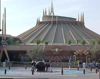
I think Tony was trying for a copper or bronze patina look to make it more Vernian looking, but it didn't really work on that scale, it's just brown. Not very optimistic. Once you decide to market the Tomorrowland as "new", you can end up with change for it's own sake to tie the facelift together. Good thing it was only paint and now the building is white again. As they say, if you're not failing enough, you're not experimenting enough.
So this question of white as a kind of "Tomorrowland" or "futuristic" color and part of the futurism movement intrigued me. The NYWF of 1939 has white as it's predominant color for the central areas and so did the 1893 Chicago World's Fair. Brazilia and the TWA terminal in NYC. The iPhone 4 in White. It's minimal and clean, I know, but I wanted to know more. I did some reading on the art movement of futurism in italy in the early 20th Century and even some of the Italian designers and their buildings with spires. It is an interesting scan to see the violence and color that was part of this early movement of futurism. My fave quote was this..
Believing in progress does not mean believing that any progress has yet been made. (Franz Kafka)
The Italian manifesto of futurist architecture is here and it's a rant! Death to all ornament!
http://www.unknown.nu/futurism/architecture.html
http://en.wikipedia.org/wiki/Futurism
http://weimarart.blogspot.com/2010/08/wenzel-hablik.html
http://en.wikipedia.org/wiki/Antonio_Sant'Elia


