News Disney Riviera Resort announced

lazyboy97o

Well-Known Member
I like it too, and I'm not complaining about this new place either. I'm just saying if the concept art for the Contemporary were posted online in 2018, people would be absolutely ripping it to shreds as boring/generic/hospital/office building.

Not everything needs to be AKL, the Poly, or WL because [shocker] different people like different things.
Ornament is not theming. The Contemporary has a unique form derived from its concept. It's not a mix-and-match box that can have any "theme" glued onto it wherever. The thing about "simple" designs is that the good ones really aren't all that simple.
 

Missing20K

Well-Known Member
I like it too, and I'm not complaining about this new place either. I'm just saying if the concept art for the Contemporary were posted online in 2018, people would be absolutely ripping it to shreds as boring/generic/hospital/office building.

Not everything needs to be AKL, the Poly, or WL because [shocker] different people like different things.

The Contemporary was built in 1971, in a modern, brutalist style. Brutalism was at it's height from the mid 50's to the mid 70's so it was very much in vogue and "contemporary" and very unique and unlike most any other hotel built at the time. Brutalist architecture up to that point, particularly in America, was used far more in institutional and governmental buildings, and far more rarely in commercial or residential construction. The form notwithstanding, the manner of construction was quite modern and fitting with the theme of "contemporary" both due to the beton brut concrete as well as the modular nature of the structure. When one begins consideration of how the programmatic layout and the building section interplay and inform one another, an even deeper level of appreciation for the design can be found.

If we are speaking of how conceptual art may have been received, I would bet the conceptual art would be leaps and bounds better than anything we have seen from DIS in at least two decades (EDIT: A few exceptions exist I admit). Hand drawn renders by extremely talented visual illustrators will always, always trump computer generated images.

And just to drive the point home...
crhconcart.jpg


crhmcginnis.jpg


I will take the above over any of the renders of any of the hotels on the slate.
 

GoofGoof

Premium Member
Chapek doesn't care about anything but moving merchandise, higher revenue, and higher guest spending each quarter. Most people are too lazy and dumb when it comes to WDW, and think what's there is the greatest thing since sliced bread because that's what the TV ads and social media posts tell them. It's all about giving Johnny and Susie their "MAGICAL!!!" WDW vacation, because that's what the parents think they're supposed to do (again, thanks to marketing and PR).

If Disney doesn't do anything but copy "industry standards", those guests today will know nothing different. They won't realize that Disney used to immerse them from the moment they walked into the resort lobby until the time they checked out (and really, with DME it's from the time they land until the time they arrive back at the airport). They think, "well, I like what my local Holiday Inn offers, so if Disney does the same thing, I'm happy". Guest satisfaction achieved without taking a single step towards what the company used to offer. It's Disney regressing to the mean, moving to be just another of the most common denominator instead of being the least common denominator that it used to be. It used to be an experience (and almost literally a magical experience back in the 80's and 90's) to stay at a Disney resort. With what they're building recently, it looks and feels more like what you can get anywhere. Sure, the CBR refresh was good and fit the vibe of the resort, but that's a refresh of an existing, long-standing property. New builds likely won't have that "character" any time soon, if ever. And that saddens me.

Blame technology, blame a declining culture, blame a declining educational system... it doesn't really matter. Nothing about any of this will change without a wholesale directional shift at the top of the company, and swift kick in the collective societal backside. It is what it is, but that won't stop me from calling them out when they make a bone-headed move, and I'll also praise them when they do something right (And I did so with their CBR refresh, as noted above). But the bone-headed moves seem to be far outnumbering the good things by a hefty margin under Chappie. And don't anyone think I'm just hammering Iger and Chapek - Eisner shoulders a lot of burden on this, because it was on his watch that a lot of these things started. But Eisner also did a lot of good in his first 10 years at the helm for the parks, whereas the Bob's don't have any goodwill built up to draw upon.

Would I stay at Riviera? Possibly, but that's because I'd like to stay at every DVC resort at least once. :) Would I add on points there? Not a chance. DVC point costs have outstripped even the government-manipulated rate of inflation by 200% since Iger took over - $98/point in 2005 would be $126 today, a $28/point increase, and current pricing is $185/point, or $59/point higher than that.
I don’t fault people if they like what’s being offered. I had some very enjoyable vacations staying at one of the All Stars. This resort looks 10xs better than that place. I wasn’t dumb or lazy, the All Stars just fit my needs and budget at the time. Not everyone puts 100% dedication to theme as their top priority too. I’d still love to see these Holiday Inns people here talk about. I’ve stayed at a few in my day and they are a far, far cry from anything in this art.

I don’t diasagree with your opinions on Chapek and Iger overall. I do think they focus way too much on shorter term profits and less on a long term growth plan. We are starting to see some movement on the park side in the right direction. They are spending money and seem to have more of a plan than the last decade. I’m curious to see how they tackle the hotel issue. They need to add more rooms to grow. In the past decade they converted a lot of hotel rooms to DVC (SSR, BLT, GF, Poly, WL, part of AKL, and now CBR). The rooms lost at CBR are being replaced with the tower at CSR so that’s a wash. The new River Country resort is the first true addition of hotel rooms in about a decade. I want to see how that plays out. You already have Wilderness Lodge and the camp ground in the location so it looks like they are going with a different more modern look. I don’t think purists will like it, but it would be a bit tired and lazy to just build another clone of Wilderness Lodge and make it look like a log cabin again.
 

GoofGoof

Premium Member
The Contemporary was built in 1971, in a modern, brutalist style. Brutalism was at it's height from the mid 50's to the mid 70's so it was very much in vogue and "contemporary" and very unique and unlike most any other hotel built at the time. Brutalist architecture up to that point, particularly in America, was used far more in institutional and governmental buildings, and far more rarely in commercial or residential construction. The form notwithstanding, the manner of construction was quite modern and fitting with the theme of "contemporary" both due to the beton brut concrete as well as the modular nature of the structure. When one begins consideration of how the programmatic layout and the building section interplay and inform one another, an even deeper level of appreciation for the design can be found.

If we are speaking of how conceptual art may have been received, I would bet the conceptual art would be leaps and bounds better than anything we have seen from DIS in at least two decades (EDIT: A few exceptions exist I admit). Hand drawn renders by extremely talented visual illustrators will always, always trump computer generated images.

And just to drive the point home...
crhconcart.jpg


crhmcginnis.jpg


I will take the above over any of the renders of any of the hotels on the slate.
I don’t see how people don’t get CR. It still works for me today.
 

Lensman

Well-Known Member
I like it too, and I'm not complaining about this new place either. I'm just saying if the concept art for the Contemporary were posted online in 2018, people would be absolutely ripping it to shreds as boring/generic/hospital/office building.

Not everything needs to be AKL, the Poly, or WL because [shocker] different people like different things.
The Contemporary is an interesting case. I happen to like it for various reasons, but I could see that if we discount the monorail passing through the building (which is perhaps so iconic that it probably can't be discounted), the Contemporary reminds me of an Embassy Suites with the interior atrium look with exposed elevators. There are probably better examples but it's as close as the examples others are choosing to compare Riviera to.

I like your post, @Missing20K. I'd argue that your points could be used to argue both sides though. I do agree that at the time of construction, Contemporary - and Poly for that matter, had unique architecture and used unique construction techniques. Those were the days! If only Disney had a moonshot division like Google or Apple did. People lament the passing of Walt's era of Disney but I think we should celebrate the fact that there's another generation of innovators who are just as ambitious and intent on changing the world. They're just not at TWDC.
 

CaptainAmerica

Well-Known Member
The Contemporary is an interesting case. I happen to like it for various reasons, but I could see that if we discount the monorail passing through the building (which is perhaps so iconic that it probably can't be discounted), the Contemporary reminds me of an Embassy Suites with the interior atrium look with exposed elevators. There are probably better examples but it's as close as the examples others are choosing to compare Riviera to.

I like your post, @Missing20K. I'd argue that your points could be used to argue both sides though. I do agree that at the time of construction, Contemporary - and Poly for that matter, had unique architecture and used unique construction techniques. Those were the days! If only Disney had a moonshot division like Google or Apple did. People lament the passing of Walt's era of Disney but I think we should celebrate the fact that there's another generation of innovators who are just as ambitious and intent on changing the world. They're just not at TWDC.
You know Animal Kingdom Lodge opened in 2001, right? And Aulani in 2011? I'd put both on par with the Polynesian.
 

Lensman

Well-Known Member
You know Animal Kingdom Lodge opened in 2001, right? And Aulani in 2011? I'd put both on par with the Polynesian.
I agree that both those resorts are great! My intent was not to criticize those by my praise and admiration for the modular construction technique used for the Polynesian and the Contemporary. Apologies for the miscommunication.
 
Last edited:

GoofGoof

Premium Member
You know Animal Kingdom Lodge opened in 2001, right? And Aulani in 2011? I'd put both on par with the Polynesian.
As far as resorts at WDW go they haven’t hit a home run since AKL in 2001. That’s 17 years ago. Part of that long time gap is they really haven’t added many new resorts since then. Mostly just DVC additions to existing resorts (including this one). The new River Country resort will be a major test.
 

GoofGoof

Premium Member
The Contemporary is an interesting case. I happen to like it for various reasons, but I could see that if we discount the monorail passing through the building (which is perhaps so iconic that it probably can't be discounted), the Contemporary reminds me of an Embassy Suites with the interior atrium look with exposed elevators. There are probably better examples but it's as close as the examples others are choosing to compare Riviera to.
There’s no free happy hour with snacks in the evenings at CR so nowhere near as good as Embassy Suites ;)
 

lazyboy97o

Well-Known Member
The Contemporary is an interesting case. I happen to like it for various reasons, but I could see that if we discount the monorail passing through the building (which is perhaps so iconic that it probably can't be discounted), the Contemporary reminds me of an Embassy Suites with the interior atrium look with exposed elevators. There are probably better examples but it's as close as the examples others are choosing to compare Riviera to.
Embassy Suites began in 1984. Hyatt Regency Atlanta’s opening in 1967 is what really kicked off the atrium hotel craze. Even then, The Contemporary is not just sort of grabbing features of Portman’s work. Becket emphasizes the horizontal more than the vertical and baths the Grand Canyon Concourse in natural light through the giant windows on the north and south sides.
 
Last edited:

RandySavage

Well-Known Member
Contemp is true to its style and time and the monorail makes it special.

The Riviera is full of inept architectural contradictions and mistakes, e.g all windows/sliding doors appear to lack lintels or sills or surrounds of any kind - like some highwayside La Quinta bunker. It's got shutters that don't fit the window size. I don't even know what design element the glowing horizontal band is trying and failing to be.

Problem is, at this point in time we are so surrounded by and inured to bad architecture in our daily lives that Riviera will not be offensive to many/most people. I've been cursed to have made a study of historic cityscapes and buildings for a long time, so I wince when I see this kind of stuff (which is every day).

At least tacky gimmicks like All-Stars/Pop Century are low and absorbed by trees. Big and badly-designed are the worst offenders (and the new WDW norm).
 
Last edited:

GoofGoof

Premium Member
Contemp is true to its style and time and the monorail makes it special.

The Riviera is full of inept architectural contradictions and mistakes, e.g all windows/sliding doors appear to lack lintels or sills or surrounds of any kind - like some highwayside La Quinta bunker. It's got shutters that don't fit the window size. I don't even know what design element the glowing horizontal band is trying and failing to be.

Problem is, at this point in time we are so surrounded by and inured to bad architecture in our daily lives that Riviera will not be offensive to many/most people. I've been cursed to have made a study of historic cityscapes and buildings for a long time, so I wince when I see this kind of stuff (which is every day).

At least tacky gimmicks like All-Stars/Pop Century are low and absorbed by trees. Big and badly-designed are the worst offenders (and the new WDW norm).
I don’t disagree with any of this. By the way, this is the way to gripe :) Back up your complaints with actual examples and facts. Too much time wasted in this thread on “that must be the main pool because why would they show a quiet pool in art”. Too much reaching for issues. There’s plenty in that art to question without creating an issue that doesn’t exist. Just my opinion.

I am not formally educated in architecture like you but I can say something just feels off to me with the tower in the 2nd art without being able to quantify exactly what. I think maybe the shutters and awnings over some of the windows. There’s some nods to French Riviera along the roofline and at ground level, but they don’t seem to mix well with the middle of the building if that makes sense. Maybe it will turn out to look better in real life...or even worse :(

I agree on the size of the building making it worse. Low rise buildings are less of a focal point. It’s a trade off for Disney. People want those rooftop lounges and views of fireworks but that comes at somewhat of a cost. Especially on a lake shared with lower buildings. Wilderness Lodge has 6 or 7 floors so it’s possible to go mid rise and keep in theme, but definitely more difficult.
 

Bocabear

Well-Known Member
I don’t disagree with any of this. By the way, this is the way to gripe :) Back up your complaints with actual examples and facts. Too much time wasted in this thread on “that must be the main pool because why would they show a quiet pool in art”. Too much reaching for issues. There’s plenty in that art to question without creating an issue that doesn’t exist. Just my opinion.

I am not formally educated in architecture like you but I can say something just feels off to me with the tower in the 2nd art without being able to quantify exactly what. I think maybe the shutters and awnings over some of the windows. There’s some nods to French Riviera along the roofline and at ground level, but they don’t seem to mix well with the middle of the building if that makes sense. Maybe it will turn out to look better in real life...or even worse :(

I agree on the size of the building making it worse. Low rise buildings are less of a focal point. It’s a trade off for Disney. People want those rooftop lounges and views of fireworks but that comes at somewhat of a cost. Especially on a lake shared with lower buildings. Wilderness Lodge has 6 or 7 floors so it’s possible to go mid rise and keep in theme, but definitely more difficult.
Its not difficult, they are just lazy.
 

GoofGoof

Premium Member
Its not difficult, they are just lazy.
Well not overly difficult but still more difficult than a 2 or 3 story building. I can’t disagree there is a level of laziness or at least complacency and the mini-towers are the new norm so it doesn’t look like this will change any time soon.
 

brb1006

Well-Known Member
The Contemporary was built in 1971, in a modern, brutalist style. Brutalism was at it's height from the mid 50's to the mid 70's so it was very much in vogue and "contemporary" and very unique and unlike most any other hotel built at the time. Brutalist architecture up to that point, particularly in America, was used far more in institutional and governmental buildings, and far more rarely in commercial or residential construction. The form notwithstanding, the manner of construction was quite modern and fitting with the theme of "contemporary" both due to the beton brut concrete as well as the modular nature of the structure. When one begins consideration of how the programmatic layout and the building section interplay and inform one another, an even deeper level of appreciation for the design can be found.

If we are speaking of how conceptual art may have been received, I would bet the conceptual art would be leaps and bounds better than anything we have seen from DIS in at least two decades (EDIT: A few exceptions exist I admit). Hand drawn renders by extremely talented visual illustrators will always, always trump computer generated images.

And just to drive the point home...
crhconcart.jpg


crhmcginnis.jpg


I will take the above over any of the renders of any of the hotels on the slate.
I agree about prefeering hand drawn renders over computer generated renders. The same goes for modern concept art for shows and attractions at both Walt Disney World and Disneyland which either uses computer generated images, stock character art, or just terrible concept out that look like it was photoshopped.

Just look at the concept art for Disneyland's 2017 update for Fantasmic.
https:///wp-content/uploads/2017/05/fan019840192312fi-550x309.jpg

And the concept art for the original show made for it's 1992 premiere.
tumblr_osranvVV3l1v0pvuyo1_1280.jpg

tumblr_osradvtn461v0pvuyo1_1280.jpg

tumblr_osraltmNxy1v0pvuyo1_400.jpg

tumblr_osrab3RFEE1v0pvuyo1_1280.jpg

concept_art_from_fantasmic__by_foxlover35-d8q27xp.jpg
 

Nmoody1

Well-Known Member
Ah! What could have been!

I agree about prefeering hand drawn renders over computer generated renders. The same goes for modern concept art for shows and attractions at both Walt Disney World and Disneyland which either uses computer generated images, stock character art, or just terrible concept out that look like it was photoshopped.

Just look at the concept art for Disneyland's 2017 update for Fantasmic.
https:///wp-content/uploads/2017/05/fan019840192312fi-550x309.jpg

And the concept art for the original show made for it's 1992 premiere.
tumblr_osranvVV3l1v0pvuyo1_1280.jpg

tumblr_osradvtn461v0pvuyo1_1280.jpg

tumblr_osraltmNxy1v0pvuyo1_400.jpg

tumblr_osrab3RFEE1v0pvuyo1_1280.jpg

concept_art_from_fantasmic__by_foxlover35-d8q27xp.jpg
 

briangaw

Active Member
For me, hotel architecture (exterior in particular) is of paramount importance because it was able to distinguish the entirety of WDW as something apart from today's norm (with Downtown Orlando, I-4 or the Lake Buena Vista Official Hotels offering perfect examples of the norm).

BLT tower was the beginning of the loss of this uniqueness, which is now accelerating to a nightmarish degree under Chapek & Iger. Some have noted, "I don't care what a building looks like, as long as the room's nice and it gives me a great view." Maybe if it were off in some distant corner of the World. But as it stands, these things going up in highly visible prime locations is like someone building a really badly-designed, ill-fitting condo in previously-pristine or historic place (e.g. Venice or Nantucket Town) affording themselves nice views of the beauty that was previously well-stewarded, while costing everyone else the same... and beginning a domino effect that leads to the end of the beauty that lured the development in the first place.

It could have been a win-win had there been executives and designers in place with a modicum of vision and knowledge. Footprint and floor-count don't necessitate a bland, every-day, degraded piece of architecture (although that's what we end up in 95% of cases around the world).

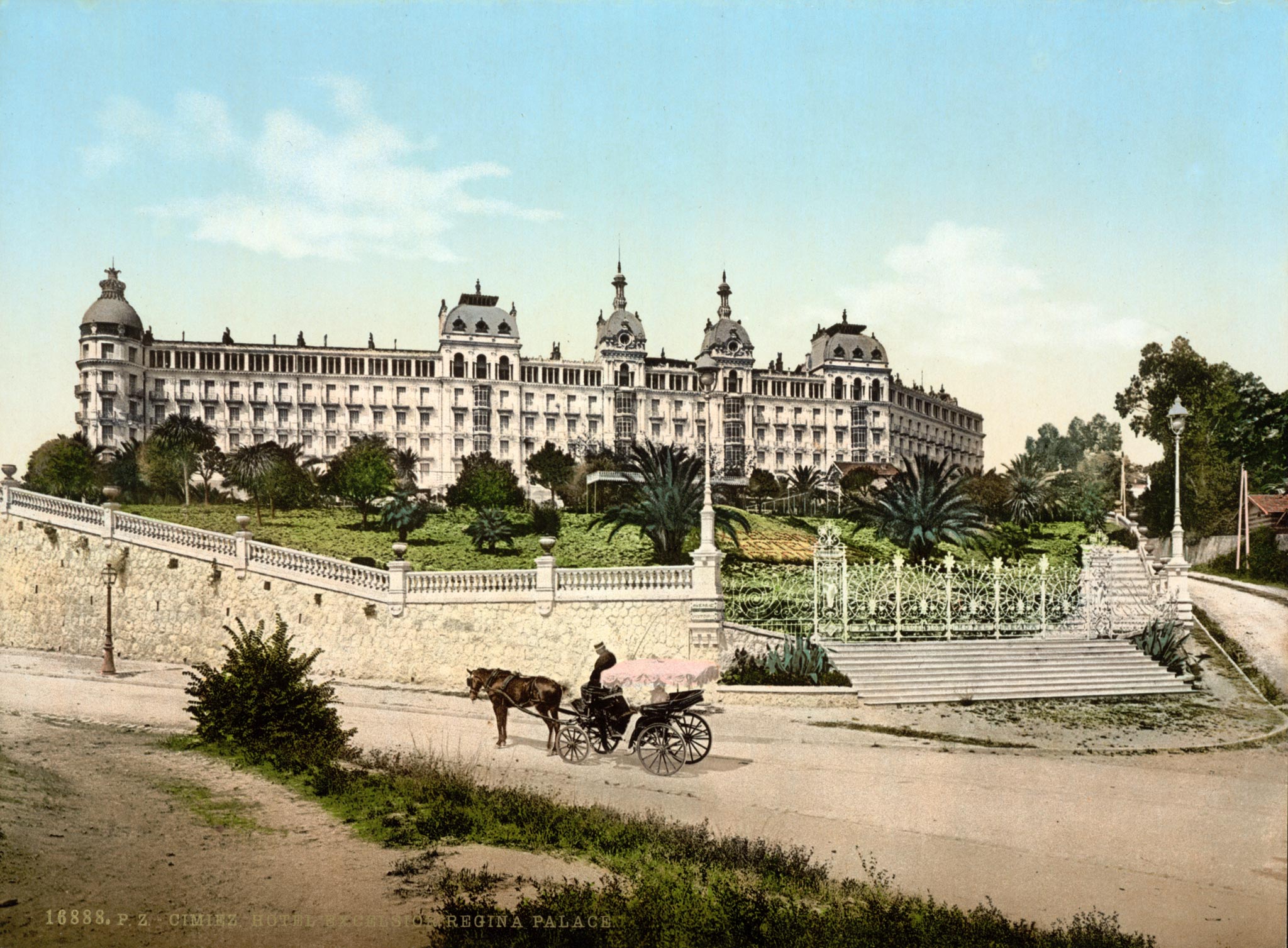
Here's a couple hotels from the actual Riviera that might be one of numerous archetypes that could have inspired Disney to build a resort themed to the Golden Age of European Travel:
Excelsior-Regina-Palace-Hotel-Nice.jpg


RL-Postcard-LL-Monte-Carlo-The-Casino.jpg


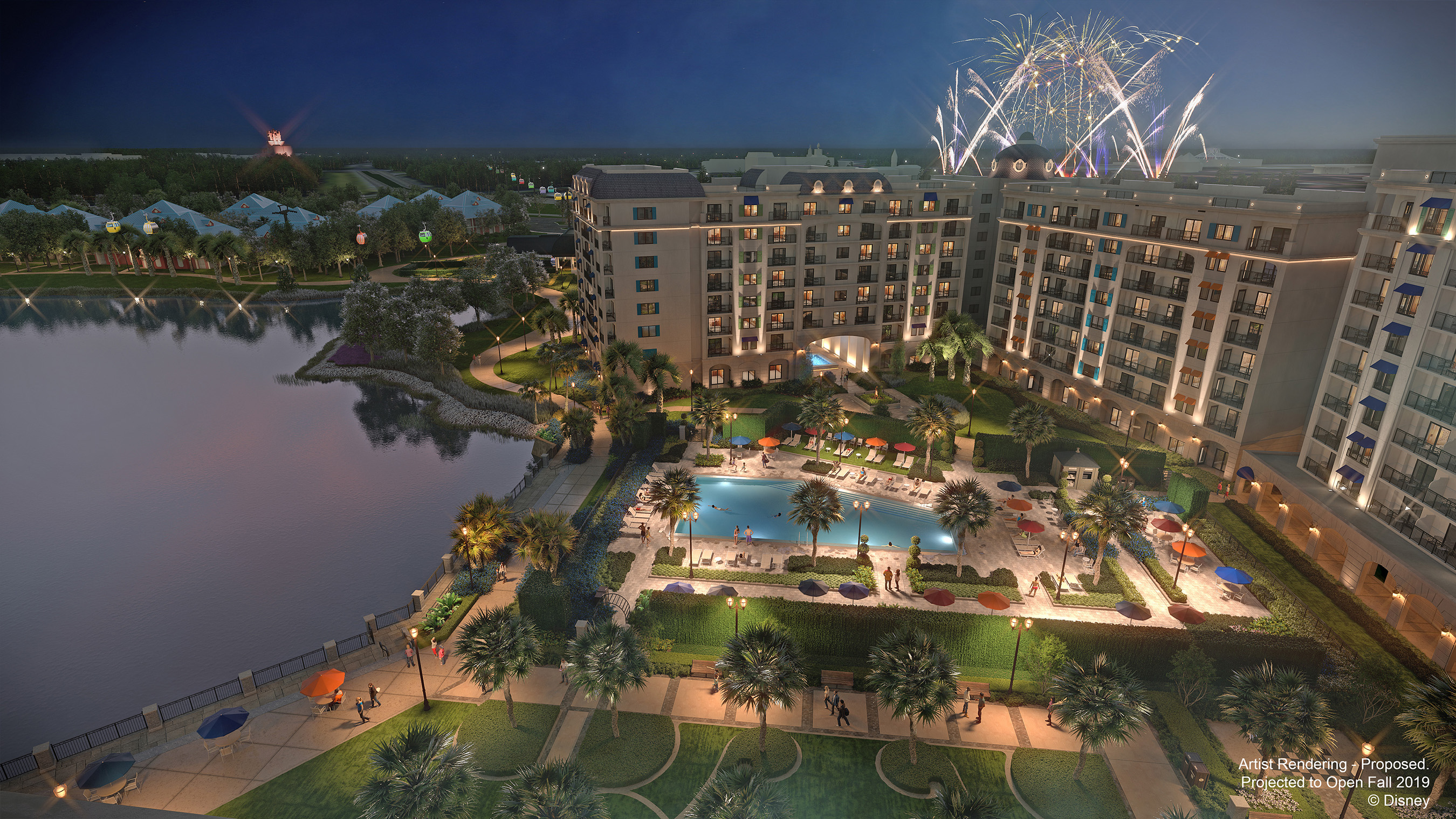
While places like the Wilderness Lodge or Grand Floridian or Beach Club did an admirable (not perfect, but probably best-in-class) job of evoking that lost, romantic age of grand hotels, why could this Riviera, architecturally, not have strove for the same? Instead it is an ugly and inept looking building (went downhill from the first very bland rendering) - the shutters presence alone show the degree of cluelessness.

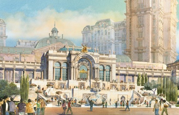
I'm not a big fan of the kitschy tower-portions of themed resorts in Macau (example below) and Vegas, but AT LEAST - at ground level - the designers and developers study and go for the architectural aspects that define a historic style (Beaux-Arts in this case). With Riviera, they couldn't have been cheaper or more lazy in this respect - like what you'd expect from an average (average = awful when compared traditional design standards) local condo development. I will take a pic of a nearby above-average condos that have much better application of traditional, historic elements than the "themed" Riviera.

Again, when a company tries to design something to evoke European resorts of old:
Summer-Pavillion_Lisboa-Palace-e1399948299387.jpg

Grand-Lisboa-Palace_South-Elevation-1024x558.jpg


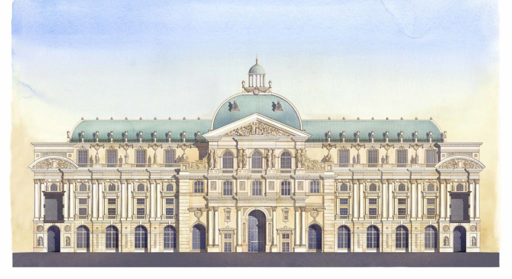
And former-themed-resort-hotel-leader-and-massively-profitable DisneyCo's effort at something similar:
Image_WDW_Riviera-Resort.jpg

I agree with you completely that so far it seems the exterior of this hotel while you can see some nods to the actual Riviera architecture, but falls way short! I think the problem, however, is the location of this resort. If they went all out on the Riviera architecture I really do think that we would then be really talking about how jarring it is to be seen from Caribbean Beach. I think they set themselves up for failure by siting this resort where they did.
 

Missing20K

Well-Known Member
Contemp is true to its style and time and the monorail makes it special.

The Riviera is full of inept architectural contradictions and mistakes, e.g all windows/sliding doors appear to lack lintels or sills or surrounds of any kind - like some highwayside La Quinta bunker. It's got shutters that don't fit the window size. I don't even know what design element the glowing horizontal band is trying and failing to be.

Problem is, at this point in time we are so surrounded by and inured to bad architecture in our daily lives that Riviera will not be offensive to many/most people. I've been cursed to have made a study of historic cityscapes and buildings for a long time, so I wince when I see this kind of stuff (which is every day).

At least tacky gimmicks like All-Stars/Pop Century are low and absorbed by trees. Big and badly-designed are the worst offenders (and the new WDW norm).
Spot on. It's a fundamental misunderstanding (at best, complete ineptness at worst) of architectural elements and proportions. Or a total dismissal of anything design related in a quest for the acceptable ROI.

The most unfortunate aspect, for me, is that because all of these buildings are just rudimentary forms with applied materials for decoration, they lack a "truth" to them. The "truth" of the building must be told in the applied decorations. But when so many of the applied elements are eliminated, dumbed down, or half-hearted, the building loses any attempt at "truth."

For example, because a visible lintel above openings is not "necessary" it's very easy to VE out any applied form indicating the existence of a lintel. Shutters not fitting the windows directly adjacent is another great example. Another very easy VE item. "Hey if we make the shutters 6" smaller on the whole building we save $200,000." I think the LED band of lighting is attempting to simulate a cornice, but again the execution is awful. My guess? Someone had a fairly nice Fypon cornice designed and it was an easy target for VE. Leave the LED for the "wow" factor at night and nix the rest.

I'm not opposed to the large scale of the new construction, sightlines from TPFKaE notwithstanding, the problem is in the execution.
 

RandySavage

Well-Known Member
I think the LED band of lighting is attempting to simulate a cornice, but again the execution is awful. My guess? Someone had a fairly nice Fypon cornice designed and it was an easy target for VE. Leave the LED for the "wow" factor at night and nix the rest.

Yep, with the LED band and roof tack-ons, they're going for a traditional crown to a building of this height... but so poorly-handled. Like a child's fingerpainting (this) next to a Monet (the grand hotel buildings of the actual Riviera Era).
 

Register on WDWMAGIC. This sidebar will go away, and you'll see fewer ads.

Back
Top Bottom