News Disney Riviera Resort announced

MickeyMinnieMom

Well-Known Member
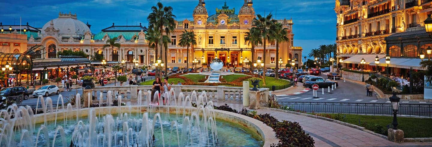
Here is a picture of Monoco...They seem to be almost dead on the style. The Riviera isn't exactly a well defined style so much as a modern interpretation of a classic design.

If they are going for beach resort of the Riviera, Im not sure what else you could do...

View attachment 354492
If they built exactly this, I'm sure someone would post about how it looks exactly like any other resort destination for the uber elite and fantastically wealthy. Same as all the rest of such places found the world over. ;)
Exactly! 👍 👍
 

Bocabear

Well-Known Member
But that picture is of a recently built resort and condo complex... not a thematic representation of what the Riviera is about....... But you are so right...they perfectly captured the style of the Riviera...
354512
 

MickeyMinnieMom

Well-Known Member
So are these... could go photo-for-photo all day, but I think the bottom line as some have said is that there is a RANGE -- it's not all that one iconic colorful pic of Monaco.

354514


354515
 

Missing20K

Well-Known Member
So are these... could go photo-for-photo all day, but I think the bottom line as some have said is that there is a RANGE -- it's not all that one iconic colorful pic of Monaco.

View attachment 354514

View attachment 354515
Which is exactly why they needed to hone down on the actual theme of the place. What exactly is the story behind the resort. A vague idea of Walt's travels through Europe is cop out. It would be akin to having an America Resort at DLP that tries to capture the entirety of the American built and unbuilt landscape within a single 20(?) story hotel tower.

They were far too ambitious with their "story telling" in this case.
 

Bocabear

Well-Known Member
Which is exactly why they needed to hone down on the actual theme of the place. What exactly is the story behind the resort. A vague idea of Walt's travels through Europe is cop out. It would be akin to having an America Resort at DLP that tries to capture the entirety of the American built and unbuilt landscape within a single 20(?) story hotel tower.

They were far too ambitious with their "story telling" in this case.
They did build the Hotel New York, the Newport Bay and the Hotel Cheyenne to all help tell a bit of the story of an American theme...It is just an odd theme, not well executed.
 

lazyboy97o

Well-Known Member
That there are large, multistory hotels in the Riviera doesn’t mean they look anything close to similar to this hotel. By that sort of measure then the Riviera does look like a Holiday Inn Express. The Riviera hotel doesn’t showcase similar sorts of scale, massing, form, materiality, ornament, etc. as any of the references photos.
 

Missing20K

Well-Known Member
They did build the Hotel New York, the Newport Bay and the Hotel Cheyenne to all help tell a bit of the story of an American theme...It is just an odd theme, not well executed.
I made the point about DLP for this very reason. While conveying an "American" theme, they are also all distinct individual properties, each telling a different "story" about the American experience.

I think their collective execution is superb in some areas, less so in others. At least they had the sense to hire Graves to do Hotel New York, though it's not terribly well executed. Even still, a shame they're making it a Marvel themed hotel.
 

nicb88

Well-Known Member
Which is exactly why they needed to hone down on the actual theme of the place. What exactly is the story behind the resort. A vague idea of Walt's travels through Europe is cop out. It would be akin to having an America Resort at DLP that tries to capture the entirety of the American built and unbuilt landscape within a single 20(?) story hotel tower.

They were far too ambitious with their "story telling" in this case.

My take on the resort is an amalgamation of themes from both the French and Italian Rivieras, rather than showing each one distinctly. The two can be travelled along in one journey so could be considered fair game as one theme. I admit it isn’t the best representation of that, but it would make sense given the mixture of both French and Italian named amenities. It certainly can’t be compared to ‘America’ as that would be more a France and Italy resort, rather than their rivieras.

Also, I don’t think Portofino is a fair comparison in any way - that one place is part of the Italian Riviera but it’s well known as being rather unique in its aesthetic. Universal knocked it out of the park with their version of it so if Disney did that everyone would be complaining it just copied that.
 

HauntedPirate

Park nostalgist
Premium Member
I made the point about DLP for this very reason. While conveying an "American" theme, they are also all distinct individual properties, each telling a different "story" about the American experience.

I think their collective execution is superb in some areas, less so in others. At least they had the sense to hire Graves to do Hotel New York, though it's not terribly well executed. Even still, a shame they're making it a Marvel themed hotel.

It did not look good from the outside when my wife and I were there in September. Maybe it was better on the inside?
 

lazyboy97o

Well-Known Member
My take on the resort is an amalgamation of themes from both the French and Italian Rivieras, rather than showing each one distinctly. The two can be travelled along in one journey so could be considered fair game as one theme. I admit it isn’t the best representation of that, but it would make sense given the mixture of both French and Italian named amenities. It certainly can’t be compared to ‘America’ as that would be more a France and Italy resort, rather than their rivieras.
Mixing places and aesthetics is a very valid concept, but they should be distinct in their presentation. Imagine something like Frontierland and Liberty Square where one moves from the French Riviera into the Italian Riviera with the aesthetics changing to show that movement from one place to another. Grabbing bits from here and there and then mashing them together doesn’t communicate anything clearly, it’s the sort of visual chaos that the “architecture of reassurance” contrasted. Even in something like Adventureland where places are less specific in their organization, European colonial ornament would make no sense on the Enchanted Tiki Room.
 

Missing20K

Well-Known Member
My take on the resort is an amalgamation of themes from both the French and Italian Rivieras, rather than showing each one distinctly. The two can be travelled along in one journey so could be considered fair game as one theme. I admit it isn’t the best representation of that, but it would make sense given the mixture of both French and Italian named amenities. It certainly can’t be compared to ‘America’ as that would be more a France and Italy resort, rather than their rivieras.

Also, I don’t think Portofino is a fair comparison in any way - that one place is part of the Italian Riviera but it’s well known as being rather unique in its aesthetic. Universal knocked it out of the park with their version of it so if Disney did that everyone would be complaining it just copied that.

My comparison was hyperbolic, yes, but theme is beyond just re-creating a time or place in the world (fictional or real). It's about telling a story. Evoking emotive experiences in the guests as they make their way through the story the designer is trying to tell. I suppose I mostly just fail to see how this hotel design tells the story of Walt and his travels through the European Riviera.
It did not look good from the outside when my wife and I were there in September. Maybe it was better on the inside?
I didn't stay there but I thought the common areas had a certain charm. Reminded me of MGM in it's hey day in spots. I found it to be self-referential without being kitsch.
Mixing places and aesthetics is a very valid concept, but they should be distinct in their presentation. Imagine something like Frontierland and Liberty Square where one moves from the French Riviera into the Italian Riviera with the aesthetics changing to show that movement from one place to another. Grabbing bits from here and there and then mashing them together doesn’t communicate anything clearly, it’s the sort of visual chaos that the “architecture of reassurance” contrasted. Even in something like Adventureland where places are less specific in their organization, European colonial ornament would make no sense on the Enchanted Tiki Room.
The thought of the resort being a "walk along the Mediterranean Riviera" would have been great if they would have massed the building to reflect differing building typologies, thus reinforcing the story that the guest is making their way from Italy, past Monaco, and into France. Would have been light years ahead of what they are building. Unfortunately, the monumental form does not lend itself well to the idea simply by being a single mass, despite being the most cost efficient approach. So one is left with a distilled, vague European Med Coast Riviera Walt's Travels "theme", instead of a cohesive story to present to the guest.
 

nicb88

Well-Known Member
My comparison was hyperbolic, yes, but theme is beyond just re-creating a time or place in the world (fictional or real). It's about telling a story. Evoking emotive experiences in the guests as they make their way through the story the designer is trying to tell. I suppose I mostly just fail to see how this hotel design tells the story of Walt and his travels through the European Riviera.

I didn't stay there but I thought the common areas had a certain charm. Reminded me of MGM in it's hey day in spots. I found it to be self-referential without being kitsch.

The thought of the resort being a "walk along the Mediterranean Riviera" would have been great if they would have massed the building to reflect differing building typologies, thus reinforcing the story that the guest is making their way from Italy, past Monaco, and into France. Would have been light years ahead of what they are building. Unfortunately, the monumental form does not lend itself well to the idea simply by being a single mass, despite being the most cost efficient approach. So one is left with a distilled, vague European Med Coast Riviera Walt's Travels "theme", instead of a cohesive story to present to the guest.

I agree that it isn’t a particularly story led concept, so the design does not reflect that, and that’s the difference between the recent resorts were seeing vs the older ones. It’s a shame given what could have been, but in my view it doesn’t make this resort unpleasant. I guess we have to take it for what it is since there’s no changing it all now!
 

Bocabear

Well-Known Member
Maybe it's the name that is throwing me off...to say Disney's Riviera Resort conjures images of both the French and Italian Rivieras as well as the Mexican Riviera... This Hotel seems to have none of the charm of any of those locales... Perhaps if they had called it Disney's Skyliner Resort (though that even sounds more interesting than what they have built) we would not be expecting a thematic representation of those locales...but rather just a hotel (DVC) with Skyliner Access... Disney's Skyliner Access Resort...Disney's DVC Vacation Resort *Now with Skyliner Access might be fine names... lol At least it would get off the hangup of theme to which there is little to none as far has been revealed.
 

MickeyMinnieMom

Well-Known Member
A vague idea of Walt's travels through Europe is cop out.
I disagree. This is a hotel -- not a land in one of the parks. I don't think it requires an incredibly detailed and specific story. I think it's enough to conjure a general vibe. Some of Disney's hotels are more "themed" than others, and I think there's room for a range.
 

eddie104

Well-Known Member
I disagree. This is a hotel -- not a land in one of the parks. I don't think it requires an incredibly detailed and specific story. I think it's enough to conjure a general vibe. Some of Disney's hotels are more "themed" than others, and I think there's room for a range.
Apparently Disneyland is getting a hotel similar to this and it's by Westin a luxury brand not "Holiday Inn Express". So whoever designed this must have did the same for the Riviera.
354605
 

Register on WDWMAGIC. This sidebar will go away, and you'll see fewer ads.

Back
Top Bottom