News Disney Riviera Resort announced

ajt5027

Member
I was referring to DVC pools here in Florida... Not Aulani... I agree the Aulani pool is amazing... The WDW pools are all ho-hum...Yes the Kidani pool is a tny bit nicer...but in general, the resort pools at the WDW resorts (excepting Stormalong Bay atht e Yacht and Beach Club) are all pretty boring....

This is all subjective. Poly pool is nice, Wilderness Lodge is amazing and both are DVC resorts. You are basing your entire opinion of this project on one piece of concept art.
 

raymusiccity

Well-Known Member
I think the problem is that the theme doesn't pop out like many of other resorts. It seems like this is the evolution of the original Venetian and maybe the Mediterranean resort. I personally would have rather had the Asian or Persian concept but out of those options this will be the one that fits in the most with CBR being next door.

I don't think this looks much better or worse than OKW or SSR. I'd be curious to see what the reaction to SSR was back in the early 00's.

I don't think the majority of DVC members bought into the program based on exterior views of any of the resorts. The entire presentation is housed in a nondescript location inside of Saratoga Springs. The wow factor was walking into the mockup of whatever resort was being featured at the time. In our case, we were impressed with the BLT room and its location. The outside design was secondary and played no part in our decision to buy.
The Riviera will have the same following. People will be swayed by the design of the rooms, the location and the access to the Skyliner. :)
 

TP2000

Well-Known Member
You might very well be correct, but why wouldn't they have created the art of the 'best' side if they were trying to show it off?

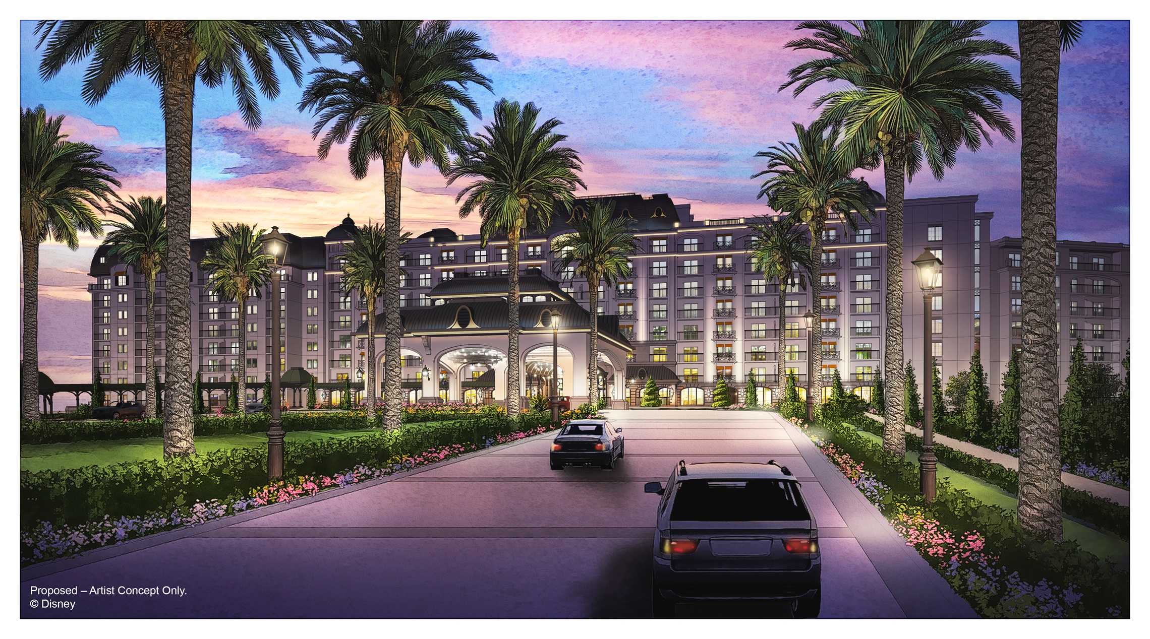
That's what worries me too. Like most of the D23 announcements this year, there was one single piece of concept art released. They chose this concept art specifically to show to the paying public at a splashy ceremony, and knowing it would get beamed around the fan community instantly. This was the best piece of art they had.

And what they chose looks basic and bland. Disney's Riviera Resort, inspired by the romance of the Jacksonville Sheraton! :rolleyes:
 

Mickey5150

Well-Known Member
That's what worries me too. Like most of the D23 announcements this year, there was one single piece of concept art released. They chose this concept art specifically to show to the paying public at a splashy ceremony, and knowing it would get beamed around the fan community instantly. This was the best piece of art they had.

And what they chose looks basic and bland. Disney's Riviera Resort, inspired by the romance of the Jacksonville Sheraton! :rolleyes:
People saying it looks like a Holiday Inn or Sheraton have to be blind or have chosen to only see what they want to see, not what Disney is showing. From the stone work along the base to the design of the roof and the detail in the railings on the room balconies, the Riviera has more style than the similarly shaped Four Seasons. The reason the concept art was released is because of the announcement of the Gondolas and Disney choosing to have a piece of artwork to show one of the gondola stations. The amount of hate for 1 picture is truly staggering, but then again, that's exactly the way people love to be on these forums. It's like someone telling you that they are pregnant and you responding that their baby is ugly.
 

nickys

Premium Member
That's what worries me too. Like most of the D23 announcements this year, there was one single piece of concept art released. They chose this concept art specifically to show to the paying public at a splashy ceremony, and knowing it would get beamed around the fan community instantly. This was the best piece of art they had.

And what they chose looks basic and bland. Disney's Riviera Resort, inspired by the romance of the Jacksonville Sheraton! :rolleyes:

This almost certainly is not the only or best piece of concept art they have. I don't think they are trying to show it off. yet. The ONLY reason they even mentioned it now is because there's a gondola station being built. Wait 18 months and then we'll get the full details of the resort, the grounds and the pool. The area is pretty big, looks like the grounds could be at least twice the size of the building itself.
 

Sir_Cliff

Well-Known Member
People saying it looks like a Holiday Inn or Sheraton have to be blind or have chosen to only see what they want to see, not what Disney is showing. From the stone work along the base to the design of the roof and the detail in the railings on the room balconies, the Riviera has more style than the similarly shaped Four Seasons.
Really? This just looks like a hotel, but it honestly looks nicer and more intricate than what Disney has presented so far:

Four-Seasons-Resort-Orlando-at-Walt-Disney-World-1.jpg


versus

Disney-Riviera-Resort_Full_30590.jpg
 

Jbres_

Member
Can we talk about the empty space between the Pop/AoA Gondola Station and the BIG CBR Station? There's a huge plot of land there; could that possibly be used for a future expansion for CBR or possibly a parking lot for the Gondola's? It's a good location because it goes right to DHS and all three of these resorts directly which would eliminate the need for parking at some of the surrounding resorts.
 

Monorail_Orange

Well-Known Member
The difference is that one isn't claiming to be a themed resort.
Your point is valid. But is it fair to judge when we don't yet know the theme, but only the title? Not saying you're wrong, or that the correct theme was selected/applied. I do agree with those that are saying it's difficult to make a final judgement on this one piece of art alone.
 

Sir_Cliff

Well-Known Member
Your point is valid. But is it fair to judge when we don't yet know the theme, but only the title? Not saying you're wrong, or that the correct theme was selected/applied. I do agree with those that are saying it's difficult to make a final judgement on this one piece of art alone.
I do get what you're saying. I think we do pretty much know the theme, though. Surely the name "Riviera" and that architecture is supposed to evoke the French Riviera? It would be strange if they chose to theme it after one of the many coastal tourist destinations that subsequently added Riviera to the end of the country or region's name. The fact no-one can say for certain shows just how "meh" the theme and design we've seen really are.

As for the art, if the best they could do was produce a generic hotel image as concept art, then surely they could have been better off just announcing the name and saying more will be revealed soon? I can't see how they'd gain anything showing an image that presented an inferior version of what they planned to open.
 

Monorail_Orange

Well-Known Member
I do get what you're saying. I think we do pretty much know the theme, though. Surely the name "Riviera" and that architecture is supposed to evoke the French Riviera? It would be strange if they chose to theme it after one of the many coastal tourist destinations that subsequently added Riviera to the end of the country or region's name. The fact no-one can say for certain shows just how "meh" the theme and design we've seen really are.

As for the art, if the best they could do was produce a generic hotel image as concept art, then surely they could have been better off just announcing the name and saying more will be revealed soon? I can't see how they'd gain anything showing an image that presented an inferior version of what they planned to open.
I wish I could disagree with you, but I can't. The only potential explanation for them intentionally leaving things generic would be to not over-hype a future DVC project while they're still selling Aulani, Poly, and now Copper Creek. DVC starts acting really funny about future projects until they're getting low on available inventory. I hate to say it, but it's typical retail strategy...SWAT: Sell What's Available Today.
 

Mike730

Well-Known Member
Can we talk about the empty space between the Pop/AoA Gondola Station and the BIG CBR Station? There's a huge plot of land there; could that possibly be used for a future expansion for CBR or possibly a parking lot for the Gondola's? It's a good location because it goes right to DHS and all three of these resorts directly which would eliminate the need for parking at some of the surrounding resorts.
Check with @danlb_2000, but I'm pretty sure the permit showed that being mostly new drainage basins beside the road that runs beneath the gondola cable.
 

slappy magoo

Well-Known Member
BLT looks like a retirement condo in Brooklyn and it's still my favorite resort because of the other amenities between it and the Contemporary, including location.

I agree the artist's rendering could very well be understated out of concern that some potential DVC buyers might wait for this resort versus buying current inventory. I understand the logic that concept art is often close to looking like or even better looking than the final project. But it's not crazy to think Disney/DVC decided to make the concept art a little more generic so they don't overhype it while there's still plenty of stock in other resorts.

It's also possible (and hey what do *I* know?) that they kept it generic to gauge feedback (message boards - the new informal focus group!) and they might adjust accordingly. OR use some of this feedback to shape the questions they might ask at future real focus groups.
 

Sir_Cliff

Well-Known Member
It's also possible (and hey what do *I* know?) that they kept it generic to gauge feedback (message boards - the new informal focus group!) and they might adjust accordingly. OR use some of this feedback to shape the questions they might ask at future real focus groups.
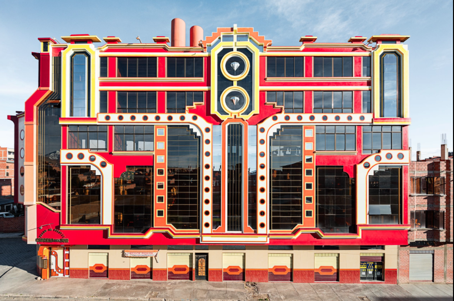
Well, if they're taking suggestions I suggest a Bolivian Cholet-themed resort:

screen-shot-2016-01-10-at-8-54-28-am.png


Cuzco's restaurant could be quite a place!

c8a78e5703204933494ded8ed7245d31.jpg


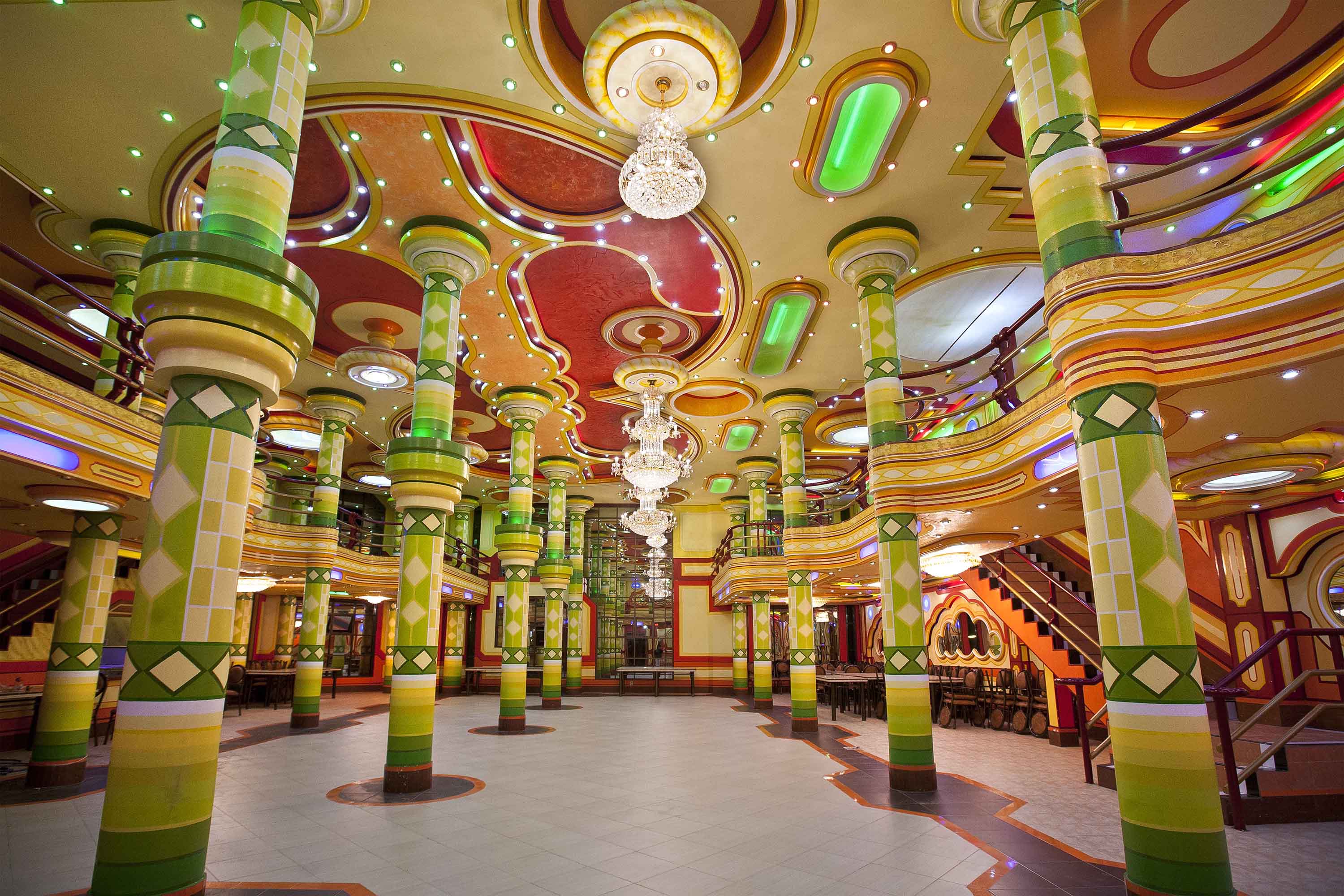
And the lobby could be rather classy, too

05img_3774.jpg
 
Last edited:

Bocabear

Well-Known Member
This almost certainly is not the only or best piece of concept art they have. I don't think they are trying to show it off. yet. The ONLY reason they even mentioned it now is because there's a gondola station being built. Wait 18 months and then we'll get the full details of the resort, the grounds and the pool. The area is pretty big, looks like the grounds could be at least twice the size of the building itself.
they are putting on a splashy event that is showing off the best of the best, don't think for a second they held back all the good artwork to release at a later date....why would they? the point of the event is to overwhelm the fans with the amazing plus for things coming... That I am quite certain, is the best piece of artwork...would not make any sense at all to not show their best....
 

peter11435

Well-Known Member
they are putting on a splashy event that is showing off the best of the best, don't think for a second they held back all the good artwork to release at a later date....why would they? the point of the event is to overwhelm the fans with the amazing plus for things coming... That I am quite certain, is the best piece of artwork...would not make any sense at all to not show their best....
Many things were held back
 

Casper Gutman

Well-Known Member
Many things were held back

They didn't announce every single thing they are planning, but they also didn't put out any art that wasn't the most idealized view of an announced structure possible. No executive said, "hey, let's produce and show crummy art that undersells our new resort for some reason." This is the best they think this hotel will ever look.
 

Register on WDWMAGIC. This sidebar will go away, and you'll see fewer ads.

Back
Top Bottom