-
Welcome to the WDWMAGIC.COM Forums!
Please take a look around, and feel free to sign up and join the community.
You are using an out of date browser. It may not display this or other websites correctly.
You should upgrade or use an alternative browser.
You should upgrade or use an alternative browser.
Differences between Disneyland and Hollywood Studios' versions of Galaxy's Edge
- Thread starter Stripes
- Start date
Darth Snips
Well-Known Member
Great thread! I dug up this old post from @hpyhnt 1000 about the differences in the Resistance base area. Thought it might be relevant here:
TL;DR - Orlando's SWL has advanced enough that we can begin to see how the area around Rise of the Resistance will be different from Anaheim's - DHS version is wider and more square whereas DLR version is narrower and longer. Pluses and minuses to each I'm sure. And satellite views have been updated enough that we can make direct aerial comparisons between both versions. These show the DHS version does not lack for overall space compared to DLR.
----------------------------------------
With the latest aerials, the layout differences around the Rise of the Resistance area are starting to become clear.
Anaheim:
View attachment 353802
Orlando:
View attachment 353829
I've scribbled some boxes and arrows to try to highlight differences.
The area around RotR in Anaheim will be much longer but narrower than the one in Orlando. It'll probably be like the difference of walking along a street or alleyway (Anaheim) versus through a square or plaza (Orlando). I suspect Anaheim's might have a better sense of journey or discovery as you'll walk along and see things revealed in the distance, whereas Orlando's will might seem more abrupt but also more enveloping in certain spots. Pluses and minuses to each I'm sure.
- The yellow box is the RotR queue entrance structure (making an educated guess for DHS). You can see how the relative location and orientation is different on each coast.
- The red box is the backstage support building.
- The dashed brown line is the X-wing replica area. In Anaheim, there looks to be a small plaza between the X-wing and backstage building. In Orlando, the probable spot for the X-wing seems smaller (no plaza) with an adjacent barrier themed as a crumbling wall.
- Arrow A: note how the Orlando backstage building will be almost right across the path from the exit of RotR, whereas in Anaheim it's significantly farther down the path.
- Arrow B: you can see how narrow Anaheim's SWL becomes relative to Orlando's. And similar to the backstage building, note how different the location of the X-wing will likely be between the 2 coasts.
Relatedly, I remember this subject came up about 1.5 years ago:
@marni1971 was kind enough to dispel the assertion that DHS was lacking for space, and @egg provided some additional explanation:
Satellite map views have been updated enough that we can make direct comparisons.
Anaheim:
View attachment 353805
Orlando:
View attachment 353806
Below I've used Anaheim's SWL as a base map and overlaid it with the approximate locations/boundaries in Orlando:
View attachment 353820
- Rise of the Resistance queue entrance (A=Orlando, AA=Anaheim)
- Backstage building (B=Orlando, BB=Anaheim)
- X-wing replica (C=Orlando, CC=Anaheim)
And, for kicks, here's a full view of Anaheim's SWL overlaid with the outlines of Orlando's (give or take a few feet):
View attachment 353821
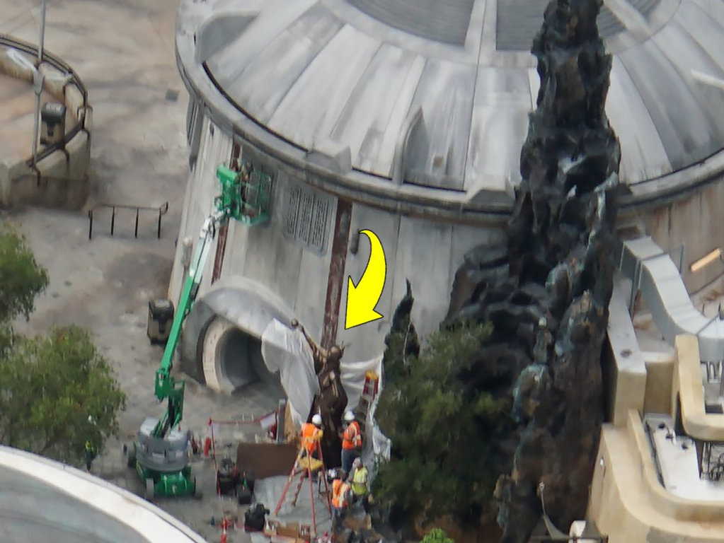
I’m unsure if this is temporary or permanent, but I’m leaning towards permanent.
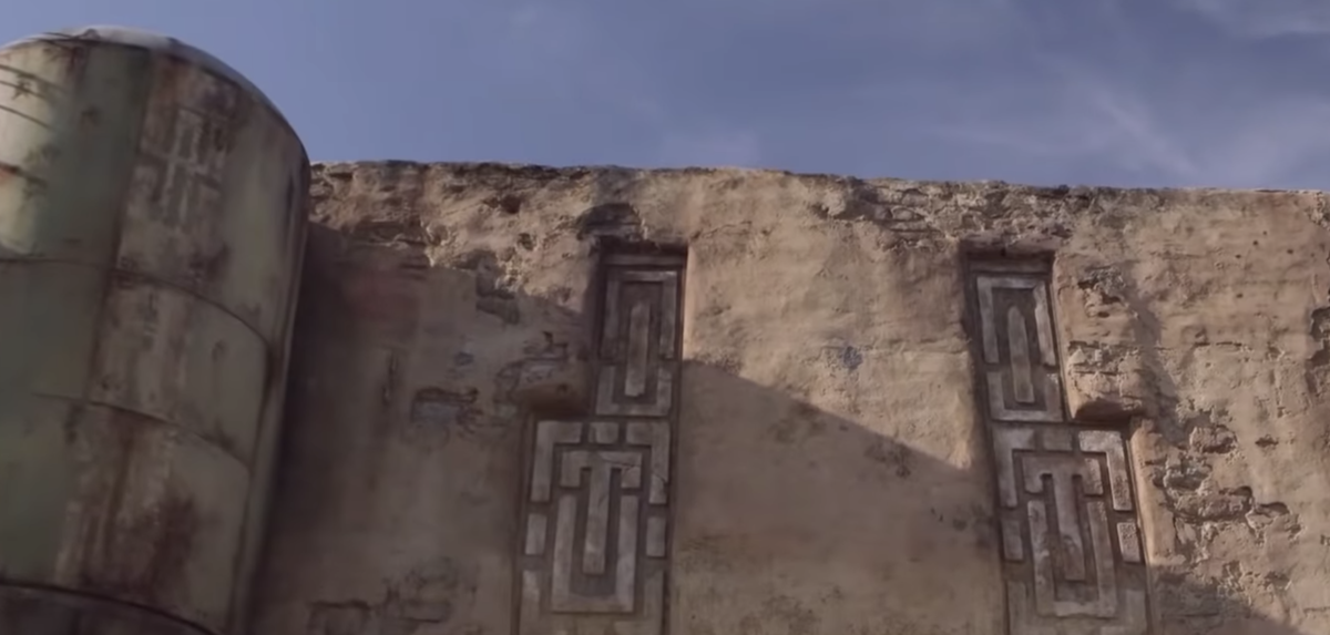
Dok-Ondar’s has 2 maroon colored decals that are situated on both sides of the entrance.
There are very faint blue highlights in the same position in Disneyland. (This picture has high contrast.)
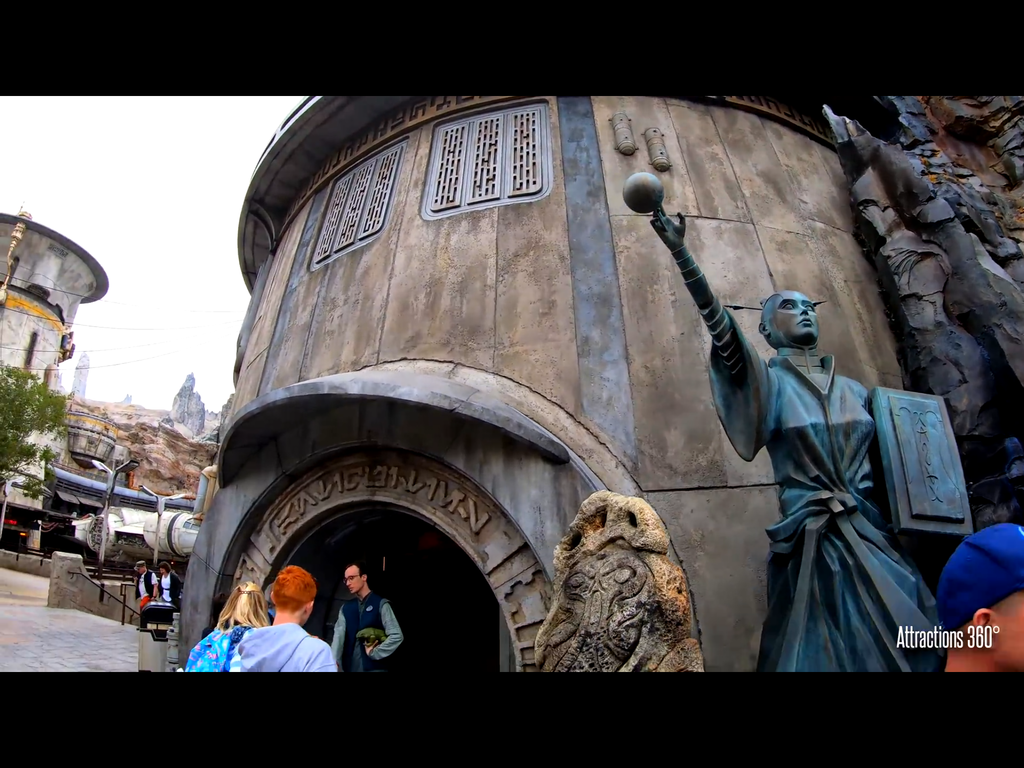
Edit: I think this picture is a little more representative of the actual color. For those with keen eyes.
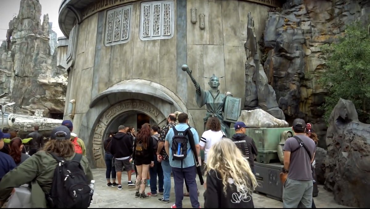
Dok-Ondar’s has 2 maroon colored decals that are situated on both sides of the entrance.
There are very faint blue highlights in the same position in Disneyland. (This picture has high contrast.)
Edit: I think this picture is a little more representative of the actual color. For those with keen eyes.
Last edited:
Tom Morrow
Well-Known Member
This is a really interesting thread. It's not often where you have an almost exact clone of something in both coasts on this scale where you can compare subtle differences like color hues.
With some exceptions, the Florida version seems to be more saturated and higher contrast. My guess is that this is because for much of the year, Florida has mucky overcast or partly cloudy skies, particularly from June through October, whereas Southern California typically has clear (albeit smoggy) skies. Florida has beautiful skies from November-ish to April, though. Overcast skies make grays and whites blend more with the sky and ground and it makes everything look bland.
Or, maybe they just wanted them to be less identical.
I also note that, although it's sometimes hard to tell, there appears to be slightly less deterioration of the buildings in Orlando compared to Anaheim. Less blaster marks as well.
Take the Marketplace for example.
This is an older photo and more detail and theming has been added since, but just to compare side by side.
DHS:
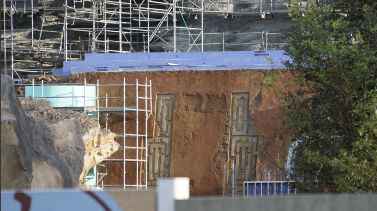
DL:
Take the Marketplace for example.
This is an older photo and more detail and theming has been added since, but just to compare side by side.
DHS:
DL:
I thought you'd appreciate itThis is a really interesting thread. It's not often where you have an almost exact clone of something in both coasts on this scale where you can compare subtle differences like color hues.
With some exceptions, the Florida version seems to be more saturated and higher contrast. My guess is that this is because for much of the year, Florida has mucky overcast or partly cloudy skies, particularly from June through October, whereas Southern California typically has clear (albeit smoggy) skies. Florida has beautiful skies from November-ish to April, though. Overcast skies make grays and whites blend more with the sky and ground and it makes everything look bland.
Or, maybe they just wanted them to be less identical.
BoarderPhreak
Well-Known Member
I think the left and right coast's offerings will always differ, even if they're "identical." While quite a bit different, compare things like the Haunted Mansion, the castles, etc. If they were truly identical, there'd be less reason to want to visit both, if nothing else. This extends to Paris, Hong Kong, Tokyo...
Then there's last minute design changes; being DHS is behind DL's schedule perhaps things changed once they saw it in person. If things start evening out as time progresses, that will be a good indicator if this was the case.
As for the foliage; consider that Cali is drier than Florida. Perhaps they're trying to "blend in" to the local flora more.
Sirwalterraleigh
Premium Member
Perhaps the brutality of the humidity in Florida - combined with the sun - caused them to modify the paint schemes?
Wouldn’t be the first time...
In five years, will they really look different at all?
Wouldn’t be the first time...
In five years, will they really look different at all?
DL: Currently Open. DHS: Currently Closed.
DHS: RotR opens in December. DL: RotR opens maybe in 2020.
DHS: Accompanying resort being build. DL: <sad trombone>
You said the Disneyland fans were “sad trombone” for not having a Star Wars hotel as a “difference”
Would you like me to quote you?
And don’t get emboldened by the clown show...it’s not going off very well if you read.
I dare you to make less sense.
Sirwalterraleigh
Premium Member
Absolutely:Let’s try to keep the thread on topic
There are no significant differences other than topography due to the size constraints in Disneyland and the encroachment of the river.
In terms of layout and shape, yes. There are also differences in theming. But I understand that this particular aspect will be insignificant to some. If this is the case for you then it would seem that this thread is of little interest to you.Absolutely:
There are no significant differences other than topography due to the size constraints in Disneyland and the encroachment of the river.
Disstevefan1
Well-Known Member
to the OP very cool thread here! And I am glad we can all agree the DHS version is far superior to DL 

TP2000
Well-Known Member
to the OP very cool thread here! And I am glad we can all agree the DHS version is far superior to DL
The differences between the two coasts are shocking. It's almost as if Disneyland was the practice canvas, and then WDI realized all their mistakes and made all the changes and adjustments they wanted to make to ensure DHS had the clearly superior looking Star Wars Land.
SpoiledBlueMilk
Well-Known Member
I can't wait to see what they come up with when the land goes into previews for paying customers in a few weeks!
I don't get it. Aside from the fact that there are some subtle palette changes to account for sun intensity and quality of light, the two lands are essentially carbon copies. Sure there are some structural changes since topography dictates certain things, but the lands were built to mirror each other. I fully expect the land at DHS to offer the same experiences that DL has. If you're looking for droids and aliens walking around, I hate to break it to you - the crowds Disney was worried about in California that didn't show up will be there in Florida.
SpoiledBlueMilk
Well-Known Member
Serious question. Has anyone heard a reason for these differences? I remember reading about a slight differences in hues to account for different levels of sunlight, smog, weather, whatever, but this seems like a lot more than that. Two different concepts altogether.
You got it right in your post. Florida's sun exposure is significantly more damaging than in CA. The quality of light is also different. You need to make changes to account for that. They may seem drastic in the photos, but they make sense on the ground. Disney doesn't want you to have two separate experiences in the same land in two different parks. They want continuity and a stable product.
tirian
Well-Known Member
To be fair, the WDW crowd doesn’t go nearly as often as the DL APs, and feels compelled to do as much as possible on each trip, hence the long lines. There’s also less to do in the MK than in DL or even the MK c. 1995.
That doesn’t mean the guests are more stupid or ignorant than the DL ones, as a certain DL-centric website likes to imply.
SWGE will be crowded because it’s in a tiny theme park with few attractions and it’s in the most-visited resort destination in Florida.
Plus, all major vacation spots are experiencing weird crowd patterns because internet bloggers hype small things that aren’t particularly special; and in today’s world, tourists are afraid to miss out on TOP THINGS that make locals scratch their heads. This includes mediocre restaurants, photo spots, bakery items, and getaways.
Here’s a NY Times article about it, and it’s happening everywhere from Europe to WDW.
As for SWGE, it’s true that Disney wants almost identical experiences, but since the beginning of the project, I’ve been told the Florida version would have slightly better theming simply because of its unique needs for color palettes and trees. We’ll see whether this is true when it opens.
Last edited by a moderator:
Register on WDWMAGIC. This sidebar will go away, and you'll see fewer ads.
