-
The new WDWMAGIC iOS app is here!
Stay up to date with the latest Disney news, photos, and discussions right from your iPhone. The app is free to download and gives you quick access to news articles, forums, photo galleries, park hours, weather and Lightning Lane pricing. Learn More -
Welcome to the WDWMAGIC.COM Forums!
Please take a look around, and feel free to sign up and join the community.
You are using an out of date browser. It may not display this or other websites correctly.
You should upgrade or use an alternative browser.
You should upgrade or use an alternative browser.
EPCOT Creations Shop opening this summer
- Thread starter wdwmagic
- Start date
Vegas Disney Fan
Well-Known Member
I’m glad I’m not the only one, that was my first thought when I saw pics… creeeepy mannequins.The metal/mirror face plates on the mannequins are creepy.
I’m a little disappointed it’s kind of bland but I think that’s better than overly busy like mouse gears was, I’m also very glad they went back to the white exterior, I think two tone with gray on the pillars would have been a nice touch (like someone mentioned earlier) but the white is infinitely better than the multi color mess it used to be.
Considering how crowded the store is, Disney should stop building attractions and just keep adding new stores every other month. Capacity!!
KIGhostGuy
Active Member
Paul Pressler’s dreamConsidering how crowded the store is, Disney should stop building attractions and just keep adding new stores every other month. Capacity!!
DreamfinderGuy
Well-Known Member
That elevator was removed during the gutting of MouseGear. There is no longer a second floor, it's all one level. That column is just a column and nothing more.I bet the elevator from Centorium is in the square column in the center of the store.
View attachment 587173
Brer_Bear_Is_Number_One
Member
The Centorium was the best (one of my all-time favorite Disney shops). MouseGear was okay. This new shop just looks very bland. And with the name 'Creations' I'd think there should be some type of 'design your own t-shirt' area or something where you get to actually create.
i do agree with the build your own shirt idea, as that would def make the creations name tie in much better. I still like the looks of the new one thoughThe Centorium was the best (one of my all-time favorite Disney shops). MouseGear was okay. This new shop just looks very bland. And with the name 'Creations' I'd think there should be some type of 'design your own t-shirt' area or something where you get to actually create.
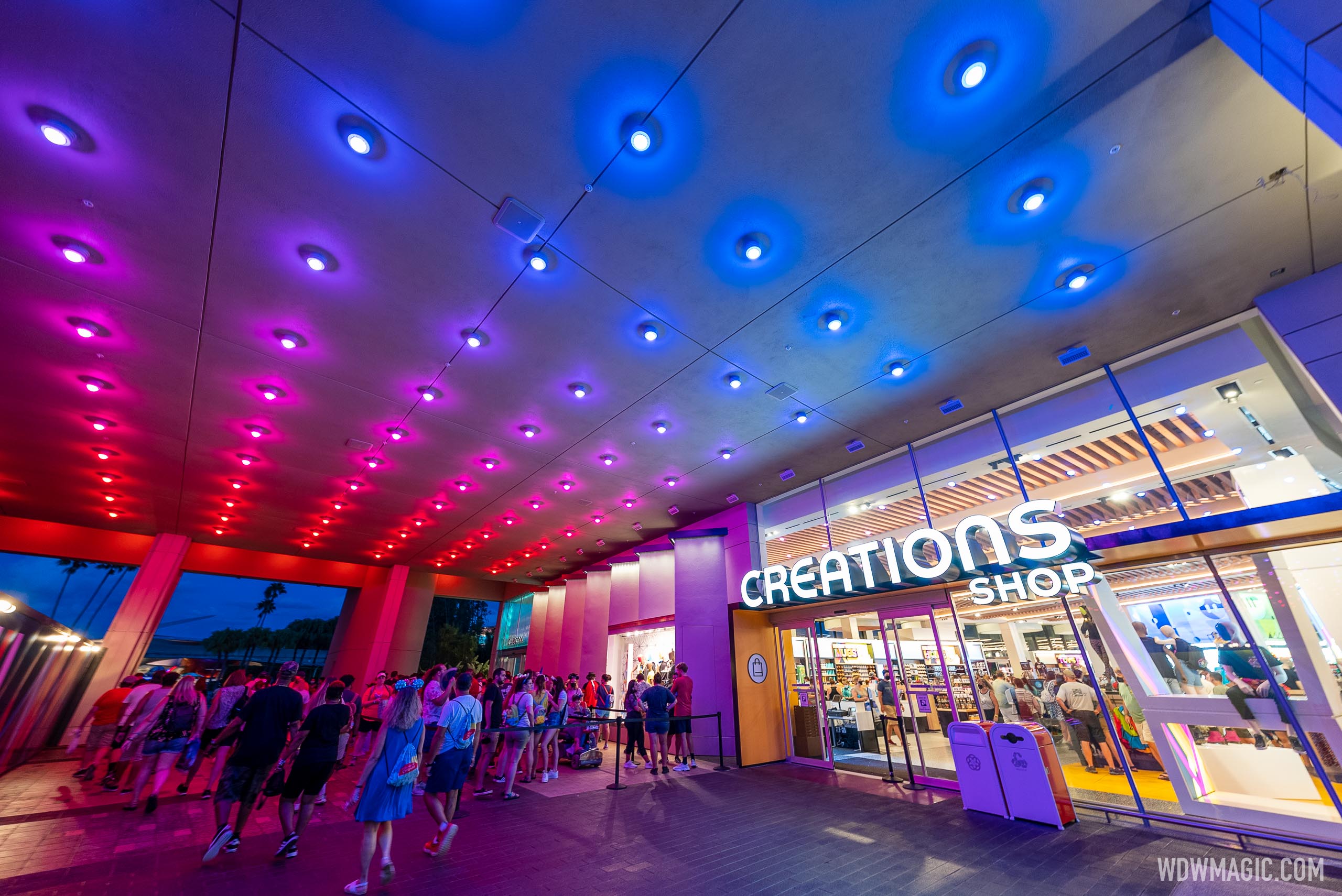
i wanna see some more pics of the ceiling area with the big circles
Figments Friend
Well-Known Member
The metal/mirror face plates on the mannequins are creepy.
They remind me of the unsettling humanoids from Disney's 'The Black Hole' movie -
thanks. I kinda wish they had done maybe like a stained glass picture in each tube for a dash of color up top. Looks cool as is though
A look at EPCOT'S new Creations Shop lighting package

A look at EPCOT'S new Creations Shop lighting package
The lights are on at the latest addition to EPCOT'S new World Celebration area.

DC0703
Well-Known Member
Eh... I guess the new store is fine. I do like all the natural light.
I'd say it looks more "contemporary department store" whereas Mouse Gears had a vibe that was much more "theme park". Reminds me of the approach they took with the Disney Springs World of Disney store, only with a futuristic slant.
Again, it looks okay... don't have strong feelings about it either way. It's a store, nothing too exciting
lazyboy97o
Well-Known Member
They didn’t bother to replace all of the window wall systems… So they’ve got the new narrow sight/butt system with glass that doesn’t align to the control joints, and the old system that did align with the joints and the colors don’t even match. Such attention to detail.
No Name
Well-Known Member
I’ve never really had much of a thought on mannequins, but some of these are really interesting and look surprisingly like people in 2021 while being clearly mannequins. Overall the new store is looking pretty nice if not a little too generic. Hopefully this ages well and/or they keep it fresh.
Prototype82
Well-Known Member
I don't have much to say other than they are finally getting this right. Clean whites, pops of color, natural light. It's only a gift shop but it finally feels like EPCOT.
Haymarket2008
Well-Known Member
Putting this out there again: if we never had Centorium, and it opened today…? It would be lambasted by the fans. I will concede that Creations is uninspired, but this is more in line with “Epcot Center” than Mouse Gear ever was.
FutureCEO
Well-Known Member
completely disney's fault, and completely avoidable.
don't hype up a store in thousands of twitter posts then say "oh, oops" when things like this happen
you want people to know about it, they know about it alright
and handing over their wallet, just as walt wanted
It's not Disney fault that people selling merchandise online and stupid people buy it at way overprice.
vikescaper
Well-Known Member
What background music is playing in the shop? I was watching a video tour and I couldn’t place if it the new entrance loop or not.
Register on WDWMAGIC. This sidebar will go away, and you'll see fewer ads.
