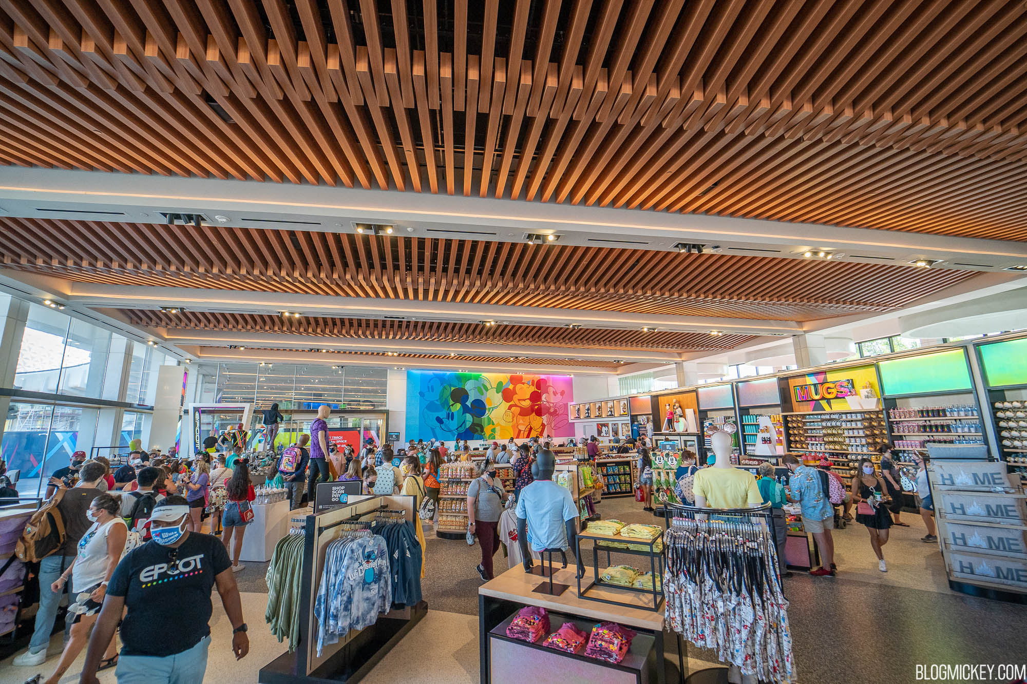
Creations Shop opening this summer

VJ

Well-Known Member
It’s $lappie’s dream! People looking at merch instead of decor. All that character and ambiance just detracts from sales opportunities. Gotta keep focused on the bottom line, stock analysts and shareholders come first.
now you're thinking like a disney executive
 

Disstevefan1

Well-Known Member
Disney to their retail designers:
"Picture in your mind Mouse Gear. Got it? OK we want the total opposite. We want a minimalist layout where the merchandise is the star! Where the merchandise is the ONLY reason to step into the space. Also a minimalist layout that costs the least to implement and maintain. We want to move away from the creative, immersive, fun spaces as folks may enter that space and get distracted and NOT buy anything. We can't let that happen."

The Designers to Disney:
"See The Creations Shop. Mission accomplished."
 

Sir_Cliff

Well-Known Member
I generally like it, though this is like The Land in terms of giving me airport vibes. Personally find it a big improvement on Mouse Gear, however.

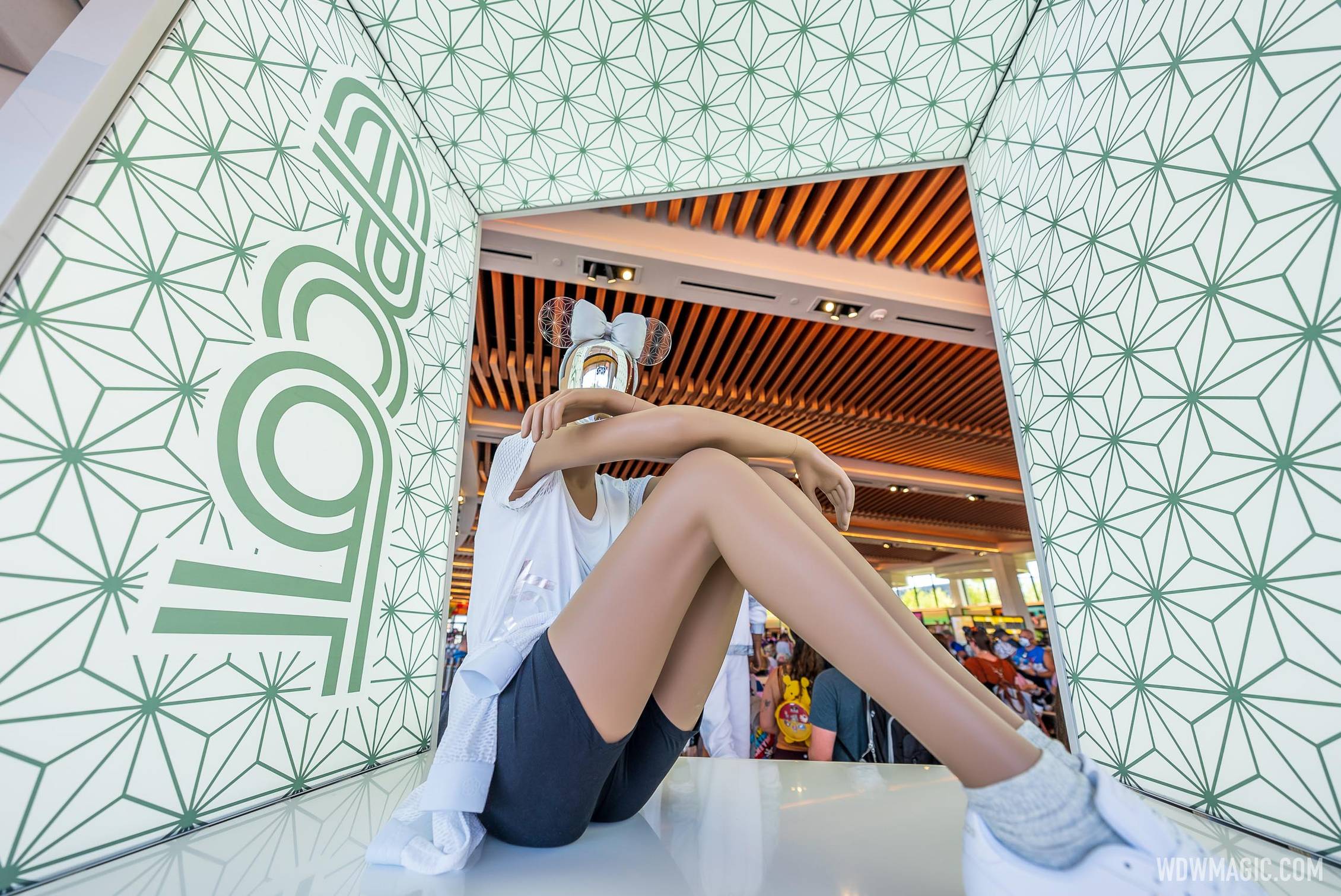
The one thing I don't love based on the pictures is the focus on Mickey. Making it so much a celebration of Mickey ends up giving the store a generic Disney feel. Not sure why they haven't done more with the Spaceship Earth motif instead. Where it's used, that works nicely and reinforces the notion that they're trying to give Epcot its own unique visual identity again.
 

J4546

Well-Known Member
i like it. The low shelving and super tall unobstructed ceilings make it looks so open and airy. I dig it. To be fair Im not really a big shopper when I go to the parks though and dont spend much time in them, so the project is really low on my give-o-crap meter. But Im digging the way the communicore is slowly coming together and it makes me excited for whats next
 

Sir_Cliff

Well-Known Member
Watching a video walkthrough, I liked the shop better than from the photos. The Mickey doesn't seem quite as overpowering and the open, minimalist design suits the location. Still think they could have leant more into Epcot-inspired designs such as Spaceship Earth or the pavilion logos, but overall seems like an improvement.
 

Disney Analyst

Well-Known Member
i like it. The low shelving and super tall unobstructed ceilings make it looks so open and airy. I dig it. To be fair Im not really a big shopper when I go to the parks though and dont spend much time in them, so the project is really low on my give-o-crap meter. But Im digging the way the communicore is slowly coming together and it makes me excited for whats next

We share very similar sentiments on this.

I personally prefer a store like this. It makes me feel far less claustrophobic, and is a lot more inviting for me to actually want to come in and browse.
 

Vegas Disney Fan

Well-Known Member
Can they not ban these scalpers. Most are probably AP holders anyway and surely they would be able to track it from the discount used?
Or simply sell stuff online, in Disney stores, or at both coasts.

I live on the west coast and only make it to WDW once every year or two, if they release a unique item my two choices are don’t get it or use a personal shopper. I refuse to pay eBay prices but have used a personal shopper for years that takes pre-orders and charges retail, their profit comes from their AP discount, not saying who but Disney must know, judging by their webpage they must buy hundreds of items every month.

This is a problem that Disney knowingly created to create demand, offer a limited supply and people will buy it now so they don’t miss out. That demand also created a demand for personal shoppers and eBayers.
 

dreday3

Well-Known Member
Not people complaining about the use of Mickey when the old stop they praise was called… MouseGear and had… Mickey.

Sometimes I am gently reminded that no matter what is done, it will be complained about on here.

I appreciate you saying this. :D

I like the store. It's bright, airy, has a modern-ish feel, has unique merch (or had anyways)...MouseGear smelled like a toilet, this looks like it smells nice. 😂
 

MisterPenguin

President of Animal Kingdom
Premium Member
At the ex-Communicore store right about now. I dunno but it feels kinda temp-ish even if it isn’t.
I'm guessing because they want to keep the flexibility to alter it as needed. If there are no big construction features that make it seem more permanent, then it's easy to add a 50th anniversary section, or a Harmonius section, or a Holidays Around the World section, and so on.
 

hpyhnt 1000

Well-Known Member
Watching a video walkthrough, I liked the shop better than from the photos. The Mickey doesn't seem quite as overpowering and the open, minimalist design suits the location. Still think they could have leant more into Epcot-inspired designs such as Spaceship Earth or the pavilion logos, but overall seems like an improvement.
I feel this center display area would be perfect for that. Instead of the abstract shapes there now, do a mix of SSE facets and pavilion logos and World Showcase skyline; as it is, they're halfway there with the Food and Wine signage. You could even put all the EPCOT Light and Color merch around it and make it "feel" like a whole section focused on EPCOT.

A quick change that would go a long way to giving the store a more park focused identity.

Creations-Shop_Full_44072.jpg


1631744927143.png


1631745288197.png
 

Sir_Cliff

Well-Known Member
I feel this center display area would be perfect for that. Instead of the abstract shapes there now, do a mix of SSE facets and pavilion logos and World Showcase skyline; as it is, they're halfway there with the Food and Wine signage. You could even put all the EPCOT Light and Color merch around it and make it "feel" like a whole section focused on EPCOT.

A quick change that would go a long way to giving the store a more park focused identity.

View attachment 587255

View attachment 587250

View attachment 587254
Completely agree and don't know why they went with Mickey instead of something more focussed on the new visual identity they're promoting for the park.

Also think those illuminated boxes above the displays were somewhere they could have subtly worked in the Spaceship Earth pattern or pavilion logos:

creaions-shop-opening-day-12.jpg


For example, running one of the following patterns through those illuminated rectangles:
Creations-Shop_Full_44122.jpg


Screen Shot 2021-09-16 at 1.05.22 am.png
 

Register on WDWMAGIC. This sidebar will go away, and you'll see fewer ads.

Back
Top Bottom