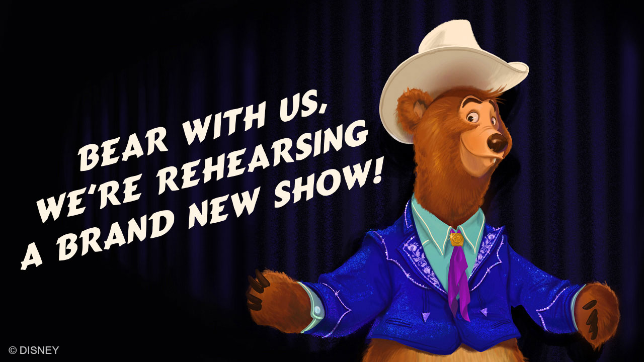
News Country Bear Jamboree is getting new songs and acts

MerlinTheGoat

Well-Known Member
Just wanted to second the idea that their Peter Pan's Flight refurb was actually a step backward rather than an forward - losing the Fly-thru Neverland Room in favor of Fly-over Neverland models zapped a lot of the richness and environmental feel out of the ride. The ride was absolutely deserving of improvements, but they should have just punched up the execution of what was there already. Instead the result is far fewer show elements and much more negative space.

I'm constantly grateful WDW's PPF didn't take notes from Tokyo's redo. Our version desperately needs love, but I think Tokyo lost the plot here and shouldn't be followed.
As a massive fan of the Pan ride at Cali/Paris, the new Neverland model wouldn't bother me if not for two very major problems-

1- Whoever sculpted the new Neverland model did a horrendous job. It's insanely misshapen and terrible. They had literally three other quality references as Cali, Paris and Shanghai all look right. Still messed it up. It was even worse when it first opened as it had this really poorly designed plume of smoke sticking out of the volcano. They have since removed this plume at least, but the model remains very ugly.
2- They didn't add any painted murals on the walls from those other three versions of the ride. So arguably the largest issue with the WDW/Tokyo version, how black and empty the walls are, was not really fixed at all.

They did add a bunch of fiber optic curtains to the black backgrounds. Which is a good and welcome addition in the Neverland flyover room specifically since the island is essentially literally floating in space. The problem is they used these star curtains throughout the other rebuilt and relocated Neverland sets for the Lost Boys, Indian Camp and Mermaid Lagoon. These models no longer look like an organic part of the island, they're just these small setpieces randomly floating in outer space for no reason.

Incidentally speaking of fiber optics, I don't know why but Paris still has the best pixie dust effect on the ship deck to this very day. Disneyland uses some dull sparkle projection, and Tokyo only covered a small corner of the boat in the effect. Whereas Paris' is a full curtain that covers that entire scene and looks spectacular. Paris overall is my favorite version even now.

As I mentioned in the TBA thread though, WDW's Pan ride has many flaws of its own. I still think it has the best London flyover (especially with the more 3-dimensional buildings), but i'm otherwise much more partial to the versions at CA/Paris. And over the past 5 years, someone has been swapping out a number of the UV lights on a number of scenes with bright spotlights. It has ruined a lot of the scenes and caused a ton of previously hidden walls and backstage stuff to become very visible. Whoever has been doing that needs to be told off.
 

Disgruntled Walt

Well-Known Member
In the Parks
No
So far, variants of *most* of the existing characters have been accounted for on the poster at least. Even the Five Bear Rugs get a mention at the bottom. Missing characters from the poster are Gomer and the Sun Bonnets. Also no mention of Little Oscar or Sammy, though these two are minor characters who may just not have made the poster.

Liver Lips is getting a major visual overhaul and renamed to Romeo. He now has slicked back suave blonde hair.

View attachment 762342
1704841531504.png

Sun Bonnets are accounted for, they've just been relegated to Trixie's back up singers. Probably a punishment for singing their offensive song in the first iteration.
 

MerlinTheGoat

Well-Known Member
What's the context on what they did to their Peter Pan's Flight?
Tokyo's Pan was originally an exact clone of WDW's 1971 variant (it still even uses the old tournament tent facade). Around 2015-2016, Tokyo's received a major overhaul.

The London scenes were more conservative with their changes, just some general lighting, projection and other minor updates for the most part. Same goes for the scenes from Skull Rock onward. Pretty standard, but also underwhemling as again they still just largely left the black walls/curtains intact and didn't implement any of the detailed murals found in the other versions at CA/Paris/Shanghai.

The entire Neverland room was gutted and redone from scratch. They attempted to copy the other versions of this scene based on the DL 1983 variant. A miniature Neverland model in the center surrounded by a curtain of fiber optic stars. But the island model ended up becoming very misshapen for some bizarre reason.

The scenes with the Lost Boys, Indian Camp and Mermaid Lagoon were also disconnected and lined up in a linear corridor one after the other, just floating inside that same black starry void as the island model. At CA/Paris, these scenes have their own detailed and connecting sets with some lovely detailed background murals on the walls. They all feel like a very organic extension of the rest of the room they're placed in. Not just random props placed in a black void without any rhyme or reason.


MerlinTheGoat

Well-Known Member
What would end up being my final ride on the WDW splash - the bright white lights were very off on that ride as well. Someone at WDW needs to learn what a dimmer pack is!
What they need to do is remove those lights entirely and bring back the UV lamps. That's the only way you can make black walls and backstage areas mostly invisible. Unless they want to do a from-scratch rebuild that adds a ton of new murals and overhead scenery to hide this stuff.

Even a dim normal lamp isn't good enough. Plus the props and figures were painted specifically for use with UV light and don't look right when lit with bright normal light.

1704842614097.png


^This is what a number of the scenes now look like since the past few years. And for those who don't remember or never went on the ride years back, no, the scenery isn't supposed to be lit that brightly and the ceiling and mechanical elements are not supposed to be nearly that visible.

As long as they maintain the inappropriate jokes…
They're not. That's one of the motivating factors behind the new show. They're trying to remove anything that could be deemed problematic.
 

Mike S

Well-Known Member
The announcement from DisneyParks Blog-
I feel like this would’ve gone over a lot better if it was simply updating to more modern country songs than what’s currently there (Queen of Hearts, All my exes live in Texas, etc.) and Bear Necessities was simply there to replace the Ballad of Davey Crockett as the new shows “Disney” song. Speaking of which is “Bear Tracks” original to the show?
 

Animaniac93-98

Well-Known Member
Just wanted to second the idea that their Peter Pan's Flight refurb was actually a step backward rather than an forward - losing the Fly-thru Neverland Room in favor of Fly-over Neverland models zapped a lot of the richness and environmental feel out of the ride. The ride was absolutely deserving of improvements, but they should have just punched up the execution of what was there already. Instead the result is far fewer show elements and much more negative space.

I'm constantly grateful WDW's PPF didn't take notes from Tokyo's redo. Our version desperately needs love, but I think Tokyo lost the plot here and shouldn't be followed.

It was another example of WDI making something more like Disneyland, which always had the flyover model of Neverland, and ignoring how WED tried to top that by having guests fly through Neverland.
 

Virtual Toad

Well-Known Member
What they need to do is remove those lights entirely and bring back the UV lamps. That's the only way you can make black walls and backstage areas mostly invisible. Unless they want to do a from-scratch rebuild that adds a ton of new murals and overhead scenery to hide this stuff.

Even a dim normal lamp isn't good enough. Plus the props and figures were painted specifically for use with UV light and don't look right when lit with bright normal light.

View attachment 762356

^This is what a number of the scenes now look like since the past few years. And for those who don't remember or never went on the ride years back, no, the scenery isn't supposed to be lit that brightly and the ceiling and mechanical elements are not supposed to be nearly that visible.


They're not. That's one of the motivating factors behind the new show. They're trying to remove anything that could be deemed problematic.
Wow, the lighting in Pan is atrocious. Inexcusable really. Does ANYONE in parks management at WDW have a clue about upholding show standards anymore?
 

aladdin2007

Well-Known Member
What would end up being my final ride on the WDW splash - the bright white lights were very off on that ride as well. Someone at WDW needs to learn what a dimmer pack is!
someone needs to be told this as well for gran fiesta tour, its really getting bad show. They are doing that in so many rides now, and its an easy fix. Its being done on purpose for some reason (security?) and needs to stop.

and while I know our pan needs some maintenance love, I really like it as is, its the one thing that hasn't been ruined or altered. Would hate to see it get the changes some of the other versions have gotten. spot lights especially.
 

yensidtlaw1969

Well-Known Member
and while I know our pan needs some maintenance love, I really like it as is, its the one thing that hasn't been ruined or altered. Would hate to see it get the changes some of the other versions have gotten. spot lights especially.
I actually tend to agree with this - there's something about the ride being largely unaltered from its opening day design that I think is keeping some of the magic in it. I think the other PPF refurbs around the world in the last decade have shown that it's not actually as easy to get right as some might think. The Disneyland refurb in 2015 I feel actually did more harm than good. Several of the new effects appear to be less reliable than what they replaced, some of the projections are obvious and too bright, and London's repaint and relighting has left it looking flatter and less magical than ever before.

There's a really simple, elemental magic to Peter Pan's Flight that I think is what makes it the enduring classic it's become, and even the little bits of tech they've tried to insert in the different versions disrupt the chemistry of the ride. It is old school, and I think that's a big part of it's charm.

I could get behind a refurb of the WDW ride if they stuck to what works with it already. It doesn't need reinvention. Spiff up some of the figures to be more on-model, add some Fiber Optic stars, fill some of the black space with handsomely painted Blacklight sets. Make it look as good as it can and maintain it at those standards. But PLEASE exercise healthy restraint - it really isn't necessary to do anything that couldn't have been done in the 1970's. The ride is stupidly popular for a reason; at its core, it works.
 

TrainsOfDisney

Well-Known Member
The Disneyland refurb in 2015 I feel actually did more harm than good. Several of the new effects appear to be less reliable than what they replaced, some of the projections are obvious and too bright, and London's repaint and relighting has left it looking flatter and less magical than ever before.
I definitely agree that the new London in DL was a step backwards but everything else is an improvement to me.

I can’t think of any too bright projections?
 

yensidtlaw1969

Well-Known Member
I definitely agree that the new London in DL was a step backwards but everything else is an improvement to me.

I can’t think of any too bright projections?
I feel like the updated face of Big Ben and the 2nd Star to the Right are too bright, giving away that they're clearly just projections and the 2nd one in particular spills too much light into a dark area. The prior solid clock face and 2nd Star effect were nothing to write home about, but I think there could have been better ways of implementing the new ideas that merged better with the existing show.

The projected water around Neverland Island is to me also a nice idea that fell flat. The additional animation it provides is nice, but without a gradient around the outer edges there's an awkward bounding box of rectangular water around the island. Makes it feel like the thing is a model in a sandbox. I get the tech has its limits, but sometimes the best way to overcome those limits is to just avoid using the tech:

Screenshot 2024-01-09 at 9.42.22 PM.png
 

MerlinTheGoat

Well-Known Member
I definitely agree that the new London in DL was a step backwards but everything else is an improvement to me.

I can’t think of any too bright projections?
Not a projection so to speak, but i'll note one particular issue with lighting. The nursery at Disneyland was massively brightened up in one of the major renovations from recent years. This room was previously lit with a much warmer reddish maroon hue, whereas it now has a much more cool white-blue appearance. But to make matters worse, this light also spills out into the first area of the London scene as the window opens and you fly outside. Casting too much of that bright white light on the UV painted props and murals. Washing them out, revealing too much of the building structure and breaking the illusion.
 

MerlinTheGoat

Well-Known Member
I believe Paris has yet to receive such extensive overhauls to its effects. It always had a few extras that Cali was lacking to begin with (like some water reflections on skull rock and the mural behind the indian village). They did add the updated spotlight of Peter's shadow in the nursery. But other than that, not even sure if they've added anything more since it first opened. The ocean surrounding the island isn't squared off like Cali, so it's not as awkward with a bit of brighter movement. There ARE already a few water effects used on parts of the island, though mostly on the waterfalls and mermaid lagoon. There surrounding water also has some ripples/sparkle effects, but it's more subdued than Cali's. Here's Paris' for reference-

1704856382111.png

Shanghai's island has some moving water effects on the main ocean, but it's far more subtle than Cali's. The surrounding ocean is also again not a square shape like Cali, and looks much more natural. Here's what it looks like-

1704858582376.png


Shanghai uses a lot of projection effects for characters though, sometimes to its detriment as I think animatronics would have been preferable (the figures it does have are nice though). There are also fewer characters in general in their version. No mermaids, natives, lost boys and fewer pirates.

And then again, you also have Tokyo's, which again has a very messed up and bizarre looking shape to it. And I forgot to mention super tiny... And again, the setpieces for the mermaids, natives and lost boys just plopped down randomly one after the other in an otherwise empty narrow corridor with nothing but the black void of space and some stars. The stars are one of the only real improvements to this version, which are admittedly better than a truly black void.

1704857967827.png


1704859292210.png
 
Last edited:

Register on WDWMAGIC. This sidebar will go away, and you'll see fewer ads.

Back
Top Bottom