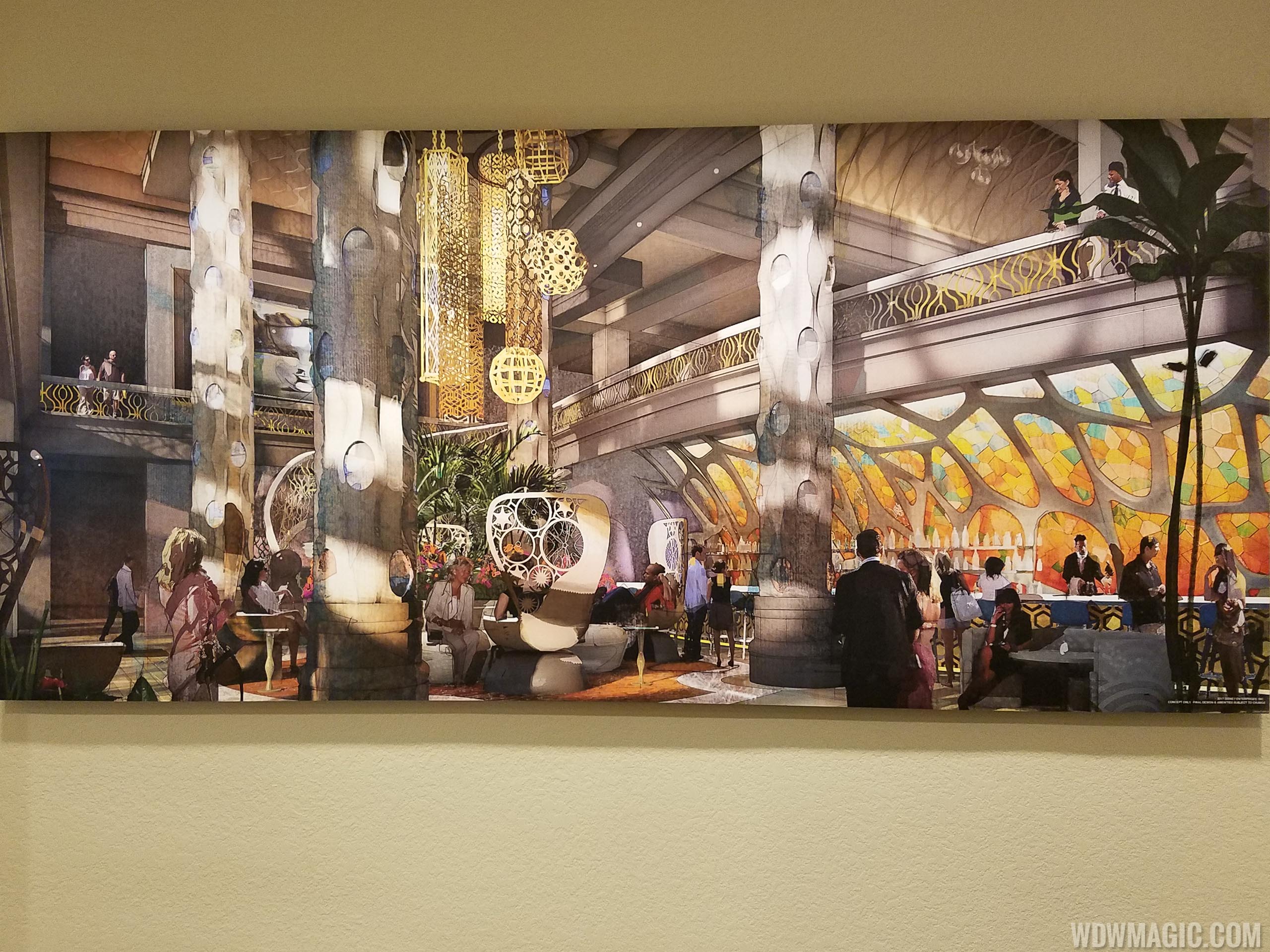
News Coronado Springs Expansion - Gran Destino Tower

Club34

Well-Known Member
I think some folks are expecting Coronado as in San Diego, whereas it's actually Spanish colonial. Thus the reason there's no southwest feel.

As for the redesign... It's certainly rather modern and a bit... Sterile, themewise. A bit like POP, yes, but not as austere. It might be a trend in hotels these days, but I'm not a fan. Half the reason for staying on-prop is the theming. This loses a lot of that. Sure, it's upscale. And it might save money down the road on future remodels. But I'm not a fan. This is Disney's big convention center though, so perhaps they're trying to appeal to a wider, business like audience.

Well, you and peter are both correct. There are multiple "themes" at the CSR. There are rancheros that are definitely more southwest style while the main building and casitas have the colonial style. The new building/lobby, although I am sure it will be grand, doesn't seem to fit. This has been my home since 2000 and I am very sad. But you can't stop what's coming so we'll see how it all plays out. The lobby will be missed. For those who have not had the pleasure, it may not be AKL but it was well done and had its own character and authenticity, in my opinion....
 

Attachments

  • 20171015_063248.jpg
    20171015_063248.jpg
    156 KB · Views: 343

BoarderPhreak

Well-Known Member
...Relive the romance of Spanish Colonial Mexico at this enchanting Resort hotel...
Ahh, Mexico. That explains it. I was thinking mainly Spain (where the rain falls on the plains). Also explains the rusty beige color scheme.

Well, you and peter are both correct. There are multiple "themes" at the CSR. There are rancheros that are definitely more southwest style while the main building and casitas have the colonial style. The new building/lobby, although I am sure it will be grand, doesn't seem to fit. This has been my home since 2000 and I am very sad. But you can't stop what's coming so we'll see how it all plays out. The lobby will be missed. For those who have not had the pleasure, it may not be AKL but it was well done and had its own character and authenticity, in my opinion....
Indeed. And yeah, I'll miss the old lobby as well. It was rather nice. I stayed there back in 2006.

WDW already has a hotel similar to the Hotel del Coronado in San Diego. The Grand Floridian was inspired in part by the Hotel Del, from what I understand.
I could totally see the resemblance, starting with the red roof and elegance.
 

Slowjack

Well-Known Member
I was talking to my wife about this general trend last night. Her thoughts were that she's totally fine with the rooms being very modern/very clean/very contemporary (without a heavy focus on theme/Disney)... in fact, she said that would be her preference. In her words, if you want to theme, let the theme be more prevalent in the restaurants, pools, and on the outsides of the buildings... if I had to wager a guess, I'd say her opinion is probably right in-line with the opinion of the general public and is a big reason why Disney is moving in this direction.
I still feel like this is a problem for Disney. What your wife is saying, in essence, is that she prefers Disney hotels differentiate themselves less. At some point, aren't more people going to balk at paying Disney rates if the experience is similar to what is available just outside the gates? I've stayed at every level of Disney resort, but on my last couple of trips I've stayed offsite. The extensive "Disney" theming of the resorts is really the only thing I miss.
 

JohnD

Well-Known Member
I'm not a fan of the all-star refurbishments or of the tower at CSR, but I don't have a problem with these rooms. The decor and theme are not bad. The sliding doors are well realized, the light fixtures above the beds add character, and there is some color, albeit earth toned colors, which go well in a southwest environment. WDW is taking many steps in the wrong direction, but I don't think these room designs are one of them.

Keep in mind this is a convention center resort. Give it just enough theming for the Coronado vibe but don't go overboard. Many guests will be staying for business with (hopefully) some vacationing thrown in on their free time.
 

MySmallWorldof4

Well-Known Member
I don't like the sink area. The counterspace looks too narrow from the picture. The overhanging sinks are a poor choice in my opinion when you take into account that kids will be staying in the rooms. I see a lot of bruised little heads because of that design. It definitely doesn't have obvious Disney theming. Maybe there are little hidden gems that we cannot see from the pictures?
 

Sir_Cliff

Well-Known Member
I was talking to my wife about this general trend last night. Her thoughts were that she's totally fine with the rooms being very modern/very clean/very contemporary (without a heavy focus on theme/Disney)... in fact, she said that would be her preference. In her words, if you want to theme, let the theme be more prevalent in the restaurants, pools, and on the outsides of the buildings... if I had to wager a guess, I'd say her opinion is probably right in-line with the opinion of the general public and is a big reason why Disney is moving in this direction.
To be honest, I don't feel all that different to your wife on this in that I'd prefer that the rooms be tasteful and modern in their selection of theme-appropriate motifs. For that reason, the rooms are the aspect of these concept art that I have the least issue with. I've only stayed at the Coronado once and, while I liked the overall theming and the setting of the resort a lot, I don't remember the room being much to write home about. In all honesty, it seemed like a standard motel room with a few kind of clunky Southwestern elements superimposed. So, sheepishly, I must admit that I prefer the look of the new rooms.

The common areas, though, seem way off. It really seems like the designers chopped the "Colonial" off and stuck with the Spanish, throwing in a dash of Seville here, a dash of Barcelona there.

For example, surely this:
Disneys-Coronado-Springs-Resort_Full_32185.jpg


is more a riff on this kind of Gaudi-style architecture in Barcelona than anything in the Southewestern US or Mexico:

3469__1469013732.jpg
 

RustyB.

New Member
I don't like the sink area. The counterspace looks too narrow from the picture. The overhanging sinks are a poor choice in my opinion when you take into account that kids will be staying in the rooms. I see a lot of bruised little heads because of that design. It definitely doesn't have obvious Disney theming. Maybe there are little hidden gems that we cannot see from the pictures?

We stayed in the Casitas section for our December 2017 trip, and it had the newly renovated rooms as shown already. They are actually very, very nice. We have stayed at CSR for two previous trips in the business class rooms (now destroyed for the tower!) and these rooms were even more accomodating. Both DDs and DW were very impressed.

The sink arrangement makes for a little bit less shelf space at the sinks directly but you have additional direct shelving above for toiletries. What is not shown is that to the right of the sinks behind the right sliding door is an elevated closet with above and below shelving. The sink area also has additional shelves and cabinets to the right of the sinks, and it really felt like we had more bathroom space than we have had on previous trips. The shower areas are very nice and modern, with lots of space between the glass/tile shower and the toilet. It was very similar to Loew's Royal Pacific that we had visited in September of 2017.

The beds were very comfortable and having them elevated allowed for storage underneath - one DD didn't even unpack...she just slid her suitcase underneath the bed and would get stuff from it as needed. That was convenient for shoes, and other unpacked luggage storage. The angle from which the bed photo is taken cuts out the right most portion of the dresser/desk/full length bar combo. There is a swivel lounge chair about where the photographer is standing and the mini fridge (odd glass fronted thing) is underneath that end section along with shelves above with coffee maker, ice bucket, etc. Power strips in the top have USB charging ports if you need them and there are 3 of these outlets along the top if I remember correctly.

As far as the theming......well you are spot on. There isn't much that screams Disney outside of the framed artwork. I am glad though that Disney is finally refreshing their resorts to catch up to others in the area, and I guess we get enough theming at the parks to make up for it.
 

TheOrangeBird01

Well-Known Member
Has it been confirmed that the current lobby/El Centro will be going away once the new tower has been constructed? Or will the lobby in the concept be only for the tower?

I'm really hoping for the current lobby to stay, as it's very nostalgic for my family (we've been staying there since 2005) and Panchito's gift shop is my favorite lol
 

RandySavage

Well-Known Member
When was the trend in the industry highly immersive, heavily themed spaces like Grand Floridian, the AKL and Port Orleans? It never was, certainly not to the extent featured at WDW. Disney was creating something relatively unique, spaces that extended and complimented the enveloping fantasy of the parks. The fact that hotel trends now dictate design philosophies is a key reason WDW is becoming less and less special.

The problems with WDW hotels "quality wise" was the maintenance, housekeeping, food quality, and price, not the intricate theming. In fact, for years that was the only thing RIGHT about the hotels.

As other astute posters have pointed out, this is an amazingly poorly designed space - there is very little theming and the bit that exists is, staggeringly, Spanish rather then Mexican. Which is just... mind boggling.

I think we have a pretty good idea of what the Riviera is going to look like.

Disney continues to be run as though the executives wish it wasn't Disney.

So well put.

Beach Club has been my home resort for most of my life and I've sadly borne witness to its de-themeing over the years, from the bland "remodeling" of the guest rooms - certainly an aesthetic downgrade from the original bright, cheerful, sea-themed style - to the removal of small details in the hallways, to doing away with the outlandishly-unique period costumes for the bell, front desk and concierge staff.

The latter costume change, brought about by the exec suite's Vegas-style mentality ("theme is now kitsch; people don't want it; de-themeing makes the resorts more adult and upscale") has resulted in a staff dressed in the most ill-fitting collars & blazers I've ever seen (as badly tailored as what the poor guides in GMR were forced to wear before its demise)... making the "deluxe hotel" feel much more amateur and 2-star when you check-in than it did when they were wearing the period dress.
 

peter11435

Well-Known Member
Has it been confirmed that the current lobby/El Centro will be going away once the new tower has been constructed? Or will the lobby in the concept be only for the tower?

I'm really hoping for the current lobby to stay, as it's very nostalgic for my family (we've been staying there since 2005) and Panchito's gift shop is my favorite lol
My understanding is that the current lobby space will stay but it’s use will change.
 

Club34

Well-Known Member
Has it been confirmed that the current lobby/El Centro will be going away once the new tower has been constructed? Or will the lobby in the concept be only for the tower?

I'm really hoping for the current lobby to stay, as it's very nostalgic for my family (we've been staying there since 2005) and Panchito's gift shop is my favorite lol

i could be wrong but i don't think that the concept pictures listed are of the lobby. they appear to be a bar or lounge. there are bottles and stools shown in a couple of the pics. one pic does have someone pulling a small suitcase. i could be wrong. i am really interested/worried about what will materialize.
 

peter11435

Well-Known Member
i could be wrong but i don't think that the concept pictures listed are of the lobby. they appear to be a bar or lounge. there are bottles and stools shown in a couple of the pics. one pic does have someone pulling a small suitcase. i could be wrong. i am really interested/worried about what will materialize.
The art is for the new lobby.
 

WDWtraveler

Well-Known Member
Photo update as of Thursday, February 22, 2018. The high rise resort at Coronado Springs is up to the 8th and 9th floors now. First photo is from the porte cochere of Coronado Springs for a size comparison.

IMG_0235.JPG


IMG_0242.JPG


The first pilings are being installed for the restaurant in the center of the lake. To the right, the first boardwalk is being installed, extending from Casitas No. 5.

IMG_0243.JPG


IMG_0245.JPG


Quite a bit of fill has been added to the front of the high rise, to build out pavement and landscaping for the front of the building.

IMG_0237.JPG


IMG_0239.JPG


Finally, here is the image you see as you drive up to the security kiosk for Coronado Springs.

IMG_0249.JPG
 

Register on WDWMAGIC. This sidebar will go away, and you'll see fewer ads.

Back
Top Bottom