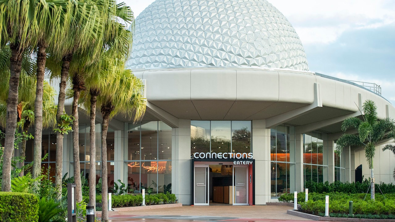
Connections Cafe and Eatery

Vacationeer

Well-Known Member
In the Parks
No
I’m sure there will be festivities. Hopefully Journey of Water and (maybe?) the rest of the spine will be completed by then but that seems it could easily fall into 2023.
That would work okay. It’ll be great not dealing the dark gloomy labyrinth of walls.
 

RSoxNo1

Well-Known Member
My one gripe with this is that its very clear that there came to be a point with this project where they realized that they still had space left and just decided to fill it with even more seating. I'm not sure of what else should have been used to fill the space (maybe another dining venue? a dessert stand perhaps? a stage for entertainment?), but there is no way the restaurant comes close to filling that dining room. Maybe if (hopefully when) Sunshine Seasons has to be taken out of commission for a refurb then it gets used more?
A Disney restaurant with too much seating? I'm ok with that.
 

yensidtlaw1969

Well-Known Member
There was a single parks blog article about it. You’re making up this over-promotion by Disney.
PR extends beyond the Disney Parks Blog - which has at least 2 articles dedicated to Connections - and every single one features the excessive, overwrought language that I called BS. If it's "just a basic quickservice" that's fine, but then this is an inordinate amount of lip service to give such a nothing-burger of a space:


Not especially becoming of you to say I'm making things up just because you don't seem to understand what I'm referring to.
 

jasminethecat

Well-Known Member
PR extends beyond the Disney Parks Blog - which has at least 2 articles dedicated to Connections - and every single one features the excessive, overwrought language that I called BS. If it's "just a basic quickservice" that's fine, but then this is an inordinate amount of lip service to give such a nothing-burger of a space:


Not especially becoming of you to say I'm making things up just because you don't seem to understand what I'm referring to.


"nothing-burger of a space"? Surely you don't mean to imply that this restaurant which will serve meatball pizza AND pepperoni pizza, not to mention a "french bistro burger" which would be difficult to replicate unless you went to a Wendy's or Burger King.

I looked at the hype, and this line stood out in particular to me. "What makes it unique is it gets its inspiration from the delicious cuisines from across the globe." Really? A restaurant at WDW, at EPCOT no less, which gets inspiration for its cuisine from across the globe?
1651026650112.png
 

yensidtlaw1969

Well-Known Member
I honestly don't see the issue here and am not sure how they can win. Some are hammering this quick service restaurant for not being an amazing experience that looks like nowhere else on planet Earth, while others are complaining that they have gone overboard in trying to build up a simple quick service restaurant as something it's not.

In terms of this explanation, sure, it's full of hyperbole as Disney PR almost always is. However, it's not really that disconnected from what they built. They did put a mural around the place showing people from different cultures around the world cultivating and eating food, a little museum of coffee implements from different times and place, and whatever that rolling pin display is supposed to be. The show kitchens do let guests watch food being prepared, and the windows do provide rather lovely views of the gardens outside.

They have to come up with some concept to guide the design, and in this case they seem to have come up with a decent one that you can detect in the space if you look for it but probably goes over the heads of most guests. It also gives the place a name that makes sense and harmonizes with Creations next-door.

I much prefer this kind of 'backstory' that is more conceptual than literal to all the fan fiction they are writing about supposed owners of stores, their families, and friends in other parks. This seems more like the Disney of old than the other type of laboured backstory that modern Imagineers seem to love.
I explained already how they can "win" - if you're designing a space that won't feature an exceptional function, then at least give it an exceptional form. Would anybody here really call the interior of Connections an exceptional space? I've passed through several dozen like it without ever meaning to.

Either make something amazing and unique to hype up, or don't hype it up so much. Seems pretty simple. The restaurant is B A S I C, with a capital B. While I think that's a lousy option to choose, it is an option . . . but if you're picking it then you should know better than to oversell that project.

For the record, I definitely agree with you about the "fan fiction" backstories. If I ever have to hear about Barnabas T. Bullion or Gustav Tinkerschmidt again it'll be too soon. Characters that have no meaningful presence, impact, or root in the experience, that merely cling to the top of it like a film someone forgot to scrub. I'm glad there's no purported "proprietor" "C. O. NnEctions" that we have to hear about but never see, adding no meat to the experience here.

But the lack of that doesn't make Connections some sort of conceptual beacon. The concept is "It's a restaurant with a sleek design, because that's what #EPCOT is, right?", and beyond that it doesn't go any deeper than . . . I'll say it again . . . an Airport Terminal Cafeteria. The only thing they do different here is branding it with EPCOT Logos and old Blueprints.

Remove those and there's nothing left in its actual bones that says "You're in EPCOT, and that's a cool place to be".
 

No Name

Well-Known Member
PR extends beyond the Disney Parks Blog - which has at least 2 articles dedicated to Connections - and every single one features the excessive, overwrought language that I called BS. If it's "just a basic quickservice" that's fine, but then this is an inordinate amount of lip service to give such a nothing-burger of a space:


Not especially becoming of you to say I'm making things up just because you don't seem to understand what I'm referring to.

You say PR extends beyond the parks blog, but then every single one of your examples is from Zach’s IG. He’s an imagineer so of course he’s going to pour over design, and that’s only to his relatively small and niche following. People seeing Zach’s stuff are people already following this closely.

There hasn’t been a single post on any of Disney’s actual social media, no media previews, etc. But I stand corrected, there have been two parks blog articles. But that’s pretty typical stuff for any quick service opening, there’s nothing new here.

Oh and I realize my original reply was slightly rude and I’m sorry about that.
 
Last edited:

UNCgolf

Well-Known Member
Remove those and there's nothing left in its actual bones that says "You're in EPCOT, and that's a cool place to be".

I agree with everything you posted -- I just believe Stargate, Centorium, MouseGear, and Electric Umbrella all had the same issue and thus it's not a departure from the spaces that served a similar function in earlier eras.

That doesn't mean they couldn't have done better this time, of course. It's just that I don't see it as a decline the way so many other things in the park are.
 

wdwgreek

Well-Known Member
I have a split mind on this. From one perspective, I hear the folks saying that this is uninspired or akin to nice high school cafeteria. I also feel from looking at the videos and pictures that this is a super clean and trendy space that I'm genuinely looking forward to experiencing. I found electric umbrella horribly date and drab, I find the modern ascetics of this space plus the new store and club cool to be very exciting and fresh. Is it epcot unique no? Will it age poorly, probably. In the moment do I see it as refreshing and modern. Yes.
 

yensidtlaw1969

Well-Known Member
You say PR extends beyond the parks blog, but then every single one of your examples is from Zach’s IG. He’s an imagineer so of course he’s going to pour over design, and that’s only to his relatively small and niche following. People seeing Zach’s stuff are people already following this closely.

There hasn’t been a single post on any of Disney’s actual social media, no media previews, etc. But I stand corrected, there have been two parks blog articles. But that’s pretty typical stuff for any quick service opening, there’s nothing new here.

Oh and I realize my original reply was slightly rude and I’m sorry about that.
Consider how many websites, like this one and beyond (I've got a bevy of links but not sure which of them are permitted to be shared here - a quick Google of Connections Cafe will bring many of them up) report on each of those posts and spread the word to Disney fans of all levels.

That's the intended purpose of the IG posts - to reach Zach's 45,000 Instagram followers, yes, but also to generate headlines far across the fanscape. And it works, which is why this thread is on page 54 for a restaurant that doesn't even open until tomorrow. We've been talking about it for months.

Also, I appreciate your apology and would like to offer my own - My response was somewhat curt as well.
 

Vinnie Mac

Well-Known Member
I explained already how they can "win" - if you're designing a space that won't feature an exceptional function, then at least give it an exceptional form. Would anybody here really call the interior of Connections an exceptional space? I've passed through several dozen like it without ever meaning to.

Either make something amazing and unique to hype up, or don't hype it up so much. Seems pretty simple. The restaurant is B A S I C, with a capital B. While I think that's a lousy option to choose, it is an option . . . but if you're picking it then you should know better than to oversell that project.

For the record, I definitely agree with you about the "fan fiction" backstories. If I ever have to hear about Barnabas T. Bullion or Gustav Tinkerschmidt again it'll be too soon. Characters that have no meaningful presence, impact, or root in the experience, that merely cling to the top of it like a film someone forgot to scrub. I'm glad there's no purported "proprietor" "C. O. NnEctions" that we have to hear about but never see, adding no meat to the experience here.

But the lack of that doesn't make Connections some sort of conceptual beacon. The concept is "It's a restaurant with a sleek design, because that's what #EPCOT is, right?", and beyond that it doesn't go any deeper than . . . I'll say it again . . . an Airport Terminal Cafeteria. The only thing they do different here is branding it with EPCOT Logos and old Blueprints.

Remove those and there's nothing left in its actual bones that says "You're in EPCOT, and that's a cool place to be".
I feel like you're the type of guy to look at Electric Umbrella and say "but it had personality!"
 

yensidtlaw1969

Well-Known Member
I agree with everything you posted -- I just believe Stargate, Centorium, MouseGear, and Electric Umbrella all had the same issue and thus it's not a departure from the spaces that served a similar function in earlier eras.

That doesn't mean they couldn't have done better this time, of course. It's just that I don't see it as a decline the way so many other things in the park are.
Stargate and Centorium at least had going for them that the entire CommuniCore structure was conceived around the shared presence of those dining and shopping options, along with the CC Exhibits themselves - they weren't slotted into an empty venue, the venue was conceptually founded on housing those specific shopping and dining options. It wasn't "and whatever restaurant and shopping we think of can go here" - the CommuniCore building wasn't an empty husk waiting for tenants. The building was designed to hold Stargate and Centorium, and the architecture and planning reflected the functions of those specific spaces in its design.

MouseGear and Electric Umbrella negated much of the form and function of these spaces the same way Innoventions did - that entire reconception botched the central plaza buildings and their value to the EPCOT guest experience, which was higher pre 1994 than it has been at any time since.

The decline was 28 years ago, so it's understandable that not everyone remembers it. And it is true that Stargate and Centorium weren't, like, E-Ticket options within the park. They were shopping and dining. But they were highly-considered shopping and dining that came in the form of an innovative design that served highly both the functional design of outer Future World and the internal spaces themselves. The CommuniCore buildings as we have known them are a gift Stargate and Centorium were partly responsible for giving us - it would not have been designed the same way without them. A gift that's been squandered for nearly 3 decades, and is now being well recieved with the new shopping and dining options that simply make bland use of an already great building.

The good things that have come with Connections and Creations are a credit to the successed of the 1982 design of the structure, not really to any work that was done now aside from choosing to reveal it again. Which was a good choice - better than Mousegear and Electric Umbrella did, but isn't an innovation of its own. Especially when you consider they took a great exterior and gave it such a regular-looking interior. Connections and Creations more leeching off the good bones than they are building on them.
 

UNCgolf

Well-Known Member
Stargate and Centorium at least had going for them that the entire CommuniCore structure was conceived around the shared presence of those dining and shopping options, along with the CC Exhibits themselves - they weren't slotted into an empty venue, the venue was conceptually founded on housing those specific shopping and dining options. It wasn't "and whatever restaurant and shopping we think of can go here" - the CommuniCore building wasn't an empty husk waiting for tenants. The building was designed to hold Stargate and Centorium, and the architecture and planning reflected the functions of those specific spaces in its design.

MouseGear and Electric Umbrella negated much of the form and function of these spaces the same way Innoventions did - that entire reconception botched the central plaza buildings and their value to the EPCOT guest experience, which was higher pre 1994 than it has been at any time since.

The decline was 28 years ago, so it's understandable that not everyone remembers it. And it is true that Stargate and Centorium weren't, like, E-Ticket options within the park. They were shopping and dining. But they were highly-considered shopping and dining that came in the form of an innovative design that served highly both the functional design of outer Future World and the internal spaces themselves. The CommuniCore buildings as we have known them are a gift Stargate and Centorium were partly responsible for giving us - it would not have been designed the same way without them. A gift that's been squandered for nearly 3 decades, and is now being well recieved with the new shopping and dining options that simply make bland use of an already great building.

The good things that have come with Connections and Creations are a credit to the successed of the 1982 design of the structure, not really to any work that was done now aside from choosing to reveal it again. Which was a good choice - better than Mousegear and Electric Umbrella did, but isn't an innovation of its own. Especially when you consider they took a great exterior and gave it such a regular-looking interior. Connections and Creations more leeching off the good bones than they are building on them.

Again, I agree with almost all of this -- but it feels like you're giving Centorium and Stargate credit that they don't really deserve. Communicore itself was incredibly well designed, but I think that's different from the actual interior design of Centorium and Stargate. They were very much early/mid 1980s design; I don't think anyone thought they were forward looking spaces absent the overall Communicore framing.

But perhaps it's two separate discussions? The overall architecture versus the interior design?
 

Rich Brownn

Well-Known Member
Ehhhhhh... yes and no. The 60s NY World's Fair is the most direct influence, but the technological triumphalism and celebration of a corporate-built future was absolutely fundamental to all American Fairs, and pavilions with exhibits celebrating this were just as central as the international exhibits. After all, the most popular and culturally resonant element of the very first US Fair in Philadelphia in 1876 was the massive Corliss Centennial Engine, which powered the entire expo and in which various great literary, political, and corporate minds saw the dawning of a new age. Really, the technological and international components can't be separated - the ideological foundation of the fair was the interaction of the two.

(And if we're looking for very direct influences, NY 1939, which featured a giant ball as the centerpiece and a popular robot show gives the 60s version a run for its money.)

I do think, however, that one way forward for EPCOT might be to start looking at the Fairs more broadly, bringing in elements from expos other then the 60s NY ones. This could open up a huge range of architectural, design, and thematic possibilities while still remaining true to the founding spirit of EPCOT.
The 64/65 relied more on corporate than any other fair because it wasn't sanctioned and a lot of nations refused to participate. (The 39/40 was also not totally sanctioned either). Compare corporate pavilions between 64/65 fair and the sanctioned Expo70.
 

MisterPenguin

President of Animal Kingdom
Premium Member
PR extends beyond the Disney Parks Blog - which has at least 2 articles dedicated to Connections - and every single one features the excessive, overwrought language that I called BS. If it's "just a basic quickservice" that's fine, but then this is an inordinate amount of lip service to give such a nothing-burger of a space:


Not especially becoming of you to say I'm making things up just because you don't seem to understand what I'm referring to.

You forgot the Connections Super Bowl spot.
 

GladToBeHear

Well-Known Member
From a design standpoint -- the biggest disappointment for me is the seating (the chairs). I was hoping to see something a little more design-forward for that space. I think it would've been the easiest way to give the dining/lounge area more of a unique look. Even something as subtle as an upgrade to a chair design like this, for example.

Agrippa-Salma-7_2000x.jpg
 

Vacationeer

Well-Known Member
In the Parks
No
From a design standpoint -- the biggest disappointment for me is the seating (the chairs). I was hoping to see something a little more design-forward for that space. I think it would've been the easiest way to give the dining/lounge area more of a unique look. Even something as subtle as an upgrade to a chair design like this, for example.

View attachment 635631
That’s a very cool chair but I could see them thinking very carefully about options when it comes to people, their kids, and lawsuits. Anything out of the ordinary could be an invitation for ambulance chasers.
 

GladToBeHear

Well-Known Member
That’s a very cool chair but I could see them thinking very carefully about options when it comes to people, their kids, and lawsuits. Anything out of the ordinary could be an invitation for ambulance chasers.
Good point. And you're right. I know that's a big factor in choosing options for seating. I just would've liked to have seen an effort to do something more forward-thinking. Seating would've been an obvious place to start. They could've even gone old-Epcot and partnered with a furniture maker/designer to do something fresh and new. Make the park a proving ground for innovation. It just seems like a missed opportunity to do something.

Do they have plans to do anything with robotic servers -- or any other kind of tech?
 
Last edited:

Register on WDWMAGIC. This sidebar will go away, and you'll see fewer ads.

Back
Top Bottom