-
The new WDWMAGIC iOS app is here!
Stay up to date with the latest Disney news, photos, and discussions right from your iPhone. The app is free to download and gives you quick access to news articles, forums, photo galleries, park hours, weather and Lightning Lane pricing. Learn More -
Welcome to the WDWMAGIC.COM Forums!
Please take a look around, and feel free to sign up and join the community.
You are using an out of date browser. It may not display this or other websites correctly.
You should upgrade or use an alternative browser.
You should upgrade or use an alternative browser.
Characters in Flight closing for redesign
- Thread starter wdwmagic
- Start date
JohnD
Well-Known Member
I like the new colors, but it doesnt pop out as "Disney" to me, But hey, neither does a lot of the Disney springs additions either so it's the direction their going for.
It's not supposed to. It's supposed to look like an old Florida town that grew around springs which joins the many other Florida towns with "Springs" in its name.
WhatJaneSays
Well-Known Member
I don't dislike it but (from the pictures at least) don't find it very interesting and a somewhat in-between design. Not sure if they wanted something that would blend in when it was airborne but still look whimsical when you saw it. You would think they'd try to do something that reflected the Disney Springs narrative.
Seriously though ... who authorized the use of 4 different colors of blue/teal? Call your art school and demand a refund.
Seriously though ... who authorized the use of 4 different colors of blue/teal? Call your art school and demand a refund.
Kman101
Well-Known Member
I really like the colors, but I'd also have to see it in person. I also really liked the former color scheme and designs. Agreed that a name change is in order if they aren't going to have characters on the balloon. At this point I don't really think the characters "fit" so is there a chance of a name change?
FigmentFan3
Well-Known Member
For those of you with triple click home to invert colors enabled on your iPhone, try it out on the new balloon for a good laugh. (The new colors are essentially the photographic negative of the previous version)
Last edited:
Mouse Detective
Well-Known Member
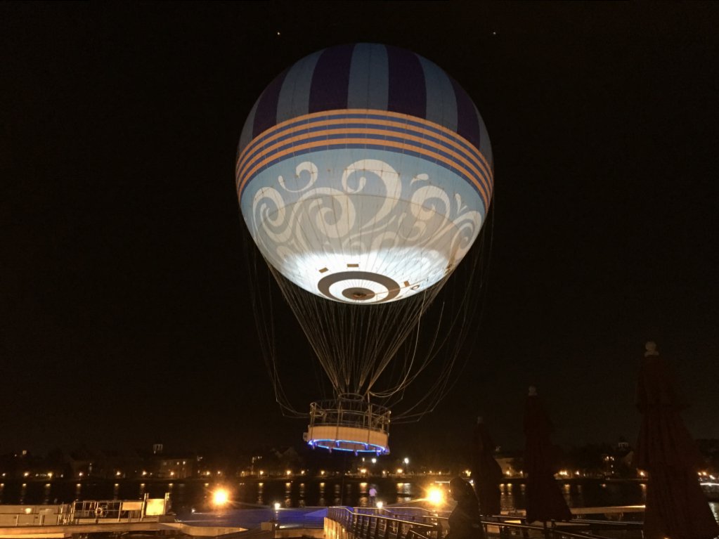
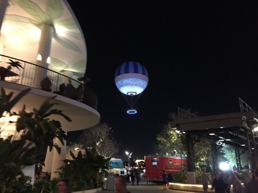
Save Pleasure Island posted a couple pictures of the balloon at night along with other information.
http://savepleasureisland.blogspot.com/2017/01/ds-update-new-balloon-flying-high.html
http://savepleasureisland.blogspot.com/2017/01/ds-update-new-balloon-flying-high.html
flynnibus
Premium Member
its not bad, but seems like the blue would be a HAZARD from a safety perspective
Three words...
FAA Minimum altitude
71jason
Well-Known Member
I really like the colors, but I'd also have to see it in person. I also really liked the former color scheme and designs. Agreed that a name change is in order if they aren't going to have characters on the balloon. At this point I don't really think the characters "fit" so is there a chance of a name change?
Saw it today, it looks sharp. Of course, it will be faded all to hell by September. Sun and rain are not kind to fabric (umbrella on my lanai doesn't last a full Summer either).
Kman101
Well-Known Member
Saw it today, it looks sharp. Of course, it will be faded all to hell by September. Sun and rain are not kind to fabric (umbrella on my lanai doesn't last a full Summer either).
The blue definitely seems like a nice change. True on the fading. I was there a few weeks ago and the fading was terrible so it seemed like good timing for a change out, but that's to be expected with our sun and weather. Blue may fare a tad better by not by much.
FigmentJedi
Well-Known Member
The area music and the Disney Store are the only Disney related elements.
And the eateries with Disney character puns in them.
disney4life2008
Well-Known Member
They got that fixed quickly. Now if only they could get ROL ready lol.
sxeensweet
Love a little Disney every day!! ;)
Love the new color scheme!!! So pretty. But yes I would of loved to see maybe Dumbo etc on it. It's a welcome change. 
The Empress Lilly
Well-Known Member
That looks so much better! Much more stylish, less clownesque.
Monorail_Red_77
Well-Known Member
I like the new color scheme. Plus now there's a blue light on the bottom of the basket. Here are a few pics from Fri night 1/20/17. It wasn't' that windy on the ground, but, I sure would not have wanted to be up in the balloon then. It was listing quite a bit back and forth as they were reeling it back down.


GhostHost1000
Premium Member
I like the look...very nice - but it does seem to have an identity crisis considering the name of the attraction
Monorail_Red_77
Well-Known Member
I wonder if they are working on changing the name to something more fitting as well. Maybe give it a retro flying ride type of feel?I like the look...very nice - but it does seem to have an identity crisis considering the name of the attraction
MarkTwain
Well-Known Member
I like the look...very nice - but it does seem to have an identity crisis considering the name of the attraction
Maybe the guests are the characters now.
PixieRDJames
New Member
I think much of the new addition suffers from the same identity crisis. I want to shop in a Disney-fied ambience. Once you enter the new section the music etc...is same-old "I could be anywhere" mall feel.I like the look...very nice - but it does seem to have an identity crisis considering the name of the attraction
If you want that, there is the Marketplace. The Town Center is trying to offer something different.I think much of the new addition suffers from the same identity crisis. I want to shop in a Disney-fied ambience. Once you enter the new section the music etc...is same-old "I could be anywhere" mall feel.
Register on WDWMAGIC. This sidebar will go away, and you'll see fewer ads.
