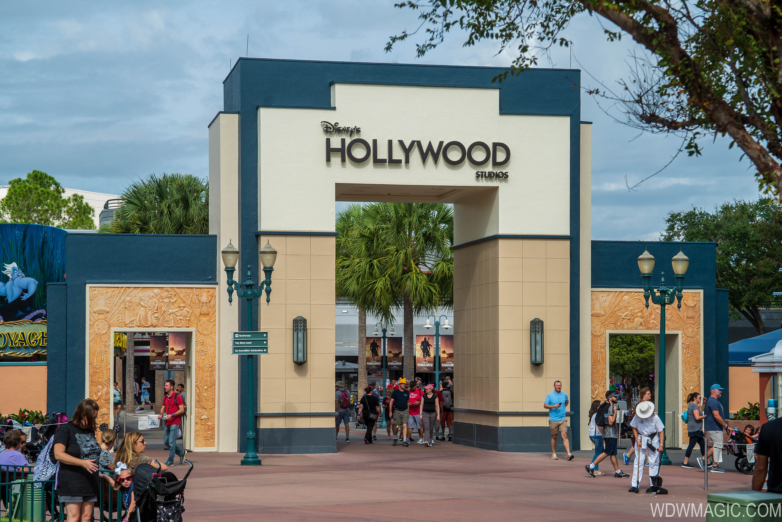
Big Reveal, New Logo

BromBones

Well-Known Member
I would prefer if they would just tear that area out back there and turn it into a Pixar area and then connect it to Toy Story Land.

I would also have preferred if they replaced that arch with a Monsters University or Monsters Inc. gate which leads into Pixar Land.
Then we can get the Monsters Inc. Roller Coaster, and other new rides.
Also give us Al's Toy Barn just on the outskirts of Andy's back yard, and a real Pizza Planet.
Then replace PizzaRizzo with a Swedish Chef's restaurant.

And flying high above Pixar land somehow....Carl's house from "Up".

But they won't do any of that.
 

Goofnut1980

Well-Known Member
I like the logo, but that blue color doesn't match any of the "entrance" colors they use for the park. It is extremely too dark, which parts will fade and will look unkempt. JMO
 

Tavernacle12

Well-Known Member
It feels weird having the logo of the park you’ve already walked into on a now random area inside that park. They should have had the sign say ‘Animation Courtyard’ or ‘Hollywood Courtyard’ or something for place-making’s sake.

As is it’s kinda like if there was a big ‘Wonders of Life’ marquee they left up for the past ten years but changed it to just say ‘Epcot’ instead.
 

Surferboy567

Well-Known Member
It feels weird having the logo of the park you’ve already walked into on a now random area inside that park. They should have had the sign say ‘Animation Courtyard’ or ‘Hollywood Courtyard’ or something for place-making’s sake.

As is it’s kinda like if there was a big ‘Wonders of Life’ marquee they left up for the past ten years but changed it to just say ‘Epcot’ instead.

I mean...new logo or not that is how it always has been. If they took down the arch...I think Disney fans would cause world war III and have organized protests outside the parks.
 

ᗩLᘿᑕ ✨ ᗩζᗩᗰ

HAPPY NEW YEAR!
Premium Member
I still think it needs the Grauman's Chinese Theatre icon. They utilized it perfectly on the in-park banners and trash cans there for awhile. Not sure why they didn't stick with it!?

I did a ROUGH (Seriously bad) mock-up using a similarly-stylized graphic. Not at all great but it does, IMO makes the entryway facade feels more complete. (Pardon my MSpaint skillz)

Working with what's there: Accented with a very stylized, stone relief "icon" and "film strip" tiles to tie into the tile work already in use this concept adds more iconic "Hollywoodness" without being too on the nose. Whereas before the "logo" consisted only of type this idea places a complimentary Grauman's Chinese Theatre icon above the Hollywood typeface to make the overall design more complete; balancing out the facade.

There's so much space above Hollywood it's a shame they can't come up with something to fill the area.

423166
 
Last edited:

aladdin2007

Well-Known Member
I still think it needs the Grauman's Chinese Theatre icon. They used it perfectly on the in-park banners and trashcans there for awhile. Not sure why they didn't stick with it!?

I did a ROUGH (Seriously bad) mock-up using a similarly stylized icon. Not at all great but it does, IMO makes the entryway facade feels more compete. (Pardon my MSpaint doodle skillz) Accented with very stylized, stone relief "icon" and "film cell strip" tiles both to tie into the tile work already used and because it adds more trope-Hollywoodness without being too on the nose. Whereas before where the "logo" was just type, now the Hollywood typeface has a complimentary icon above it to make the "logo" complete and balance out the facade.

There's so much space above Hollywood it's a shame they can't come up with something to fill the area.

View attachment 423166

I think thats pretty good I would like that. It does need something it looks too bland and generic, I wish they would get off this generic kick they are on property wide. Disney use to be detailed, now its becoming too standard, from resorts/rooms, to store refurbishments and other things like this.
 

Register on WDWMAGIC. This sidebar will go away, and you'll see fewer ads.

Back
Top Bottom