trainplane3
Well-Known Member
Saw on Twitter that the new logo is now up on the archway...no characters, which surprises me....are they coming later???
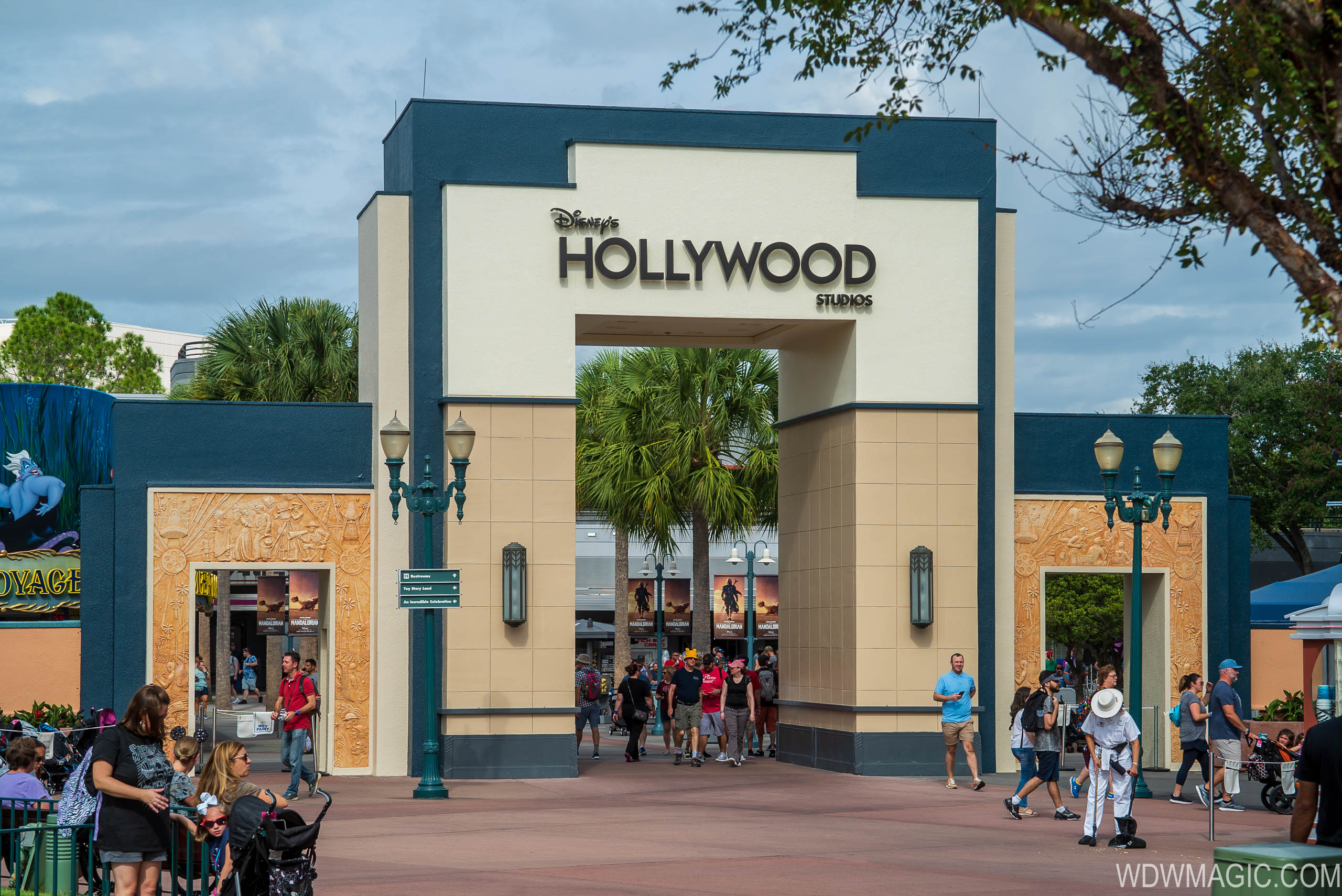
PHOTOS - New logo installed on the Studio archway at Disney's Hollywood Studios
The new logo design now has a prominent spot in the the park.
 www.wdwmagic.com
Last edited by a moderator: