-
Welcome to the WDWMAGIC.COM Forums!
Please take a look around, and feel free to sign up and join the community.
You are using an out of date browser. It may not display this or other websites correctly.
You should upgrade or use an alternative browser.
You should upgrade or use an alternative browser.
News Big changes coming to EPCOT's Future World?
- Thread starter djkidkaz
- Start date
They should have encircled the base with a stand-up circular counter.Looks like enough guests have been tripping over the bases of these lights outside of Connections for them to decide to shave them off altogether.View attachment 768187View attachment 768188View attachment 768190View attachment 768189
Last edited:
aladdin2007
Well-Known Member
the whole area is a blunder to me..honestly this company....what a mess.
Skibum1970
Well-Known Member
Peanut Butterfly and jellyfish sandwishes. They tickle at first but sting afterward.Peanut butterfly and jelly sandwiches!!
RoysCabin
Well-Known Member
Said this in the Journey of Water thread, but seeing in person for the first time this week, I'm glad to see it's not just a big concrete space back there anymore, but the lack of a fountain was glaring, and ultimately it's hard to avoid the feeling of "Wait...we had walls up for years for this? And some of the walls are STILL up?!"
Ultimately it's a nice little green space, and having the CommuniCore buildings be opened up more again is nice, but, man, I don't know, it's probably just my long-time thoughts and fantasy planning over what could've been done with the whole general CommuniCore concept making me feel like this should be something more.
Ultimately it's a nice little green space, and having the CommuniCore buildings be opened up more again is nice, but, man, I don't know, it's probably just my long-time thoughts and fantasy planning over what could've been done with the whole general CommuniCore concept making me feel like this should be something more.
yensidtlaw1969
Well-Known Member
Sadly, the whole plaza really registers like a massive and wasted opportunity.Said this in the Journey of Water thread, but seeing in person for the first time this week, I'm glad to see it's not just a big concrete space back there anymore, but the lack of a fountain was glaring, and ultimately it's hard to avoid the feeling of "Wait...we had walls up for years for this? And some of the walls are STILL up?!"
Ultimately it's a nice little green space, and having the CommuniCore buildings be opened up more again is nice, but, man, I don't know, it's probably just my long-time thoughts and fantasy planning over what could've been done with the whole general CommuniCore concept making me feel like this should be something more.
We've complained for years that it needed a rethink, they hamstrung the park for years in the name of giving us a change and they won't be doing that again any time soon. For what it took and what we got the whole thing is pretty odiously overexpensive and underwhelming, despite a similarly overlong construction timeline.
I say this as someone who generally tries to gives the creatives the benifit of the doubt. I don't blame them entirely, but I have to say despite that this thing is nearly a complete misfire. I can't imagine anyone behind the scenes is too happy with the result.
Thank goodness it at least has some pretty lights. Sometimes.
Chef idea Mickey`=
Well-Known Member
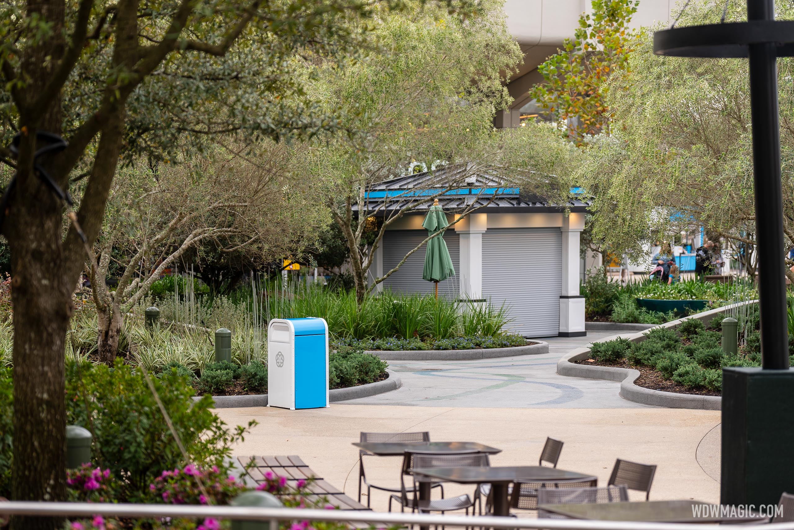
I love this, it's the only thing I love so far of the World Celebration sector . The rest is depressing! The worst of worst is those lamps, iron metal chairs that took 5 years... however Epcot trash can is bright and blue white!New (food?) booths in World Celebration in front of CreationsView attachment 768151View attachment 768152
Last edited:
Brian
Well-Known Member
Wow, these do not fit the aesthetic at all. Such an eyesore.New (food?) booths in World Celebration in front of CreationsView attachment 768151View attachment 768152
Cmdr_Crimson
Well-Known Member
They remind me of small Disney Springs Kiosks just outside of Paddlefish..Wow, these do not fit the aesthetic at all. Such an eyesore.
mightynine
Well-Known Member
I was worried we wouldn’t have enough room for more kiosks in Epcot, but thank goodness those square inches will stop being layabouts and start generating some income.
Merchandise kiosks arrive in the new World Celebration Gardens at EPCOT

Merchandise kiosks arrive in the new World Celebration Gardens at EPCOT
Merchandise kiosks arrive in the new World Celebration Gardens at EPCOT


Andrew25
Well-Known Member
I think those areas are better served for additional seating because those "cul-da-sacs" are surprisingly well hidden for those that don't know its there. Wouldn't surprise me if this is temporary until they can get Communicore Hall online as that will provide far better visibility.
The use of the bright white is at least consistent between the light fixtures and the garbage cans and the kiosks. It certainly does clash with the use of weathering steel and general earth tones of the surrounding areas.Wow, these do not fit the aesthetic at all. Such an eyesore.
It's a unique approach and if it was done intentionally it could certainly generate negative reactions from some.
But I guess if the intent is for it to stand out from everything else (merch kiosk) and not blend in or be missed, then mission accomplished.
I don't think it looks awful, but having anything that's bright white outdoors in Florida won't stay bright white for long unless there is constant upkeep.
Now please fix the under tree lighting in the center section of Dreamer's point.
Last edited:
Brian
Well-Known Member
They look a bit better in your photos, but perhaps that's because it was overcast there versus more sunny in the others.Merchandise kiosks arrive in the new World Celebration Gardens at EPCOT

Merchandise kiosks arrive in the new World Celebration Gardens at EPCOT
Merchandise kiosks arrive in the new World Celebration Gardens at EPCOTwww.wdwmagic.com


I think these would look a lot better if the white was the light beige of the exterior walls of Creations and Connections instead.
What's more fitting than random boxy buildings dropped in the middle of a garden setting? Oh wait...Wow, these do not fit the aesthetic at all. Such an eyesore.
I was worried we wouldn’t have enough room for more kiosks in Epcot, but thank goodness those square inches will stop being layabouts and start generating some income.
There's probably a joke there about activations and revenue, but my wallet just ran off and hid so I need to go find it.
Chef idea Mickey`=
Well-Known Member
They don't know what they want, they want to rid the cool essence of Epcot Future World hub was but now want to incorporate the cool essence Epcot of trash and koisk. The problem is they want to go away from Epcot theme park approach everyone pays for and come to replaces it with a city suburban park site but still want to plop theme park stuff aesthetic that it doesn't work even though attractionwise it's more a Disney park now than Epcot was before. They know they are sticking around with theme park but wanted to give you not the best for a five year overhaul.They look a bit better in your photos, but perhaps that's because it was overcast there versus more sunny in the others.
I think these would look a lot better if the white was the light beige of the exterior walls of Creations and Connections instead.
Now I see they don't want you to have a white and blue chairs but prefer you sit comfortably on dull metal but facing an aesthetic trash can and koisk and that's what you pay for walking in a park that's twice the size of Magic Kingdom.
Last edited:
aladdin2007
Well-Known Member
agree, no one with a vision over this project at all, too many cooks in the kitchen throwing things left and right. Yet they have purposely been trying to take the theme park out of theme park. Now they are probably finding and realizing its not going over too well. I think this park has more problems now than it ever had before. Hodgepodgecot.They don't know what they want, they want to rid the cool essence of Epcot Future World hub was but now want to incorporate the cool essence Epcot of trash and koisk. The problem is they want to go away from Epcot theme park approach everyone pays for and come to replaces it with a city suburban park site but still want to plop theme park stuff aesthetic that it doesn't work even though attractionwise it's more a Disney park now than Epcot was before. They know they are sticking around with theme park but wanted to give you not the best for a five year overhaul.
Now I see they don't want you to have a white and blue chairs but prefer you sit comfortably on dull metal but facing an aesthetic trash can and koisk and that's what you pay for walking in a park that's twice the size of Magic Kingdom.
Chef idea Mickey`=
Well-Known Member
This overhaul center looks identical to my community College I use to go to and yet my college was built over what was once an army navy base airport airfield.. I would never in a million years want a world class theme park such as Epcot to look like a downtown suburban park or to look like an apple store. They have no money, they have no creative imagineers, no architects...all the best folks are gone and probably some out there helping build the park back into park over at Epic Universe. Have you ever heard of a park with no fountains of any kind? Only my college campus.. Epcot is a unique park supposed to be a one unique only there place with unique seating, lighting, etc that you can't find anywhere else not something I can find at Home Goods but proves this is what the Disney company rn those who run it agree upon and approve on just to get by... Disney Springs overhaul was built years before and is more aesthetically pleasing and they knew back then to how to theme it and environment it to feel you are at an amazing place called Disney Springs and there you don't even pay to visit. There's nothing unique, aesthetically pleasing and makes you know your at Epcot and nowhere else in the world.agree, no one with a vision over this project at all, too many cooks in the kitchen throwing things left and right. Yet they have purposely been trying to take the theme park out of theme park. Now they are probably finding and realizing its not going over too well. I think this park has more problems now than it ever had before. Hodgepodgecot.
THEZach would like a word. After all, he was the "single accountable WDI leader for the EPCOT project, including master planning, story and concept, detailed design, and delivery/construction elements".agree, no one with a vision over this project at all, too many cooks in the kitchen throwing things left and right. Yet they have purposely been trying to take the theme park out of theme park. Now they are probably finding and realizing its not going over too well. I think this park has more problems now than it ever had before. Hodgepodgecot.
Register on WDWMAGIC. This sidebar will go away, and you'll see fewer ads.
