Disstevefan1
Well-Known Member
So they going to move forward with something in WoL now...since they now have the empty hall for festival space?
We only have memories....I really miss the fountain of nations. I was excited when they said they saved water from the fountain of nations that would be poured into the new fountain in a ceremony.
Too bad the new fountain fell victim to cost cuts and now we have that super ugly planter and broken lights in the cement.
The only thing that's wonderful with Creation Shop/Connection's is the Giant Atmosphere Windows that allows you to see the outside and Spaceship Earth off to the distance.or people who remember the previous iteration was a barren concrete wasteland
it also eliminated those winding or different level walking paths some were to been in color like pink. Even if the two story structure wasn't built didn't mean you could not kept something that made it Epcot only centric vs anywhere that's free public space.Even the greenspace is not great...a series of garden rooms, a lack of kinetics, rusty dry areas with no focus... When they were talking about Walt's unique perspective for the statue looking over his creation...it really pretty much means looking about 150' into a corporate business park... I was hoping they would have actually created a raised overlook... something dramatic... but the entire project lacks the drama and cohesion...
Ah yes, the ~$1.7 billion (in 2024 $) thing looks better than the thing that didn't cost ~$1.7 billion! Wow!
This argument is so funny to me because there's literally more bare concrete now than there was beforeor people who remember the previous iteration was a barren concrete wasteland
And those were there the whole time...they were just covered up in the 90s...The only thing that's wonderful with Creation Shop/Connection's is the Giant Atmosphere Windows that allows you to see the outside and Spaceship Earth off to the distance.
Everything else is like an Apple Store except nothing advanced futuristic about it and a green space that looks like a community college campus park with some rusty home goods hobby lobby metal furniture.
Oh yes, I probably was referring to as a store vs Mouse Gears. Mouse Gears didn't need the windows to be stellar and terrific.. yes the Innovention/Communicore buildings had windows and high ceilings great Communicore Hall better than the 2024 one!And those were there the whole time...they were just covered up in the 90s...
I paid to be in Epcot not wasteland that doesn't look or feel like a Disney Park or Epcot!or people who remember the previous iteration was a barren concrete wasteland
removing Fountain of Nation's is like the Mediterranean Sea dried itself in Europe.This argument is so funny to me because there's literally more bare concrete now than there was before
The festival center transformation is even better!
Tomorrowland @ Disneyland Shanghai comes to mind.Not to defend Disney's actions, but what exactly should be the aesthetic design for Epcot's hub? How exactly should interiors of Connections/Creations look like? Can you provide a few examples?
I always liked a downsized version of this for the Land pavilion.
While I thought the Tomorrowland at Shanghai Disney was interesting for about a minute, it in person feels even more like a corporate business park than the new EPCOT central core... Too cold, not a drop of whimsy or fun anywhere to be seen...it literally looks like a very well designed office park or college campus... but it is attractive...but you do not feel like it is a theme park... I guess maybe you can say there is more cohesion to the land...the front half of EPCOT currently just feels like a lot of unrelated parts with no focus....Tomorrowland @ Disneyland Shanghai comes to mind.
or people who remember the previous iteration was a barren concrete wasteland
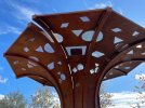
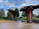
Someone seriously designed this, AND INTENDED this to look this way???View attachment 817971
Speaking of barren concrete waste 🗑
Is that a mushroom.. color is hideous
We couldn't get the fountain, wishing tree, holiday light up planter decor for thissss junky wobbly, the pavement color doesn't help either. This here is worse than anything in JOW.
Someone seriously designed this, AND INTENDED this to look this way???
I HATE the rusty look!
I call them rustrooms.
I love how it mimics an umbrella, yet it's not enough to able to give shade, plus they made sure if it rains no one would stand under it. Doesn't rust motivate bring more heat. I'd apologize if this was the new Mater Meet and Greet since canceling the Rivers of America demolition.Someone seriously designed this, AND INTENDED this to look this way???
I HATE the rusty look!
I call them rustrooms.
Corten Art
Take a closer look at Corten Art installations and discover why it has become so popular. From modern art pieces to garden designs, Corten steel creates unique results. See why Corten Art is a trend that's here to stay.www.metalartstatue.com
Register on WDWMAGIC. This sidebar will go away, and you'll see fewer ads.