Clamman73
Well-Known Member
The redo is so good that there's no more complaints.New vs Old
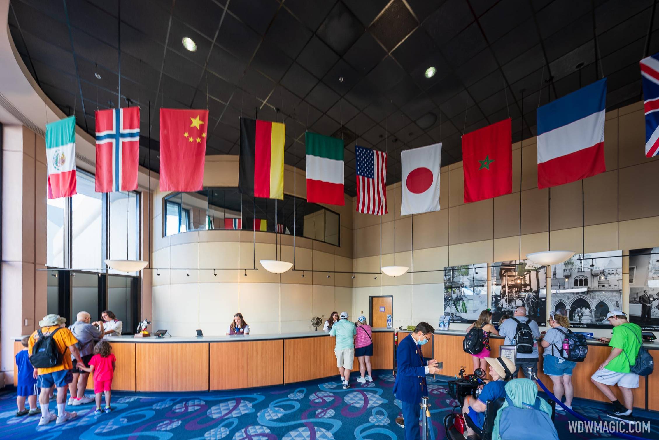
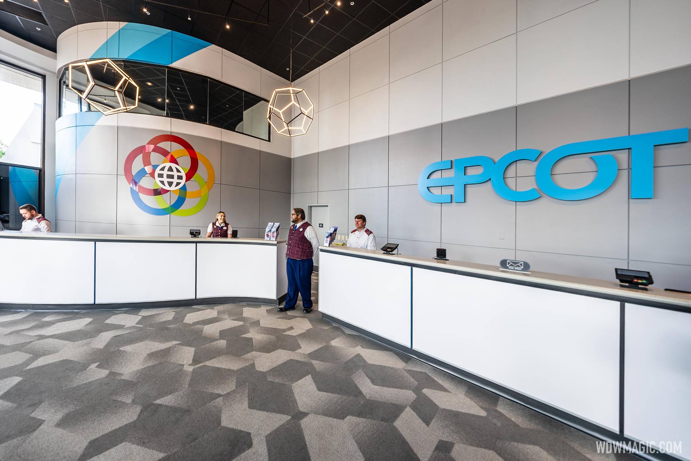
The redo is so good that there's no more complaints.New vs Old


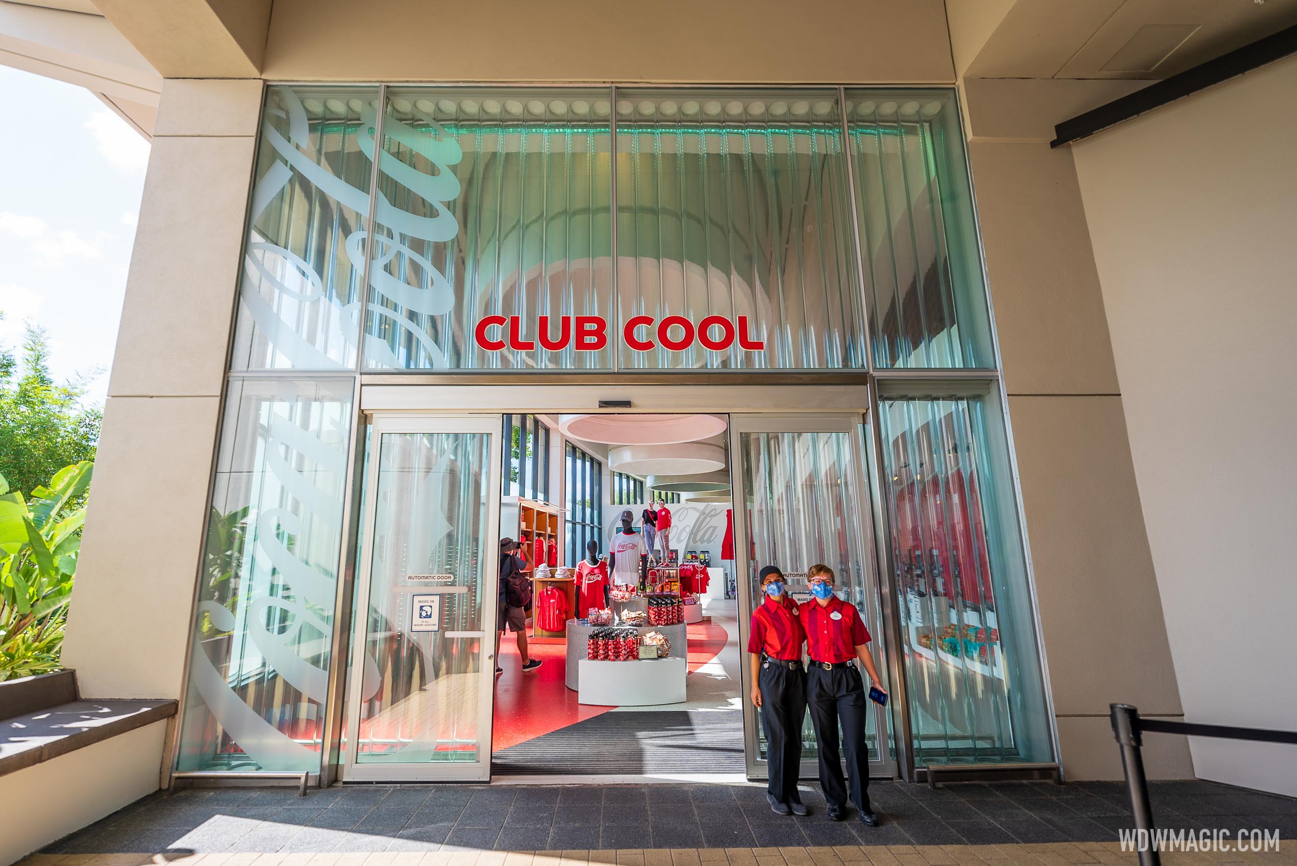
Do they still have the free samples of international drinks?You're right, it should be shoved to the side because it never fit the theme of EPCOT anyway, especially "Future World."
Also, IMO, the previous Club Cool looked awful from an interior design point of view. I saw nothing pleasing when I went in there... which is why I stopped going in there.
Yes. It's next to Creations Shop.Do they still have the free samples of international drinks?
The original "Ice Station Cool" was pretty awesome in the summer when the cooling worked in the ice tunnel.
Seems like a lateral move, although I really like that old carpet.New vs Old


I had the same thought, so much brighter, the white on top really brightens up the whole space.Goes to show you how much paint can do for a place, huh?
(I don't see any difference wrt the amount of light let into the place).
The space definitely looks brighter, more spacious and modern now. Only thing for me is, I would've liked to see the 'flags theme' incorporated in a discreet, elegant way. A narrow 'flags' trim at the top of the wall, would've been a nice touch, imho.Charm = Removed. The little bits that the old GR had are gone, replaced by a logo and a gray wall.
Right? Such a small thing to do, but too big for the "big thinkers" like TheZach.The space definitely looks brighter, more spacious and modern now. Only thing for me is, I would've liked to see the 'flags theme' incorporated in a discreet, elegant way. A narrow 'flags' trim at the top of the wall, would've been a nice touch, imho.
Yes at Club CoolDo they still have the free samples of international drinks?
The original "Ice Station Cool" was pretty awesome in the summer when the cooling worked in the ice tunnel.
As an international visitor, and although my country's flag wasn't there, seeing them made me feel welcome. Same goes for Fountain of Nations and watching I:ROE at the end of my Epcot days.Right? Such a small thing to do, but too big for the "big thinkers" like TheZach.
Right. I know. It looked the same to me. I wasn't sure if it was the same part as we see here in the east building. the part with the black glass.@Casper Gutman was asking about the glassed-in area behind the guest relations desk, not the vertically extended stairwell outside the building.
thanks for showing this. I was trying to figure it out.From Google Maps, it appears that the stairwell would be behind the wall to the right of the counter. You can't have glass in a stairwell. It would break under the heat of a fire and let smoke in.
View attachment 640799
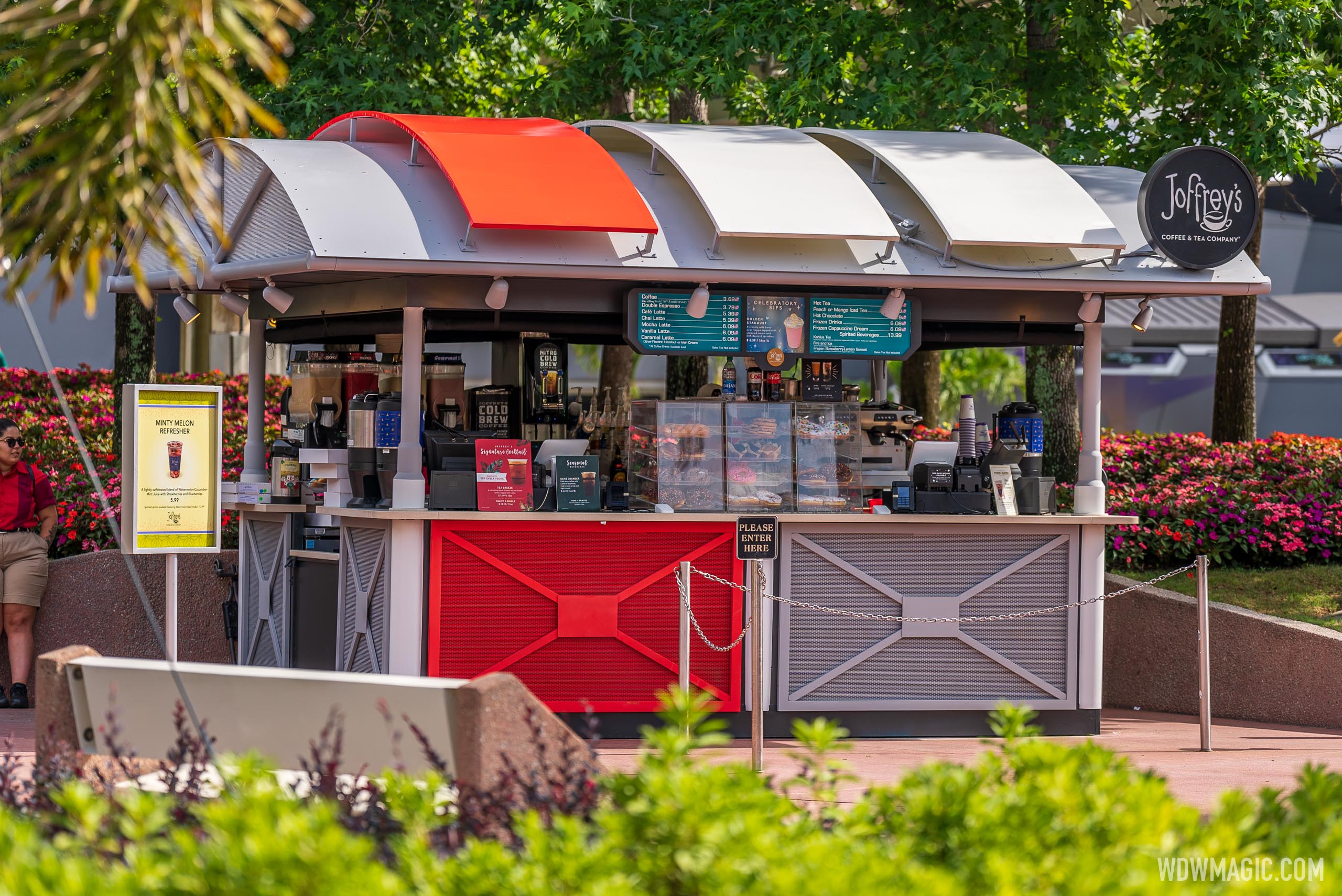
I think it might be unfinished. The two on the right still look like the original cream color, and if I recall correctly, each awning is also supposed to have a lighted sign advertising various Joffrey's products.I hate how much the one red, two white awnings trigger my OCD.
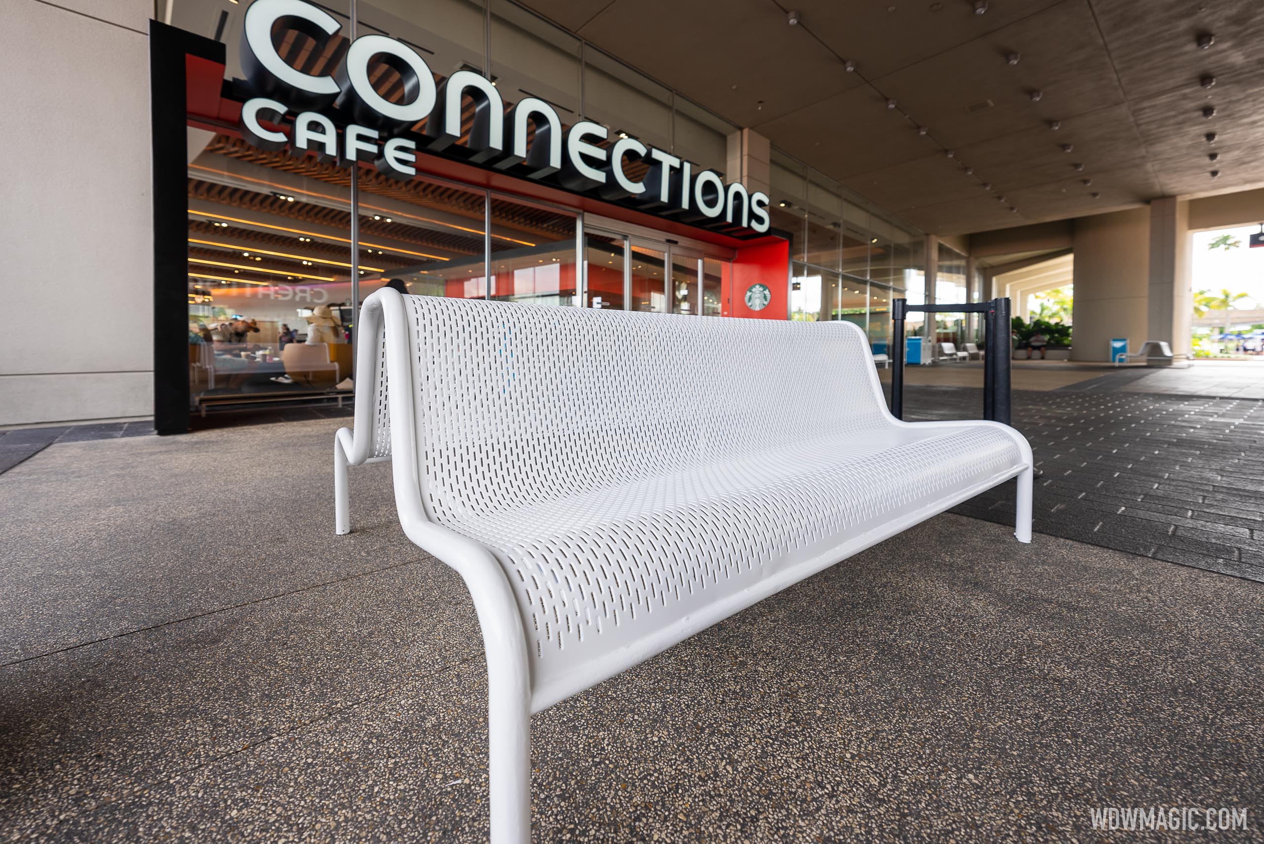
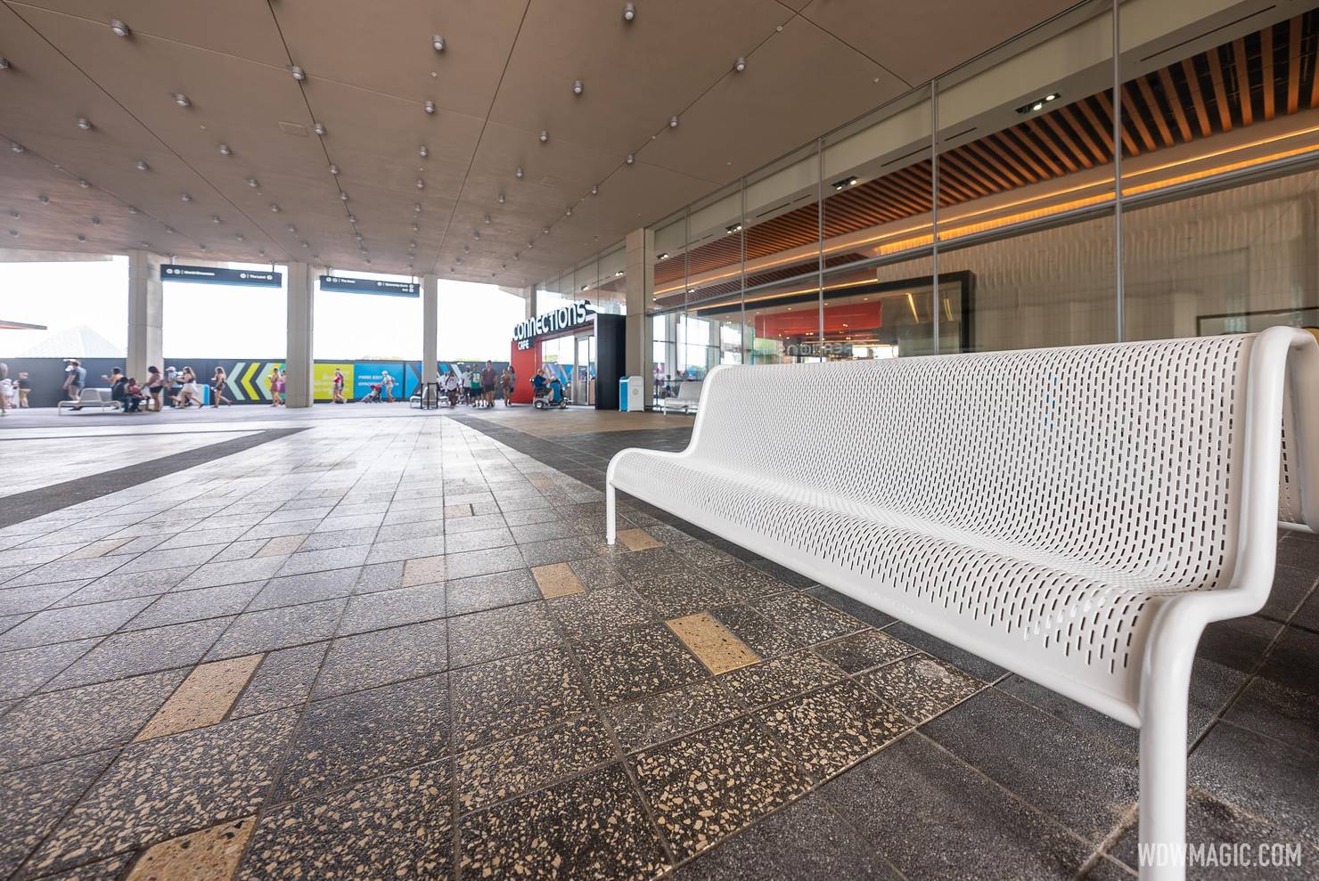

Benches arrive in the EPCOT World Discovery breezeway outside Connections Cafe and Creations Shop

Benches arrive in the EPCOT World Discovery breezeway outside Connections Cafe and Creations Shop
EPCOT has more seating ahead of the opening of Cosmic Rewind this week in World Discovery.www.wdwmagic.com

Register on WDWMAGIC. This sidebar will go away, and you'll see fewer ads.
