trainplane3
Well-Known Member
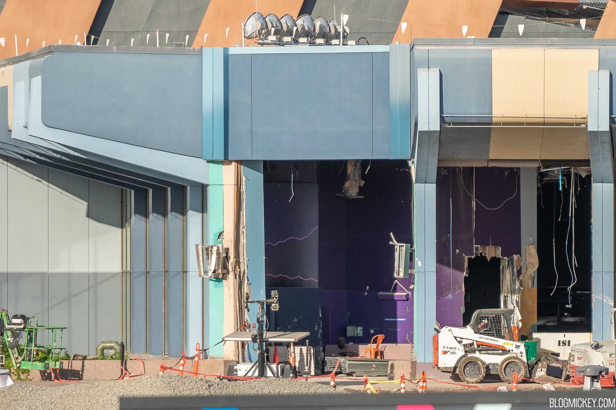
Possible temporary light rig? Maybe for SSE?
 blogmickey.com
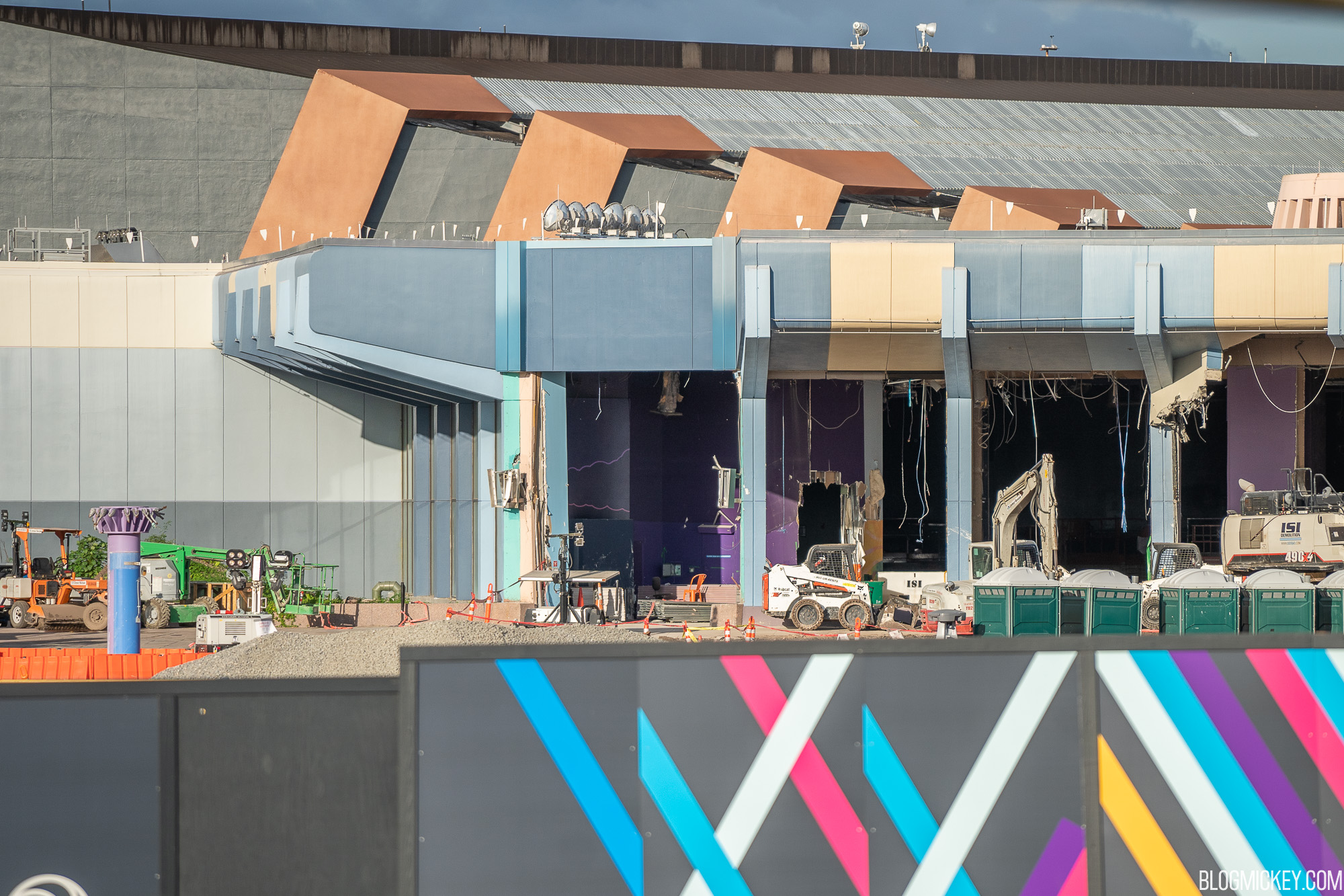
The Electric Umbrella is almost at the point of no return.
Former Innoventions East Entrance Torn Open as EPCOT Spine Project Continues
Walt Disney World news, photos, and reviews! We provide you with daily news from the Walt Disney World theme parks and beyondblogmickey.com

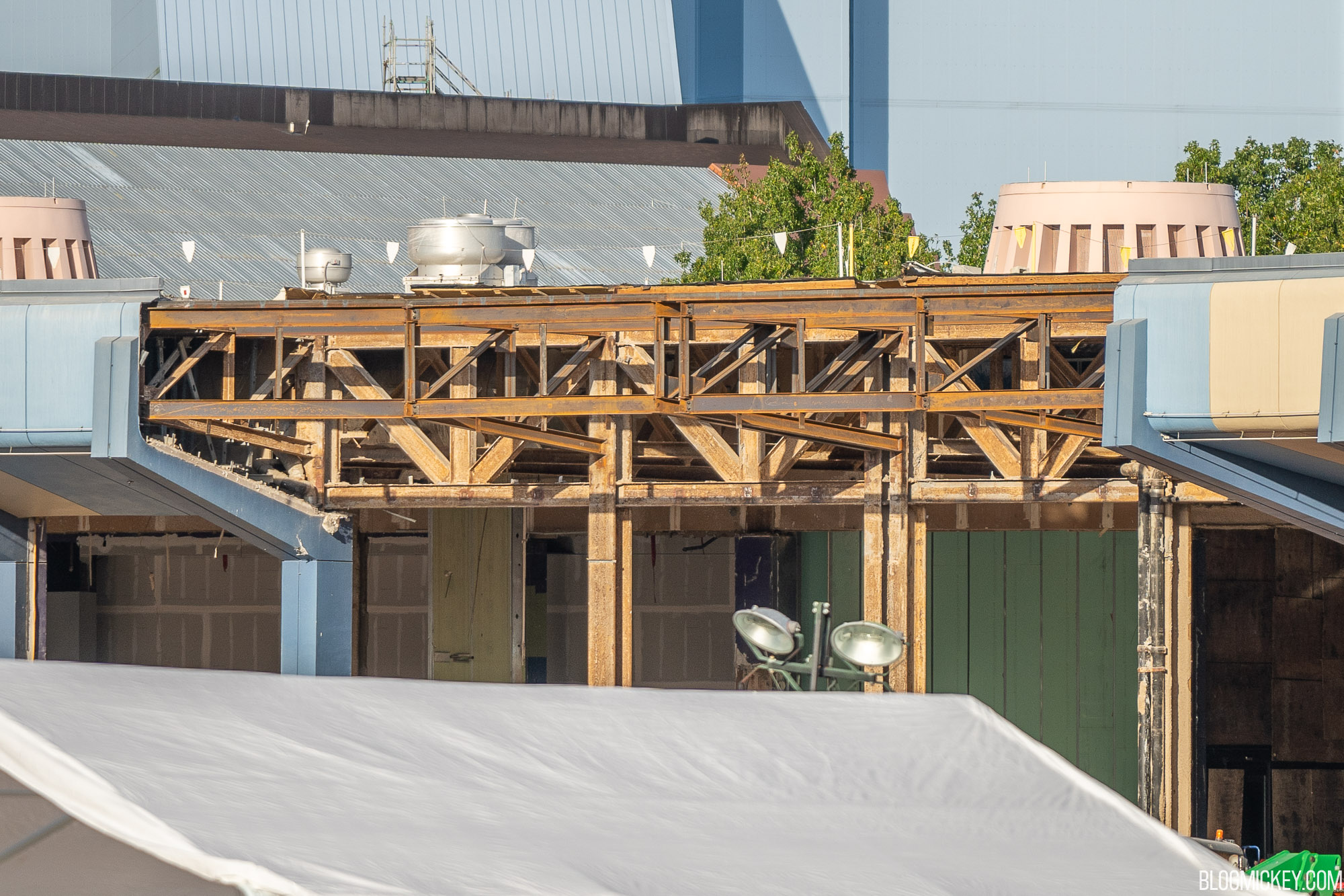
No more notch in the passthrough ceiling!

It’ll buff out.The Electric Umbrella is almost at the point of no return.
Just reserved parks for a January weekend trip and for the first time the one I excluded was my former favorite Epcot. I can handle construction everywhere if it is making progress but Future World just looks like a wasteland now and the delay in France expansion and Harmonius is just sad.
Honestly, The Land is still in a pretty good spot still. The Seas could have a hefty repaint inside to make it feel fresh again and not overly dark. Imagination is truly the worst area in the park and should get a lot of focus inside and out.Despite the obviously dire circumstances, I am glad that future/unannounced plans have halted on The Land, Seas, and Imagination. Much better that they be addressed when the timing (and funding) is right. Future World East has needed the facelift much more and they're FAR along in its' reimagination. West now retains the last few classic Epcot experiences and I don't want them tampered with.
Be careful using those words..."inside" and "out".Honestly, The Land is still in a pretty good spot still. The Seas could have a hefty repaint inside to make it feel fresh again and not overly dark. Imagination is truly the worst area in the park and should get a lot of focus inside and out.

Be careful using those words..."inside" and "out".
hisssss"inside" and "out"
Aquariums are necessarily dark. If the people area was too bright, all you would see is people reflected on the tank glass and not the fish.Honestly, The Land is still in a pretty good spot still. The Seas could have a hefty repaint inside to make it feel fresh again and not overly dark. Imagination is truly the worst area in the park and should get a lot of focus inside and out.
I meant the actual paint (mainly in the central area) to bring it closer to the Sea Base Alpha aesthetic. Or something else to make it more then 10 shades of blue.Aquariums are necessarily dark. If the people area was too bright, all you would see is people reflected on the tank glass and not the fish.
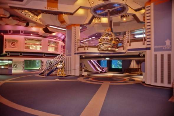

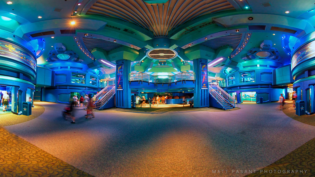
It is too much blue...but in the other pics, the hue of the lighting really made the purple/blue and orange just bleh. I'd like to see the blue broken up with something pale or maybe even a light metallic shade of something.I meant the actual paint (mainly in the central area) to bring it closer to the Sea Base Alpha aesthetic. Or something else to make it more then 10 shades of blue.
You had whites, off-whites, oranges, blues, and even some different colored lighting originally:


Now you have blue,blue,blue,blue,blue,blue,blue,blue,blue,blue,blue,blue, and blue green.

I never minded the Nemo overlay (it got kids into the Seas while getting the same message across) but I've always had a weird hate for the look of everything. I just feel it needs something to break up the literal shades of blue.
I'll gladly take a color or two just to break up the blue. There's a bit of detail still on those "pods" that could get brought out with a different color tossed in there.It is too much blue...but in the other pics, the hue of the lighting really made the purple/blue and orange just bleh. I'd like to see the blue broken up with something pale or maybe even a light metallic shade of something.
Register on WDWMAGIC. This sidebar will go away, and you'll see fewer ads.
