Architectural authenticity at World Showcase

clarabellej

Well-Known Member
Well and there’s the whole Pinocchio village haus, when Pinocchio is unquestionably a questionable Italian story.

It’s all a hodgepodge and appropriately located in Fantasyland.

Sorry, not on topic with Epcot, but worth a mention.

Check out the fantastic murals in Pinocchio Village Haus. Very special.
 

LittleBuford

Well-Known Member
Original Poster
What rules?

You post a picture of an Ionic portico and say this is how it "should" be done, with should in quotations, implying you yourself understand that not all Ionic colonnades are designed in the same manner. The AA rotunda "should" also have fluted columns, but they don't. Even in your example, they are mixing two-sided and four-sided capitals, which would not be considered "normal" either. Generally, one would use all two-sided, or all four-sided. Again, not a rule, but a common occurrence for this style.

This is why it's a contentious issue with a couple of us fellow members. Because you are pointing out how some WS designs are going "against the rules" but some of us are pointing out that there are, in fact, no hard and fast "rules" for any architectural movement. Architectural movements evolve and overlap and transition within and around one another, influencing later movements and re-interpreting earlier ones. The decisions imagineers made during design of WS may be either "good" or "bad" depending on one's personal taste. But the idea that WS is inauthentic because of WDI "breaking the rules" is misguided, simply because the "rules" don't exist. The "authenticity" of WS is enhanced by the vernacular touches, not washed away.

The "rules" I am harping on are not historical architectural design "rules" but are simply matters of how the concept art depicts, or does not depict, accurate constructability for the desired themed environment.

We’re going around in circles at this point, and I won’t have anything further to add to the following:

1. I wasn’t the one who introduced the notion of architectural norms in the first place. That particular debate was begun by others in the crêperie thread, of which this one is simply an overblown tangent.

2. That each tradition has norms—let’s avoid the more stringent term “rules”—is something we all seem to accept here. Yes, there is considerable scope and variety in how things were historically done, but certain features, standards, and principles remained characteristic of a given tradition or family of traditions. That, after all, was the basis of most of the complaints about the crêperie.

3. In no variety of classicism are Ionic colonnades treated as they are at the American Adventure. That’s not a criticism of what the Imagineers did, but an admiring acknowledgement of it. The result is exceptional, perhaps even unique in the world, and that’s no bad thing.

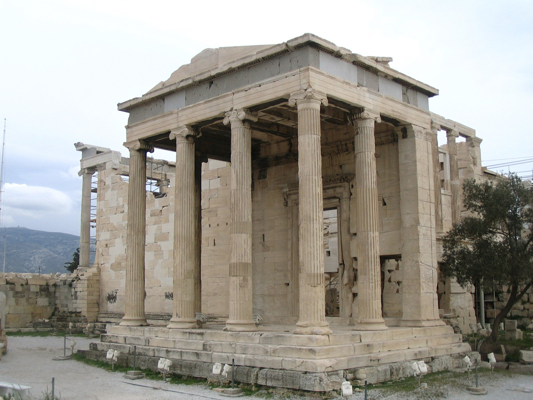
4. The Ionic portico shown in my previous post follows a venerable model that goes all the way back to Classical (with a capital-C this time) Greek precedent. Here’s the Erechtheion in Athens:

1129214_orig.jpg


5. Almost every point I’ve made has been met with a reaction that makes it seem as if I’m insulting Disney Imagineers. I’m not. I’m actually celebrating the very thing they’re named for: their imaginativeness.

6. As you noted a few pages ago, this should be a fun thread. Things have got weirdly tense, and I’m not exactly sure why. I may get myself into further trouble for saying this, but it is a theme park we’re discussing, and it would be great if the tone of the thread could reflect that.
 

Heppenheimer

Well-Known Member
Well and there’s the whole Pinocchio village haus, when Pinocchio is unquestionably a questionable Italian story.

It’s all a hodgepodge and appropriately located in Fantasyland.

Sorry, not on topic with Epcot, but worth a mention.

Check out the fantastic murals in Pinocchio Village Haus. Very special.
Yes, Italian story, but the design in the film is straight out of Tyrol and the Alpine region of Bavaria. Pinocchio's town, to me, looks like it was heavily inspired by Ehrwald in Austria.
 

Missing20K

Well-Known Member
We’re going around in circles at this point, and I won’t have anything further to add to the following:

1. I wasn’t the one who introduced the notion of architectural norms in the first place. That particular debate was begun by others in the crêperie thread, of which this one is simply an overblown tangent.

2. That each tradition has norms—let’s avoid the more stringent term “rules”—is something we all seem to accept here. Yes, there is considerable scope and variety in how things were historically done, but certain features, standards, and principles remained characteristic of a given tradition or family of traditions. That, after all, was the basis of most of the complaints about the crêperie.

3. In no variety of classicism are Ionic colonnades treated as they are at the American Adventure. That’s not a criticism of what the Imagineers did, but an admiring acknowledgement of it. The result is exceptional, perhaps even unique in the world, and that’s no bad thing.

4. The Ionic portico shown in my previous post follows a venerable model that goes all the way back to Classical (with a capital-C this time) Greek precedent. Here’s the Erechtheion in Athens:

1129214_orig.jpg


5. Almost every point I’ve made has been met with a reaction that makes it seem as if I’m insulting Disney Imagineers. I’m not. I’m actually celebrating the very thing they’re named for: their imaginativeness.

6. As you noted a few pages ago, this should be a fun thread. Things have got weirdly tense, and I’m not exactly sure why. I may get myself into further trouble for saying this, but it is a theme park we’re discussing, and it would be great if the tone of the thread could reflect that.
1) I never suggested you initiated the discussion. Not sure why it matters who initiated discussion of "norms".

2) Yes, better to use "norms" than "rules". My comment on "rules" was pretty self-explanatory and I felt compelled to counter your post because "rules" is a poor word choice for this discussion.

3) Perhaps, or perhaps we haven't uncovered all the variations of Greek Classic temple architecture. I personally don't have the time to investigate deeply into all examples of original Greek Classic temples. Did the imagineers turn the capitals for fun? For visual interest? To be "unique"? To differentiate it from the "true" examples? I suppose all are possible, but I would venture to say the idea has some real-world precedent, if for no other reason than because of the attention to detail WDI had adhered to during the design of WS.

4) I never disputed this fact, and was simply stating that even in Classic examples, such as you've shown in the previous and with the Erechtheion, the use of both capitals was clearly after stonemasons were able to create 3 and 4 sided capitals. The Classic styles progressed as technology increased. Using both in that instance was simply a matter of having the ability to do so. Hence, why a contemporary designer could choose to use any of the pre-established "norms", be they two-sided capitals oriented "correctly" or four-sided capitals, or some combination of the two.

5) I did not get that impression from your posts at all. Point and counter-point are a means of discussion.

6) I am having fun. I always enjoy architectural discussion. I guess.....sorry, not sorry my tone is not one of revelry? I guess I'm the Joe Friday of architectural discourse, "Just the facts, ma'am." ;)
 

LittleBuford

Well-Known Member
Original Poster
1) I never suggested you initiated the discussion. Not sure why it matters who initiated discussion of "norms".

2) Yes, better to use "norms" than "rules". My comment on "rules" was pretty self-explanatory and I felt compelled to counter your post because "rules" is a poor word choice for this discussion.

3) Perhaps, or perhaps we haven't uncovered all the variations of Greek Classic temple architecture. I personally don't have the time to investigate deeply into all examples of original Greek Classic temples. Did the imagineers turn the capitals for fun? For visual interest? To be "unique"? To differentiate it from the "true" examples? I suppose all are possible, but I would venture to say the idea has some real-world precedent, if for no other reason than because of the attention to detail WDI had adhered to during the design of WS.

4) I never disputed this fact, and was simply stating that even in Classic examples, such as you've shown in the previous and with the Erechtheion, the use of both capitals was clearly after stonemasons were able to create 3 and 4 sided capitals. The Classic styles progressed as technology increased. Using both in that instance was simply a matter of having the ability to do so. Hence, why a contemporary designer could choose to use any of the pre-established "norms", be they two-sided capitals oriented "correctly" or four-sided capitals, or some combination of the two.

5) I did not get that impression from your posts at all. Point and counter-point are a means of discussion.

6) I am having fun. I always enjoy architectural discussion. I guess.....sorry, not sorry my tone is not one of revelry? I guess I'm the Joe Friday of architectural discourse, "Just the facts, ma'am." ;)

Thanks for your good-natured response.

Regarding point 3, if anyone here ever does come across an Ionic colonnade resembling the one at Epcot, I hope they remember this thread and let the rest of us know. I too will be on the lookout. But isn’t it cool to consider that Disney Imagineering may have singlehandedly reinvented classicism? :)
 

Missing20K

Well-Known Member
As always, you're too kind! I think what you're saying is perfectly clear. I am also looking forward to eating at this bizarro crêperie one day and thinking about all the wailing and gnashing of teeth it has provoked!

Honestly, I envy the amount of architectural knowledge on display in this thread and wish I knew so much on the topic. For me personally, though, I am struggling to understand why there is a need to defend the Imagineers' faithful adherence to different architectural principles at all. That's not what I've ever understood Imagineering to be about.

If we want an example in World Showcase where all the rules of real world authenticity are thrown out the window, just look at the Mexico Pavilion. The exterior of that pavilion mashes up elements from Uxmal, Teotihuacán, Tenochtitlán, and possibly elsewhere into a "Mesoamerican" temple. These are all elements from cities and civilisations that existed different times and places but that happen to fall within the current national territory of Mexico. A structure like that would never exist in the real world, but all the different elements blend together into an unproblematic image of precolombian Mexico (pyramid, Mayan carvings, etc) for most guests. That's more or less what I've always understood Imagineering to be about.
The Mexico pavilion is not unlike the other WS pavilions in how it depicts the architecture of the intended theme.

They may have amalgamated the varying cultures into one distilled building, but the precedents for design are all still from actual Mesoamerica.

I fail to see how this is widely different than the how any of the other pavilions mash architectural styles together.

I don't think any of us are asking for scale replicas of buildings in the respective pavilions. Simply that what they do design, at the very least appears to be a part of the real-world dialogue of architectural theory, so that the guest may place themselves in the story desired by WDI. I think this is generally accomplished very well. If the execution was poor, we wouldn't even be able to have the discussion over the nitty gritty details of their work.
 

lazyboy97o

Well-Known Member
I am a little busy with work these days and am not trained in architecture, so I don't have too much to add right now to this thread unfortunately! I did, though, just want to chime in to say that I agree that the general "authenticity" Imagineers seek has traditionally not been a painstaking reconstruction of really-existing architecture. Obviously a large part of making a structure or location read as authentically from a particular time or place involves studying and recreating as convincingly as possible the associated architectural conventions. Not doing that can lead to situations like the Creperie art which reads as "off" to a lot of people without them (us) necessarily knowing why.


The point, though, is not to authentically recreate French architecture in the French pavilion, for example. As I understand it, the idea is to evoke a sensation of authentic Frenchness through a blending of signs that guests will read as authentic. So long as the guests won't pick up on it, I doubt the Imagineeers worry too much about bending architectural rules in their theming should they have to for practical reasons. Say we found a creperie in the suburbs of Paris that looked exactly like what is proposed for Epcot with logical explanations for all the quirks of design, would it suddenly represent great design choice due to its authenticity? I don't really think so, because it still wouldn't read well within the pavilion based on the guests' expectations of authenticity.

Authenticity is not recreation. It does not mean having and copying a direct reference for everything. That can lead to its own unauthentic design, as you end up with a hodgepodge of elements that, while all have specific precedent, make no real sense just being mixed together. Authenticity is about understanding the how and why of design elements and being able to utilize them in a well informed manner. Knowing the norms and working with them as a guide.


How does one create an impression of a place? To some, a green roof with a steep slope is enough to be consider French. Is that though an appropriate view of one’s audience? That they don’t really know and it doesn’t really matter? Or would it be better to assume that the audience does know and you therefore have to meet that high expectation? By assuming that the audiences knows you immediately start building in the immersion and [true] details that so many people highlight as key aspects of top tier themed design because everything becomes informed by that goal.


Making changes for more practical and legal purposes are a great example of how authenticity works in a themed environment. Panic bars on doors are required by code but that doesn’t mean just choosing the cheapest ones and moving on, instead there are options available in terms of look and finish and one can be selected that best fits how such a requirement might have been handled.


There are also artistic reasons to deviate, but even that doesn’t mean just ignoring established norms. The great counter is “Why is there a medieval castle on Main Street?” but there isn’t. A medieval castle would clash with Main Street and even Fantasyland. Instead Sleeping Beauty Castle and Cinderella Castle are romantic and eclectic revival designs of a similar time period. The castles also substitute the place of a prominent civic structure in typical Main Street layouts. They follow a number of norms and make a deliberate switch to signify the uniqueness of the place. Even Le Château de la Belle au Bois Dormant, while much more fanciful, exaggerates and emphasizes certain aspects that still fall in line with romantic storybook notions. This could all be contrasted by Enchanted Storybook Castle which is this hulking mass with all sorts of architectural bits on it that sits in a field with almost no relationship to anything else.
 

networkpro

Well-Known Member
In the Parks
Yes
Well and there’s the whole Pinocchio village haus, when Pinocchio is unquestionably a questionable Italian story.

It’s all a hodgepodge and appropriately located in Fantasyland.

Sorry, not on topic with Epcot, but worth a mention.

Check out the fantastic murals in Pinocchio Village Haus. Very special.

Well the South Tyrol region in Italy is where people speak mainly German and Ladin.
 

Attachments

  • 1556122881882.png
    1556122881882.png
    247 KB · Views: 100

Heppenheimer

Well-Known Member
Sleeping Beauty Castle and Cinderella Castle are romantic and eclectic revival designs of a similar time period.

Speaking of which...

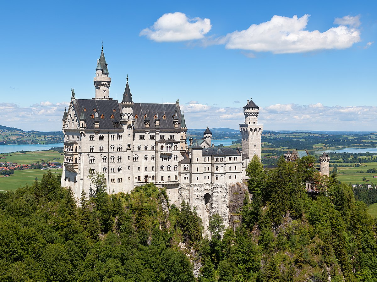
Even though Cinderella Castle was supposedly based on Schloss Neuschwanstein, other than a vauge sense that they are both Romantic fairy tale castles, I don't see much direct influence of the latter on the former, although Sleeping Beauty Castle has some more obvious homages to Neuschwanstein, particularly the main tower, and some of the side turrets.


Compare, however, the turrets on Chateau Chaumont:


And the upper windows on Chateau Chambord:


To me, these look like direct architectural quotes.

I'm sure also that the upper spire on Cinderella Castle also comes directly from some Gothic cathedral, but off the top of my head, I can't think of which one.

Does anyone know of any other direct inspirations for the various design elements of the castle?
 

Kevin_W

Well-Known Member
I'm sure also that the upper spire on Cinderella Castle also comes directly from some Gothic cathedral, but off the top of my head, I can't think of which one.

Does anyone know of any other direct inspirations for the various design elements of the castle?

I thought I'd read that Neuchwanstein was much more of an inspiration for Sleeping Beauty Castle than Cinderella Castle. That said, the tallest spire on Cinderella castle (with the smaller offset spire on its side - I don't know the term) does look to come from Neuchwanstein. Aside from that, Cinderella is certainly influenced by the chateaus of the Loire valley.

Regardless of inspiration, I think they did a great job - WDW may have been the second castle park built of the 6 around the world, but I think it still has the best castle.
 

rkleinlein

Well-Known Member
This could all be contrasted by Enchanted Storybook Castle which is this hulking mass with all sorts of architectural bits on it that sits in a field with almost no relationship to anything else.
This made me go look at it for the first time. What a monstrosity. It's obvious which architects/imagineers knew more about proportion, balance, scale, nuance, subtlety, etc. The one on the right is the Disney castle version of a McMansion. Authenticity aside, it's a poor, sloppy design that looks haphazardly thrown together. And, to return to the original topic, the same can be said of the creperie and other design missteps at WDW.
Screen Shot 2019-04-26 at 10.49.13 AM 2.png
 

Register on WDWMAGIC. This sidebar will go away, and you'll see fewer ads.

Back
Top Bottom