Architectural authenticity at World Showcase

RandySavage

Well-Known Member
What makes World Showcase so appealing is how the original designers took pieces from various parts of each country, then tweaked them and finally reassembled them - not incorrectly, but purposefully - into an interwoven postcard pastiche that feels both familiar and unique (and on the theatrical scale of a theme park).

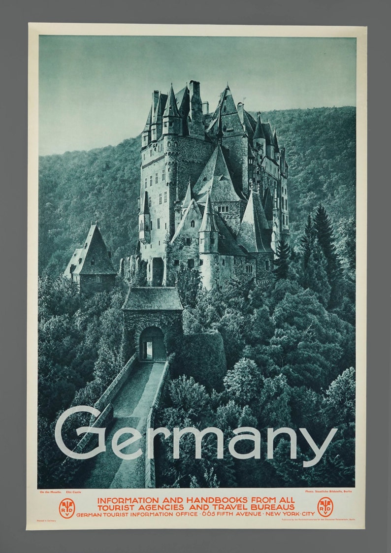
Germany Pavilion creates something that feels like a unified Bavarian town under a castle, but it's a re-molded amalgam of places including Freiburg, Frankfurt, Rothenburg and Castle Eltz.
Freiburg's Kaufhaus:
lightbox_historisches-kaufhaus-3.jpg


Frankfurt's Romer:
AK-Frankfurt-Frankfurter-Messe-Partie-am-Roemer-Wappen.jpg


Burg Eltz:
il_794xN.1131727257_i9dw.jpg
 

Gitson Shiggles

There was me, that is Mickey, and my three droogs
Thank you! And am I right in assuming that the government no longer sponsors the pavilion?

An official Disney Imagineering book published in the 00’s listed Morocco as being the only pavilion sponsored by its government. Unfortunately, I do not have a hard copy myself. This is the link to the most revised version.

The Imagineering Field Guide to Epcot at Walt Disney World--Updated! (An Imagineering Field Guide) https://www.amazon.com/dp/1423124677/ref=cm_sw_r_cp_api_i_Sb3UCbX6CMKQW
 

LittleBuford

Well-Known Member
Original Poster
An official Disney Imagineering book published in the 00’s listed Morocco as being the only pavilion sponsored by its government. Unfortunately, I do not have a hard copy myself. This is the link to the most revised version.

The Imagineering Field Guide to Epcot at Walt Disney World--Updated! (An Imagineering Field Guide) https://www.amazon.com/dp/1423124677/ref=cm_sw_r_cp_api_i_Sb3UCbX6CMKQW

Interesting! Thanks!

I did some Googling on this topic and discovered the following:

- The tourist office moved to another, less prominent, section of the pavilion after the café took its place, and it remained in existence for most, if not all, of the ’00s (can anyone remember when and where they last saw it?). Whether its subsequent disappearance tells us anything about the pavilion’s sponsorship is unclear; I’ve found nothing online to substantiate my earlier assumption.

- The pavilion has what appears to be an official (though rather rudimentary) website dated 2012:


This too suggests some involvement on the part of the Moroccan state until at least this date.
 

larryz

I'm Just A Tourist!
Premium Member
The Arabic inscription over the main arch fronting Tangierine Café translates as "Centre for Travel Information". I'm assuming this was the building's original function back when the Moroccan government sponsored it, and since it's now an eatery, my guess is that this official sponsorship is no more. Perhaps someone reading this can confirm one way or the other.
This is what I see over the arch...
مركز المعلومات السياسية

I translate that as "Political Information Center," but your point remains valid -- an eatery is hardly a place to inquire about government policies.
 

"El Gran Magnifico"

Mr Flibble is Very Cross.
It’s actually my lame inability to pick up on sarcasm that’s the problem! Please don’t stop commenting.

I'll ask questions......serious ones.....how's that?

This to me is a great thread. It speaks to the immersion that every single poster on this forum is enamored with. Hence, why they visit DW in the first place. They're not going there just to ride a rollercoaster. They expect to "experience" Disney. This thread is the "experience" whether or not they're conscious of it.
 
Last edited:

Castle Cake Apologist

Well-Known Member
I wanted to point something out, speaking of being inspired to research more about World Showcase architecture.

When all the discussion was happening in the crêperie thread, I did some research of my own into the things that were being said about the art and learned quite a bit about design and architecture. It was that research that led me to understand why the art had felt "off" to me, and I found myself agreeing with a lot of what was being said about the design choices.

I'm saying this because I think this thread highlights much of the problem with the crêperie for me. While many of the examples posted here are quirky and nontraditional, they nonetheless still manage to instantly communicate a sense of place. Whether the pinecone finial is paired with an "inappropriate" pediment, it still conveys a sense of Italian design to my brain. Through my research, I found that the traditional buildings of Brittany, France seem to feature large amounts of dark wood and stone and patterns on the building fronts.

366602


To me, the crêperie looks like it would stick out like a sore thumb among these buildings. That was the largest issue for me, not necessarily anything wrong with the architectural choices themselves.

Not trying to start anything back up, just something I wanted to point out.
 

LittleBuford

Well-Known Member
Original Poster
I wanted to point out something, speaking of being inspired to research more about World Showcase architecture.

When all the discussion was happening in the crêperie thread, I did some research of my own into the things that were being said about the art and learned quite a bit about design and architecture. It was that research that led me to understand why the art had felt "off" to me, and I found myself agreeing with a lot of what was being said about the design choices.

I'm saying this because I think this thread highlights much of the problem with the crêperie for me. While many of the examples posted here are quirky and nontraditional, they nonetheless still manage to instantly communicate a sense of place. Whether the pinecone finial is paired with an "inappropriate" pediment, it still conveys a sense of Italian design to my brain. Through my research, I found that the traditional buildings of Brittany, France seem to feature large amounts of dark wood and stone and patterns on the building fronts.

View attachment 366602

To me, the crêperie looks like it would stick out like a sore thumb among these buildings. That was the largest issue for me, not necessarily anything wrong with the architectural choices themselves.

I see what you’re saying, but to be fair to Disney, I don’t think they claimed anything other than the menu would be Breton in inspiration (I could well be wrong, in which case please correct me). The problem with trying to evoke Brittany itself is that the kind of architecture in the pictures you posted doesn’t read as French to most people, and it also clashes with the overwhelmingly turn-of-the-century Parisian feel of the France pavilion, which is much less eclectic (regionally as well as chronologically) than its British counterpart.

And so while I agree with you that “the crêperie looks like it would stick out like a sore thumb” among the examples of Breton architecture you showed us, it seems a good (if somewhat unexciting) stylistic fit for the pavilion itself.
 
Last edited:

LittleBuford

Well-Known Member
Original Poster
Whether the pinecone finial is paired with an "inappropriate" pediment, it still conveys a sense of Italian design to my brain.

I should note that I was unable to find a single image of this particular kind of finial used in any Italian building, though it’s extremely common in the American context and other Neoclassical traditions. There must be examples in Italy, too, but urn-shaped finials seem to be far more usual there.

ETA: Found one!

 
Last edited:

lazyboy97o

Well-Known Member
Note: I have not yet read any of the replies in this thread.

Evaluating the classical elements of World Showcase through the lens Neoclassicism is a fundamentally flawed exercise. The cultural dominance and decline of the École des Beaux-Arts followed by the rise of Modernism in the early 19th century has perpetuated the idea that [Neo]classicism is one singular style with very defined rules. This is a key part of how Modernism viewed itself, breaking free of tradition, dogma and the École. Taking a brief (but somewhat related) aside to recent events, the term “Gothic” was applied to buildings like Notre Dame des Paris during the Renaissance to associate their lack of classical forms with the Goths and the sacking of Rome. This simplified narrative of Classical overlooks the “complexity and contradiction” (to steal a phrase from Robert Venturi) of a few hundred years of competing and reacting thoughts regarding Classical architecture. Neoclassicism, as a proper noun, is a specific period and set of ideas regarding Classical architecture which was a reaction against the opulence of the Rocco / Late Baroque style, which was still a Classical style. The Renaissance was the start of reviving Classical design but it became “less pure” and more ornate as styles progressed in the Mannerist, Baroque and Rococo / Late Baroque periods until there a desire to return to something more rooted in the perceived simplicity and elegance of Rome, Neoclassicism. This period was then followed by other styles that were also classical revivals and they all differed in their general views and interpretations of Classical design.

The statue of Neptune in the Italy Pavilion was modeled after the work of Bernini and it is situated in front of a niche as is typical of many sculptures. It is though unusual for a building to be so completely oriented around framing a statue. The central portion of the pediment, where the pinecone is located, is the tympanum, a space which has no consistent form. Tympanum design ranges the entire gamut from a plain surface to highly intricate relief sculpture. In architecture, Neoclassicism was a simplified, flatter reaction against the opulence of Rococo / Late Baroque design. While there is ample precedent, this does mean that a flat tympanum is a bit too plain for a frame for a Baroque statue while having its own Baroque sculpture would compete for attention with the statue. A circle is a common, simple geometric form often placed in the tympanum but is more associated with Renaissance design whereas the Baroque, in focusing less on pure geometry, tended to favor the oval and more ornamental designs. The Roman pinecone is probably not an ideal image to use but it is also not entirely out of line as it is a symbol that comes from antiquity. Religious (Catholic) imagery would have been the most typical for a pediment, including many oval-based designs, but seems like it too would be an odd choice as a backdrop for a statue of Neptune.

Ionic columns perpendicular to the entablature are rare but they do occur, including on the front of the Jefferson Memorial. Following the more formal rules typically associated with Classical design, The American Adventure rotunda and Jefferson Memorial are also atypical as they are not fluted. The Ionic order is traditionally associated with the feminine but in the US the unfluted Ionic column was tied to notions of a softened masculinity as part of Greek Revival architecture that celebrated republicanism, very much including the ideas of Thomas Jefferson.

The doorway with the stacked columns does not appear as though it is supposed to be a Classical design. Instead it appears to be an attempt at storytelling. Reusing parts of Roman buildings was common throughout Italy. Different bricks or stones isn’t something that could easily be read, but piecing together different capitals is something more obvious. It’s not a particularly good looking design, but it’s about something different, a more vernacular architecture built from salvaged parts.

With regards to the Georgian building, it doesn’t have a cornice. That is coping and would not be continuous. The whole pavilion is more focused on different styles crammed together and filling in spaces so I fail to see how this really differs.

Issues of finish seem to be a different discussion. More authentic materials are always better and are something that has very much improved over the past few decades. The best example of this is Main Street, USA at the Magic Kingdom and Disneyland Paris. Disneyland Paris uses real brick and wood and the result is spectacular compared to the Magic Kingdom which can often look a little too much like painted plastic.

None of this really means that the idea of authenticity in themed design is bunk. Ideals and goals are not automatically negated by any and all shortcomings. There is far, far more effort big and small that shows authenticity as the desired goal. Authentic should also not be confused with reproduction, Where these identified issues differ from the upcoming crêperie is in level of deviation from larger norms, not just matters of ornament. The small window on the right storefront breaks the entire overall composition of a “building” on the facade. It would be like one random window on the exterior of The America Adventure being of a different size. This is different from the Georgian building too, as the window in that moves to occupy an implied larger space but it does not also change size. The small window on the crêperie implies a smaller space while the window below contradicts that implication. Other elements are rooted in specific functions and ignore how they accomplished that function. Walt Disney World is filled with fake doors but they are not just sitting a few feet above the floor level.
 

Register on WDWMAGIC. This sidebar will go away, and you'll see fewer ads.

Back
Top Bottom