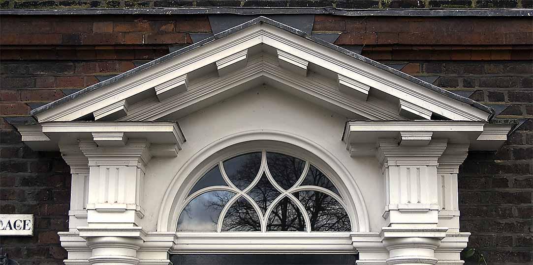
Architectural authenticity at World Showcase

LittleBuford

Well-Known Member
Original Poster
Before anything else (and I added this last when I should have written it first), thank you for your detailed and thought-provoking response.

Evaluating the classical elements of World Showcase through the lens Neoclassicism is a fundamentally flawed exercise. The cultural dominance and decline of the École des Beaux-Arts followed by the rise of Modernism in the early 19th century has perpetuated the idea that [Neo]classicism is one singular style with very defined rules. This is a key part of how Modernism viewed itself, breaking free of tradition, dogma and the École. Taking a brief (but somewhat related) aside to recent events, the term “Gothic” was applied to buildings like Notre Dame des Paris during the Renaissance to associate their lack of classical forms with the Goths and the sacking of Rome. This simplified narrative of Classical overlooks the “complexity and contradiction” (to steal a phrase from Robert Venturi) of a few hundred years of competing and reacting thoughts regarding Classical architecture. Neoclassicism, as a proper noun, is a specific period and set of ideas regarding Classical architecture which was a reaction against the opulence of the Rocco / Late Baroque style, which was still a Classical style. The Renaissance was the start of reviving Classical design but it became “less pure” and more ornate as styles progressed in the Mannerist, Baroque and Rococo / Late Baroque periods until there a desire to return to something more rooted in the perceived simplicity and elegance of Rome, Neoclassicism. This period was then followed by other styles that were also classical revivals and they all differed in their general views and interpretations of Classical design.

This is all very important and true, but the implication is that I'm guilty of the oversimplification you caution against, which I don't think is a fair characterisation at all. Each example I provide is measured against the (admittedly pliable) norms of its own geographical and historical context.

The statue of Neptune in the Italy Pavilion was modeled after the work of Bernini and it is situated in front of a niche as is typical of many sculptures. It is though unusual for a building to be so completely oriented around framing a statue. The central portion of the pediment, where the pinecone is located, is the tympanum, a space which has no consistent form. Tympanum design ranges the entire gamut from a plain surface to highly intricate relief sculpture. In architecture, Neoclassicism was a simplified, flatter reaction against the opulence of Rococo / Late Baroque design. While there is ample precedent, this does mean that a flat tympanum is a bit too plain for a frame for a Baroque statue while having its own Baroque sculpture would compete for attention with the statue. A circle is a common, simple geometric form often placed in the tympanum but is more associated with Renaissance design whereas the Baroque, in focusing less on pure geometry, tended to favor the oval and more ornamental designs. The Roman pinecone is probably not an ideal image to use but it is also not entirely out of line as it is a symbol that comes from antiquity. Religious (Catholic) imagery would have been the most typical for a pediment, including many oval-based designs, but seems like it too would be an odd choice as a backdrop for a statue of Neptune.

Though the statue and its rocky setting are indeed Berninesque (not to mention reminiscent of the Trevi Fountain), the structure itself looks more Neoclassical than it does Baroque (at least to my eyes). This in itself speaks to the the lack of architectural purism at World Showcase. However one reads the fountain's style, I have never seen a tympanum that contains a finial [ETA: I found one Neo-Baroque example, shown in the next post]. Finials, if they play by the rules, go on top of things, not inside them. This is an example of a design that does not reflect the conventions of any breed of classicism I know, including the Baroque. And as I note in a subsequent post, I've struggled to find even a single Italian example of this particular type of finial (though I know they must be out there [ETA: Indeed, I finally found one; see the post below]). All of which is to say that the person who drew up this fountain was clearly willing to do things a little differently from the artists and architects who inspired him/her.

Ionic columns perpendicular to the entablature are rare but they do occur, including on the front of the Jefferson Memorial.

As you know, the examples at the Jefferson Memorial are tucked behind the principal columns of the entrance portico. Can you show me a single Ionic colonnade in which all of the capitals are oriented as they are at the American Adventure? I wouldn't be surprised if the only one in existence is at Walt Disney World.

The doorway with the stacked columns does not appear as though it is supposed to be a Classical design. Instead it appears to be an attempt at storytelling.

Which is the point I'm trying to make for the whole of World Showcase. Storytelling takes precedence over authenticity, as well it should.

It’s not a particularly good looking design

I personally find it charming!

With regards to the Georgian building, it doesn’t have a cornice. That is coping and would not be continuous.

Be that as it may, I've never seen a Georgian townhouse whose chimney rises, without any sort of articulation, directly out of the brickwork of the facade. Nor have I seen any with discontinuous coping. And we're still left with the visual suggestion of nonsensically located fireplaces.

The whole pavilion is more focused on different styles crammed together and filling in spaces so I fail to see how this really differs.

It doesn't differ. It's simply one of many examples of the unconstrained approach that, to a lesser or greater extent, is at play in all of the pavilions.

None of this really means that the idea of authenticity in themed design is bunk. Ideals and goals are not automatically negated by any and all shortcomings.

I didn't say it was, and I never referred to shortcomings.

There is far, far more effort big and small that shows authenticity as the desired goal.

This, I think, is where we fundamentally disagree. I don't believe that the desired goal of all that effort is authenticity per se, but a sort of imaginative simulacrum of authenticity that is rich in real-life details even as it feels fantastic and whimsical. The Imagineers clearly did their homework and have very successfully evoked the countries and cultures they set out to. They did not, however, hold back from reconfiguring their models and even, at times, defying the norms of the very traditions they cite. And to my mind at least, the result is more interesting and compelling for these "inaccuracies".
 
Last edited:

LittleBuford

Well-Known Member
Original Poster
Regarding the fountain, I wonder if the out-of-context (?) finial is a clever nod to this extraordinary beast:

Vatican%200032-M.jpg


I did find this one Neo-Baroque triangular pediment sheltering a pine-cone finial, though exactly when and where it comes from I can't determine:

366647


Source:


And I finally found an Italian building that uses this finial type, which here functions as a dome pinnacle:


This little structure belongs to a later period than that being evoked by the Epcot fountain. I'd be interested to see earlier examples if anyone comes across them.
 
Last edited:

LittleBuford

Well-Known Member
Original Poster
Very interesting discussion, lol no way can I contribute, unfortunately I'm one of those visitors who thinks either "pretty" or "ugly". I never think in terms of whether a building is architecturally correct. I also never thought the wdw imagibeers where trying to be accurate.
Interesting discussion though

I agree with @lazyboy97o to the extent that adherence to certain architectural norms does tend to result in works that are likelier to be regarded as attractive, even by people who claim to be architecturally illiterate. Whether you realise it or not, you’ve had so much exposure to various architectural styles that you’re primed to sense when something is really off and question its aesthetic appeal. Where he and I diverge is on the question of how rigorously the Imagineers observed these conventions. The vast majority of people looking at the quirky Ionic rotunda inside the American Adventure won’t question the orientation of the capitals and will see an elegant classicising structure evocative of American history. As this and other examples show, the Imagineers knew what they could get away with while still respecting, in overall flavour and spirit, the traditions they utilised.

Anyway, glad you’re enjoying the thread, and thanks for your input. :)
 

larryz

I'm Just A Tourist!
Premium Member
Note: I have not yet read any of the replies in this thread.

Evaluating the classical elements of World Showcase through the lens Neoclassicism is a fundamentally flawed exercise. The cultural dominance and decline of the École des Beaux-Arts followed by the rise of Modernism in the early 19th century has perpetuated the idea that [Neo]classicism is one singular style with very defined rules. This is a key part of how Modernism viewed itself, breaking free of tradition, dogma and the École. Taking a brief (but somewhat related) aside to recent events, the term “Gothic” was applied to buildings like Notre Dame des Paris during the Renaissance to associate their lack of classical forms with the Goths and the sacking of Rome. This simplified narrative of Classical overlooks the “complexity and contradiction” (to steal a phrase from Robert Venturi) of a few hundred years of competing and reacting thoughts regarding Classical architecture. Neoclassicism, as a proper noun, is a specific period and set of ideas regarding Classical architecture which was a reaction against the opulence of the Rocco / Late Baroque style, which was still a Classical style. The Renaissance was the start of reviving Classical design but it became “less pure” and more ornate as styles progressed in the Mannerist, Baroque and Rococo / Late Baroque periods until there a desire to return to something more rooted in the perceived simplicity and elegance of Rome, Neoclassicism. This period was then followed by other styles that were also classical revivals and they all differed in their general views and interpretations of Classical design.

The statue of Neptune in the Italy Pavilion was modeled after the work of Bernini and it is situated in front of a niche as is typical of many sculptures. It is though unusual for a building to be so completely oriented around framing a statue. The central portion of the pediment, where the pinecone is located, is the tympanum, a space which has no consistent form. Tympanum design ranges the entire gamut from a plain surface to highly intricate relief sculpture. In architecture, Neoclassicism was a simplified, flatter reaction against the opulence of Rococo / Late Baroque design. While there is ample precedent, this does mean that a flat tympanum is a bit too plain for a frame for a Baroque statue while having its own Baroque sculpture would compete for attention with the statue. A circle is a common, simple geometric form often placed in the tympanum but is more associated with Renaissance design whereas the Baroque, in focusing less on pure geometry, tended to favor the oval and more ornamental designs. The Roman pinecone is probably not an ideal image to use but it is also not entirely out of line as it is a symbol that comes from antiquity. Religious (Catholic) imagery would have been the most typical for a pediment, including many oval-based designs, but seems like it too would be an odd choice as a backdrop for a statue of Neptune.

Ionic columns perpendicular to the entablature are rare but they do occur, including on the front of the Jefferson Memorial. Following the more formal rules typically associated with Classical design, The American Adventure rotunda and Jefferson Memorial are also atypical as they are not fluted. The Ionic order is traditionally associated with the feminine but in the US the unfluted Ionic column was tied to notions of a softened masculinity as part of Greek Revival architecture that celebrated republicanism, very much including the ideas of Thomas Jefferson.

The doorway with the stacked columns does not appear as though it is supposed to be a Classical design. Instead it appears to be an attempt at storytelling. Reusing parts of Roman buildings was common throughout Italy. Different bricks or stones isn’t something that could easily be read, but piecing together different capitals is something more obvious. It’s not a particularly good looking design, but it’s about something different, a more vernacular architecture built from salvaged parts.

With regards to the Georgian building, it doesn’t have a cornice. That is coping and would not be continuous. The whole pavilion is more focused on different styles crammed together and filling in spaces so I fail to see how this really differs.

Issues of finish seem to be a different discussion. More authentic materials are always better and are something that has very much improved over the past few decades. The best example of this is Main Street, USA at the Magic Kingdom and Disneyland Paris. Disneyland Paris uses real brick and wood and the result is spectacular compared to the Magic Kingdom which can often look a little too much like painted plastic.

None of this really means that the idea of authenticity in themed design is bunk. Ideals and goals are not automatically negated by any and all shortcomings. There is far, far more effort big and small that shows authenticity as the desired goal. Authentic should also not be confused with reproduction, Where these identified issues differ from the upcoming crêperie is in level of deviation from larger norms, not just matters of ornament. The small window on the right storefront breaks the entire overall composition of a “building” on the facade. It would be like one random window on the exterior of The America Adventure being of a different size. This is different from the Georgian building too, as the window in that moves to occupy an implied larger space but it does not also change size. The small window on the crêperie implies a smaller space while the window below contradicts that implication. Other elements are rooted in specific functions and ignore how they accomplished that function. Walt Disney World is filled with fake doors but they are not just sitting a few feet above the floor level.
 

Beacon Joe

Well-Known Member
FWIW, the UK pavilion's architecture seems no less jumbled than Bletchley Park.

Re: Germany, I've spent a lot of time exploring Rothenburg and Freiburg, and get the nods to both cities in the EPCOT pavilion. Not really getting any Eltz vibe, though.
 

Ellen Ripley

Well-Known Member
Note: I have not yet read any of the replies in this thread.


The statue of Neptune in the Italy Pavilion was modeled after the work of Bernini and it is situated in front of a niche as is typical of many sculptures. It is though unusual for a building to be so completely oriented around framing a statue. The central portion of the pediment, where the pinecone is located, is the tympanum, a space which has no consistent form. Tympanum design ranges the entire gamut from a plain surface to highly intricate relief sculpture. In architecture, Neoclassicism was a simplified, flatter reaction against the opulence of Rococo / Late Baroque design. While there is ample precedent, this does mean that a flat tympanum is a bit too plain for a frame for a Baroque statue while having its own Baroque sculpture would compete for attention with the statue. A circle is a common, simple geometric form often placed in the tympanum but is more associated with Renaissance design whereas the Baroque, in focusing less on pure geometry, tended to favor the oval and more ornamental designs. The Roman pinecone is probably not an ideal image to use but it is also not entirely out of line as it is a symbol that comes from antiquity. Religious (Catholic) imagery wouThld have been the most typical for a pediment, including many oval-based designs, but seems like it too would be an odd choice as a backdrop for a statue of Neptune.


The Neptune statue area has never worked for me and I thank you for helping me understand what my gut was telling me. It's always seemed like a miniature Trevi Fountain idea that had not been pulled off well AT ALL.... cheers
 

Missing20K

Well-Known Member
Good thread @LittleBuford!

I think one aspect maybe being overlooked is that an artist is free to create pastiche artwork, utilizing various means, methods and precedents. The issue becomes intent.

@lazyboy97o already touched on this a bit in his post, but if the artist intends to create a pastiche for whatever reason they choose, fantastic. Particularly when the pastiche reflects a greater understanding of the artwork itself, as well as the influences of said artwork.

The creperie, for instance, appears as though the pastiche nature of the concept art is not intentional and rather a haphazard mistake. Even items such as the odd scupper at the top of a parapet where it would not catch any rainwater, and the downspout going out and around a mid-wall cornice, could have made sense in a themed environment, not if they had real world precedents, but if they helped to tell, or reinforce, the story. Now if when this thing opens and they have some elaborate backstory about how the creperie had a fire, so they replaced the roof, so they needed new scuppers and downspouts, and they added a new sanitary system to the city so the downspout had to be at the front of the building in order to drain into the city's new sewer system, well then maybe there could be an argument for it looking the way it does. But for crying out loud, look what I had to conjure up in terms of story to make that facade even work a little. Still not sure how that story could account for the odd roof line over the entrance, but I digress.

So again, it comes back to intent and storytelling. The creperie as currently seen in the concept art might have worked had it shown that the design choices made were intentional and relating to the story. I'm not sure it reflects either intent or a story. What is the story for this creperie? Honestly, I'm not sure. And I know there are certain guests that don't care about what the story of the creperie is, as long as they taste decent. But I care about the story of why the creperie is there, what's the story of the owner, the patrons, the crepes themselves. For my money (which honestly DIS gets less and less of anymore) I think all projects in the parks should ask the question "What is the Story of this attraction/theater/food trough?" immediately after the bean counters tell WDI "we need more food troughs".

In regards to the American Adventure rotunda, a couple thoughts. I believe the orientation was intentional. Here are my reasons.

1) The exterior of American Adventure is Georgian, but the rotunda and theater is New Classical. This disparity alone suggests the interior colonnade capital placement was an intentional design choice. As was not fluting these columns, but the colonnade inside the theater has fluted columns and Corinthian capitals. So I'm almost certain that each of these decisions was not made lightly. Even a first year architecture student would know not to use all three of the Classical Order styles without intent.

2) If you are on the ground floor of the rotunda, the column capitals are quite high and overshadowed by the domed coffered ceiling. Making there orientation of less importance from that area. However, if one is on the top floor of the rotunda, the capitals reveal themselves as one circulates around the rotunda making their way toward the theater. To be frank, they probably should have used four-sided Ionic capitals, but doing so would almost require fluted columns, which I'm supposing would have been too much ornamentation for the intent of the rotunda. Which is not to sit and stare but to admire the ceiling and the space and continue moving to the exhibits and theater.

3) The pavilion is a nice little progression of moving from the stately Georgian exterior to a slightly more elaborate interior rotunda, to a highly detailed and ornamental theater. This again relays to me the very intentional placement of the capitals, as well as the thought put into the entire experience.

As far as some of your examples in your original post, most have been addressed so I won't rehash them. And it appears as though you've found precedents for what, at your first glance, seemed to be a "Disney original", so props on the research, very well done!
 

Sir_Cliff

Well-Known Member
The problem with trying to evoke Brittany itself is that the kind of architecture in the pictures you posted doesn’t read as French to most people, and it also clashes with the overwhelmingly turn-of-the-century Parisian feel of the France pavilion, which is much less eclectic (regionally as well as chronologically) than its British counterpart.
I think the highlighted part above is what I find most interesting and engaging about Disney theme parks. Essentially, actual authenticity is neither here nor there. The goal of the imagineers has always been to appeal to the kinds of collective images we have in our minds of different times and places. In the case of the France pavilion, the important point is not that it looks like an actual place in France. The point is that it all reads as "French" to guests.

I think describing Disney theming as pastiche is a little dismissive, but I do think the real skill shown by imagineers has been to assemble a whole array of subconsciously recognisable visual queues that don't need further translation for guests. In the case of the French pavilion, consider this line from the 1982 Beard book about Epcot Center: "are you in Paris? Yes. Are you in the rest of France, known collectively as the provinces? Yes again. Epcot Center has given you a little of both." As has been amply demonstrated in this thread, the German pavilion equally takes a bunch of structures and architectural motifs from different cities and regions in the country and puts them together in a way that guests read unproblematically as "German". In that sense, Disney theming provides interesting insights into how we categorise the world and also how we travel through it. It's not just Disney theme parks, but actual tourist destinations who now have to reshape themselves to look more like the place visitors expect to find when they arrive.

The peak of Disney theming for me is where the concept being evoked is more abstract. For example, in Adventureland the Imagineers can throw together Polynesian, African, Middle Eastern, and Asian theming and guests read it all as evocative of the same general idea. In this case, the Imagineers have tapped into something a little more unsettling as it speaks to notions of colonialism and primitivism that read large swathes of the world as similarly exotic, savage, and places of adventure. Still, it is a fascinating distillation of that fact.

As others have said, thanks for the fascinating thread @LittleBuford!
 
Last edited:

Heppenheimer

Well-Known Member
I think the highlighted part above is what I find most interesting and engaging about Disney theme parks. Essentially, actual authenticity is neither here nor there. The goal of the imagineers has always been to appeal to the kinds of collective images we have in our minds of different times and places. In the case of the France pavilion, the important point is not that it looks like an actual place in France. The point is that it all reads as "French" to guests.

I think describing Disney theming as pastiche is a little dismissive, but I do think the real skill shown by imagineers has been to assemble a whole array of subconsciously recognisable visual queues that don't need further translation for guests. In the case of the French pavilion, consider this line from the 1982 Beard book about Epcot Center: "are you in Paris? Yes. Are you in the rest of France, known collectively as the provinces? Yes again. Epcot Center has given you a little of both." As has been amply demonstrated in this thread, the German pavilion equally takes a bunch of structures and architectural motifs from different cities and regions in the country and puts them together in a way that guests read unproblematically as "German". In that sense, Disney theming provides interesting insights into how we categorise the world and also how we travel through it. It's not just Disney theme parks, but actual tourist destinations who now have to reshape themselves to look more like the place visitors expect to find when they arrive.

The peak of Disney theming for me is where the concept being evoked is more abstract. For example, in Adventureland the Imagineers can throw together Polynesian, African, Middle Eastern, and Asian theming and guests read it all as evocative of the same general idea. In this case, the Imagineers have tapped into something a little more unsettling as it speaks to notions of colonialism and primitivism that read large swathes of the world as similarly exotic, savage, and places of adventure. Still, it is a fascinating distillation of that fact.

As others have said, thanks for the fascinating thread @LittleBuford!
Speaking along this line, there's one completely "inauthentic" aspect of the German pavilion that I love nonetheless. The mural paintings on the main entrance to the Biergarden depict the coat-of-arms of each of the 16 states of modern Germany.

http://www.disneyfoodblog.com/wp-content/uploads/2013/09/Biergarten-Exterior.jpg

Mural paintings like this are common in southern Bavaria, but you would never see the 16 Bundeslaender together like this on an old building. In fact, 5 of those states (Mecklenburg-Vorpommern, Brandenburg, Sachsen-Anhalt, Sachsen and Thueringen) didn't even exist as distinct political units at the time the pavilion was originally built, so Disney at some point after 1989 must have taken the time and effort to update the decor. It probably goes completely unnoticed by most guests, but I think its a nice little tribute to the reunification of the country.
 

LittleBuford

Well-Known Member
Original Poster

Thank you—both for your kind words and for your thoughtful reply! In keeping with the idea of pastiche, I'm going to address your points selectively and out of order, which I hope is all right.

And it appears as though you've found precedents for what, at your first glance, seemed to be a "Disney original"

To clarify, I didn't! The Ionic colonnade remains a one-off as far as I can tell, and the chimney of the little Georgian house appears to be similarly aberrant (I don't mean the word pejoratively). As for the fountain, I haven't found a single seventeenth- or eighteenth-century Italian pediment that is decorated in such a manner.

Of course, none of this rules out the possibility that precedents may exist (though I wouldn't be at all surprised if the Ionic colonnade really is unique). I'm sure there must be a Georgian townhouse somewhere in the UK that has a strange chimney comparable to its Epcot cousin. But then we have to ask which of these two scenarios is likelier: that the Imagineers were deliberately referring to obscure and highly atypical models, or that they were happy to rejig the ingredients at their disposal in ways that didn't strictly conform with the traditions being evoked. I tend to think the latter.

In regards to the American Adventure rotunda, a couple thoughts. I believe the orientation was intentional. Here are my reasons.

1) The exterior of American Adventure is Georgian, but the rotunda and theater is New Classical. This disparity alone suggests the interior colonnade capital placement was an intentional design choice. As was not fluting these columns, but the colonnade inside the theater has fluted columns and Corinthian capitals. So I'm almost certain that each of these decisions was not made lightly. Even a first year architecture student would know not to use all three of the Classical Order styles without intent.

2) If you are on the ground floor of the rotunda, the column capitals are quite high and overshadowed by the domed coffered ceiling. Making there orientation of less importance from that area. However, if one is on the top floor of the rotunda, the capitals reveal themselves as one circulates around the rotunda making their way toward the theater. To be frank, they probably should have used four-sided Ionic capitals, but doing so would almost require fluted columns, which I'm supposing would have been too much ornamentation for the intent of the rotunda. Which is not to sit and stare but to admire the ceiling and the space and continue moving to the exhibits and theater.

3) The pavilion is a nice little progression of moving from the stately Georgian exterior to a slightly more elaborate interior rotunda, to a highly detailed and ornamental theater. This again relays to me the very intentional placement of the capitals, as well as the thought put into the entire experience.

I agree that there is a decorative progression from exterior to interior, but having the capitals face the usual way wouldn't have changed anything from that perspective. My guess (and it is just that!) is that whoever designed the rotunda did something deliberately inauthentic in order to yield a more creative, idiosyncratic result. The change is subtle enough that most people miss it but significant enough that those who know something about architecture will catch it and contemplate it. It turns an otherwise beautiful but forgettable feature into a memorable talking point, all the more so because it is the central part of the central pavilion. What I'm arguing, in other words, is that one of the stories being told—in addition to those of time and place—is that of Disney creativity itself, with the Imagineers leaving their distinctive mark on their work. And the same holds true for World Showcase in general.

Of course, not every quirk or "deviation" can have been so well thought out. I doubt that there was much intent behind the Georgian chimney, and the Neptune fountain to my eyes looks altogether lacklustre (look at the ungainly way the arch springs from the imposts). But even these examples help to distinguish the buildings of World Showcase from their real-life counterparts, and so in their own way contribute to the imaginative and at times surreal atmosphere that makes the World so different from the world.
 
Last edited:

LittleBuford

Well-Known Member
Original Poster
I think the highlighted part above is what I find most interesting and engaging about Disney theme parks. Essentially, actual authenticity is neither here nor there. The goal of the imagineers has always been to appeal to the kinds of collective images we have in our minds of different times and places. In the case of the France pavilion, the important point is not that it looks like an actual place in France. The point is that it all reads as "French" to guests.

I think describing Disney theming as pastiche is a little dismissive, but I do think the real skill shown by imagineers has been to assemble a whole array of subconsciously recognisable visual queues that don't need further translation for guests. In the case of the French pavilion, consider this line from the 1982 Beard book about Epcot Center: "are you in Paris? Yes. Are you in the rest of France, known collectively as the provinces? Yes again. Epcot Center has given you a little of both." As has been amply demonstrated in this thread, the German pavilion equally takes a bunch of structures and architectural motifs from different cities and regions in the country and puts them together in a way that guests read unproblematically as "German". In that sense, Disney theming provides interesting insights into how we categorise the world and also how we travel through it. It's not just Disney theme parks, but actual tourist destinations who now have to reshape themselves to look more like the place visitors expect to find when they arrive.

The peak of Disney theming for me is where the concept being evoked is more abstract. For example, in Adventureland the Imagineers can throw together Polynesian, African, Middle Eastern, and Asian theming and guests read it all as evocative of the same general idea. In this case, the Imagineers have tapped into something a little more unsettling as it speaks to notions of colonialism and primitivism that read large swathes of the world as similarly exotic, savage, and places of adventure. Still, it is a fascinating distillation of that fact.

As others have said, thanks for the fascinating thread @LittleBuford!

Thanks for this great post!

I hope I didn't come across as dismissive, even if I did once or twice use the word "pastiche". There is a great deal of skill and thought behind these (sometimes weird and wacky) medleys, and I absolutely adore the result.

Like you, I really enjoy the more hybrid kind of theming that one finds in areas like Adventureland, despite its problematic implications. I wonder what future generations will make of it all.
 

lazyboy97o

Well-Known Member
This is all very important and true, but the implication is that I'm guilty of the oversimplification you caution against, which I don't think is a fair characterisation at all. Each example I provide is measured against the (admittedly pliable) norms of its own geographical and historical context.
Neoclassicism and the very related Georgian are the only references you make. You jump right to it in regards to the Italy Pavilion, an odd beginning considering its origins as a reaction against Italian trends, and more specifically of the sort of trends for which your specific example is a backdrop.

Though the statue and its rocky setting are indeed Berninesque (not to mention reminiscent of the Trevi Fountain), the structure itself looks more Neoclassical than it does Baroque (at least to my eyes). This in itself speaks to the the lack of architectural purism at World Showcase. However one reads the fountain's style, I have never seen a tympanum that contains a finial [ETA: I found one Neo-Baroque example, shown in the next post]. Finials, if they play by the rules, go on top of things, not inside them. This is an example of a design that does not reflect the conventions of any breed of classicism I know, including the Baroque. And as I note in a subsequent post, I've struggled to find even a single Italian example of this particular type of finial (though I know they must be out there [ETA: Indeed, I finally found one; see the post below]). All of which is to say that the person who drew up this fountain was clearly willing to do things a little differently from the artists and architects who inspired him/her.
How is it Neoclassical? It is a frame for a large niche and even the tympanum has recesses. Neoclassicism emphasizes the wall and planar elements. Calling it a finial is just labeling it something else to claim it as wrong. The proliferation of the pinecone as a pediment finial came later as it was easy to produce. It’s a Roman symbol behind a statue of a Roman god.

As you know, the examples at the Jefferson Memorial are tucked behind the principal columns of the entrance portico. Can you show me a single Ionic colonnade in which all of the capitals are oriented as they are at the American Adventure? I wouldn't be surprised if the only one in existence is at Walt Disney World.
This would be another example of you primarily using Neoclassicism as the model for evaluation. The columns of the Jefferson Memorial are not hidden behind something to be read as a planar elevation, they are part of the procession through the spaces, a key aspect of the École’s view of architecture. The entire portico, the very entrance into the memorial, features the singular orientation along the exterior and on the interior. The condition surrounds the viewer and Pope knew the “solution” for such spaces, the four-sided Ionic capital. Similar to the Jefferson Memorial, when moving across the second floor of The American Adventure lobby, the capitals are perpendicular to the movement of people in the space, and at its most direct align with the ceiling beams.

Be that as it may, I've never seen a Georgian townhouse whose chimney rises, without any sort of articulation, directly out of the brickwork of the facade. Nor have I seen any with discontinuous coping. And we're still left with the visual suggestion of nonsensically located fireplaces.
Articulation of the chimney is not a defining characteristic of Georgian design. It becomes more prominent in more contemporary houses in a Federal/Georgian style as the wall structure changes to wood and the brick becomes veneer. Coping would not be coping if it continued along the chimney. Georgian architecture also became a vernacular style, which means some weird stuff happens. It’s not usual, but front corner fireplaces do sometimes occur on smaller vernacular British dwellings.

This, I think, is where we fundamentally disagree. I don't believe that the desired goal of all that effort is authenticity per se, but a sort of imaginative simulacrum of authenticity that is rich in real-life details even as it feels fantastic and whimsical. The Imagineers clearly did their homework and have very successfully evoked the countries and cultures they set out to. They did not, however, hold back from reconfiguring their models and even, at times, defying the norms of the very traditions they cite. And to my mind at least, the result is more interesting and compelling for these "inaccuracies".
“Authenticity” is a term repeatedly invoked by the industry itself, including Walt Disney Imagineering. It’s the term used again and again to describe World Showcase by Disney in the early 1980s. It continues to be invoked by Disney, is a topic of discussion at things like the TEA’s SATE Conference and Thea Awards, as well as more industry-focused publications like InPark Magazine or blooloop. Here is a blog post from former Imagineer Don Carson that touches on a lot of the same issues: http://themedenvironments.blogspot.com/2013/04/theme-park-101-stick-in-eye.html
 

LittleBuford

Well-Known Member
Original Poster
Neoclassicism and the very related Georgian are the only references you make. You jump right to it in regards to the Italy Pavilion, an odd beginning considering its origins as a reaction against Italian trends, and more specifically of the sort of trends for which your specific example is a backdrop.

I should not have used the term "Neoclassical" in relation to the fountain, because, as you rightly pointed out, the statue itself evokes the Baroque, even if (to my mind) the structure around it does not. Plain old "classical" is what I ought to have written, and I apologise for not having done so. But my point still stands: the pediment's design is evidently derived in part from that of a (Neoclassical) broken pediment with a pine-cone finial.

How is it Neoclassical? It is a frame for a large niche and even the tympanum has recesses. Neoclassicism emphasizes the wall and planar elements.

The depth of the pediment is about the only thing that looks Baroque about it. And while I agree that Neoclassicism is generally less dimensional, there are plenty of examples with greater depth to them:

broken-base-pediment-large.jpg


Calling it a finial is just labeling it something else to claim it as wrong.

That's really unfair of you. I'm calling it a finial because that's what it is.

The proliferation of the pinecone as a pediment finial came later as it was easy to produce. It’s a Roman symbol behind a statue of a Roman god.

But none of this changes the fact that the pine-cone motif (whether or not you regard it as a finial) isn't characteristic of seventeenth- or eighteenth-century Italian architecture. There were many more obvious (and arguably more suitable) choices by which an Italian Baroque aesthetic might have been suggested. As it is, the design is little more than generically classicising, which is no doubt enough to read as Italian in most people's eyes. (To be clear, I'm talking about the architectural part of the fountain only, not the statuary, which is much more specific in feel.)

This would be another example of you primarily using Neoclassicism as the model for evaluation. The columns of the Jefferson Memorial are not hidden behind something to be read as a planar elevation, they are part of the procession through the spaces, a key aspect of the École’s view of architecture. The entire portico, the very entrance into the memorial, features the singular orientation along the exterior and on the interior. The condition surrounds the viewer and Pope knew the “solution” for such spaces, the four-sided Ionic capital. Similar to the Jefferson Memorial, when moving across the second floor of The American Adventure lobby, the capitals are perpendicular to the movement of people in the space, and at its most direct align with the ceiling beams.

Your opening remark here is unfair and untrue. Whether Neoclassical or otherwise, no Ionic colonnade I've ever encountered has its capitals oriented as they are at the American Adventure, and none of us in this thread has been able to produce evidence of one. I don't understand why it's such a big deal to acknowledge that the Imagineers decided to do something absolutely unorthodox in this instance.

Articulation of the chimney is not a defining characteristic of Georgian design.

I didn't say it was. All I said was that I've never seen a Georgian chimney or roofline behave that way, and I stand by that claim.

Coping would not be coping if it continued along the chimney.

But my point is that the chimney "shouldn't" be interrupting the coping along the facade in the first place.

Georgian architecture also became a vernacular style, which means some weird stuff happens. It’s not usual, but front corner fireplaces do sometimes occur on smaller vernacular British dwellings.

To quote something I wrote in a post above: "I'm sure there must be a Georgian townhouse somewhere in the UK that has a strange chimney comparable to its Epcot cousin. But then we have to ask which of these two scenarios is likelier: that the Imagineers were deliberately referring to obscure and highly atypical models, or that they were happy to rejig the ingredients at their disposal in ways that didn't strictly conform with the traditions being evoked. I tend to think the latter."

And let me add that the style of the Epcot structure reads to me as that of a respectable (though miniaturised) townhouse, not of a vernacular dwelling.

“Authenticity” is a term repeatedly invoked by the industry itself, including Walt Disney Imagineering. It’s the term used again and again to describe World Showcase by Disney in the early 1980s. It continues to be invoked by Disney, is a topic of discussion at things like the TEA’s SATE Conference and Thea Awards, as well as more industry-focused publications like InPark Magazine or blooloop. Here is a blog post from former Imagineer Don Carson that touches on a lot of the same issues: http://themedenvironments.blogspot.com/2013/04/theme-park-101-stick-in-eye.html

And as I've already said and—I think—amply demonstrated, I'm not dismissing the importance of authenticity at all. I just think you and I have very different notions of what constitutes authenticity in the context of theme-park design.

In any case, I really don't want this thread to become tense. I appreciate your perspective, even if I don't always agree with it.
 
Last edited:

Missing20K

Well-Known Member
Of course, not every quirk or "deviation" can have been so well thought out. I doubt that there was much intent behind the Georgian chimney, and the Neptune fountain to my eyes looks altogether lacklustre (look at the ungainly way the arch springs from the imposts). But even these examples help to distinguish the buildings of World Showcase from their real-life counterparts, and so in their own way contribute to the imaginative and at times surreal atmosphere that makes the World so different from the world.

Again a fun thread and I don't want to derail it too much or nitpick over word choice or some such matters.

But I will say I fundamentally disagree with this statement. All good designers, and as well all know Disney has had some of the best, rarely, if ever, overlook any aspect of their design. The quirks and deviations one sees, particularly in a themed environment, are very deliberate. The coping example at the Georgian house at the UK, for example, was 100% purposeful as someone had to draft the architectural details for that area, and how the coping and the brick interact, and how the roofing membrane terminates under the coping at the parapet but at a termination bar on the backside of the chimney. If this was not deliberate, the project architect or partner reviewing the drawings would have instantly seen the "mistake" and immediately have told the draftsman/woman to fix it.

Sometimes, what appears to be an overlooked quirk or deviation is in fact the point of emphasis, as those deviations are unique and must be detailed through drawings, and constructed as unique. Your idea that these features help to distinguish themselves from their real world counterparts is, to me anyway, stronger evidence of the deliberateness of the quirks, rather than a lack of intent by the designers.

Greatly appreciate your responses and thoughtful discourse even when I've disagreed.
 

lazyboy97o

Well-Known Member
The depth of the pediment is about the only thing that looks Baroque about it. And while I agree that Neoclassicism is generally less dimensional, there are plenty of examples with greater depth to them:
There isn’t much to the entire elevation. The pediment is clearly a means of capping the more traditional niche backdrop to the statue.

That's really unfair of you. I'm calling it a finial because that's what it is.
As you already stated, a finial goes on top. A finial can take many forms. It’s location is key to it being one.

But none of this changes the fact that the pine-cone motif (whether or not you regard it as a finial) isn't characteristic of seventeenth- or eighteenth-century Italian architecture. There were many more obvious (and arguably more suitable) choices by which an Italian Baroque aesthetic might have been suggested. As it is, the design is little more than generically classicising, which is no doubt enough to read as Italian in most people's eyes. (To be clear, I'm talking about the architectural part of the fountain only, not the statuary, which is much more specific in feel.)
I’ve already mentioned more appropriate Baroque tympanum ornament. I’ve also addressed why it makes sense for it to be rather generic, as the focus is the statue not the resolution to its isolated niche. It’s not an empty space (which would have had plenty of percent) nor would it be it’s own ornate sculpture calling attention away from the statue.

But my point is that the chimney "shouldn't" be interrupting the coping along the facade in the first place.
Coping is a solid piece on top of a wall that protects the wall assembly. Coping that continued through a chimney would kill people.

Your opening remark here is unfair and untrue. Whether Neoclassical or otherwise, no Ionic colonnade I've ever encountered has its capitals oriented as they are at the American Adventure, and none of us in this thread has been able to produce evidence of one. I don't understand why it's such a big deal to acknowledge that the Imagineers decided to do something absolutely unorthodox in this instance.
The portico of the Jefferson Memorial is unorthodox in a very similar manner. You rejected it because it does not read in the front elevation.

And as I've already said and—I think—amply demonstrated, I'm not dismissing the importance of authenticity at all. I just think you and I have very different notions of what constitutes authenticity in the context of theme-park design.
You said it is wrongheaded to expect architectural norms to be followed. What is authenticity if not that established language? That doesn’t mean everything has a direct precedent or there are no deviations or something new, but that new has to have some some purpose and basis in an established language which can be read and understood.
 

LittleBuford

Well-Known Member
Original Poster
As you already stated, a finial goes on top. A finial can take many forms. It’s location is key to it being one.

By that logic, the upside-down Corinthian capitals that flank the fountain as flowerpot bases shouldn't be called capitals, since they no longer function as such. The pine-cone design in the fountain's pediment is specifically that of a finial, even if it's not doing what one typically does.

Coping is a solid piece on top of a wall that protects the wall assembly. Coping that continued through a chimney would kill people.

You're misunderstanding me. I'm saying that the chimney should not be in that spot to interrupt the coping of the facade in the first place.

For those wondering, this is how one would expect the roofline to behave (this example is in Dublin and so technically falls outside today's UK):

image.jpg


The portico of the Jefferson Memorial is unorthodox in a very similar manner. You rejected it because it does not read in the front elevation.

There is a major difference between four "misoriented" Ionic capitals behind the principal columns of a portico and a whole colonnade of them. At the Jefferson Memorial, the capitals are turned that way in order not to clash with the rest of the portico. At Epcot, there is nothing at all to necessitate this far more audacious and conspicuous instance of anticlassicism, which must be either a careless mistake or—far likelier—a deliberately offbeat move designed to make the structure more interesting and distinctive.

That doesn’t mean everything has a direct precedent or there are no deviations or something new, but that new has to have some some purpose and basis in an established language which can be read and understood.

I agree with this entirely and have said nothing to contradict it. This whole thread began because you asked me to provide evidence of existing World Showcase structures that go against the norms of the traditions they cite. I believe I've done that. That there are such deviations does not in any way mean that the Imagineers didn't know their stuff or that they didn't also incorporate a host of authentic details into their work.
 
Last edited:

Missing20K

Well-Known Member
I'm not gonna quote cause I'm lazy. ;)

Georgian architecture is widely varied and became so common throughout the English speaking world in the 18th and 19th centuries that vernacular architecture absorbed many aspects of Palladian/Georgian architecture. The UK chimney example could easily be seen as a vernacular interpretation of Neo-Georgian architecture. The architrave/cornice underneath the porch suggests as much, as that is also a "quirk" and deviation from architectural "norms", as one would generally not put a cornice directly underneath a balcony (a balcony that has no door and windows above the floor line, making the guardrail and balcony more aesthetic than functional, unless one wants to climb through a window).

If they were concerned about the aesthetic linearity of the coping around the chimney, they could have easily used a face brick in the same dimensions and reveal as the coping adjacent and it would have maintained the horizontal lines. The fact they did not do this strongly implies the purpose in which they detailed that aspect of the building. Regardless of the reasoning, it was without question on purpose.

Also, as an edit to my previous post, I was calling out the coping and suggesting it was a parapet cap, in which the roofing membrane would run underneath the cap. The UK example is quite glaringly a solid coping, in which case the membrane would stop at a termination bar and not under the precast? concrete coping. I blame the fact we use coping and cap interchangeably at our office (though we shouldn't) and it was still early. :hilarious: My point remains that if it were a mistake it would have been addressed during the construction document phase.
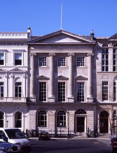
However, I think one might be able to establish that the UK pavilion building in question has a backstory of being built after the Great Fire of London. See, up until that time, the vast majority of London had pitched roofs with overhanging eaves. After the Great Fire, a new law went into effect that eliminated the eaves and required parapets of 18" minimum height on all buildings. The larger building behind is done in something closer to a Greek Revival style. It looks conspicuosly like 15 St James Square by James Athenian Stuart (see below) which places it in a time period of 1760ish, well after the Great Fire. The building it juts out from, is in a Georgian vernacular style, placing it in a similar time frame, perhaps a bit later but also built after the Great Fire when new building requirements were enforced. Thus the dichotomy of the end gabled roof building adjacent to structures with parapets. Or I could just be creating a backstory that fits what I see. ;)

If not for established architectural languages, even amongst innovation and deviation, it would be incredibly difficult to discern one culture's built environment from another. The composition, form and arrangement of architectural elements speaks to a particular time, place and circumstance.

33225-large.jpg
 

Register on WDWMAGIC. This sidebar will go away, and you'll see fewer ads.

Back
Top Bottom