Architectural authenticity at World Showcase

CraftyFox

Well-Known Member
As a bit of an architectural nut, I love the responses on this thread. Very interesting reads! You guys quite committed at delving into the little details.

In regards to the controversy over the new creperie in the France Pavilion, it just seems kinda modern. It looks like the high end shopping center in my hometown.
 
Last edited:

Missing20K

Well-Known Member
Examples of a chimney "breaking" the coping.

The_Hare_and_Billet_Public_House%2C_Blackheath_Vale_-_geograph.org.uk_-_1600346.jpg


Blackheath, London, UK


367102


Gloucester Place, Marylebone, London, UK (near where my wife and I stayed for one leg of our honeymoon)
 

Attachments

  • Capture_d.PNG
    Capture_d.PNG
    1.2 MB · Views: 88

LittleBuford

Well-Known Member
Original Poster
I'm not gonna quote cause I'm lazy. ;)

Ha! No worries! :)

If they were concerned about the aesthetic linearity of the coping around the chimney, they could have easily used a face brick in the same dimensions and reveal as the coping adjacent and it would have maintained the horizontal lines. The fact they did not do this strongly implies the purpose in which they detailed that aspect of the building. Regardless of the reasoning, it was without question on purpose.

I think it's far more probable that they simply weren't concerned about it to begin with. Why would they be? Their task wasn't to obsessively follow in the footsteps of actual Georgian architects, but to conjure the flavour of a Georgian house, which they did very well. No ordinary viewer would ever think to question that chimney, though it is, by the standards of historical models, highly questionable. That doesn't make it a mistake as such, but it does make it a Disney Deviation.™

However, I think one might be able to establish that the UK pavilion building in question has a backstory of being built after the Great Fire of London. See, up until that time, the vast majority of London had pitched roofs with overhanging eaves. After the Great Fire, a new law went into effect that eliminated the eaves and required parapets of 18" minimum height on all buildings. The larger building behind is done in something closer to a Greek Revival style. It looks conspicuosly like 15 St James Square by James Athenian Stuart (see below) which places it in a time period of 1760ish, well after the Great Fire. The building it juts out from, is in a Georgian vernacular style, placing it in a similar time frame, perhaps a bit later but also built after the Great Fire when new building requirements were enforced. Thus the dichotomy of the end gabled roof building adjacent to structures with parapets. Or I could just be creating a backstory that fits what I see. ;)

This is a wonderful demonstration of the kind of rich storytelling Disney can prompt in us. For my part, I think the story is far simpler: an Imagineer designed a Georgian house without being overly worried about the way the chimney "should" connect to the facade. The stylistically unrelated gabled house next to is isn't, I think, meant to be read as belonging to the same place; the two are simply spliced together, like so many other structures at World Showcase.

The composition, form and arrangement of architectural elements speaks to a particular time, place and circumstance.

I agree, and the Imagineers clearly knew this. Some of their creations are more successful at placemaking than others, though. Take away the statuary from the Neptune fountain and you're left with a blandly classicising structure that does not look specifically Italian.
 
Last edited:

LittleBuford

Well-Known Member
Original Poster
Examples of a chimney "breaking" the coping.

The_Hare_and_Billet_Public_House%2C_Blackheath_Vale_-_geograph.org.uk_-_1600346.jpg


Blackheath, London, UK


View attachment 367102

Gloucester Place, Marylebone, London, UK (near where my wife and I stayed for one leg of our honeymoon)

Thank you. I too found such examples, which is why I was very careful in referring specifically to the facade (by which I meant the entrance facade). It's not at all unusual for chimneys to behave this way on a building's side. Had the Epcot chimney been placed a foot or two back, it would have been unexceptionable.
 

Missing20K

Well-Known Member
Thank you. I too found such examples, which is why I was very careful in referring specifically to the facade (by which I meant the entrance facade). It's not at all unusual for chimneys to behave this way on a building's side. Had the Epcot chimney been placed a foot or two back, it would have been unexceptionable.
So is your issue with the fact the chimney breaks the coping, or the fact it is in the corner of the building, or both? Being in the corner could simply be a bit of vernacular whimsy the imagineers decided to employ.

My main point is that the chimney in the corner, the capitals turned perpendicular to the frieze, the cornice below a balcony, are very deliberate design choices. Drawings are reviewed countless times before construction and none of these items would have been overlooked.

I can't stress enough how virtually nothing is overlooked when designing a building. Whether it's the warehouses and data centers or the Division 1 basketball arena I've worked on, or the UK pavilion or American Adventure rotunda by Disney, each and every detail is gone over many, many times with a fine tooth comb. Partly to maintain architectural integrity, though that is a large reason, but also in order to properly bid and construct the building from the drawings and specifications so that no occupant is placed in harms way and so that the client, contractors and architect are all properly liable for their respective aspects of the finished product.
 

LittleBuford

Well-Known Member
Original Poster
So is your issue with the fact the chimney breaks the coping, or the fact it is in the corner of the building, or both? Being in the corner could simply be a bit of vernacular whimsy the imagineers decided to employ.

I don't have an issue with it! I'm just saying that I've never seen the coping along the (entrance) facade of a Georgian house interrupted by a chimney. I agree that the building ends up looking more whimsical because of this odd placement, but a little bit of historical accuracy is sacrificed in the process.

My main point is that the chimney in the corner, the capitals turned perpendicular to the frieze, the cornice below a balcony, are very deliberate design choices. Drawings are reviewed countless times before construction and none of these items would have been overlooked.

Deliberate or not, the results break certain conventions, in some cases to the point of outright inauthenticity, as with the Ionic colonnade.

I can't stress enough how virtually nothing is overlooked when designing a building. Whether it's the warehouses and data centers or the Division 1 basketball arena I've worked on, or the UK pavilion or American Adventure rotunda by Disney, each and every detail is gone over many, many times with a fine tooth comb. Partly to maintain architectural integrity, though that is a large reason, but also in order to properly bid and construct the building from the drawings and specifications so that no occupant is placed in harms way and so that the client, contractors and architect are all properly liable for their respective aspects of the finished product.

Wouldn't this hold true for the design of the crêperie also? What basis do we have to complain about the roofs or windows if every single detail is always the result of very specific, well-thought-out decisions? [ETA: In case it isn't clear, these questions are somewhat rhetorical, channeling your own claims and asking how far they should be taken. In no way am I claiming that the crêperie is actually the result of such careful planning as you describe.]
 
Last edited:

lazyboy97o

Well-Known Member
By that logic, the upside-down Corinthian capitals that flank the fountain as flowerpot bases shouldn't be called capitals, since they no longer function as such. The pine-cone design in the fountain's pediment is specifically that of a finial, even if it's not doing what one typically does.
Those capitals are designed to look like reused bits of a ruined building. The pinecone was a Roman symbol and there are not many other ways to depict it in relief.

You're misunderstanding me. I'm saying that the chimney should not be in that spot to interrupt the coping of the facade in the first place.

For those wondering, this is how one would expect the roofline to behave (this example is in Dublin and so technically falls outside today's UK):
Those chimneys don’t share the vertical surface of the front parapet. They’re a different condition. I didn’t deny that set back for a chimney is far more typical.

There is a major difference between four "misoriented" Ionic capitals behind the principal columns of a portico and a whole colonnade of them. At the Jefferson Memorial, the capitals are turned that way in order not to clash with the rest of the portico. At Epcot, there is nothing at all to necessitate this far more audacious and conspicuous instance of anticlassicism, which must be either a careless mistake or—far likelier—a deliberately offbeat move designed to make the structure more interesting and distinctive.
It’s not four. All sixteen are non-standard for such a condition.

I agree with this entirely and have said nothing to contradict it. This whole thread began because you asked me to provide evidence of existing World Showcase structures that go against the norms of the traditions they cite. I believe I've done that. That there are such deviations does not in any way mean that the Imagineers didn't know their stuff or that they didn't also incorporate a host of authentic details into their work.
You offered these as examples of how Imagineers have not followed architectural norms and that it is wrongheaded to have such an expectation. At some point it seems that the large presence of these authentic details would indicate not just an Easter egg, but an actual desired goal.

Wouldn't this hold true for the design of the crêperie also? What basis do we have to complain about the roofs or windows if every single detail is always the result of very specific, well-thought-out decisions?
Deliberate is not synonymous with well considered or even good. Journey Into Your Imagination and Superstar Limo were also the result of years of deliberate decisions. The deliberateness of the crêperie is why it is problematic. Someone decided to place a collector head at the top of a parapet. Someone decided to make one window a completely different size while most everything around it maintained the dominant pattern language.
 

lazyboy97o

Well-Known Member
Speaking along this line, there's one completely "inauthentic" aspect of the German pavilion that I love nonetheless. The mural paintings on the main entrance to the Biergarden depict the coat-of-arms of each of the 16 states of modern Germany.

http://www.disneyfoodblog.com/wp-content/uploads/2013/09/Biergarten-Exterior.jpg

Mural paintings like this are common in southern Bavaria, but you would never see the 16 Bundeslaender together like this on an old building. In fact, 5 of those states (Mecklenburg-Vorpommern, Brandenburg, Sachsen-Anhalt, Sachsen and Thueringen) didn't even exist as distinct political units at the time the pavilion was originally built, so Disney at some point after 1989 must have taken the time and effort to update the decor. It probably goes completely unnoticed by most guests, but I think its a nice little tribute to the reunification of the country.
It’s not inauthentic as World Showcase is set in the present.
 

LittleBuford

Well-Known Member
Original Poster
There are several points you raise that I've already addressed multiple times. So as not to repeat myself further, I'm going to leave them unanswered here, but my responses remain the same as before.

Those chimneys don’t share the vertical surface of the front parapet.

I didn't say they did. On the contrary, I said they they represent a norm that the Epcot house goes against.

It’s not four. All sixteen are non-standard for such a condition.

The front eight columns form a standard colonnade with conventionally oriented capitals:

Jefferson-Memorial1.jpg


You offered these as examples of how Imagineers have not followed architectural norms and that it is wrongheaded to have such an expectation. At some point it seems that the large presence of these authentic details would indicate not just an Easter egg, but an actual desired goal.

From the outset, I've said that authentic details are interwoven with unorthodox ones. You keep mischaracterising my position (witness your "Easter egg" remark here), no matter how many times I restate it.

Deliberate is not synonymous with well considered or even good.

I didn't say it was. And you seem to have missed the sceptical tone with which I asked those questions, which were paraphrasing another poster's viewpoint rather than conveying my own.
 
Last edited:

lazyboy97o

Well-Known Member
No, the time frame has nothing to do with it. You just wouldn't see all of the state coats of arms together like that, especially painted southern Bavarian style.

But as I wrote, it's still a nice tribute.
It’s a painting celebrating Germany is a pavilion about Germany done in a style sympathetic to the larger aesthetic.

I didn't say they did. On the contrary, I said they they represent a norm that the Epcot house goes against.
I never denied the larger norm. I understood it from the beginning. You have provided no basis for denying the inclusion of more vernacular design elements, especially on a small building that has other more vernacular characteristics.

The front eight columns form a standard colonnade with conventionally oriented capitals:
You keep trying to isolate bits and keep going to just the front. It is two rows of columns, so the standard is a four-sided capital to create the appropriate alignment within the portico itself.

From the outset, I've said that authentic details are interwoven with unorthodox ones. You keep mischaracterising my position (witness your "Easter egg" remark here), no matter how many times I restate it.
How is that not suggestion that authentic details are an outlier? I’m not sure you know what you are trying to say. You say authentic details are not a goal or some standard, but then take offense at the suggestion that you claim they are only a minor element. Are you claiming them equal in presence and importance?
 

LittleBuford

Well-Known Member
Original Poster
I’m not sure you know what you are trying to say.

This conversation isn't going how I'd hoped. You're being authentically snarky, and I'm not willing to engage further if this is the sort of tone you're going to adopt.

Thank you for your input, and for prompting the creation of this thread.
 

Sir_Cliff

Well-Known Member
This, I think, is where we fundamentally disagree. I don't believe that the desired goal of all that effort is authenticity per se, but a sort of imaginative simulacrum of authenticity that is rich in real-life details even as it feels fantastic and whimsical. The Imagineers clearly did their homework and have very successfully evoked the countries and cultures they set out to. They did not, however, hold back from reconfiguring their models and even, at times, defying the norms of the very traditions they cite. And to my mind at least, the result is more interesting and compelling for these "inaccuracies".
I am a little busy with work these days and am not trained in architecture, so I don't have too much to add right now to this thread unfortunately! I did, though, just want to chime in to say that I agree that the general "authenticity" Imagineers seek has traditionally not been a painstaking reconstruction of really-existing architecture. Obviously a large part of making a structure or location read as authentically from a particular time or place involves studying and recreating as convincingly as possible the associated architectural conventions. Not doing that can lead to situations like the Creperie art which reads as "off" to a lot of people without them (us) necessarily knowing why.

The point, though, is not to authentically recreate French architecture in the French pavilion, for example. As I understand it, the idea is to evoke a sensation of authentic Frenchness through a blending of signs that guests will read as authentic. So long as the guests won't pick up on it, I doubt the Imagineeers worry too much about bending architectural rules in their theming should they have to for practical reasons. Say we found a creperie in the suburbs of Paris that looked exactly like what is proposed for Epcot with logical explanations for all the quirks of design, would it suddenly represent great design choice due to its authenticity? I don't really think so, because it still wouldn't read well within the pavilion based on the guests' expectations of authenticity.
 

LittleBuford

Well-Known Member
Original Poster
I am a little busy with work these days and am not trained in architecture, so I don't have too much to add right now to this thread unfortunately! I did, though, just want to chime in to say that I agree that the general "authenticity" Imagineers seek has traditionally not been a painstaking reconstruction of really-existing architecture. Obviously a large part of making a structure or location read as authentically from a particular time or place involves studying and recreating as convincingly as possible the associated architectural conventions. Not doing that can lead to situations like the Creperie art which reads as "off" to a lot of people without them (us) necessarily knowing why.

The point, though, is not to authentically recreate French architecture in the French pavilion, for example. As I understand it, the idea is to evoke a sensation of authentic Frenchness through a blending of signs that guests will read as authentic. So long as the guests won't pick up on it, I doubt the Imagineeers worry too much about bending architectural rules in their theming should they have to for practical reasons. Say we found a creperie in the suburbs of Paris that looked exactly like what is proposed for Epcot with logical explanations for all the quirks of design, would it suddenly represent great design choice due to its authenticity? I don't really think so, because it still wouldn't read well within the pavilion based on the guests' expectations of authenticity.

Thank you for this. As has happened before in other threads, your thoughts pretty much mirror my own, and you’ve managed to convey them far more succinctly and eloquently than I seem to have been able to.

I’m smiling as I imagine eating at the crêperie one day and replaying this unwieldy thread in my head!
 
Last edited:

Nemo14

Well-Known Member
When my daughter was very young, one of her favorite books was Trouble with Trolls by her favorite author/illustrator, Jan Brett. The story took place in Norway, and the beautiful illustrations were inspired by a trip the author had taken to Norway. The first time that we took our daughter to World Showcase, she spotted the Norway buildings(before the Frozen invasion) and said "Look Mom, it's Jan Brett's house!"
To me, that's what the architecture in World Showcase was meant to do - not necessarily duplicate, but nevertheless, take you there.

Great thread, by the way!
 

Missing20K

Well-Known Member
I don't have an issue with it! I'm just saying that I've never seen the coping along the (entrance) facade of a Georgian house interrupted by a chimney. I agree that the building ends up looking more whimsical because of this odd placement, but a little bit of historical accuracy is sacrificed in the process.


Deliberate or not, the results break certain conventions, in some cases to the point of outright inauthenticity, as with the Ionic colonnade.


Wouldn't this hold true for the design of the crêperie also? What basis do we have to complain about the roofs or windows if every single detail is always the result of very specific, well-thought-out decisions? [ETA: In case it isn't clear, these questions are somewhat rhetorical, channeling your own claims and asking how far they should be taken. In no way am I claiming that the crêperie is actually the result of such careful planning as you describe.]
Historical accuracy is not sacrificed though. Vernacular touches do not make the building historically inaccurate and mostly does the opposite.

Same with the colonnade. As @lazyboy97o stated, there are two rows of columns behind the facade that are also oriented to the elevation. A four-sided capital would have been more appropriate both at Jefferson Memorial and, in my opinion, the American Adventure rotunda. Being a deliberate decision does not entail it being a good design decision. But I can promise that the capitals at the AA rotunda were double and triple checked before the stamp was applied to the drawings. Whether a good decision or not can be argued. Whether they made the decision with purpose, can not. I only brought up the way one circulates the building and the orientation of the capitals in such a way to "reveal" themselves as an attempt to dissect the designers intent. Not defend it as a "good" design decision.

Yes, it would hold true for the creperie as well and that is where the conversation began. That the detailing they are showing on the rendering doesn't seem to have a basis in even vernacular architecture, because of some of the smaller details, particularly the scupper at the top of the parapet and the standing seam metal roof that stops in front of the adjacent wall behind the creperie signage. Those aren't vernacular details as much as they are, seemingly, a lack of construction knowledge. The metal roof extending past the edge of the adjacent "building" being more egregious than the scupper detail (which could be an attempt at a quirky vernacular detail, though I'd argue a poor one).

Even well thought-out decisions are not immune to appropriate critique.

In contrast to some of the hotel concept art, I don't believe the creperie artwork was created from a BIM model and rendered. It appears as a one-off piece of digital or maybe hand drawn art. If true, this lends to the criticism of the artwork showing inconsistent knowledge of construction methodology.

If they build this structure as depicted.....well I can tell you where some of DIS construction capital goes.

If anyone can tell me a good reason that the middle volume is overlapping the volume to the viewers right just enough to make it a pain in the butt to build, I'd love to hear it.
 

LittleBuford

Well-Known Member
Original Poster
Historical accuracy is not sacrificed though. Vernacular touches do not make the building historically inaccurate and mostly does the opposite.

If it results in something that is unattested in existing Georgian townhouses, I don't think it's adding at all to the building's accuracy.

Same with the colonnade. As @lazyboy97o stated, there are two rows of columns behind the facade that are also oriented to the elevation.

Those two rows are absolutely standard, because their capitals run in line with the architraves they support. It's a very different situation from the four columns immediately behind the facade colonnade, as these have capitals that are perpendicular to the architraves.

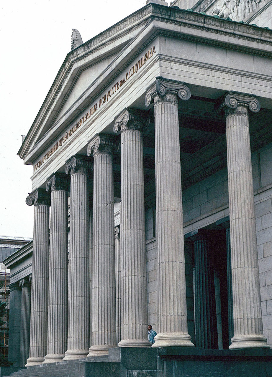
For those who are curious, here is how an Ionic portico "should" be treated (note how the capitals in the corners are adapted so that they work from both sides):

Figure-12-Pushkin-Museum-Moscow-Loth.jpg


Being a deliberate decision does not entail it being a good design decision. But I can promise that the capitals at the AA rotunda were double and triple checked before the stamp was applied to the drawings. Whether a good decision or not can be argued. Whether they made the decision with purpose, can not. I only brought up the way one circulates the building and the orientation of the capitals in such a way to "reveal" themselves as an attempt to dissect the designers intent. Not defend it as a "good" design decision.

But all of this is beside the point. I was asked to show examples of the Imagineers doing things that go against the rules. Whether one likes the result or not (and I do!), and whatever the intention behind it, the design of the American Adventure's rotunda is a very obvious instance of this phenomenon. I really don't understand why this is proving so contentious an issue.
 
Last edited:

Missing20K

Well-Known Member
If it results in something that is unattested in existing Georgian townhouses, I don't think it's adding at all to the building's accuracy.


Those two rows are absolutely standard, because their capitals run in line with the architraves they support. It's a very different situation from the four columns immediately behind the facade colonnade, as these have capitals that are perpendicular to the architraves.

For those who are curious, here is how an Ionic portico "should" be treated (note how the capitals in the corners are adapted so that they work from both sides):

Figure-12-Pushkin-Museum-Moscow-Loth.jpg


But all of this is beside the point. I was asked to show examples of the Imagineers doing things that go against the rules. Whether one likes the result of not (and I do!), the American Adventure rotunda is a very obvious instance of this phenomenon. I really don't understand why this is proving so contentious an issue.
What rules?

You post a picture of an Ionic portico and say this is how it "should" be done, with should in quotations, implying you yourself understand that not all Ionic colonnades are designed in the same manner. The AA rotunda "should" also have fluted columns, but they don't. Even in your example, they are mixing two-sided and four-sided capitals, which would not be considered "normal" either. Generally, one would use all two-sided, or all four-sided. Again, not a rule, but a common occurrence for this style.

This is why it's a contentious issue with a couple of us fellow members. Because you are pointing out how some WS designs are going "against the rules" but some of us are pointing out that there are, in fact, no hard and fast "rules" for any architectural movement. Architectural movements evolve and overlap and transition within and around one another, influencing later movements and re-interpreting earlier ones. The decisions imagineers made during design of WS may be either "good" or "bad" depending on one's personal taste. But the idea that WS is inauthentic because of WDI "breaking the rules" is misguided, simply because the "rules" don't exist. The "authenticity" of WS is enhanced by the vernacular touches, not washed away.

The "rules" I am harping on are not historical architectural design "rules" but are simply matters of how the concept art depicts, or does not depict, accurate constructability for the desired themed environment.
 

Sir_Cliff

Well-Known Member
Thank you for this. As has happened before in other threads, your thoughts pretty much mirror my own, and you’ve managed to convey them far more succinctly and eloquently than I seem to have been able to.

I’m smiling as I imagine eating at the crêperie one day and replaying this unwieldy thread in my head!
As always, you're too kind! I think what you're saying is perfectly clear. I am also looking forward to eating at this bizarro crêperie one day and thinking about all the wailing and gnashing of teeth it has provoked!

Honestly, I envy the amount of architectural knowledge on display in this thread and wish I knew so much on the topic. For me personally, though, I am struggling to understand why there is a need to defend the Imagineers' faithful adherence to different architectural principles at all. That's not what I've ever understood Imagineering to be about.

If we want an example in World Showcase where all the rules of real world authenticity are thrown out the window, just look at the Mexico Pavilion. The exterior of that pavilion mashes up elements from Uxmal, Teotihuacán, Tenochtitlán, and possibly elsewhere into a "Mesoamerican" temple. These are all elements from cities and civilisations that existed different times and places but that happen to fall within the current national territory of Mexico. A structure like that would never exist in the real world, but all the different elements blend together into an unproblematic image of precolombian Mexico (pyramid, Mayan carvings, etc) for most guests. That's more or less what I've always understood Imagineering to be about.
 

Register on WDWMAGIC. This sidebar will go away, and you'll see fewer ads.

Back
Top Bottom