Before anything else (and I added this last when I should have written it first), thank you for your detailed and thought-provoking response.
This is all very important and true, but the implication is that I'm guilty of the oversimplification you caution against, which I don't think is a fair characterisation at all. Each example I provide is measured against the (admittedly pliable) norms of its own geographical and historical context.
Though the statue and its rocky setting are indeed Berninesque (not to mention reminiscent of the Trevi Fountain), the structure itself looks more Neoclassical than it does Baroque (at least to my eyes). This in itself speaks to the the lack of architectural purism at World Showcase. However one reads the fountain's style, I have never seen a tympanum that contains a finial [ETA: I found one Neo-Baroque example, shown in the next post]. Finials, if they play by the rules, go on top of things, not inside them. This is an example of a design that does not reflect the conventions of any breed of classicism I know, including the Baroque. And as I note in a subsequent post, I've struggled to find even a single Italian example of this particular type of finial (though I know they must be out there [ETA: Indeed, I finally found one; see the post below]). All of which is to say that the person who drew up this fountain was clearly willing to do things a little differently from the artists and architects who inspired him/her.
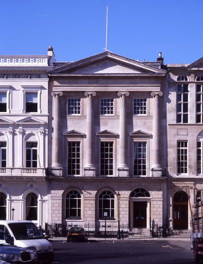
As you know, the examples at the Jefferson Memorial are tucked behind the principal columns of the entrance portico. Can you show me a single Ionic colonnade in which all of the capitals are oriented as they are at the American Adventure? I wouldn't be surprised if the only one in existence is at Walt Disney World.
Which is the point I'm trying to make for the whole of World Showcase. Storytelling takes precedence over authenticity, as well it should.
I personally find it charming!
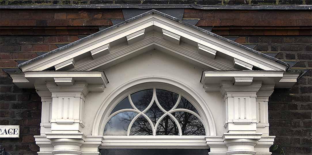
Be that as it may, I've never seen a Georgian townhouse whose chimney rises, without any sort of articulation, directly out of the brickwork of the facade. Nor have I seen any with discontinuous coping. And we're still left with the visual suggestion of nonsensically located fireplaces.
It doesn't differ. It's simply one of many examples of the unconstrained approach that, to a lesser or greater extent, is at play in all of the pavilions.
I didn't say it was, and I never referred to shortcomings.
This, I think, is where we fundamentally disagree. I don't believe that the desired goal of all that effort is authenticity per se, but a sort of imaginative simulacrum of authenticity that is rich in real-life details even as it feels fantastic and whimsical. The Imagineers clearly did their homework and have very successfully evoked the countries and cultures they set out to. They did not, however, hold back from reconfiguring their models and even, at times, defying the norms of the very traditions they cite. And to my mind at least, the result is more interesting and compelling for these "inaccuracies".
Evaluating the classical elements of World Showcase through the lens Neoclassicism is a fundamentally flawed exercise. The cultural dominance and decline of the École des Beaux-Arts followed by the rise of Modernism in the early 19th century has perpetuated the idea that [Neo]classicism is one singular style with very defined rules. This is a key part of how Modernism viewed itself, breaking free of tradition, dogma and the École. Taking a brief (but somewhat related) aside to recent events, the term “Gothic” was applied to buildings like Notre Dame des Paris during the Renaissance to associate their lack of classical forms with the Goths and the sacking of Rome. This simplified narrative of Classical overlooks the “complexity and contradiction” (to steal a phrase from Robert Venturi) of a few hundred years of competing and reacting thoughts regarding Classical architecture. Neoclassicism, as a proper noun, is a specific period and set of ideas regarding Classical architecture which was a reaction against the opulence of the Rocco / Late Baroque style, which was still a Classical style. The Renaissance was the start of reviving Classical design but it became “less pure” and more ornate as styles progressed in the Mannerist, Baroque and Rococo / Late Baroque periods until there a desire to return to something more rooted in the perceived simplicity and elegance of Rome, Neoclassicism. This period was then followed by other styles that were also classical revivals and they all differed in their general views and interpretations of Classical design.
This is all very important and true, but the implication is that I'm guilty of the oversimplification you caution against, which I don't think is a fair characterisation at all. Each example I provide is measured against the (admittedly pliable) norms of its own geographical and historical context.
The statue of Neptune in the Italy Pavilion was modeled after the work of Bernini and it is situated in front of a niche as is typical of many sculptures. It is though unusual for a building to be so completely oriented around framing a statue. The central portion of the pediment, where the pinecone is located, is the tympanum, a space which has no consistent form. Tympanum design ranges the entire gamut from a plain surface to highly intricate relief sculpture. In architecture, Neoclassicism was a simplified, flatter reaction against the opulence of Rococo / Late Baroque design. While there is ample precedent, this does mean that a flat tympanum is a bit too plain for a frame for a Baroque statue while having its own Baroque sculpture would compete for attention with the statue. A circle is a common, simple geometric form often placed in the tympanum but is more associated with Renaissance design whereas the Baroque, in focusing less on pure geometry, tended to favor the oval and more ornamental designs. The Roman pinecone is probably not an ideal image to use but it is also not entirely out of line as it is a symbol that comes from antiquity. Religious (Catholic) imagery would have been the most typical for a pediment, including many oval-based designs, but seems like it too would be an odd choice as a backdrop for a statue of Neptune.
Though the statue and its rocky setting are indeed Berninesque (not to mention reminiscent of the Trevi Fountain), the structure itself looks more Neoclassical than it does Baroque (at least to my eyes). This in itself speaks to the the lack of architectural purism at World Showcase. However one reads the fountain's style, I have never seen a tympanum that contains a finial [ETA: I found one Neo-Baroque example, shown in the next post]. Finials, if they play by the rules, go on top of things, not inside them. This is an example of a design that does not reflect the conventions of any breed of classicism I know, including the Baroque. And as I note in a subsequent post, I've struggled to find even a single Italian example of this particular type of finial (though I know they must be out there [ETA: Indeed, I finally found one; see the post below]). All of which is to say that the person who drew up this fountain was clearly willing to do things a little differently from the artists and architects who inspired him/her.
Ionic columns perpendicular to the entablature are rare but they do occur, including on the front of the Jefferson Memorial.
As you know, the examples at the Jefferson Memorial are tucked behind the principal columns of the entrance portico. Can you show me a single Ionic colonnade in which all of the capitals are oriented as they are at the American Adventure? I wouldn't be surprised if the only one in existence is at Walt Disney World.
The doorway with the stacked columns does not appear as though it is supposed to be a Classical design. Instead it appears to be an attempt at storytelling.
Which is the point I'm trying to make for the whole of World Showcase. Storytelling takes precedence over authenticity, as well it should.
It’s not a particularly good looking design
I personally find it charming!
With regards to the Georgian building, it doesn’t have a cornice. That is coping and would not be continuous.
Be that as it may, I've never seen a Georgian townhouse whose chimney rises, without any sort of articulation, directly out of the brickwork of the facade. Nor have I seen any with discontinuous coping. And we're still left with the visual suggestion of nonsensically located fireplaces.
The whole pavilion is more focused on different styles crammed together and filling in spaces so I fail to see how this really differs.
It doesn't differ. It's simply one of many examples of the unconstrained approach that, to a lesser or greater extent, is at play in all of the pavilions.
None of this really means that the idea of authenticity in themed design is bunk. Ideals and goals are not automatically negated by any and all shortcomings.
I didn't say it was, and I never referred to shortcomings.
There is far, far more effort big and small that shows authenticity as the desired goal.
This, I think, is where we fundamentally disagree. I don't believe that the desired goal of all that effort is authenticity per se, but a sort of imaginative simulacrum of authenticity that is rich in real-life details even as it feels fantastic and whimsical. The Imagineers clearly did their homework and have very successfully evoked the countries and cultures they set out to. They did not, however, hold back from reconfiguring their models and even, at times, defying the norms of the very traditions they cite. And to my mind at least, the result is more interesting and compelling for these "inaccuracies".
Last edited:


")

")
 My point remains that if it were a mistake it would have been addressed during the construction document phase.