An Incredible New EPCOT Blog

techiegsy

Member
Hmm... I have always been looking for a way to unify the logos of the attractions, like for EPCOT Center, but without reusing the old designs to make them more modern. And I think this guy has really got it, If we has a hexagon for each logo, and each logo based on the same design, we could finally give some cohesion to the mess of attraction/pavilion logos at the moment.

Something Like this (Maybe for SSE):
Icon+-+Legacy.png


What'dayathink?
 

cblodg

Member
Hmm... I have always been looking for a way to unify the logos of the attractions, like for EPCOT Center, but without reusing the old designs to make them more modern. And I think this guy has really got it, If we has a hexagon for each logo, and each logo based on the same design, we could finally give some cohesion to the mess of attraction/pavilion logos at the moment.

Something Like this (Maybe for SSE):
Icon+-+Legacy.png


What'dayathink?

That is absolutely BEAUTIFUL!!! :sohappy:
 

Mr.EPCOT

Active Member
Original Poster
Hmm... I have always been looking for a way to unify the logos of the attractions, like for EPCOT Center, but without reusing the old designs to make them more modern. And I think this guy has really got it, If we has a hexagon for each logo, and each logo based on the same design, we could finally give some cohesion to the mess of attraction/pavilion logos at the moment.

Something Like this (Maybe for SSE):
Icon+-+Legacy.png


What'dayathink?

I don't know, I love love love that graphic, but the beauty of the original symbol set is the simplicity and abstract representation of the pavilions topic, not the building itself. They each capture that perfectly, and think there's no reason they couldn't just keep using them.
 

Testtrack321

Well-Known Member
How so? That's all original use of the old logo.

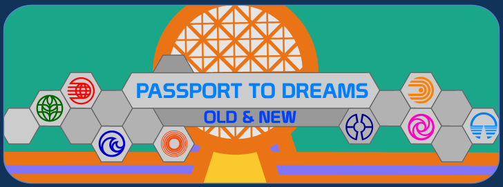
I think it was a mistake on my part, the Centorum logo he threw up there I now think was an old logo used in park, not his own creation. I saw this and though of the Passport to Dreams banner...

PTDLogo5.png


I still stand by the fact I still find the designs ugly and unimaginative. Chrome and beveling doesn't equal the future or good design. As for the wallpaper, I think it needs some dolphins and whales...
 

Future Guy

Active Member
I think it was a mistake on my part, the Centorum logo he threw up there I now think was an old logo used in park, not his own creation. I saw this and though of the Passport to Dreams banner...

I still stand by the fact I still find the designs ugly and unimaginative. Chrome and beveling doesn't equal the future or good design. As for the wallpaper, I think it needs some dolphins and whales...

Right, it's a reproduction of Centorium's original sign. I think the blog is awesome. Already following.
 

Mr.EPCOT

Active Member
Original Poster
The top one? Hopefully in the archives....waiting to be put back. :o

The original bronze one was sold on eBay, can you believe that?!:mad:

I think they should put it right in the spot where the park was dedicated...


The Fountain stage! :lookaroun :lol:

But seriously, they should incorporate it into a new design for the fountain in front of Spaceship Earth.

And what original bronze plaque are you referring to?
 

EPCOT Explorer

New Member
I think they put it right where the park was dedicated...


The Fountain stage! :lookaroun :lol:

But seriously, they should incorporate it into a new design for the fountain in front of Spaceship Earth.

And what original bronze plaque are you referring to?
In front of the American Pavilion and Spaceship Earth.

ERIN WALLACE FAIL.:fork::lol:

I agree. On the fountain, if anything. On a Pylon. ;)

And the Bronze Plaque I posted isn't the original. Look at the EPCOT logo. They changed it out in 1994.:brick:


Sorry.:-)
 

techiegsy

Member
I don't know, I love love love that graphic, but the beauty of the original symbol set is the simplicity and abstract representation of the pavilions topic, not the building itself. They each capture that perfectly, and think there's no reason they couldn't just keep using them.

I think they need to be updated before they get used again, but I think we need a universal logo set back!
 

Register on WDWMAGIC. This sidebar will go away, and you'll see fewer ads.

Back
Top Bottom