-
Welcome to the WDWMAGIC.COM Forums!
Please take a look around, and feel free to sign up and join the community.
You are using an out of date browser. It may not display this or other websites correctly.
You should upgrade or use an alternative browser.
You should upgrade or use an alternative browser.
AMC Theater finally getting a replacement at Downtown Disney
- Thread starter Sharon&Susan
- Start date
CaptinEO
Well-Known Member
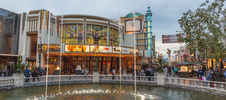
I actually find all these examples "more Disney" than Disney themselves.True. But The Grove or The Americana in LA, or the Irvine Spectrum or Pacific City in OC were purpose-built for all that. Downtown Disney circa 2001 turned out to be a pleasant and very modest sized cheaper versions of those other SoCal malls. No trolley systems, no fountain shows, no carousels, no elaborate architecture and dynamic spaces. Downtown Disney was a noticeable downgrade from those other glamour centers and was just sort of... pleasant.
This latest strip mall replacement for AMC is underwhelming, especially compared to The Grove, Americana, Spectrum, etc..
The Grove, west Los Angeles
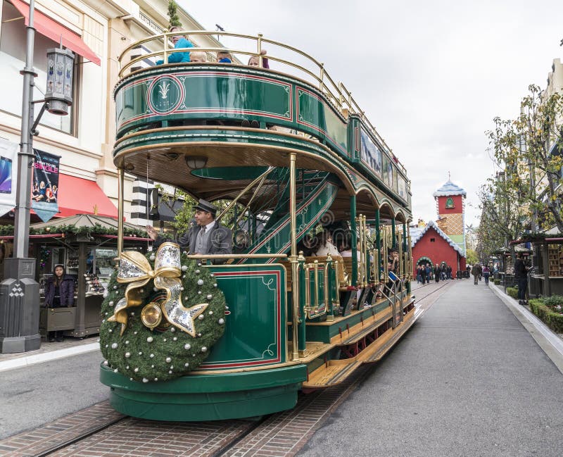
The Americana, Glendale
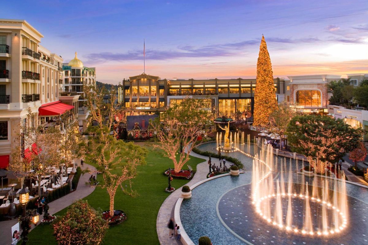
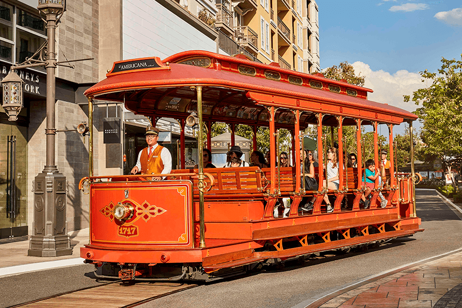
The Spectrum, Irvine
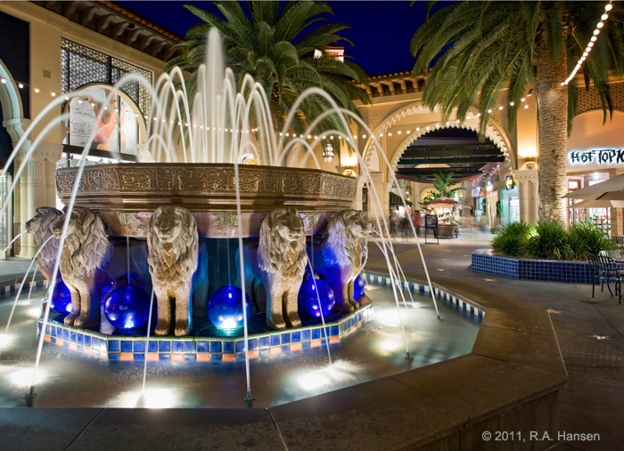

So compared to other big "lifestyle centers" around SoCal, no that new strip mall at Downtown Disney replacing the old AMC is not impressive. Nor is it memorable, or worth all the words they used to try and make it seem far more exciting than it is.
DrAlice
Well-Known Member
We're just cynical about Disney's corporate speak. It's a bit much. Here's an analogy of our complaint: Don't brag and gush that you're going to give me filet mignon when you are really just serving an upscale hamburger.jeez some people are just so negative its like they get off on being pesimistic....
ANY change to that end of DT Disney is welcome and will be better than empty buildings. I don't think any of us are negative about that. I think we all like the concept art, too. It's nice. But, that's it. It's just nice. So don't try to sell it that it's going to be earth-shattering architecture. They could've had a nice positive "Pardon our Pixie Dust" kind-of announcement that let people know that they were revitalizing that end of DT Disney without going into all the hyperbole and you probably wouldn't have seen so much cynicism on this board.
P.S. Also, a reminder that this forum is the self-proclaimed "Hive of Miserable B@stards" so.......
TP2000
Well-Known Member
jeez some people are just so negative its like they get off on being pesimistic....
Just calling it like I see it.
Did you not read Disney's press release on these new mall boxes for a few restaurants and shops?
I mean, honestly, their own announcement was way over the top for what they are doing; tearing down the abandoned AMC and building a small strip mall. Every company gilds the lily a bit when they announce something new, but you shouldn't lie and exaggerate too much or else people stop listening to you.
"Stunning new lifestyle space"... "Southern California mid-century modern architecture"... "a beautiful blend of vibrant color palettes, multi-cultural design elements and patterns"
In smarmy and meaningless Disneyspeak, all those words mean this basic box of retail/dining...
Last edited:
Disney Irish
Premium Member
Honest question, how is this different than any other corporate product announcement press release of the last 20+ years?Just calling it like I see it.
Did you not read Disney's press release on these new mall boxes for a few restaurants and shops?
I mean, honestly, their own announcement was way over the top for what they are doing; tearing down the abandoned AMC and building a small strip mall. Every company gilds the lily a bit when they announce something new, but you shouldn't lie and exaggerate too much or else people stop listening to you.
"Stunning new lifestyle space"... "Southern California mid-century modern architecture"... "a beautiful blend of vibrant color palettes, multi-cultural design elements and patterns"
In smarmy and meaningless Disneyspeak, all those words mean this basic box of retail/dining...
View attachment 602387
Why do "we" expect Disney to be basic and bland (which is what you're asking for when saying "basic box of retail/dining") when the corporate landscape for product press releases is to "schmaltz it up" when describing the product?
Also I don't see Disney is lying or exaggerating too much in this press release just because the words don't match what you personally see in the single piece of concept art. There is a reason why the concept art says "artist concept only". Its meant to just give you a basic idea of what the project "COULD" look like, not a one-for-one exact detailed rendering of the project blueprints.
TP2000
Well-Known Member
Also I don't see Disney is lying or exaggerating too much in this press release just because the words don't match what you personally see in the single piece of concept art. There is a reason why the concept art says "artist concept only". Its meant to just give you a basic idea of what the project "COULD" look like, not a one-for-one exact detailed rendering of the project blueprints.
I don't see any of the things Disney is describing in that concept sketch. Or, if there is a hint of something (perhaps the beige building on the right with the white trusses supporting the awning will actually look like the famous Coachella Valley Savings & Loan building?), it's been alarmingly turned into a boxy strip mall with some pasted-on whimsy.
If you see those descriptions in that concept sketch, I admire your ability to dance along with corporate press releases. But if you'd indulge us in what you see, please label the following quotes from Disney on this piece of concept art;
1. Multi-Cultural Design Elements
2. Southern California Mid-Century Modern Architecture
3. Beautiful Blend of Vibrant Color Palettes
4. Stunning Lifestyle Space
TP2000
Well-Known Member
Two big pieces of abandoned property were left out of this announcement; the ESPNZone and the Rainforest Cafe. I wonder what will replace those two blocks? And I wonder how on earth they're going to describe whatever it is that replaces them?
If that new strip mall with the lawn is a "stunning lifestyle space" with "multi-cultural design" and "vibrant color palettes", I can only imagine what otherworldly delights the Great Communicators in TDA will come up with to describe Phase Two!
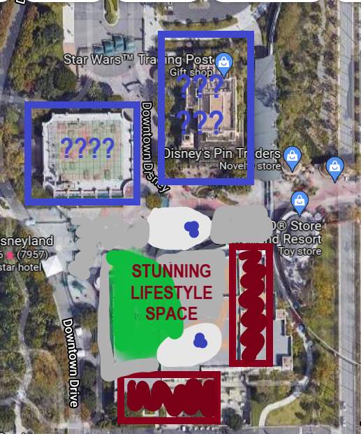
If that new strip mall with the lawn is a "stunning lifestyle space" with "multi-cultural design" and "vibrant color palettes", I can only imagine what otherworldly delights the Great Communicators in TDA will come up with to describe Phase Two!
Disney Irish
Premium Member
I don't see any of the things Disney is describing in that concept sketch. Or, if there is a hint of something (perhaps the beige building on the right with the white trusses supporting the awning will actually look like the famous Coachella Valley Savings & Loan building?), it's been alarmingly turned into a boxy strip mall with some pasted-on whimsy.
If you see those descriptions in that concept sketch, I admire your ability to dance along with corporate press releases. But if you'd indulge us in what you see, please label the following quotes from Disney on this piece of concept art;
1. Multi-Cultural Design Elements
2. Southern California Mid-Century Modern Architecture
3. Beautiful Blend of Vibrant Color Palettes
4. Stunning Lifestyle Space
View attachment 602397
Well first lets get the correct entire image of the concept art:

Second, lets look at the overall color palette of the image itself. Lots of greens, blues, yellows, and reds, but an overall color palette representative of what you might find on an artists paint palette.
Third, lets look at this corner for a second:
This awning (as well as the other one in the upper right of the concept art) is meant to represent the artists palette itself.
Now sticking with this same corner, look what is coming up out of the thumb hole of the palette, something evoking a very mid-century modern design.
And as for the lifestyle space and multi-culture design. That might not be on display in this concept art outside of the green lawn area but we are just in the beginning stages. I'm sure more will come out as time goes on.
Disney appears to be paying respects to its artistic roots with some of these projects.
TP2000
Well-Known Member
Well first lets get the correct entire image of the concept art:

Second, lets look at the overall color palette of the image itself. Lots of greens, blues, yellows, and reds, but an overall color palette representative of what you might find on an artists paint palette.
Third, lets look at this corner for a second:
View attachment 602400
This awning (as well as the other one in the upper right of the concept art) is meant to represent the artists palette itself.
Now sticking with this same corner, look what is coming up out of the thumb hole of the palette, something evoking a very mid-century modern design.
And as for the lifestyle space and multi-culture design. That might not be on display in this concept art outside of the green lawn area but we are just in the beginning stages. I'm sure more will come out as time goes on.
Disney appears to be paying respects to its artistic roots with some of these projects.
That's the new security screening structure in the corner, that will finally replace the "temporary" tents they've had there for years. It looks nice, and I agree it's got a mid-century aesthetic that is a great choice against the backdrop of the Disneyland Hotel.
It will be a huge improvement over what's been there for years, as the "Guest Arrival Experience" for people paying hundreds of dollars per night for the "World Class Resort" experience at the Disneyland Hotel.
You Are Immersed In Magic!

Disney Irish
Premium Member
Sorry but I don't think that is a new security screening area being represented.That's the new security screening structure in the corner, that will finally replace the "temporary" tents they've had there for years. It looks nice, and I agree it's got a mid-century aesthetic that is a great choice against the backdrop of the Disneyland Hotel.
It will be a huge improvement over what's been there for years, as the "Guest Arrival Experience" for people paying hundreds of dollars per night for the "World Class Resort" experience at the Disneyland Hotel.
You Are Immersed In Magic!

If you notice its very open, not very secure.
The screening area would be outside of the view of this concept art.
DrAlice
Well-Known Member
Because Disney's intended corporate image is one of a Premium brand (the so-called "Disney difference"). At one point in time, Disney did not have to resort to smarmy corporate speak. They just announced their intentions and then the amazing product that was delivered spoke for itself. The recent corporate announcements declare the latest offerings will live up to the "Disney difference" standard, but in reality they have been the same or less than what can be found elsewhere (for cheaper!).Honest question, how is this different than any other corporate product announcement press release of the last 20+ years?
tl;dr: We hold Disney to a higher standard, because for decades they have told us to do just that! (And they've charged us accordingly!)
Disney Irish
Premium Member
What you're talking about is from a completely different era of Disney, pre-70s Disney. This has been the same type of corporate speak coming out of Disney for 20+ years, since the mid-90s at least. Its the same corporate speak coming out of all corporation since the mid-90s.Because Disney's intended corporate image is one of a Premium brand (the so-called "Disney difference"). At one point in time, Disney did not have to resort to smarmy corporate speak. They just announced their intentions and then the amazing product that was delivered spoke for itself. The recent corporate announcements declare the latest offerings will live up to the "Disney difference" standard, but in reality they have been the same or less than what can be found elsewhere (for cheaper!).
tl;dr: We hold Disney to a higher standard, because for decades they have told us to do just that! (And they've charged us accordingly!)
TP2000
Well-Known Member
Sorry but I don't think that is a new security screening area being represented.
If you notice its very open, not very secure.
The screening area would be outside of the view of this concept art.
I'm pretty sure that's an artistic interpretation of the new security screening area. Notice the cow-catcher walls leading up to it. Also remember that for years now Downtown Disney has been "inside the security envelope" for the Resort, and I doubt they'll change that strategy.
This new
Vegas Disney Fan
Well-Known Member
Sorry but I don't think that is a new security screening area being represented.
If you notice its very open, not very secure.
The screening area would be outside of the view of this concept art.
I think you are correct, it looks like there will be 3 new buildings and a courtyard where the AMC building was, I think the current security area will be north of this concept art.
In the concept art the north edge of the building is where the monorail track corner ends.
I hope I’m wrong but I don’t think we’ll get a new security area as part of this project.
Last edited:
Figments Friend
Well-Known Member
Let me see if I can write a Disney-level press release. It seems fairly easy, if you've got your adjectives ready.
Bringing the west end of Centervale Avenue to life, a stunning new lifestyle space has just opened west of WalMart that reflects this beautiful and vibrant community. Whimsy is found in the different roof heights and attached pergolas, while sidewalk tables reminiscent of European cafe society welcome shady relaxation, and a creamy palette of colors ignites the imagination. The multi-cultural communities who call Centervale home are reflected in the global-fusion cuisines on offer, from Panda Express to Chipotle, along with a focus on health and beauty with a Happy Nails and a Supercuts. Ample parking awaits at Centervale's nexus of lifestyle and diversity!

Bob called... and said that you are hired.
Can you start next week?
-
TP2000
Well-Known Member
Because Disney's intended corporate image is one of a Premium brand (the so-called "Disney difference"). At one point in time, Disney did not have to resort to smarmy corporate speak. They just announced their intentions and then the amazing product that was delivered spoke for itself. The recent corporate announcements declare the latest offerings will live up to the "Disney difference" standard, but in reality they have been the same or less than what can be found elsewhere (for cheaper!).
tl;dr: We hold Disney to a higher standard, because for decades they have told us to do just that! (And they've charged us accordingly!)
Beautifully said.
And it's exactly why so many of us make fun of Disney's recent media statements, and their other pre-crafted communication like the Parks Blog. It's been building for years, but the stuff they are publishing lately via various formats and departments has really become laughably pukey and just... smarmy. It's gross.
Walt was the complete and total opposite of these 30something "communicators" that Disney employs now. Walt humbly underplayed everything and just let the extremely high quality product do most of the talking.
In 1965 Walt went on national network color television and explained Disneyland's new ride this way...
"People are going to get on a boat here and ride through the lagoon, and then as they get around here we're going to take them down a waterfall! And we'll take 'em back into the past, into the days of pirates, you know where the whole caribbean area was full of pirates and they were always sacking towns and things."
That's how Walt humbly introduced Pirates of the Caribbean to America. And things.
So you'll have to excuse us if we roll our eyes, laugh at them, and then tune out their pukey blather that describes a small, nicely landscaped strip mall as a "multi-cultural stunning lifestyle space".
Disney Irish
Premium Member
I'm pretty sure that's an artistic interpretation of the new security screening area. Notice the cow-catcher walls leading up to it. Also remember that for years now Downtown Disney has been "inside the security envelope" for the Resort, and I doubt they'll change that strategy.
This newsection of mallstunning lifestyle space is inside this security bubble, and beyond this security screening structure.
View attachment 602416
Look at the Monorail in the top of the concept art. If we take that as our orientation then that left awning would be basically between where Rainforest Cafe and ESPN buildings are today. And that awning to the upper right would be where AMC ticket kiosk is today.
Again the screening area would be just out of view in the bottom of the concept art.
Disney Irish
Premium Member
Beautifully said.
And it's exactly why so many of us make fun of Disney's recent media statements, and their other pre-crafted communication like the Parks Blog. It's been building for years, but the stuff they are publishing lately via various formats and departments has really become laughably pukey and just... smarmy. It's gross.
Walt was the complete and total opposite of these 30something "communicators" that Disney employs now. Walt humbly underplayed everything and just let the extremely high quality product do most of the talking.
In 1965 Walt went on national network color television and explained Disneyland's new ride this way...
"People are going to get on a boat here and ride through the lagoon, and then as they get around here we're going to take them down a waterfall! And we'll take 'em back into the past, into the days of pirates, you know where the whole caribbean area was full of pirates and they were always sacking towns and things."
That's how Walt humbly introduced Pirates of the Caribbean to America. And things.
So you'll have to excuse us if we roll our eyes, laugh at them, and then tune out their pukey blather that describes a small, nicely landscaped strip mall as a "multi-cultural stunning lifestyle space".
Different eras of corporations. Disney isn't unique in this, back then all product releases were done a lot differently than today. While we like to continue to hold Disney the standards of 50s-60s corporate life, we don't live in an episode of Mad Men. Corporation Communication is completely different and has been 20+ years, again Disney isn't unique here.
Vegas Disney Fan
Well-Known Member
Beautifully said.
And it's exactly why so many of us make fun of Disney's recent media statements, and their other pre-crafted communication like the Parks Blog. It's been building for years, but the stuff they are publishing lately via various formats and departments has really become laughably pukey and just... smarmy. It's gross.
Walt was the complete and total opposite of these 30something "communicators" that Disney employs now. Walt humbly underplayed everything and just let the extremely high quality product do most of the talking.
In 1965 Walt went on national network color television and explained Disneyland's new ride this way...
"People are going to get on a boat here and ride through the lagoon, and then as they get around here we're going to take them down a waterfall! And we'll take 'em back into the past, into the days of pirates, you know where the whole caribbean area was full of pirates and they were always sacking towns and things."
That's how Walt humbly introduced Pirates of the Caribbean to America. And things.
So you'll have to excuse us if we roll our eyes, laugh at them, and then tune out their pukey blather that describes a small, nicely landscaped strip mall as a "multi-cultural stunning lifestyle space".
“and things”… my favorite saying of Walt’s because it starts the imagination running.
Register on WDWMAGIC. This sidebar will go away, and you'll see fewer ads.
