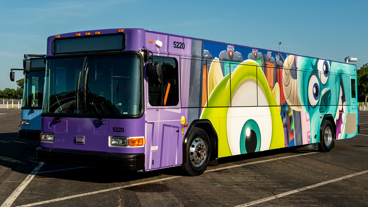
Next Gen Busses

TrainsOfDisney

Well-Known Member
As a side note.... it seems the busses are being wrapped to go with the Skyliner opening. While I would personally prefer a more character free design on both, if the idea is to change over the busses to match the skyliner that makes way more sense then just a few random character busses roaming around.

I saw some of the gondolas testing and realized the design was similar and it was one of those “ah-ha” moments.
 

rkleinlein

Well-Known Member
A far cry from the impeccable design and thoughtful details that used to set Disney parks apart from the rest. So cheesy. More visual clutter. I wonder who Disney thinks the audience is for these. For a place that caters more and more to the rich, these look SO lowbrow: cheap, tacky, and obnoxious (as wraps are in general).
 

cmb5002

Well-Known Member
Love the inside. Not a huge fan of the outside.

While the outside does have characters like the Skyliner, it still doesn't match the style. Skyliner characters are only in the window and show a somewhat classy bottom half. The buses just have the character smeared over the entire exterior, so large that you can't even see their face. Just doesn't look as classy to me. I'd be happier if they took the red and gray style and put the entire character (or at least a full image of their head) only in the window.

But hey, I don't go to Disney for the buses, they're just my method of getting to the park. Ultimately unimportant.
 

rkleinlein

Well-Known Member
These wraps though are very obnoxious. I don't understand why the images have to be so large that they have to crop the character's face.
They don't HAVE to be obnoxious. They're obnoxious because either the designers aren't good or the executives who approve the designs have no taste or understanding of good design and aesthetics. It could be both.
 

Epcot82Guy

Well-Known Member
I agree. The wraps could be very nice. These feel very garish and loud. I really am beginning to think the audience isn't the rich. As much as just the devotional character fans (and, for the young ones, their parents). My big concern there would be longevity if that's the focus. It feels like a display at Target vs. something of more long-lasting quality.
 

ImperfectPixie

Well-Known Member
I agree. The wraps could be very nice. These feel very garish and loud. I really am beginning to think the audience isn't the rich. As much as just the devotional character fans (and, for the young ones, their parents). My big concern there would be longevity if that's the focus. It feels like a display at Target vs. something of more long-lasting quality.
Wraps typically don't last more than 7-10 years anyway, so longevity isn't necessary even a concern here.
 

larryz

I'm Just A Tourist!
So cheesy.
409221
 

ThatMouse

Well-Known Member
The wraps could be a lot worse, advertising their latest thing like Disney+ or the live action remakes. They do this on the inside unfortunately where they could be using the space for more theme park related banners up there. We don't want to be taken out of the moment with ads for TV shows really.
 

raymusiccity

Well-Known Member
A far cry from the impeccable design and thoughtful details that used to set Disney parks apart from the rest. So cheesy. More visual clutter. I wonder who Disney thinks the audience is for these. For a place that caters more and more to the rich, these look SO lowbrow: cheap, tacky, and obnoxious (as wraps are in general).
Seems like quid pro quo. Isn't riding a bus, packed in like sardines, cheap and tacky to begin with?
 

412

Well-Known Member
I think that the first "fab five" wraps are fine. They look like they were thoughtfully created specifically for a bus. Moreover, they fit within Disney Transportation's overarching bus theming: bold solid colors, thick lines, etc.

These new designs are a departure from that style. They don't look like they were created with their context in mind, and they do not mesh with the previous style at all. Like others have said, they look tacky.

Busses are not the most important thing at Walt Disney World, but I think these new wraps are notable as an example of careless IP placement. With the first wraps, the IP is contextualized and integrated into the theme. With these new wraps, the IP disregards context and theme.

Across all areas of Walt Disney World, many of us are fine with the former but not the latter.
 

tirian

Well-Known Member
I really like the original releases with proper* Mickey and the gang, but these new wraps sadly emphasize that Disney isn’t interested in innovation so much as slapping cartoon characters on things and calling it a day. Yes, the new interiors will be nice until all the USB ports are broken or jammed. (How many of them still function in the Tangled restroom area?) But we know the long-awaited investment in property-wide People Movers will never happen.

Someone probably pitched this as a way to make little kids happy while waiting in bus lines.

*as opposed to the hideous Ren-n-Stimpy style going into MRR.
 

WDWFREAK53

Well-Known Member
Wow...these look tacky and cheesy.
The buses themselves are nice but the wraps just scream "cheap" to me.

A nice streamlined look across the line would've been nice. If they wanted to add character integration for the kids, a simple "name" within a band with a small character on top of the band would've worked.

All of the buses should look uniform...and these don't.
 

Register on WDWMAGIC. This sidebar will go away, and you'll see fewer ads.

Back
Top Bottom