-
Welcome to the WDWMAGIC.COM Forums!
Please take a look around, and feel free to sign up and join the community.
You are using an out of date browser. It may not display this or other websites correctly.
You should upgrade or use an alternative browser.
You should upgrade or use an alternative browser.
New color scheme on the Future World breezeway entrances
- Thread starter wdwmagic
- Start date
 :dazzle::hurl:
Sage of Time
Well-Known Member
any news?
I hope they have it done by the new year!!!
I hope they have it done by the new year!!!
ClemsonTigger
Naturally Grumpy
Seems a bit out of place, reminds me of POP Century, however, I like lime green so I'm fine with it.
I'll just have to swing by and see what it looks like in relation to its surroundings.
That was my immediate thought.
Sage of Time
Well-Known Member
POP is green?:shrug::shrug:That was my immediate thought.
Mr.EPCOT
Active Member
POP is green?:shrug::shrug:
Classic Hall (the main building) is a similar shade of green.
EPCOT Explorer
New Member
Totally got very excited when I saw this bumped....:dazzle: :lol:
:lol:
:lol:WDW Vacationer
Active Member
There is a plan.So, we are seeing a lot of "little" changes to Epcot recently. What's the plan here? There has to be something bigger at work.
Mr.EPCOT
Active Member
Yup.
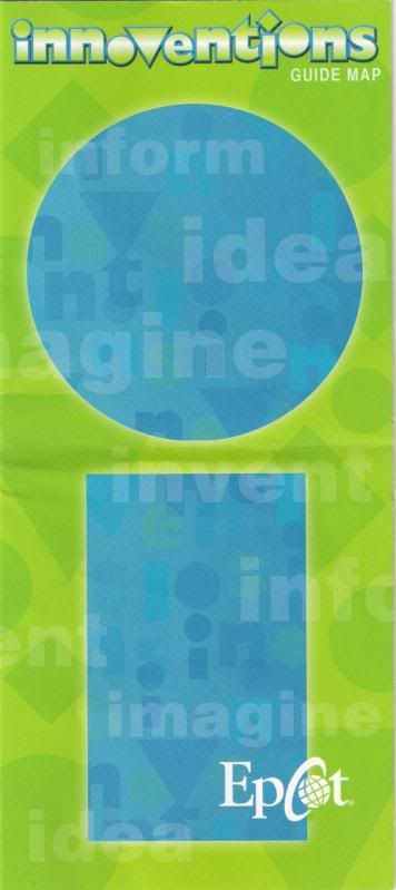
Updated Innoventions Guidemaps! It's too bad they don't include ALL of Innoventions like they should, the southern quadrants with MouseGear, Fountain View, and Club Cool.
East side, notably with a blurb about the upcoming Sum of All Thrills.

West, including the new Great Piggy Bank Adventure.

The new Safety Smart Lab addition to the UL Test the Limits Lab in Innoventions East looks to be almost done. This will feature Timon and Pumbaa.

You know, sitting here in Innoventions East, working on this post, has made me realize what a perfect example the UL 'exhibit' (I use that word lightly) is of the terrible contrast between CommuniCore and Innoventions. You walk into CommuniCore and it was open, inviting, light, somewhat soothing, somewhat compelling, not at all noisy, maybe a little soothing, easy to navigate, and all-around pleasant. Innoventions dark, very noisy, chaotic, visually abrasive, maybe a little intimidating, obviously very randomly laid out, claustrophobic, and overall quite meaningless. I've seen at least three or four parties walk in, take a look at what's going on, and walk right back out, all within the past few minutes. Setting aside any personal bias, it would seem to me that the CommuniCore model for the pavilion would be more attractive to potential sponsors. How many people walk in here on a daily basis, see the insanity that's going on, and move right on without even getting a glimpse of the companies that might be displaying cool stuff?
EPCOT Explorer
New Member
The colors now match the new maps for Innoventions.
Love the maps...

That "i" might be our new logo...
WDW Vacationer
Active Member
Love the maps...
That "i" might be our new logo...
Whose new logo?
EPCOT Explorer
New Member
Whose new logo?
Innoventions...:lol:
WDW Vacationer
Active Member
Innoventions...:lol:
Oh, duh!:hammer:
EPCOT Explorer
New Member
Oh, duh!:hammer:
Nah, shoulda been clearer.
WDW Vacationer
Active Member

EPCOT Explorer
New Member
The Conundrum
New Member
The new map looks horrible as do the colors. Epcot continues to spiral downward.
Seriously, im starting to get half a mind to dedicate my life to creating an an entertainment enterprise that will stand for Walt Disney's original principles, commitment to excellence, and ideals to march foward into the future because the current Walt Disney media giant has lost touched with what used to make it so great.
Seriously, im starting to get half a mind to dedicate my life to creating an an entertainment enterprise that will stand for Walt Disney's original principles, commitment to excellence, and ideals to march foward into the future because the current Walt Disney media giant has lost touched with what used to make it so great.
EPCOT Explorer
New Member
The new map looks horrible as do the colors. Epcot continues to spiral downward.
Seriously, im starting to get half a mind to dedicate my life to creating an an entertainment enterprise that will stand for Walt Disney's original principles, commitment to excellence, and ideals to march foward into the future because the current Walt Disney media giant has lost touched with what used to make it so great.
Opinion. I think the colors look good...FOR WHAT'S BEEN DONE. We havn't seen the rest.
Saying that, it's going up...This is much better than tan, pink, and purple. And clutter.:shrug:
DO like the idea, though.:wave:
Register on WDWMAGIC. This sidebar will go away, and you'll see fewer ads.