Which Logo Do You Like Better?

Which Logo Do You Like Better?

  • The Old One

    Votes: 58 36.5%
  • The New One

    Votes: 95 59.7%
  • Neither

    Votes: 6 3.8%

  • Total voters
    159
  • Poll closed .

tirian

Well-Known Member
I chose the old one, but I would not want to see it brought back. It looks too dated, and is better suited for a few retro products here and there, and the occasional reference (See the monorails and SpectroMagic).

From a marketing and brand strength perspective, I think the new logo is absolutely rock solid, and I wouldn't want to see it changed. I wouldn't mind seeing the Mickey Globe incorporated somehow, but otherwise, it is absolutely perfect.

I voted "neither," because the old one is beyond outdated and the new one is too generic.

The mouse globe definitely needs to come back, but not as a letter, and certainly not in a weird combination of the Walt Disney script and 70s blockiness.

I agree with the person who said the "D" resembles a backwards "G"; it does, but this also makes it instantly recognizable.
 

kimmykimmy

New Member
I like them both, actually. =)
I think the old one represents vintage Disney, while the new one corresponds quite nicely with the new updates that have been brought to the parks.
 

DME

Well-Known Member
I chose the old one, but I would not want to see it brought back. It looks too dated, and is better suited for a few retro products here and there, and the occasional reference (See the monorails and SpectroMagic).

From a marketing and brand strength perspective, I think the new logo is absolutely rock solid, and I wouldn't want to see it changed. I wouldn't mind seeing the Mickey Globe incorporated somehow, but otherwise, it is absolutely perfect.

I agree with you 100%
 

WDWFigment

Well-Known Member
I voted "neither," because the old one is beyond outdated and the new one is too generic.

The mouse globe definitely needs to come back, but not as a letter, and certainly not in a weird combination of the Walt Disney script and 70s blockiness.

I agree with the person who said the "D" resembles a backwards "G"; it does, but this also makes it instantly recognizable.

I'll agree that the current logo is generic, and although I really hate that most of the time, I think this is one of those instances where being generic isn't such a bad thing. Unfortunately, the general public doesn't love WDW as much as us (maybe that's not "unfortunate). While we have no trouble associating this Disney product with others, some do. I think the current logo's resemblance to other Disney products establishes a strong connection between the products with consumers.

Companies spend a lot of money to create and protect a strong and cohesive brand. They are not going to allow confusion among their products or between their products and other brands. Therefore, I think the "Waltograph" signature is an important part of these Disney logos (someone, perhaps you, made the argument in another thread that the logo is generic because the font can be downloaded by anyone. Well, the same goes for the old logo's font and just about every font used at WDW).

Look at it this way--some aspect of the product is going to be genericized due to consumer confusion. Would you rather have it be the overarching name, or each individual product's name (Walt Disney's Magic Kingdom, Walt Disney's Epcot...perhaps even Walt Disney's Space Mountain, etc.)? I think the current logo strikes a good balance while incorporating something "of Walt" in its presentation. Adding the globe would be really nice, but I'd be content with just adding that globe to places throughout the parks (maybe a flag at the train station, etc.).

...If those arguments don't sell you, think of the costs of rebranding everything. Is a slight variation in Walt's signature that big of a deal? Is it more important than plussing or refurbishing an attraction?
 

EpScott

Member
I am a huge logo freak, so this thread is right up my alley! I happen to like both logotypes; the old one is forever linked in my head with good memories of Disney World from my younger years, while the new one brings a level of sophistication that just isn't inherent in the block-style letters. As far as corporate identity---the new one is the way to go, hands down. And adding a mouse globe could still be done in a manner that would keep it in line with the refined newer look.

p.s.----I love the "Disney" corporate script that is based on Walt's signature!!!
 

BriLee

New Member
I like the new one. I started going to WDW in '03, so I never really knew what the old one looked like. At least I can't remember seeing it. The new is more "disney magic" looking :)
 
Ask and you shall receive:

Slide1-10-1.jpg

Vey nice combination! I actually prefer the old over the new. This example offered here could really work for something new and yet something old!
 

DisneyEverest

Member
Original Poster
I voted old because I miss the Mickey glode being incorporated. Ideally, I would like to see a merger of both logos. I have included a picture of my vision below. Please ignore the horrible editing on it. I made it in a couple of minutes this morning. :wave:

Slide1-9.jpg


Color Version:

Slide1-10-1.jpg
Very cool, looks great.
 

Skipper Dan

Active Member
I chose the old one, but I would not want to see it brought back. It looks too dated, and is better suited for a few retro products here and there, and the occasional reference (See the monorails and SpectroMagic).

From a marketing and brand strength perspective, I think the new logo is absolutely rock solid, and I wouldn't want to see it changed.

Agreed.

I was born during the time in which the old logo was still being used, but I was six years old when the current one was unveiled, so I am obviously partial to the current. From a designer's standpoint, I do not personally care for the "mickey globe," but if it ever had to come back, I would possibly like to see a revision of that idea. :cool:
 

hpyhnt 1000

Well-Known Member
Never really did like the overly large "D" in in the old logo, even though the Mickey globe was kind of neat. The newer one just looks nicer to me (not saying it couldn't be better, mind you), though I am a bit partial to that one since ts the only logo I've known for WDW. :eek:
 

tirian

Well-Known Member
I'll agree that the current logo is generic, and although I really hate that most of the time, I think this is one of those instances where being generic isn't such a bad thing. Unfortunately, the general public doesn't love WDW as much as us (maybe that's not "unfortunate). While we have no trouble associating this Disney product with others, some do. I think the current logo's resemblance to other Disney products establishes a strong connection between the products with consumers.

Companies spend a lot of money to create and protect a strong and cohesive brand. They are not going to allow confusion among their products or between their products and other brands. Therefore, I think the "Waltograph" signature is an important part of these Disney logos (someone, perhaps you, made the argument in another thread that the logo is generic because the font can be downloaded by anyone. Well, the same goes for the old logo's font and just about every font used at WDW).

Look at it this way--some aspect of the product is going to be genericized due to consumer confusion. Would you rather have it be the overarching name, or each individual product's name (Walt Disney's Magic Kingdom, Walt Disney's Epcot...perhaps even Walt Disney's Space Mountain, etc.)? I think the current logo strikes a good balance while incorporating something "of Walt" in its presentation. Adding the globe would be really nice, but I'd be content with just adding that globe to places throughout the parks (maybe a flag at the train station, etc.).

...If those arguments don't sell you, think of the costs of rebranding everything. Is a slight variation in Walt's signature that big of a deal? Is it more important than plussing or refurbishing an attraction?

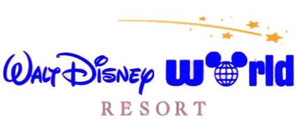
I'm not saying the script needs to be changed, just that I'd like to see it done.

BUT...

The Walt Script has become so common that the resort no longer has an identity of its own. I love the original logo for its nostalgic factor, but it's far too outdated to be used again. At least the old one gave the resort its own branded identity. "Walt Disney World" and four Macy's stars (pixie dust?) do not represent the resort as a vacation destination.

Simply reintroducing the mouse globe to stand alongside the current logotype would communicate that this is a vacation world*, not just another competitor on I-4. Plus, this wouldn't interfere with the company's marketing strength at all—people recognize that Disney script, and it would remain.

*Yes, I know that the wonderfully bland "World" is on the logo already, but the text still doesn't differentiate the "Walt Disney" part from anything else with their name on it. The point is to make the Walt Disney World logo instantly recognizable on its own terms, not just to slap the word "World" behind the company script typeface.
 

Register on WDWMAGIC. This sidebar will go away, and you'll see fewer ads.

Back
Top Bottom