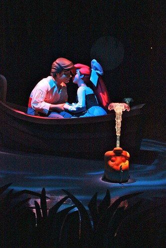
But as someone heavily interested in theme park design, Imagineering, and the how-to of making Disney magic, I am of the opinion that all magic is, nonetheless, by design, and am very curious as to what that specifically Mermaid is missing that prevents it from having the charm of less sophisticated rides like Pan. Any thoughts?
I have quite a few i am happy to share.
I have experienced both versions of the attraction. While FL has the beautifully designed show building, i think the DCA version of the ride was a bit more enjoyable. Not sure why that is....since they are pretty much exact clones, but i saw a lot more things in the FL version that needed to be addressed.
Since your interest is in the design aspects, and visual elements from a design standpoint, i will focus on those things instead of talking about the AAs and actual present figure elements. I will say this though : While it would have helped greatly to have had more Animatronics present in the attraction, more lighting tricks could have been employed in their absence to better create the illusion of movement on the many stationary figures.
Let us start off with lighting then...
The show building is lit in blues at night time, and i question that choice. Eric*s home looks stunning at daytime, with its warm palette of colors ( yellows, creams, browns, etc..) but it seems to lose a lot of the splendor at night. This i found surprising when i witnessed it, as WDI always does a fine job lighting such large, prominent structures. Why wash the building in blue spotlights though? I can understand wanting to convey the ocean with the color, and perhaps even seperate it from nearby structures, but it would seem to me the best way to light it would have been with a warmer set of colors. Yellows...dash of pink...dash of orange maybe..or the like.
Lighting in the actual ride has already been commented on when the original at DCA opened. Too bright, and unfocused...though some adjustments were made after the initial opening. The FL version i thought looked okay, but to help add a little more *Magic* to the ride-through i think some lighting techniques could have been added to help sell the *undersea* setting. There are some already present ( mostly projections ) but tossing in a few more flicker effects or wave rays would add considerably. Also, with so many figures in the attraction somewhat stationary, using some lighting effects to create movement in those spaces would also help add some sparkle. Light is a key aspect to any experience, wether people realize this or not. I think more could have been done in the attraction with light, exspecially since we are dealing with so many figures and fish that are not moving. A little quiver of light, or a spot wash with a little animation in the beam would work wonders to create a more magical setting.
Another aspect that i find would help sell the effect of being under the sea better, and also cover some serious visual intrusions would be to use some sort of above-head ceiling cover in the main *Under The Sea* show segment. Here the scene is set to appear as if we are under the water, but in reality the effect is somewhat lost due to the plainly visable ceiling lights, air circulation unit and vents, and other needed but unhidden elements. If some kind of blue or green tinted vinyl/plastic/light gel sheet/scrim type of cover could be suspended from the ceiling under the ventilation system and light bars it would obscure Guests views from below. Also, it would allow light to filter through and create a nice soft glowing effect...just as it really would appear to look from below the water, looking up ! I suppose such a apparatus would break about two dozen fire codes....but wow, it would solve all of the visual problems in that main set area AND create much needed ambiance in one sweep.
Something else that may contribute to the less-Magical feel of the attraction is the rather abrupt ending.
It is a great pity the original planned ending (battling Ursula/storm at sea sequence) was cut.
The ride really needed some kind of conflict , and then resolve it to conclude with the happy ending. That is proper story telling. Now i am not saying just pull a *book report* on the attraction and tell the film story scene by scene. No...make it better by adding the elements everyone remembers and are high points of the particular story. Having some kind of conflict show and then resolved would have helped make the ending of the ride more inspiring. As it is now, the end comes too abruptly with no real visual explanation...other then the tiny Ursula shown in the background of the final set.
With the conflict present, the finale would have been more joyus for the audience...not to mention, the characters too!
There is no real joy felt in the final scene...nothing to take with you when you exit the ride.
All the noted magical attractions have this. Mermaid as a attraction does not, in my opinion.
So as far as designing for success, i think that final scene missed the boat in a big way...no pun intended!

