Californian Elitist
Well-Known Member
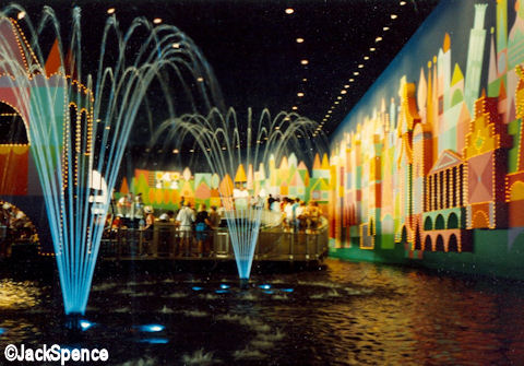
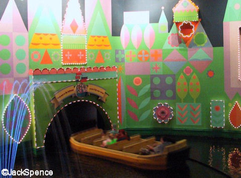
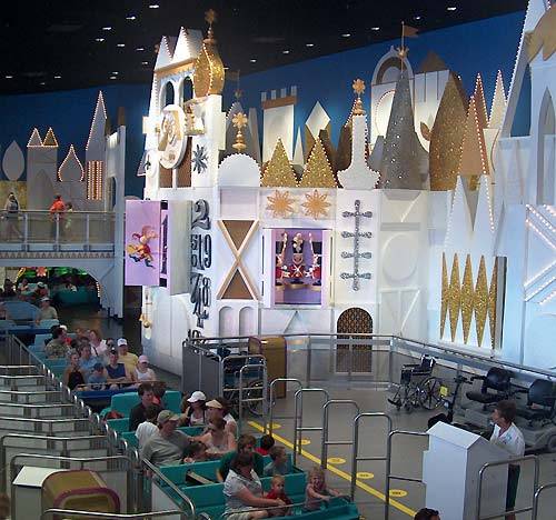
I agree. I think they also shouldn't have changed it. Don't get me wrong, Disneyland's is WAAAY better. But I think the older colorful one worked better as an interior queue and Disneyland's works better as an exterior queue. But that's just me. I also miss the fountains.
No, I absolutely agree with you and I was thinking the exact same thing. They shouldn't have changed it. It was really nice and pretty before. Like you said, the clock face facade just doesn't look right inside with that blue wallpaper on the back. The fountains were very pretty. There was no need to change that.


