-
Welcome to the WDWMAGIC.COM Forums!
Please take a look around, and feel free to sign up and join the community.
You are using an out of date browser. It may not display this or other websites correctly.
You should upgrade or use an alternative browser.
You should upgrade or use an alternative browser.
What are some of the big eye sore's you would like to see removed?
- Thread starter Figment632
- Start date
CaptainMichael
Well-Known Member
I'd also like the chain removed from in front of the Adventurers Club.
Lee
Adventurer
I'd also like the chain removed from in front of the Adventurers Club.
^Winner.
maggiegrace1
Well-Known Member
For starters:


and all of these:

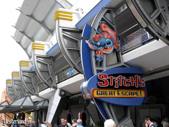
Aw man, you beat me to it! (Stitch)
imagineer boy
Well-Known Member

(One of those things are gone, already! Yay!)
I actually kind of like them. I think they sort of add a kenetic energy to Future World IMHO. :shrug:
You win! I can't STAND those tombs!
What they should really do is keep the plaqs but get rid of the tombs and put them on somthing more tasteful looking.
The Bay Lake Tower.
I think the tower its self looks okay, I just don't like it next to the Contemporary building. Way too much contrast between the architectural styles.
My choice would be the Soarin queue. I honestly think its the ugliest and barest looking queue line ever. The games and blue lights don't count as themeing to me. But the bare yellow walls at the entrance, industrial cieling support beams and air vents near the end, blegh. UGLY!
Mr.EPCOT
Active Member
I think the tower its self looks okay, I just don't like it next to the Contemporary building. Way too much contrast between the architectural styles.
It'd be okay on its own. If it was built anywhere else, it'd look perfectly fine. But it just doesn't jive with the original A-frame next door like it should.
xtina72
New Member
For starters:
and all of these:

:sohappy: I hate the fact that you can not sit on a bench and not be asked "do you know what Disney's best kept secret is?" UGH!
ChrisFL
Premium Member
After not liking the idea of Bay Lake Tower...I really don't hate it that much...yes I wish it was more like the Contemporary (maybe with ever decreasing radius circlular floors in an upward slope, but hey, that's just the aspiring architect talking).
It's not that bad, it's pushed farther back from the Contemporary so it doesn't interfere that much.
As for the Test Track overhang...I hate it and like it at the same time. I do really like the clean look of WoM, but the extra shade and rest area the cover provides isn't bad either...I just wish it was less "in your face"
MousDad
New Member
What are some eye sore's around WDW that you would like to see either fixed or removed.

Zummi Gummi
Pioneering the Universe Within!
I have to go with the tombs at the Epcot entrance.
The hat doesn't really bother me all that much, to be honest. :shrug:
The hat doesn't really bother me all that much, to be honest. :shrug:
Mr.EPCOT
Active Member
Lee
Adventurer
Mr.EPCOT
Active Member
:ROFLOL:
And some of it's occupants, too....
I think that goes without saying... :zipit:
EPCOT Explorer
New Member
Erin Wallace. My apologies.
That wasn't Meg, that was some other random public relations-type chick.
Can't say I disagree, especially with the Speedway.For starters:


and all of these:

You don't even like the architecture?!? :lol:
Stunning, IMHO.
The Whirlygigs, yeah. It's just that it becomes clutter with all the other stuff. If it was just the 'gigs, and placed more strategically, I would not mind.I actually kind of like them. I think they sort of add a kenetic energy to Future World IMHO. :shrug:
What they should really do is keep the plaqs but get rid of the tombs and put them on somthing more tasteful looking.
!
I, for example, would like to see the 'gigs built INTO the walls of CCore.
YES! :lol:
Agrees I was in there a few weeks ago, but the inside is rather interesting.
MousDad
New Member
Agrees I was in there a few weeks ago, but the inside is rather interesting.
D'you see the sundial?
EPCOT Explorer
New Member
Agrees I was in there a few weeks ago, but the inside is rather interesting.
Technical readouts of the battle station are needed.
:lookaroun
Please enumerate on your experiences.:lookaroun
:lol:
maggiegrace1
Well-Known Member
Love the Dolphin..I have to agree with Leave a Legacy, and also going with the big-ugly-triangle-you-can-see-from-everywhere-on-property a.k.a. The Dolphin =/
The sundial is pretty cool..I have not been in there for a long time but when I used to go do my banking in there at Vista it was pretty!..D'you see the sundial?
Register on WDWMAGIC. This sidebar will go away, and you'll see fewer ads.

