-
The new WDWMAGIC iOS app is here!
Stay up to date with the latest Disney news, photos, and discussions right from your iPhone. The app is free to download and gives you quick access to news articles, forums, photo galleries, park hours, weather and Lightning Lane pricing. Learn More -
Welcome to the WDWMAGIC.COM Forums!
Please take a look around, and feel free to sign up and join the community.
You are using an out of date browser. It may not display this or other websites correctly.
You should upgrade or use an alternative browser.
You should upgrade or use an alternative browser.
WDW Picture of the Day Thread (Part 5)
- Thread starter WDWFigment
- Start date
crlachepinochet
New Member
Hooray for the new thread! Great pictures so far, everyone!


1DisneyDad
Well-Known Member
jeffb
Well-Known Member
Sissa216 - fantastic shot in post 19.
Steiny68 - great shot of Harper's mill in post 27
xsupaxmadxsfnex - great shot and framing of the castle in post 33.
Here is my post for today:

Please click here for a larger 1500 X 1000 size version: http://www.flickr.com/photos/96525092@N00/2952742431/sizes/o/
Steiny68 - great shot of Harper's mill in post 27
xsupaxmadxsfnex - great shot and framing of the castle in post 33.
Here is my post for today:

Please click here for a larger 1500 X 1000 size version: http://www.flickr.com/photos/96525092@N00/2952742431/sizes/o/
ChuckElias
Well-Known Member
^^^ Jeff, do you have a color version of the above photo for comparison? I have no training or anything, but this seems to me to be a case where the B&W treatment might actually detract from the image.
Not saying that I don't like it. Please understand, I'm not criticizing. I'm just wondering why you went B&W for this, and what it looks like in color. I'm trying to learn a little something.
Not saying that I don't like it. Please understand, I'm not criticizing. I'm just wondering why you went B&W for this, and what it looks like in color. I'm trying to learn a little something.
ChuckElias
Well-Known Member
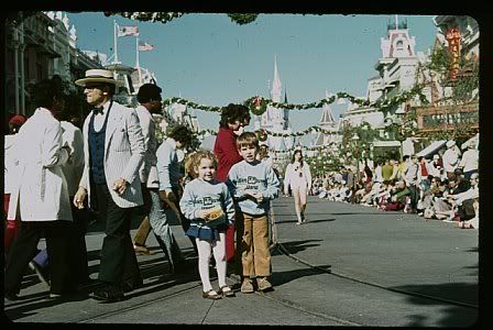
Continuing with my dad's slides from 1972. (Apparently, I was also wrong about the ugly orange sweatshirts. That must have been another trip.) This one is self-explanatory.

jeffb
Well-Known Member
^^^ Jeff, do you have a color version of the above photo for comparison? I have no training or anything, but this seems to me to be a case where the B&W treatment might actually detract from the image.
Not saying that I don't like it. Please understand, I'm not criticizing. I'm just wondering why you went B&W for this, and what it looks like in color. I'm trying to learn a little something.
Chuck, no worries - What struck me in the b&w version (and why I went this route) is the how the marching band and drum are light gray and white while the backgound (sky / sidewalk) are dark grey creating very good contrast between the subject and the background. I will try to put the unprocessed color version up on flickr.
BTW - I am really enjoying you pictures from 1972 (I love vintage WDW) and those are awesome sweatshirts (with the old WDW logo). Disney - please re-issue them!
noflashphoto
New Member
°O°Joe
Member
I'm a little biased because, in general, I have a tendency to favor black and white photography... but personally, for me what makes the band photo awesome in black and white, is that there are virtually no distractions to pull your eye away from the subject. It's a great picture. I have a feeling that if this were in full color, because of the bright colors, the eye might have a tendency to wander all around the frame. Not that that's necessarily a bad thing, but here - where the focal point is obviously the band member pointing at you, black and white works perfect. It's a very nice conversion too. Great job as always, Jeff!
As a side note, if you're in to selective coloring, leaving just the subject and his props color I'm betting would look pretty cool as well!
As a side note, if you're in to selective coloring, leaving just the subject and his props color I'm betting would look pretty cool as well!
Register on WDWMAGIC. This sidebar will go away, and you'll see fewer ads.

