-
Welcome to the WDWMAGIC.COM Forums!
Please take a look around, and feel free to sign up and join the community.
You are using an out of date browser. It may not display this or other websites correctly.
You should upgrade or use an alternative browser.
You should upgrade or use an alternative browser.
Walt Disney Company 100 at [Cabochon] Disneyland
- Thread starter Californian Elitist
- Start date
Disney Analyst
Well-Known Member
Some screenshots from a YouTube channel I shan’t link to (BL&B).
Fountains installed.
View attachment 690769
View attachment 690770
The other side seems to have a cover fitted, as well as shiny nozzles. The nozzles just peak out on the left side. I assume right side of castle is still mid-installation.
Also surrounding the fountain is a ring of LEDs for lighting.
It’s all a bit much. But that’s just me. Personally, I like structure and organization. I wouldn’t have put so many references that have nothing to do with each other on one design. For the Disneyland popcorn buckets, I feel the design should focus solely on Disneyland. Then for another piece of merchandise design, they could have done Walt Disney arriving to California, creating Mickey, and making shorts. Another for the premiere of Snow White, the individual WDW parks, DCA, and so on.I take it as a history of the company via:
Walt’s arrival in Hollywood/pre Disneyland w/ the Flowers and Tree reference, Mickey Mouse Carthay Circle that doubles as a rep for DCA and Snow White’s iconic opening, the studio street sign and Tinkerbell.
Then you have pre or opening day Disneyland with the train, carousel, bench which also act as representing what led to Disneyland as rhe bench could be seen as the famous park bench Walt sat on when struck with the idea. Opening day Disneyland is anchored by the castle, Dumbo and Jolly Rodger/Chicken of the Sea.
The next layer is the 60s/70s via Matterhorn, Small World, Tiki Room, Haunted Mansion, Space Mountain.
Modern Disney is shown via DCA and Chubby from Runaway Railway.
At least that’s what I got from looking at it
This is just a petty personal annoyance. I actually do like the design, for the most part.
I actually like how he looks in the design. It’s playful and cute. I just wish he looked older, the age he was when Disneyland opened.True. I’m not completely anti Walt on merch. I think it can be done tastefully. I don’t think this is one of those times. A lot of it probably has to do with how he looks in this art style though.
Like this is nice…
View attachment 690780
Don’t like when he’s some modern looking cartoon. I also feel like if he wanted to be a cartoon it probably would have happened at some point between the 20s - 60s when he was alive. Or maybe it did?
Nland316
Well-Known Member
I hope they dye the water a nice blue color. I’ve never been a fan of the murky brown water…The other side seems to have a cover fitted, as well as shiny nozzles. The nozzles just peak out on the left side. I assume right side of castle is still mid-installation.
View attachment 690786
Also surrounding the fountain is a ring of LEDs for lighting.
View attachment 690787
Disney Analyst
Well-Known Member
Better photo:
Brer Oswald
Well-Known Member
It’s an iconic sign, but it has nothing to do with Disneyland. Mind you, neither do the flowers from “Flowers and Trees”. Maybe they were going with a “Disney’s presence in California” theme?I agree that there should be separate designs for the respective parks. I didn’t notice the Walt Disney Studios signage on there until you pointed it out. Seems very random and arguably out of place.
That’s what I’m thinking. And if that’s the case, then everything in the design belongs there. I keep having to remind myself that this isn’t a Disneyland anniversary, but the entire company’s history. I keep forgetting.It’s an iconic sign, but it has nothing to do with Disneyland. Mind you, neither do the flowers from “Flowers and Trees”. Maybe they were going with a “Disney’s presence in California” theme?
brb1006
Well-Known Member
It's suppose to be celebrating the entire company itself.It’s an iconic sign, but it has nothing to do with Disneyland. Mind you, neither do the flowers from “Flowers and Trees”. Maybe they were going with a “Disney’s presence in California” theme?
Disney Analyst
Well-Known Member
Now to be on castle watch, I assume we will go right from Christmas castle into 100th castle.
CaptinEO
Well-Known Member
I didn't even realize this was supposed to be Walt Disney. When did Walt ever look like this?I like it. Except for Gomez on the left side.
CaptinEO
Well-Known Member
The more I look at this the more it reminds me of bad banner art those dapper day people would use.
During the 1920s. The stache and parted hair are spot on. It’s obviously an artistic interpretation of a young Walt Disney.I didn't even realize this was supposed to be Walt Disney. When did Walt ever look like this?
I think it’s cute.The more I look at this the more it reminds me of bad banner art those dapper day people would use.
I just realized this is kicking off in two weeks.
Anyone planning to be there on January 27th?
waltography
Well-Known Member
I'll be at the parks the 29th; giving the vloggers a chance to give me a lay of the land before I attempt a VQ for MMRR/see the new shows.Anyone planning to be there on January 27th?
mickEblu
Well-Known Member
Anyone planning to be there on January 27th?
I’m going. Mostly for MMRR. Not sure if I’ll attempt to catch one of those new shows. I’d imagine I’d have to camp out for a few hours for that.
Foodie Guide to the Disney100 Celebration -
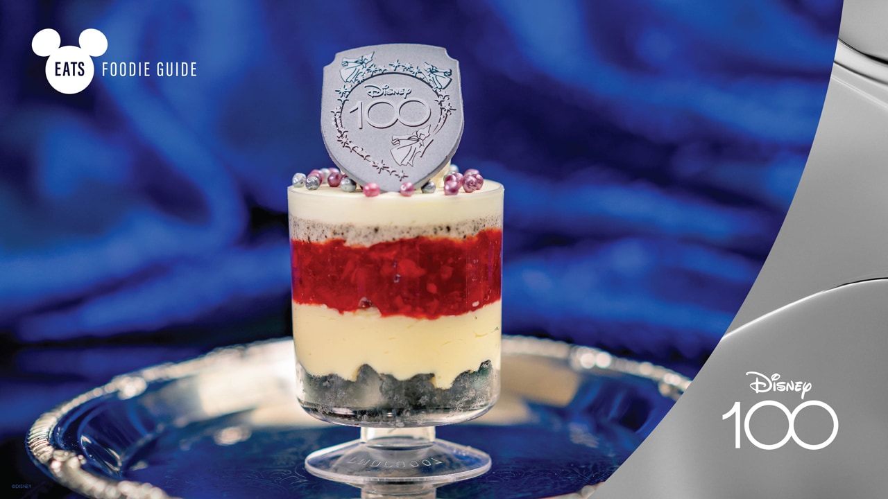
Disney Eats: Foodie Guide to Disney 100 Celebration at Disneyland Resort, June 2023 Update
Disney Eats reveals new Disney 100 Celebration food, drinks and novelty items available at Disneyland and Disney California Adventure in celebration of Disney 100th anniversary.
disneyparks.disney.go.com
Register on WDWMAGIC. This sidebar will go away, and you'll see fewer ads.