TTA Refurbishment on schedule?

xstech25

Well-Known Member
It makes sense to have the support columns be orange/red since it's supposed to be a Rocket Tower, I think that looks great. The orange escalator just looks bizarre, hopefully they fix that.

Someone suggested earlier that this is the start of a long term painting project in Tomorrowland - which I think is kind of strange considering not long ago they went away from the orange trim and went with the more futuristic looking blue, silver, and green.

Considering how people dress these days retro/vintage seems to be back in, so maybe they are just going with that trend? :p
 
Last edited:

Rinx

Well-Known Member
Who the ef makes these decisions?!?! Better yet, who approves them? Did they just decide to use leftover puke colors from the FutureWorld job? And based on what I've read in previous posts, there's going to be mooore????
:banghead: :banghead: :banghead: :banghead: oww...been doing that a lot lately here....
 

djkidkaz

Well-Known Member
I actually don't mind the paint scheme. What I like about it is that it highlights that there is "something" there. It draws your attention. The old paint scheme made it look like it was just an escalator for CM use or something. It was hidden away due to the paint scheme making it disappear into the existing building.
 

scottnj1966

Well-Known Member
I really thought we would finally see the removal of that turn style. I also thought they would build a better queue line for when it does get busy. I have seen the line become a crazy mess lately.
 

danv3

Well-Known Member
Half this thread pretty much exposes the horrible dilemma WDW deals with every day. Some people despise the new paint others like it. In this one way, I sort of feel bad for TDO. Just this one way though.

You're right about the paint. On the other hand, there's pretty close to universal dislike of the current audio, and I think we'd all agree from these reports that the attraction probably needed another few days in refurb to get closer to show quality.

People on this site can agree on stuff after all!
 

Tim Lohr

Well-Known Member
I think the new "retro" color scheme looks great, it's all 1960's/70's earth tones which are a perfect fit for the midcentury/Eero Saarinen parts of Tomorrowland, and I think those new colors tie the original 70's parts of Tomorrowland together with the 90's remodel pretty well

plus the funky verions of "if you had wings" at the end of this video was a nice touch too, I don't know if I ever noticed they played that before
 

Mealtrip

Member
So that's what it looks like without 500 strollers parked in front of it. I really wish we could start leaning more toward a 1900's Jules Verne type of color pallet and a get away from the 1950's Retro Sci-Fi look… at least there in the center, and then segue into the 50's plastic future colors as you move toward the Speedway. Isn't that the same orange paint that is being used on the concrete "gear" planters in front of MouseGears at Epcot?
 

aladdin2007

Well-Known Member
I think the new "retro" color scheme looks great, it's all 1960's/70's earth tones which are a perfect fit for the midcentury/Eero Saarinen parts of Tomorrowland, and I think those new colors tie the original 70's parts of Tomorrowland together with the 90's remodel pretty well

plus the funky verions of "if you had wings" at the end of this video was a nice touch too, I don't know if I ever noticed they played that before

I was wondering about that also, was it playing before or did they just add it? I dont recall hearing it prior.
 

Tim Lohr

Well-Known Member
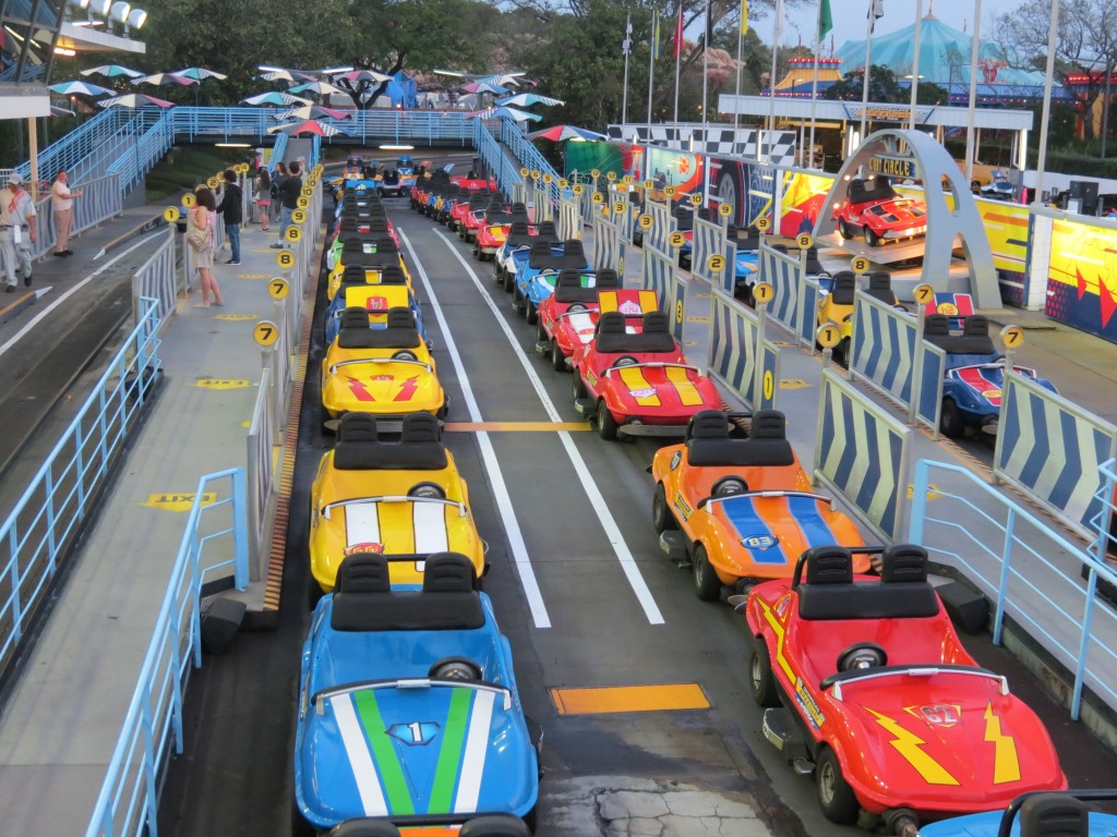
The new colors of the TTA station are pretty much the same colors the Speedway cars have always been... minus the decals
IMG_2513-1024x768.jpg
 

TyrantBoss

Well-Known Member
Maybe the folks at Disney need to start thinking that the FUTURE is not about new paint jobs. The Future is about pushing the limits of technology, invention, development and dreaming big. Tomorrowland used to at least capture the future, now it just looks like an day-glow, erector set version of the future. It just doesn't work anymore.
 

ToTBellHop

Well-Known Member
Maybe the folks at Disney need to start thinking that the FUTURE is not about new paint jobs. The Future is about pushing the limits of technology, invention, development and dreaming big. Tomorrowland used to at least capture the future, now it just looks like an day-glow, erector set version of the future. It just doesn't work anymore.
I would imagine your negativity would vanish if you were actually in Tomorrowland. With all the new paint, and its associated fumes, everyone is high on life (and paint) in Tomorrowland this week! No one even notices the missing audio and hot dog-sales are THROUGH THE ROOF, to infinity and beyond!
 

boufa

Well-Known Member
I love the belief that so much that Disney does is random, and knee jerk. Sure there is some of that, but there are actual plans and decisions being made. I seriously doubt that no one knew the color scheme before it was done. I seriously doubt that the guy who approved the HUB work didn't know about the colors. There is a method. There is a purpose. We may not like it (and we rarely like anything our favorite place on the planet does) but it isn't random.
 

Register on WDWMAGIC. This sidebar will go away, and you'll see fewer ads.

Back
Top Bottom