News Tiana's Bayou Adventure - latest details and construction progress

LittleBuford

Well-Known Member
Does this signage in Frontierland look like something singing bears could have constructed in 1898 when grizzly hall opened?View attachment 778632View attachment 778634
Also seems kind of out of place to have a sign in the wild west say Splash Mountain in a widly different font and color scheme then the rest...
View attachment 778635
The difference is that these signs are aesthetically pleasing and thematically appropriate (the Splash Mountain one more for the ride than for the land). The fonts they’ve used for TBA are neither—and I say that as someone who’s otherwise been supportive of the retheme.
 

Disgruntled Walt

Well-Known Member
In the Parks
No
Someone may have mentioned this, but imagine if they used the shanghai pirates ride system to build a brand new attraction for Tiana (with many of the elements being incorporated into his version) behind Big Thunder...
Too late for that, they're wasting the Tiana IP on a retheme! They could have done something extraordinary!
 

wishesnighttimespec

Active Member
The difference is that these signs are aesthetically pleasing and thematically appropriate (the Splash Mountain one more for the ride than for the land). The fonts they’ve used for TBA are neither—and I say that as someone who’s otherwise been supportive of the retheme.
Understandable but to the world of Frontierland splash was known as Chick-a-pin hill and not splash mountain
 

Disney Analyst

Well-Known Member
The difference is that these signs are aesthetically pleasing and thematically appropriate (the Splash Mountain one more for the ride than for the land). The fonts they’ve used for TBA are neither—and I say that as someone who’s otherwise been supportive of the retheme.

I also am not the biggest fan of the font / design of the Tiana's Foods signs. They feel printed out of a modern software.
 

LittleBuford

Well-Known Member
I also am not the biggest fan of the font / design of the Tiana's Foods signs. They feel printed out of a modern software.
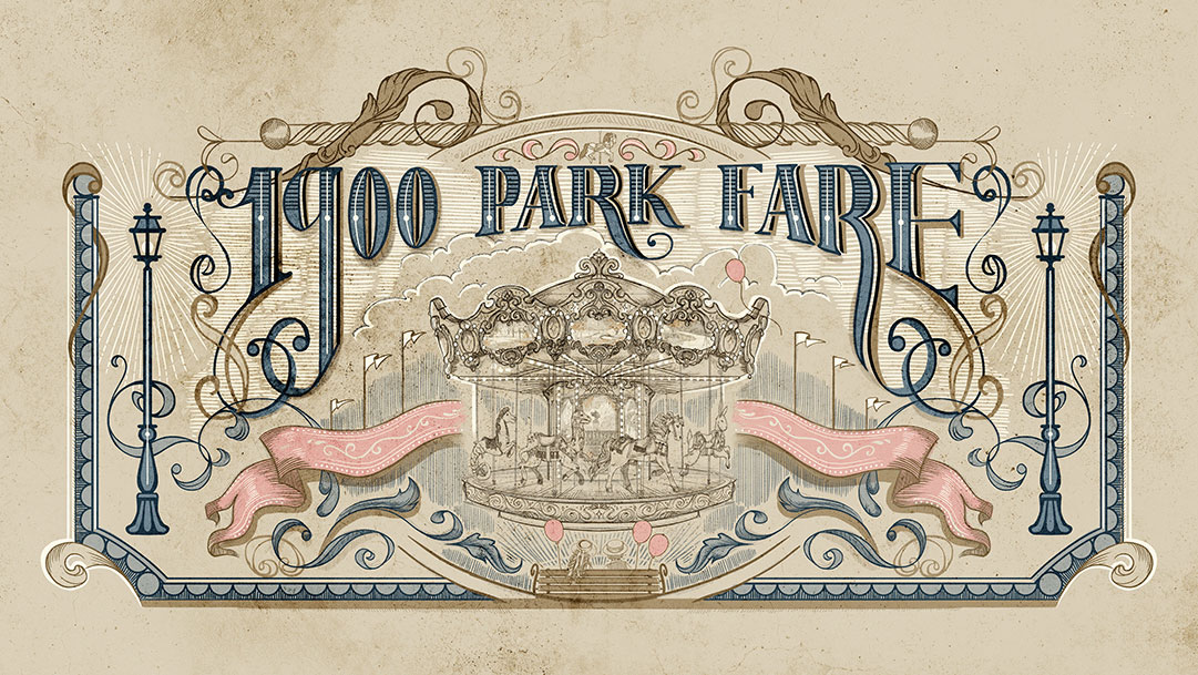
Together with the Arabic debacle over at the Morocco pavilion, the TBA signage really does make me wonder how and why Imagineering has lost its way in this particular regard. Then again, they did pretty well with the font design for 1900 Park Fare:

1900-Park-Fare_Full_54902.jpg


I guess we’re seeing the work of different teams, some better than others.
 

Disney Analyst

Well-Known Member
Together with the Arabic debacle over at the Morocco pavilion, the TBA signage really does make me wonder how and why Imagineering has lost its way in this particular regard. Then again, they did pretty well with the font design for 1900 Park Fare:

1900-Park-Fare_Full_54902.jpg


I guess we’re seeing the work of different teams, some better than others.

But I really do love everything else I am seeing, and I am hopeful the actual attraction marquee is gorgeous.

The other signs, they are minor, and could easily be changed or swapped out in the future.
 

MistaDee

Well-Known Member
You do realize that the NGram you're showing is talking about a miniscule mention of "employee-owned business" (.0000000507% in 1929). That hardly constitutes as "certainly in use." The percentage is 0 in 1927. You haven't really proven your point. I have a degree in US History and I can tell you, having taken specific classes on the history of the American economy, employee-owned businesses were not advertised in the way Tiana's Foods is being advertised. I get that some people want to defend this ride against all criticism, but let's not change history to fit the weak narrative choices they have made.
"Employee Owned" wouldn't even have been advertised 20 years ago, let alone in the 1920's.
They are using present day slogans applied to a ride dated in the 1920's in order to appeal and appease present day sentiments.
Why shouldn’t they? Their target audience, after all, is present day people.


The primary point I'm trying to make is that Disney is not "changing history" to serve some woke mind virus. There is a strong historical basis for farm collectives in the 1920s that Disney is drawing from and they absolutely advertised their existence. If Disney can be accused of anything here it is using a synonym: "employee owned" for "collective" or "co-op."

This might be creative license or simply that this term is more easily understood by all the kids in its audience. The real contention here is that the underlying concept proliferated historically in this period. If you want to interrogate all of Disney's historical lands for any synonyms used anachronistically, you'll have quite a bit of work ahead of you.... yet I suspect these anachronisms will fail to strike a nerve in the same way "employee owned" seems to

The forced “employee-owned coop” narrative is clearly just Disney apologizing for their own story. In order to justify the ride’s elevation, they made it a salt mine, which meant Tiana couldn’t just own a restaurant, but an entire food empire.

But of course, making Tiana a greedy capitalist executive would go against everything they believe in at The Walt Disney Company®, Inc. Corp. LLC. So they have to overtly advertise that Tiana’s Foods does not follow the traditional oppressive corporate structure.

The issue here is not that the company is “employee-owned.” It’s that Disney feels compelled to tell us that and advertise it when it has no bearing on the story. I haven’t seen any signs advertising the number of employees at the company or whether they have casual Fridays, for example, because it would be irrelevant and out of place.

Now this is a much more insightful critique: it is rather hyperbolic that the company Walt built (who was notably anti-labor,) and has grown to become a mega-corporation, is spinning tales about Tiana the girl-boss creating equitable employee co-operatives.

I guess I appreciate the effort creatively but it does ring rather hollow when considered in its larger context.
 

mickEblu

Well-Known Member
It’s not just that it feels out of place; it doesn’t look particularly well done by any standard.

But how can they not see what we see? It’s such an easy fix but I don’t understand how it gets this far in the first place. There is no excuse and I can’t really make any sense of it.
 

mickEblu

Well-Known Member
I’m sure someone in Imagineering is just as bothered by it. At least it’s something they can easily fix if they choose to (which I really hope they will).

They looked at it and put it up. That’s incredible to me. Unless it’s some sort of test while they wait for the real finished product.
 

Sir_Cliff

Well-Known Member
Together with the Arabic debacle over at the Morocco pavilion, the TBA signage really does make me wonder how and why Imagineering has lost its way in this particular regard. Then again, they did pretty well with the font design for 1900 Park Fare:

1900-Park-Fare_Full_54902.jpg


I guess we’re seeing the work of different teams, some better than others.
Yes, this is exactly where I am. Something strange is going on in the graphics department of WDI.

I remember in the first (1996) edition of the book Walt Disney Imagineering: A Behind the Dreams Look at Making the Magic Real they had a whole section on signs and even the graphics they created for old bottles in one attraction (I think it was Phantom Manor or Big Thunder in Paris?). They really made a big point of the care that went into making the graphics even for something as small as a bottle label appropriate for the time period.

I'm also pretty optimistic about this attraction as a whole, but the signs really do have the feel of being printed using modern software that @Disney Analyst notes. This has been going on for a while at WDI and I really hope they sort it out.
 

Register on WDWMAGIC. This sidebar will go away, and you'll see fewer ads.

Back
Top Bottom