I recently rewatched the film; you remember correctly.From what I recall, they just cut him off for good. He wasn't looking for a wife to regain their support, he was looking for a wealthy girl so her fortune would support him. Facilier mentioned that in his song. Naveen initially tried to woo Tiana into kissing him because (besides wanting to turn back into a human) he saw her in a fancy dress and assumed she was really wealthy. IIRC he was upset when he discovered she was a struggling waitress.
-
Welcome to the WDWMAGIC.COM Forums!
Please take a look around, and feel free to sign up and join the community.
You are using an out of date browser. It may not display this or other websites correctly.
You should upgrade or use an alternative browser.
You should upgrade or use an alternative browser.
News Tiana's Bayou Adventure - latest details and construction progress
- Thread starter wdwmagic
- Start date
Surferboy567
Well-Known Member
So that’s it then right?View attachment 778050
Today Show not GMA sorry haha
If it’s Tiana related it can only be one of two things, the Tiana Disney + show or Tiana’s Bayou Adventure. With today’s last batch of critters supposedly coming later today it’s gotta be the opening date? GMA also has a history of promoting Disney Parks additions.
peter11435
Well-Known Member
I find it unlikely Disney would have her make any related announcements on NBC.So that’s it then right?
If it’s Tiana related it can only be one of two things, the Tiana Disney + show or Tiana’s Bayou Adventure. With today’s last batch of critters supposedly coming later today it’s gotta be the opening date? GMA also has a history of promoting Disney Parks additions.
MagicHappens1971
Well-Known Member
If it’s on the Today show and not GMA, then no.So that’s it then right?
If it’s Tiana related it can only be one of two things, the Tiana Disney + show or Tiana’s Bayou Adventure. With today’s last batch of critters supposedly coming later today it’s gotta be the opening date? GMA also has a history of promoting Disney Parks additions.
Drew the Disney Dude
Well-Known Member
- In the Parks
- Yes
wishesnighttimespec
Active Member
Very interesting the banner was removed. I wonder if it is totally gone or they are working on a new version? Or it's moved inside to a show scene from now on.
I wonder how many spelling errors they noticed?Very interesting the banner was removed. I wonder if it is totally gone or they are working on a new version? Or it's moved inside to a show scene from now on.
wishesnighttimespec
Active Member
Saw this on Twitter this morning, does anyone know where the background of this photo is? Or is it just edited?

Disstevefan1
Well-Known Member
Its only funny because its true.I wonder how many spelling errors they noticed?
Drew the Disney Dude
Well-Known Member
- In the Parks
- Yes
Unfortunately the photos are from 2015: https://disneyparks.disney.go.com/b...l-images-of-tiana-from-the-princess-the-frog/Saw this on Twitter this morning, does anyone know where the background of this photo is? Or is it just edited? View attachment 778083
Surferboy567
Well-Known Member
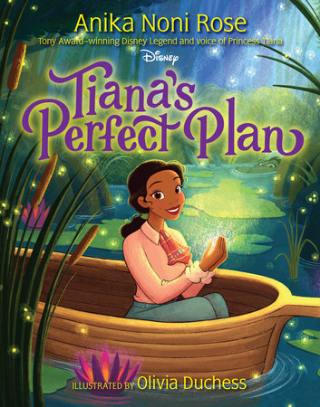
The big reveal is a children’s book called Tiana‘s Perfect Plan seems like it’s based on the ride.
Tiana’s in laws (the royals) are coming to town and she has to look for a “secret ingredient“ to make something for them she needs to go on adventure for the ingredient. Sometimes the secret ingredient isn’t what you think…man that sounds familiar.
EDIT: Tiana is wearing her attraction outfit.
Tiana’s in laws (the royals) are coming to town and she has to look for a “secret ingredient“ to make something for them she needs to go on adventure for the ingredient. Sometimes the secret ingredient isn’t what you think…man that sounds familiar.
EDIT: Tiana is wearing her attraction outfit.
Surferboy567
Well-Known Member

Tiana's Perfect Plan by Anika Noni Rose: 9781368081603 | PenguinRandomHouse.com: Books
A charming debut picture book from acclaimed actress, singer, and Disney Legend Anika Noni Rose, which shows Princess Tiana on a never-before-seen New Orleans adventure! After traveling all winter, Tiana...
If you read the about section, this is literally the plot of the ride adapted for a children’s book.
EDIT: Releases on October 22, 2024 if that means anything…Disneyland? That seems late.
Surferboy567
Well-Known Member
I was kinda right no date…yet though.If it’s on the Today show and not GMA, then no.
The plot of the book that Anika just announced:
ABOUT TIANA’S PERFECT PLAN
A charming debut picture book from acclaimed actress, singer, and Disney Legend Anika Noni Rose, which shows Princess Tiana on a never-before-seen New Orleans adventure!
After traveling all winter, Tiana and Naveen are back in New Orleans in time for Mardi Gras. Tiana wants everything to be just right, putting the finishing touches on their party favors and parade float.
But then she gets an unexpected letter from Naveen’s parents, the king and queen of Maldonia. They’ve decided to join the celebration!
Determined to make it the best Mardi Gras ever, Tiana sets out on a new adventure with some old friends to find the perfect ingredients for a special addition. But soon she finds that perfect might not be the goal . . . and she may already have all she needs.
Surferboy567
Well-Known Member
Seems like the show happens…then the ride does. “traveling all winter“ sounds like a Disney + show.The plot of the book that Anika just announced:
ABOUT TIANA’S PERFECT PLAN
A charming debut picture book from acclaimed actress, singer, and Disney Legend Anika Noni Rose, which shows Princess Tiana on a never-before-seen New Orleans adventure!
After traveling all winter, Tiana and Naveen are back in New Orleans in time for Mardi Gras. Tiana wants everything to be just right, putting the finishing touches on their party favors and parade float.
But then she gets an unexpected letter from Naveen’s parents, the king and queen of Maldonia. They’ve decided to join the celebration!
Determined to make it the best Mardi Gras ever, Tiana sets out on a new adventure with some old friends to find the perfect ingredients for a special addition. But soon she finds that perfect might not be the goal . . . and she may already have all she needs.
Any bets on what the secret ingredient is…I’m starting to doubt it’s critters now.
Tha Realest
Well-Known Member
That ship sailed when they used Brigham Young’s hearse for Disneyland’s HM.Out of curiosity, do vintage car enthusiasts shudder at stuff like this? Having antiques repainted and displayed in an amusement park instead of professionally restored and preserved in a museum?
This is the sort of thing where it might be better to custom fabricate the vehicle if only to preserve history.
Keep in mind, Disney will probably have their piece to say today so I wouldn't rule out an opening date dropping yet
Brer Oswald
Well-Known Member
The secret ingredient is everyone.Seems like the show happens…then the ride does. “traveling all winter“ sounds like a Disney + show.
Any bets on what the secret ingredient is…I’m starting to doubt it’s critters now.
Brer Oswald
Well-Known Member
This sums up my issues to a T. It’s just adding more things they will have to address for the eventual update, Splash 2.8: Tiana 1.5 Final Mix Back Cover.The main issue, as I see it, stems from a struggle to marry the "Tiana glam-styling" with rural farm life. The concept just isn't gelling. Visually, it's all over the place. We have a colorful yet still weathered barn plastered with near-psychedelic murals, but it doesn't work. We have a rustic fence along the ride path with what appears to be "decals" of chopped vegetables, and it's supposed to somehow evoke the 1930s. We have a printed banner that was... (removed? TBD?) And a parked truck that doesn't feel grounded in reality because it's too showy and pristine for its locale—not at all like a real rural food-coop daily commuter work truck. I just think WDI is at odds on how to present anything. And when they go cheap, it shows.
It's probably too late in the game for them to change anything now, but there's been some really good insight by other forum members detailing ways these issues can be remedied. I don't know if WDI is just not seeing it or doesn't care. Either is a cause for concern.
Surferboy567
Well-Known Member
Still thinking it may happen with the final critter reveal. It makes logical sense, also I doubt it’s coincidence this book based on the ride is announced today.Keep in mind, Disney will probably have their piece to say today so I wouldn't rule out an opening date dropping yet
Register on WDWMAGIC. This sidebar will go away, and you'll see fewer ads.

