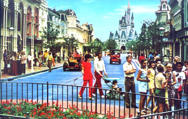
This was the Magic Kingdom?

loveofamouse

Well-Known Member
I also like the newer castle. The older one was too gold, made it look fake. The newer paint job makes it look more realistic, like a princess really lives there. Look at the windows, in the old one, they are bright gold. In the new one, they are dark, like lights turned off.
 

whitney37354

Active Member
Wow! It looks to incredibly different! (and I'm kinda hung up on the reality that 1991 was 20 years ago.)

Me too! My 20 year high school class reunion is this year. That cannot be possible.

I've been to MK two times: 1986 & 2010. No wonder it was like being there for the first time last summer. There is a lot of difference in the two pictures above. I like the newer one better.
 

cymbaldiva

Active Member
I prefer the old. Kind of keeps the mystique of the castle until you get up on it. Plus I like the greenery. Too much asphalt makes me feel like I'm in a WalMart parking lot or something.

Agreed. :)

To me now the Castle just seems...overexposed. And smaller.... :(
 

PolynesianPrincess

Well-Known Member
I like the "new" one better but both of them look amazing. I mean, you're looking at Cinderella Castle... there's no way it could possibly look "bad".... except if it's painted pink like a birthday cake....:confused:
 

rachels

New Member
Hard to believe 20 years ago you could see this...


1991
2qnr2is.jpg


and now you see this...

2011
5exr0m.jpg

So Mysterious I love it! Brings back memory of when I was younger...couldn't wait to get up close to the castle
 

devoy1701

Well-Known Member
I agree that the trees in the 1991 picture look too big for the hub, but I think they should have replaced them with some new and smaller oak trees or maybe some magnolia trees that never would have grown that big. I think the trees definitely help make it look more majestic and gives the courtyard a more realistic setting than the current concrete garden look the hub has. The size of the trees in the 1971 picture posted looks good!


I also like the newer castle. The older one was too gold, made it look fake. The newer paint job makes it look more realistic, like a princess really lives there. Look at the windows, in the old one, they are bright gold. In the new one, they are dark, like lights turned off.


are you kidding? They've slapped so much blue paint on the spires today that they look like plastic!
 

Testtrack321

Well-Known Member
I like the big trees, but I guess you lose some battles when there are stage shows and fireworks that people need to see...

If there's one thing we can agree on those old planters are UGLY!
 
Wow, the Hub used to look Dreadfully 1970's. All that precast concrete, and precast benches. Blah. The new one is much more open, and flows much better. I just want them to get rid of that stupid tent set from the castle show, as well as let the trees get lightly larger. they're pruned to be about 8' from the ground now. Let them get about 15-18 feet. just for more presence... but not 30' like before.
 

JustInTime

Well-Known Member
I like them both! I wish we had a mixture. I know that I hate the crappy tent and that enormous stage. And I like the less busy, more green feel of the old one.

But really, notice how much better the castle looks without that stage and tent. You can see the arch without having to walk around the stage.
 

hpyhnt 1000

Well-Known Member
Amazing how green the center of the Magic Kingdom used to be, isn't it?

For me, neither is really ideal. The trees in the 1991 picture are too big and block too much of the castle, but they do provide lush greenery and the hub back then provided many more benches and seating areas (even though the planters were rather plain and ugly). The 2011 pic allows you to see the castle much better, but thats about all it has going for it. The flower beds are significantly smaller compared to before and there is absolutely no shade. The current hub also has a desperate lack of seating.

Personally, I would love to see the hub return to something closer to the original but with more of an attempt made to control the size of the trees; the current one is just too much flat concrete for my liking. While the old hub design had its flaws, I think they overcorrected in the redesign and just created a whole set of new ones.
 

MouseDreaming

Well-Known Member
I like them both! I wish we had a mixture. I know that I hate the crappy tent and that enormous stage. And I like the less busy, more green feel of the old one.

But really, notice how much better the castle looks without that stage and tent. You can see the arch without having to walk around the stage.
AGREED! I never realized how much I disliked those stupid tents, until I saw the two together. There is something about that peek into Fantasyland through Cinderella's castle...:rolleyes:
 
I like the new look better.

For some reason, with all of the trees hiding the castle, it makes the park (or this area of the park) look less distinguishable/professional/Disney to me. All the trees make it look like so many other parks that make up for theirlack of themeing in the form of foliage.

Edit: Personally, when I think of the Magic Kingdom the first thing I think of is "The Man in the Yellow Shirt." The old look just didn't have it.
 

Phonedave

Well-Known Member
I don't mind the removal of the trees, but I would have liked some of the structure to remain. Something more than a circular planter to break up that vast expanse of salmon concrete.

-dave
 

epcotWSC

Well-Known Member
I like the new look better just because the Castle is more exposed and there's more room. However, if it was anywhere else, the old area was gorgeous.
 

Register on WDWMAGIC. This sidebar will go away, and you'll see fewer ads.

Back
Top Bottom