TEAM WALT
DISNEY’S DARK KINGDOM
The presentation begins by acknowledging the pitfalls of a Villains Park. There is much wisdom in this. With this realization you can start to develop a design philosophy which will act as a sturdy foundation for all to come.
Others more eloquent than I have discussed Joe Rhode’s underlying philosophy for Animal Kingdom. While the surface-level park is simply “look, animals,” the designers’ concept of man’s relationship to nature helps make even
Avatar feel fitting. By outlining your Yin & Yang concept, by tying that into Dark Kingdom and Hong Kong Disney Resort as a whole, you have a similar philosophy which truly unites the entire project.
Resort-wide
Hong Kong is a smart resort choice. Is is basically a blank slate. There’s a ready-made expansion spot, and hardly any redundant ride types or themes to worry about. You take full advantage of this!
The best choice is the organizing principle of Tao. Hong Kong Disneyland was consciously designed with Feng Shui principles, and you’re building from that. Replacing the Esplanade fountain with the Yin Yang icon instantly, effortlessly, simplistically communicates your concept to all guests.
@Outbound has quickly become a master map maker, with Dark Kingdom as his crowning achievement. The park’s layout is nicely organic. The use of waterways reminds me somewhat of DisneySea on a smaller scale. One stated purpose was to create a dark mirror of HKDL across the Esplanade, and the layout sadly doesn’t really reflect that. To see the revamped Castle from Jiu Cheng, that parallel might still be evident, but making the theme clearer via layout would do a lot to strengthen the underlying Yin Yang concept.
I would like to know more about the Downtown Disney referenced in your resort map. Such an addition would greatly strengthen an underdeveloped resort. The opportunity was there to have the shopping district complement the second gate.
Hungry Ghost Hotel
This is the biggest miss of your project. On its own, a Haunted Mansion Hotel is an intriguing idea. The elevators are a keen touch among many. It simply doesn’t work for Hong Kong. There’s a reason they have Mystic Manor instead of a traditional Haunted Mansion: Chinese ghost taboo. Okay, I’m simplifying a complex cultural topic, but suffice it to say westernized ghosts are a gigantic no-no in China.
Even ignoring that issue, the Hungry Ghost Hotel is strangely located. It’s placed at the resort’s furthest point from the existing hotel corridor along the southern coast, and furthest too from your proposed Downtown Disney. The hotel eats into valuable park acreage, undermining future expansions, while not really doing anything to improve the in-park experience in the way that DisneySea’s Hotel MiraCosta does. Had you instead located your new hotel alongside Downtown Disney, placed it directly above the shopping level and facing Dark Kingdom on the other side, you could have greatly benefited the resort’s overall charm and layout.
Jiu Cheng
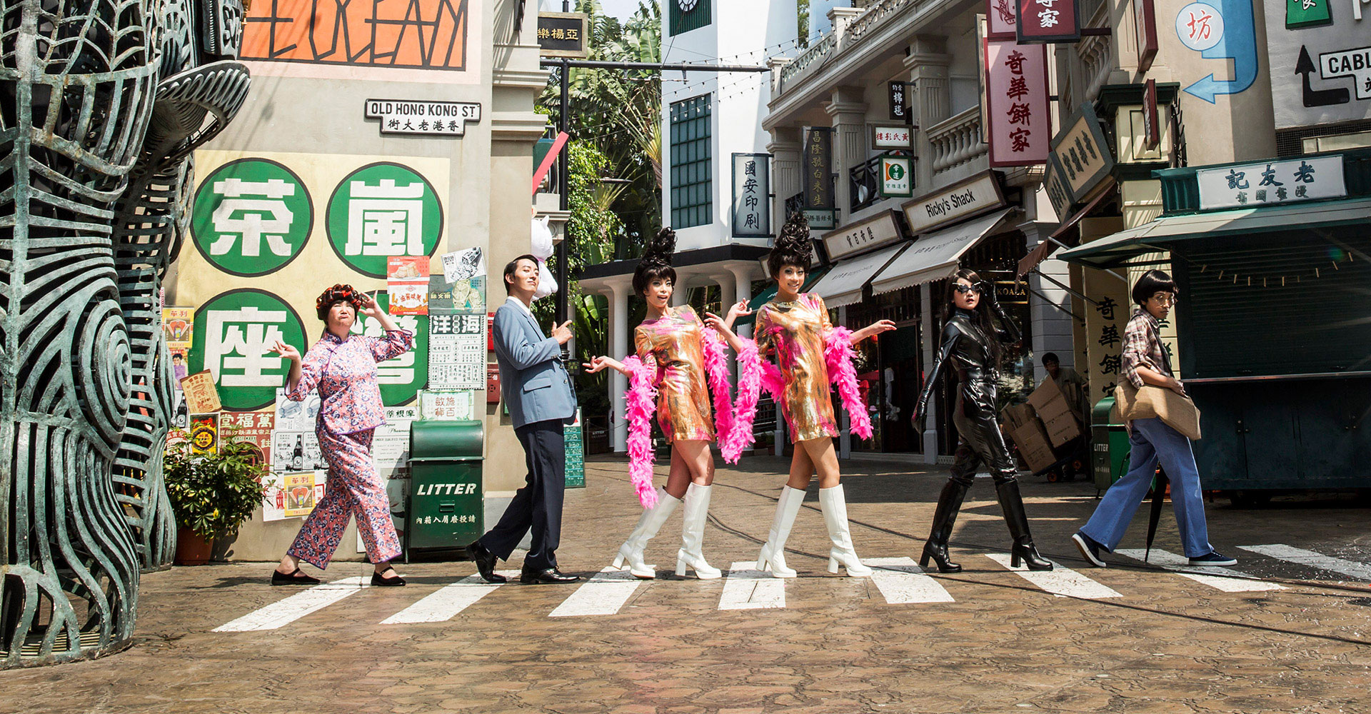
On the surface, Jiu Cheng seems like the Main Street that HKDL
should have received. It isn’t American nostalgia circa 1900, which holds no meaning in Asia, but rather the modern Chinese equivalent of that. Even ignoring the overall theme of Dark Kingdom, already this reads as a strong decision.
Then, slowly, subtly, we start to notice those signs of decay. This is a very measured approach to the concepts of evil, villainy, pessimism. Not over-your-head but under-your-skin. I’m reminded of Imagineering’s rejected 1920s Prohibition concept for Disneyland Paris’ Main Street. Team Walt has simply remade that general idea in an Asian setting…and in the process, they’ve perhaps unintentionally conjured up local histories of crime-ridden British occupation circa 1900. Or perhaps not so unintentionally, since Club Obi-Wan (from
Temple of Doom) is based on just that. I became more aware of Chinese urban history when visiting Hong Kong and Shanghai, so doubtlessly this topic would hold great meaning for locals.
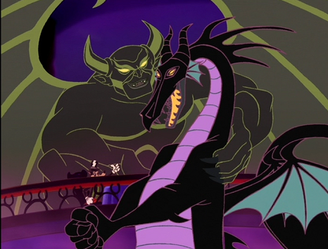
Villainy feels very naturalistic here. As with Shadowlands, your street terminates at Bald Mountain…however, yours is modified into a noticeably more thoughtful mountain. Mount Thor, the world’s steepest slope. It’s evil in a nicely understated way. Similarly, character presence in Jiu Cheng is understated. The Hong Kong Sanctum Sanctorum, while an IP reference, blends in and doesn’t call attention to itself. Other characters are limited to the interiors, except of course for the Maleficent statue. (Nice art!

)
(High Speed Heist is fun. What an odd coincidence that both teams placed a Test Track ride in their Main Street!)
Rothana Drive Yards
I approve of unique
Star Wars lands. Duplicating Batuu everywhere gives us no incentive to travel.
Rothana is carefully calibrated to fit both Hong Kong and Dark Kingdom. The snowy theme is one which has been considered multiple times for HKDL, likely due to the extreme summer humidity. It’s a cool setting in all ways. Light Side against Dark Side, that naturally fits your Ying Yang concept of villainy, and it’s subtly conveyed with the Imperial architecture. This land is a pretty simple
Star Wars setting, but the more you look the more you notice the Empire’s twisted presence.
I’m glad you pointed out that
Star Wars is less popular in Asia. I’d’ve nitpicked otherwise. Given that, it’s understandable that Rothana is notably more humble than Galaxy’s Edge, while retaining the same immersion throughout its shops and restaurants. It’s a tad unrealistic to propose all-new rides rather than reskinned Galaxy’s Edge clones, though on the other hand I wish Disney did more of that.
I like your three rides, particularly the March of the Empire omnimover. The ridethrough maintains the Yin Yang duality, transitioning from a beautiful kyber crystal cavern to an Imperial mining operation. That contrast shows Dark Kingdom’s design philosophy on a micro scale, and such thematic precision makes me think really highly of the entire project. (The Wampa attack wouldn’t work on an omnimover.)
Incidentally, I appreciate that each land has at least one truly immersive restaurant. There’s more to a park than E-tickets, and these experiences add immeasurable depth to the guest experience. Good attention here. Good attention too with your overall ride balance.
Black Bayou
I take slight issue with your anti-Frontierland being located here. By not mirroring HKDL’s layout, it might not be clear to guests how New Orleans happens to be an evil Grizzly Gulch. I doubt most Hong Kongers know enough about American culture or the U.S. Castle Parks to make that comparison.
No matter, this is a good land. Once again, you’ve made the villainous theme subtle rather than the core design aesthetic. New Orleans Square is an amazing land, so I am a sucker for a thematic expansion which folds in more bayou, more voodoo, and more monsters. Actually, this feels like an anti-Adventureland more than anything else, particularly the swamp landscaping would beautifully parallel Jungle River Cruise’s flooded Cambodian delta. Hong Kong’s subtropical climate would really benefit such a world!
While Disney Villains are present in Black Bayou, in the forms of Oogie Boogie and Dr. Facilier, you’ve taken care to keep them indoors. They’re part of the environment, not the central focus. The Enchanted Voodoo Room is a very exciting update on a classic, modifying the attraction type
and the theme while retaining reverence for the original. This would complement the Tiki Room just as Mystic Manor complements Haunted Mansion. Modern revamps like this should be a Hong Kong specialty!
In contrast, while Monsters of the Inner Swamp is doubtlessly a good original ride, since Hong Kong has no Splash Mountain (and since Hong Kong is so damnably hot), I think with a little retooling you could’ve had another creative reinterpretation here.
Night Hollow
I gave Team Roy grief for spreading their animated villains across practically the entire park. I applaud Team Walt for
largely relegating them into a single anti-Fantasyland. This setting is more or less the first thing one imagines for a Villains Park; it would be missed if absent.
Each park has a Maleficent coaster. As a flying coaster, would yours utilize that unique Disney flying coaster patent with the vertically-arranged loading platforms? What of the coaster infrastructure? I asked Team Roy similar questions, so I guess it’s me. I’m obsessed with how roller coasters and theme overlap.
Of the other attractions, Hook Naval Academy is good filler. It’s a little awkward to fuse Hook and Ursula into one ride though. Mother Gothel’s Tower is fun. I suppose this is to be Hong Kong’s version of Tower of Terror, despite its relative smallness, which is a curious decision since it seems Tower of Terror would be the easiest ride of them all to clone into a Villains Park. Lastly, Bald Mountain (as your iconic structure and thus presumably home to your “thesis statement” attraction) seems underserved by a mere walkthrough.
Night Hollow is surrounded on all sides by other lands. There is no room to expand. This seems a mistake, since historically Fantasylands grow the most. There is always potential for more Disney Villain attractions, and new baddies are always being created, so don’t limit yourselves spatially!
Pleasure Island
As an evil response to Toy Story Land, this is better than I could have expected. Unlike Toy Story Land, this sounds…actually good! It also sounds like a better pier area than Disney has yet managed to create, with a deeper theme than “a pier area.” Between this and Night Hollow, I like that young children are accommodated in a park which might otherwise repel them, whether by theme or by thrill.
My one big gripe with Pleasure Island is that you haven’t taken advantage of Hong Kong Disneyland’s coastal location. Why is this oriented facing inland? You should’ve taken a tip from DisneySea here and set the land facing out towards the South China Sea, and really added to that seaside pier park feeling.
On a granular level, every attraction is simply a ton of fun. Individually, the Merry-Go-Round or Fun Wheel aren’t terribly special, but they certainly add to the atmosphere. I love the Trams mostly because they reference Morey’s Piers! The indoors miniland themed to
Wreck-It Ralph seems slightly out-of-place, given that the land is primarily based on
Pinocchio (a limiting theme), though since it’s indoors it’s less intrusive, and since it’s indoors it’s also air-conditioned

Puppets on Parade fits like a glove.
With The Monstro, I was a little worried that you would duplicate California Screamin’s flaws – conceptually a fairly basic coaster below Disney’s capabilities. So color me pleased when you coastal coaster includes an unexpected highly-themed indoors section! It’s Incredicoaster meets Seven Dwarfs Mine Train meets Alton Towers’ Thir13een, and I’m on board!
Wonderland
Conceptually, Wonderland feels like Dark Kingdom’s least essential land. It has undeniable strengths, no doubt, particularly the visuals by
@Disney Dad 3000 (always a fan).
Functionally, despite the Frozenland reference, I can see this working most like DisneySea’s Mermaid Lagoon – an indoors oasis for the kiddies, one that’s beautiful to behold but which is otherwise lacking in content when found in such a mature and engaging park. There are no bad attractions here. It is a fun expansion on existing
Alice in Wonderland ideas. I like the Caucus Race, though maybe as a Caterpillar spinner. Wild Butterfly reminds me of Dollywood’s upcoming Dragonflier family coaster for some reason. Relocating Mad Tea Party here from HK Disneyland seems a silly thing. It begs the question.
One more headlining D- or E-ticket could make Wonderland more substantial. The IP lends itself to a modernized dark ride, something on a par with Pooh’s Hunny Hunt or even Tokyo’s upcoming Beauty & the Beast ride. Maybe for a future expansion?
Sorcerer’s Apprentice
As you yourselves ask, why not just make Fantasmic? In the real world, that would make the most sense. But this isn’t the real world, it’s the Sorcerer’s Apprentice Universe, where creativity oozes from every pore, where nobody creates clones!
So both teams made spectaculars centered around Bald Mountain, each climaxing in a big AA Chernabog…it’s the sensible choice. Within that framework, I for one was certainly
not expecting Ernesto de la Cruz as our Master of Ceremonies! That unexpected touch gives the show a clear structure, and a clear identity quite removed from Fantasmic. It’s fun, it lets you visit lots of other Disney villains along the way (with so many toons, Darth Vader feels left-field). The heroes triumph at the end, just as they do in Team Roy’s show. Maybe it’s just a difference of emphasis, but I feel that this particular show doesn’t nail the park’s design philosophy (Yin Yang) quite as well as Roy’s did.
But nearly everything leading up to this has nailed that philosophy oh so well! There have been nitpicks along the way – that’s almost unavoidable when developing something as vast and complex as a theme park – but those nitpicks fade into the distance when we consider how consistent and unified Disney’s Dark Kingdom is as a whole. You’ve taken the oddball concept that is a Disney Villains Park and you’ve done a very respectable job of making a mature, functional park out of it, a park which maintains Walt Disney’s core ideals as filtered through a new prism. Well done!


