The Sorcerer's Apprentice Season 4: Homecoming Edition

pixie_princess

Well-Known Member
The amazing Mission Space duo of Team Green and Team Orange proudly presents:

Your dinner

Disney's MGM Studios 1995-2001 upgrade!!!
enhance (4).jpeg


spacemt354

Chili's
Original Poster
spacemt354's Review
17.jpg

18.jpg

Can I start off by saying the MGM custom map was so spot on perfect the review is over. Done boom this wins! Well, I'll keep going:p, but still that brought back such nostalgia and was so authentic to the real map, even down to the different colored paths to represent the various streets/lands. Amazing, this without question is one of my top 3 favorite art pieces of the entire season (saying it's my favorite is disregarding the recency effect, ask me in a few weeks, but this is definitely one of the best I've seen)

The first thing I looked for is some sort of tie-in and why these additions are being made. While the intro paragraphs did a good job summarizing what was coming, it left me wondering if there was any overarching thematic reason for these specific additions to be had aside from moving MGM away from its original Studio design. Why is it still called the Studios why not Disney-MGM Adventure or something of that nature?

Muppet City
I'll say the New York style theme after the Muppets Take Manhattan was a nice touch given the time period. I like that you didn't meddle with a classic in Muppet*Vision but I was slightly disappointed with The Great Muppet Movie Ride. I feel like even the films chosen would stand the same fate as The Great Movie Ride and eventually the scenes, especially Frankenstein and The Lion King might become outdated with new animated and horror films on the rise year after year.

That being said - the apartments, and general kinetic energy of the city as a whole with the apartments totally made up for it! I loved all the little details and hidden quintessential Muppet moments that a guest could experience walking throughout the city. Especially the lockers which is such a Muppet thing to have, so wacky and weird.

Star Wars: Tatooine Spaceport
*Fans in 1999 pre-release of The Phantom Menace* -- oh boy that's gonna be the best Star Wars film ever! And I just got an AOL dial up email that Disney is building an entire land based on Tatooine and Pod Racing! Now back to Baha Men"

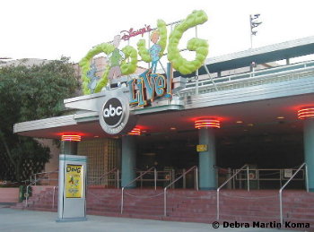
In the end though this is a highly immersive land as it was defined, and given the Tatooine gift shop, as long as there are adequate transitions from one area to another - this works for my book. And as an aside - I actually like the prequels, so I am the audience you want for this Pod Racing attraction;) I would have gone right on that as a kid (I still would) very well outlined (very much appreciate and note the willingness to try new artwork on this @DisneyFan18 - the multiple designs are very well done and really immerse me in the region. Everything is good in my book except for one detail and that's the Imperial Troopers attraction. It says it's going where Doug Live! would have...but that's in the ABC-TV Theater where American Idol was and now where the Frozen Sing-a-long is. Unless you're converting the entire building (including Sounds Dangerous) I still think it would be a tight squeeze and might even have to demo the entire area and start over again. A minor note, no harm done in the end, but just wanted to point it out because I actually saw this show as a kid and knew right where it was :p
m_dougext.jpg


Maroon Studios
A quick note it seems like the Warehouse of Wonders attraction is in Maroon Studios? Its placement before getting to Maroon Studios was a bit confusing at first, but overall not too big of a deal. Just remember placement for next time. Now - this Warehouse of Wonders might be the one of the most 'wonderful' things to come out of this presentation. It totally took me by surprise. Okay while the 2001 chimps looking at the Leg Lamp (from Christmas Story?) is just so out in left field it's in another ballpark, the charm and classic Disney story tropes seen throughout the attraction really sell it. It feels like a prequel to Mystic Manor, in a good way - as chaos is loose in a prop room causing havoc and the adventure to ensue, before being brought back to the load area and the situation calmed down - a great attraction!

Regarding the rest of Maroon Studios - I think the Hyperion Ave facade style was a bold and refreshing choice for MGM. The Terminal Bar sounds like a place where Team Brava would spend most of their nights in MGM. Bringing over Roger Rabbit was a welcome surprise, and the character windows was a nice detail.

Sunset Boulevard
The Griffith Park combo along with a connected Sunset with Maroon Studios were both excellent design choices. Having a trolley down Sunset just seems like a home-run (however I do fear that the street is very tight as is...it wasn't designed for a trolley, so maybe expand the width of Sunset Blvd to accommodate the trolley and guests?) But again the kinetic energy is something that MGM used to have in spades...and this Sunset Blvd expansion is doing just that for the park. Everything in motion.

As much as I appreciate the use of The Rocketeer - I think this ride could have been cut. 3 E-Tickets all on the same street seems a bit much, and all with height requirements, and Fantasmic nearby, I could just see this being a cluster crowd nightmare. With that I do like how it took the Soarin' tech - a nice tie in with the time period. The Gangster Patrol though is my favorite of the area - I really wish Disney went this route and did something a bit more mature. It would blend in so well with the Tower of Terror as well, be a bit more adult at the end of the Blvd, with mostly everything else for the kids. Everything about the attraction is so well choreographed and described.

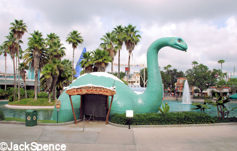
More streetmosphere - you all rocked the street characters, another great addition with the silent slapstick street shoot (say that 5 times fast). One hesitation I have is the Bulldog Cafe in my opinion should have done near Gertie on Echo Lake - to blend in with the California Crazy architecture already present.
Min%20and%20Bill%2003.jpg

Having it here on Sunset, especially surrounded by more mature attractions seems thematically out of place. However, the finale of the project - Fantasmic and the One Man's Dream daytime show were both home runs to me! Very nice descriptions and changes to the current show while still keeping the vibe of the former versions. The parades, along with the year dates, were very well laid out and made total sense given the Disney releases -- I even remember the Hercules Zero to Hero parade from MGM - the memories!

Overall, while it did go $500 million over the DCA budget a decade later -- sometimes you have to spare no expense to create the park of your dreams - and with this new Disney-MGM Studios renovation, you have done just that - Organic Orange and Great Green with a wonderful final team project of The Sorcerer's Apprentice Season 4: Homecoming Edition!​
 

spacemt354

Chili's
Original Poster
Stanza XIII Results
poster%2B15.jpg

Thank you for the amazing refurbishment to MGM and with that said it goes without question that...

Orange/Green Team
An amazing team effort capped off with a first time project manager, resilient teammates, and great chemistry

Congratulations everyone and good luck in Stanza XIV!
 

spacemt354

Chili's
Original Poster
poster%2B18.jpg

After three arduous months of creativity, teamwork, learning, and improvement, the 10 finalists looked back at where they came from, and towards what they hoped to accomplish.

After reuniting with Yen Sid, Figment, Dreamfinder, and the hosts, the finalists reminists about their first Stanza and how far they came throughout The Sorcerer's Apprentice Season 4: Homecoming Edition, even going back to the first note of the ultimate prize of The Sorcerer's Hat.
Comic1.png

Figment and Dreamfinder brought the hat to the finale project - which would be shown to the players along with some helpful tips and guidelines for the final project, including a mock up that Figment had worked on for The Sorcerer's Apprentice Universe as a whole and how it has grown since the very first project of Season 1 almost 5 years ago...


One player asked a question before the finale was released.
"So why were there 14 Stanzas? Was that just a random number?" @AceAstro asked out of curiosity.
"Nothing in this season is by accident" Yen Sid responded "From what space had told me, and from my recollection, The Sorcerer's Apprentice was a poem written by Johann Wolfgang Goethe in 1797. It was a ballad that contained...14 Stanzas."


The Sorcerer's Apprentice, 1797
 

spacemt354

Chili's
Original Poster
poster%2B19.jpg

poster%2B16.jpg

Congratulations to everyone who has made it this far! Your hard work, dedication, and passion for imagineering has shined through these Stanzas. Now, we have an opportunity to showcase everything we have learned, tried, and honed in this finale Stanza with 1st place in Season 4 and the Sorcerer's Hat on the line! Let's get to it...

The final task is to design a timeless E-Ticket attraction for your 'home' Disney Park.

- Your 'home' park is defined by the Disney park you feel most comfortable working with (more details below)

- You may use time-travel for this project. For instance, if your home park is currently crowded with E-Tickets, then you may travel back to a time when you have available space. Moreover, you may also use time-travel to re-imagine a timeless E-Ticket attraction (such as Pirates of the Caribbean, The Haunted Mansion, Jungle Cruise, Splash Mountain, Spaceship Earth, and more) in your own way. Just remember to account for the technology of your era if you use this route.

- We are looking for an emphasis on story, immersion, and creative heart. Secondly, the focus of your project should be on your E-Ticket attraction details and why it best suits the park you have chosen.

- This is taking place within The Sorcerer's Apprentice Universe, with the previous four seasons of content in existence. A detailed guide will be provided for your benefit. Lastly, your choice of location can be any Disney park except the 'bought' Cedar Fair/Six Flags properties from Stanza V.
--------------------------------
Individual Reviewers
michmousefan, WowFactor, Sam4D23, gonzoWDW, CraftyFox, Brer Oswald, v_k, P_Radden, WDW Guru, WED Imagineering, Fox&Hound, Magic Feather

This Project is due Saturday June 23rd at 11:59PM EST

Time Zones
Pacific Standard Time - 8:59 PM
Eastern Standard Time - 11:59 PM
Greenwich Mean Time - 3:59 AM
Central European Time - 4:59 AM

Thank you, best of luck to everyone, have fun, and enjoy the finale of Homecoming Edition!​
 

MonorailRed

Applebees
MonorailRed’s Reviews
17.jpg

18.jpg
Introduction - I feel like this was a nice start. I do wish it was sold in an overall mission of improving the park, rather then just an overview of the challenge. It felt like more of a summary than a selling intro to the big project.


Project Overview - The map was spectacular! I think it really shows up like the old 2000s maps at Walt Disney World Resort. Hats off to @DHindley, I think it helped visualize the overall project immensely. Timeline seems realistic n this component as well. Overall I really liked this section!


Muppet City - I love the idea of Converting this specific area of the park into Muppets. I think this was e perfect time period to do this as well - very smart move.

I think the locker integration may have been a nice nod to Muppets Take Manhattan, but also adds a Little confusion to the storyline since the Muppets apprently have apartments within the land? It made the cohesion of the land seem a little more off.

I loved the Electric Mayhem concept! :D I think it plays off of Mulch, Sweat, and Shears in an odd way.

As someone who previously worked within the classic Streets of America and DHS’s original format, I think there would expansion space where Kermit’s would be within the previous Streets of America, which was also a unique integration. It seems like a unique solution to Toontown. Fozzie’s, Kermit’s, and Miss Piggy’s were a home run.

Overall enjoyed this section!

Star Wars: Tatooine Spaceport - Knocked it out of the park! Loved this!

Warehouse of Wonders - Staying true to Studio this was my favorite project from the entire challenge. Amazing work! I think it really showcases the movie immersion in the way people think of Studios, this really, really, sold the entire project for me. I could see this as a classic attraction.
Maroon Studios - This seemed like a nice revision of Animation Courtyard. I think it adds more immersion to the studios, as well as addressing attractions and experiences for the entire family - Awesoem job!

Sunset Boulavard - THIS WAS AMAZING. :D Putting Fantasmic in a setting, adding a carousel, Rocketeer and the Gangster attraction. Incredibly impressive.

Overall, I didn’t say much in this review because I was truly floored with the content of this project. It all seemed to fit classic Studios seamlessly, while brining to life wonderful additions that have always addressed Studios’ needs. After seeing this, I can’t wait to see what the finale holds . :D:cool: Great job to everyone involved.


spacemt354

Chili's
Original Poster
MonorailRed’s Reviews
17.jpg

18.jpg
Introduction - I feel like this was a nice start. I do wish it was sold in an overall mission of improving the park, rather then just an overview of the challenge. It felt like more of a summary than a selling intro to the big project.


Project Overview - The map was spectacular! I think it really shows up like the old 2000s maps at Walt Disney World Resort. Hats off to @DHindley, I think it helped visualize the overall project immensely. Timeline seems realistic n this component as well. Overall I really liked this section!


Muppet City - I love the idea of Converting this specific area of the park into Muppets. I think this was e perfect time period to do this as well - very smart move.

I think the locker integration may have been a nice nod to Muppets Take Manhattan, but also adds a Little confusion to the storyline since the Muppets apprently have apartments within the land? It made the cohesion of the land seem a little more off.

I loved the Electric Mayhem concept! :D I think it plays off of Mulch, Sweat, and Shears in an odd way.

As someone who previously worked within the classic Streets of America and DHS’s original format, I think there would expansion space where Kermit’s would be within the previous Streets of America, which was also a unique integration. It seems like a unique solution to Toontown. Fozzie’s, Kermit’s, and Miss Piggy’s were a home run.

Overall enjoyed this section!

Star Wars: Tatooine Spaceport - Knocked it out of the park! Loved this!

Warehouse of Wonders - Staying true to Studio this was my favorite project from the entire challenge. Amazing work! I think it really showcases the movie immersion in the way people think of Studios, this really, really, sold the entire project for me. I could see this as a classic attraction.
Maroon Studios - This seemed like a nice revision of Animation Courtyard. I think it adds more immersion to the studios, as well as addressing attractions and experiences for the entire family - Awesoem job!

Sunset Boulavard - THIS WAS AMAZING. :D Putting Fantasmic in a setting, adding a carousel, Rocketeer and the Gangster attraction. Incredibly impressive.

Overall, I didn’t say much in this review because I was truly floored with the content of this project. It all seemed to fit classic Studios seamlessly, while brining to life wonderful additions that have always addressed Studios’ needs. After seeing this, I can’t wait to see what the finale holds . :D:cool: Great job to everyone involved.


So I think you can tell --- we really liked your project :)
 

spacemt354

Chili's
Original Poster
Finale Week Announcements

In the final week of The Sorcerer's Apprentice Season 4: Homecoming Edition - look for some special events to celebrate everyone's achievements, get an inside look at the creation of the season, and the look ahead to the future!

Player Art Gallery
Look to the Raiders of the Lost Art thread for a summary of the best artwork from the entire season, Stanza by Stanza

Behind The Scenes
Check the Fantasmic 2000! thread throughout the week for some behind the scenes looks at each Stanza and some auxiliary projects that served as inspirations behind them.

Upcoming Events
After the finale of Season 4 - we've got a few other competitions on the horizon, both with sign-ups going on right now. @DisneyFan18 as the host of the One Sentence Competition Season 4 - Episode 3 and So, You Want To Be An Imagineer Season 17: The International Edition hosted by @TheOriginalTiki Check your Times Guide, er, I mean the other threads, for more information;)
 

MonorailRed

Applebees
Finale Week Announcements

In the final week of The Sorcerer's Apprentice Season 4: Homecoming Edition - look for some special events to celebrate everyone's achievements, get an inside look at the creation of the season, and the look ahead to the future!

Player Art Gallery
Look to the Raiders of the Lost Art thread for a summary of the best artwork from the entire season, Stanza by Stanza

Behind The Scenes
Check the Fantasmic 2000! thread throughout the week for some behind the scenes looks at each Stanza and some auxiliary projects that served as inspirations behind them.

Upcoming Events
After the finale of Season 4 - we've got a few other competitions on the horizon, both with sign-ups going on right now. @DisneyFan18 as the host of the One Sentence Competition Season 4 - Episode 3 and So, You Want To Be An Imagineer Season 17: The International Edition hosted by @TheOriginalTiki Check your Times Guide, er, I mean the other threads, for more information;)
0d070d69bcec5ba64f7c02cdaa8d4be9.jpg
 

spacemt354

Chili's
Original Poster
Project Day!

We will be posting our reviews and the finale presentation here over the next day or so - by all means if it's easier feel free to continue to post the projects over on the Finale thread, I'll add a supplemental link to each project in the reviews, but check over here for them starting after midnight.

Thanks everyone and see you soon!
 

AceAstro

Well-Known Member
Project Day!

We will be posting our reviews and the finale presentation here over the next day or so - by all means if it's easier feel free to continue to post the projects over on the Finale thread, I'll add a supplemental link to each project in the reviews, but check over here for them starting after midnight.

Thanks everyone and see you soon!
Can’t wait to see everything. This finale presentation is going to be incredible!!
 

spacemt354

Chili's
Original Poster
spacemt354's Finale Reviews
Part 1
@D Hindley -
The Myth of Zorro

The set-up is incredibly well worded and I truly get the sense of traveling back to a time that you can no longer visit - a classic trope of Disney attractions. Something that brings more quaint local charm to Walt's California, tying in an old TV show while commemorating Old Californian culture would go a long way in adding a balance and beauty to DCA.

I like the setup of Alta Pueblo as well - seems like an area that would blend in nicely next to Ornament Valley as a transition piece. Redressing the back of the Tower of Terror as a crumbling adobe is a nice touch, reminds me of what they are doing with Toy Story Land and Rock n Roller Coaster over in WDW currently. A possibly expensive, but worthy addition to add to the immersion of the land. Great optics choice.

The diction used throughout this, I'll say it here, is beyond impressive. I mean there were words on several occasions, mostly adjectives, that I never even heard of and had to look up what they meant :hilarious: It's highly impressive to me to somehow implement a critical reading component into a hobby imagineering project.

The artwork was spectacular, especially the use of color patterns. When being set in a sort of desert, rocky landscape, it could be very easy for the entire area to become one note thematically. But your use of different colored rocks, foliage, water fountains, and tiled roof patterns all added different layers of creative touches that enabled a sense of fantasy, along with realism - a quintessential component of the best quality Disney attractions!

Zorro himself, the mysetious set-up and the backstory was nice, however I do think the ride suffered a bit from a bit of a bloated narrative in some sense which I'll get to later. The queue itself going through the private library was one of my favorite components. A wonderful queue area and transition through the secret passageway - getting Wayne Manor inspiration vibes from this going through the bookcase. The upper and lower level art designs were so very realistic - I very much appreciated the attention to detail. I remember way back for Sleeping Beauty Mine Train in Stanza I - you had asked for the Seven Dwarfs Mine Train layout for an example, and I see that same style of layout with the layered pathway drawings came back for the finale! Improved no doubt!

Budget seems a little low for it being 2015 and such an immersive dark ride, I'd say at least $200 Million. The modern upgrade to the water filtration backups was a nice touch given the location in California. The music and the restaurant along the waterway both brought some kinetic elements to the beginning of the attraction - basically DCA's version of Pirates and Blue Bayou!

The one description I wish there was as we delve into the scene descriptions, was a bit of elaboration on the upper vs lower levels. Through the queue we descend one floor (assuming from ground level) then board on a lower level, we dip down another 1 story in Scene 5 to a lower lower level, before climbing a lift in Scene 7 to the upper levels where there's a small drop, and then a 2 story drop back to the lower level - I probably would have just labeled it as distinct levels it was a bit confusing to read how there were multiple drops per level.

Mostly all of the scenes blended perfectly in a canvas of Marc Davis meets Pirates of the Caribbean, with an old Californian flair. Simply amazing stuff! The attention to where each animatronic was placed, the shadow techniques, the choreography of the AAs, was incredible. One criticism might be that some of the scenes, particularly the armory and bull-fight, felt like they might be cut down during post-production or budgetary cuts if this ever got built. Great scenes, but in a way felt like it was more just showing off Zorro rather than adding to the story narrative if that makes sense. I loved the viaduct showing a future scene though - holy cow what a cool effect!

In the end - this was a fantastic final project, one that really set the bar high for everyone in this final round. And thank you for not only submitting first, but doing so in advance because of your trip - hope you're having a wonderful time and thank you for all your contributions to Season 4, Douglas! Inspiring work through and through!
 

Register on WDWMAGIC. This sidebar will go away, and you'll see fewer ads.

Back
Top Bottom