-
The new WDWMAGIC iOS app is here!
Stay up to date with the latest Disney news, photos, and discussions right from your iPhone. The app is free to download and gives you quick access to news articles, forums, photo galleries, park hours, weather and Lightning Lane pricing. Learn More -
Welcome to the WDWMAGIC.COM Forums!
Please take a look around, and feel free to sign up and join the community.
You are using an out of date browser. It may not display this or other websites correctly.
You should upgrade or use an alternative browser.
You should upgrade or use an alternative browser.
The Sole Imagineer: An Imagineering Competition - Discussion Thread
- Thread starter RMichael21
- Start date
TheOriginalTiki
Well-Known Member
Universal owns the rights to Wicked 
Zweiland
Well-Known Member
Oh yeah, somehow I forgot that this challenge was in Uni!Universal owns the rights to Wicked
tcool
Well-Known Member
Oz and they have the rights to Wicked I think. In general I asked for Oz since Japan used it.Wait-- tcool, did RM give you permission to use stuff from Wicked or jusst Oz? You'd have to get the rights for both.
tcool
Well-Known Member
This is relatively short because I liked them all and knew nothing of the source materials except sort of @Zweiland 's stuff and @TheOriginalTiki
Vipraa -
Overall great job @Vipraa . And if I knew we could've rethemed shops I would've done that as well! Overall I can't complain about this walkthrough since I haven't seen any of those films. I also think the location is spot on due to the proximity of it being so close to the Monster Café!
Zweiland -
I either read this wrong or something because I thought you were adding Gyrospheres and Kayaking which threw me off completely. Oh and kayak was spelled wrong once. I don't know enough about Jurassic Park franchise other than it has dinosaurs. And with that factored in I still liked the concept, but I did get confused overtime.
Vipraa -
Overall great job @Vipraa . And if I knew we could've rethemed shops I would've done that as well! Overall I can't complain about this walkthrough since I haven't seen any of those films. I also think the location is spot on due to the proximity of it being so close to the Monster Café!
Zweiland -

I agree with @TheOriginalTiki this feels like the best proposal of them all, and the winning one as well. Although @RMichael21 is the one to decide about that. I can't really complain about this it all seems so cool. Is it what Lost Continent needs? No not really, it sort of is the thing some people consider what's before Harry Potter. I can't recall the last time I spent a half hour there. I don't even think I've seen Sindbad Stunt Show nor have I ever hear anyone mention it. It's still open right? Oh and also did I say how much I love this walkthrough? Because I really do.
Tiki -
I either read this wrong or something because I thought you were adding Gyrospheres and Kayaking which threw me off completely. Oh and kayak was spelled wrong once. I don't know enough about Jurassic Park franchise other than it has dinosaurs. And with that factored in I still liked the concept, but I did get confused overtime.
Zweiland
Well-Known Member
See my above post. I'm just tired and looking for an excuse to bring out the IP pitchforks, I guess.Oz and they have the rights to Wicked I think. In general I asked for Oz since Japan used it.
englanddg
One Little Spark...
englanddg
One Little Spark...
Oz rights are owned by Warner Bros. Wicked are owned by Universal. With a few exceptions.See my above post. I'm just tired and looking for an excuse to bring out the IP pitchforks, I guess.
Disney owns the rights to Return to Oz, I'm fairly certain.
The Frank Baum and Ruth Thompson books are all in the public domain, and as a result stories based on them (such as the Wiz and Oz the Great and Powerful) are fair game, however references to the Judy Garland version of the movie may not be made without permission from Warner Bros.
englanddg
One Little Spark...
My reviews...stream of consciousness, as always. (cracks open a fresh root beer and gets started, as a side note, root beer in an ice cold glass bottle is so much better than a plastic one!)
@Vipraa
Project Link Here
- Nice musical choice, as far as capturing the feeling, but it's "Giant Monster" themes...while contemporary to the movies, these are not the iconic Universal Movie Monster themes...
Very similar sounds, but why not use them?
- Queue sounds nice, in theory (very similar to GMR, but with a Monsters theme)
- I'm not sure you need to have a "Living Monster Initiative"...I think it gives away your unique points of the ride too early. I think a better script could have revolved around a "monster museum gone wrong" plot, or something else.
- The Dracula scene is just uninspired. Nothing terrible, nothing great. Considering you had so much emphasis on your queue presentation about it being "a living monster" experience, it seems rather bland.
- I'm confused how you plan to light these things "in black and white". An example or short explanation, even if it was just a short separate section talking about the "technology" used, would be nice. I can make the visual, but I'm having trouble with the practical, especially since your "guide" is full color, how you'd handle that clash? A scrim could work (as they use in some parts of GMR), but I'd have liked to seen it clarified a bit more...
- Nice nod to the original by using Fritz instead of Igor as the assistant.
- wreaks not reeks.
- I'm gonna disagree with Tiki, I liked the use of the cliche "birth" of the monster. I thought it came off pretty good, though I'm curious how much action could be accomplished in a single set piece / scene like this without live actors. ARE these live actors?
- Again, the Wolf Man, are these live actors?
- Like the Dracula scene, I found this a bit cliche and underwhelming.
- I found the ending VERY anti-climactic. As an audience, I never get to "finish" the journey. Rather, something goes wrong, monsters are everywhere now (still not sure practically how you'd pull that off) and BAM...here's the gift shop.
- The gift shop is a gift shop.
- I like that your soundtrack is long enough that it allows the reader to reasonably peruse the entire proposal without it ending. That helps keep the mood. Good job!
SUMMARY for @Vipraa
Overall, not bad. I really think your "scientists" and "museum" plot is not required, and merely adds confusion. I think if you'd just done an immersive environmental walk-through, it could have played better. Also, a map would have been nice, and I didn't see any custom artwork here at all (even the great logo at the top is an existing logo easily found online). Considering I know what you can do with graphics (and did for tcool's in the discussion thread) I'm surprised you didn't do more along those lines.
Also, there was a chance to go beyond the "Fab Four" classic Universal Monsters here and include others, like the Creature from the Black Lagoon (which, was filmed in Florida, btw) and the Invisible Man as well.
Last edited:
Vipraa
Well-Known Member
@tcool @englanddg @TheOriginalTiki
Since it has been brought up multiple times ill clarify. They are live actors not AA's. For the black and white effect the sets and clothing will all be only colored in black and white and enhanced with projections. Also the entire experience was meant to have a slightly cliche feel to it as they are classic movies.
Thanks again for the reviews guys.
englanddg
One Little Spark...
@Zweiland
Project Link Here
- Like Vipraa, nice musical choice.
- I think a title would have worked at the top...I shouldn't have to read two paragraphs in to find the name of the attraction (which is only mentioned in full once) sortof tossed off to the side. Title, or logo...or both. Something to bring front and center WHAT you are doing.
- Hah...hell joke. Funny.
- Nice map. Fits in there pretty well.
- I'm not sure how you'd fit a mountain in there? Granted, Poseidon's Fury has a rather large facade, but...mountains take up a lot of space... Perhaps if you had described it more as "cliffs" and had some detail on the map to show it's a "front", it would work better? But, as stands, this description needs a bit of clarification/work.
- This sounds very similar to Poseidon's so far...in terms of mechanics. While a realistic thing, it's not also necessarily a good thing, as they are so close?
- You could have done more with the queue...in fact, aside from saying one exists with a short description, you do nothing...considering this is a walkthrough, interactive queues (like em or not) make PERFECT sense here.
- Are these live actors or animatronics? Or a blend? Nevermind, you clarify it a paragraph later.
- I'm having trouble picturing the "ferry boat". Again, some more clarity here would be nice. I get the "metaphorical" transition, but considering it's just a walkthrough, this smacks of a ride? Couldn't this just be done with lighting?
Poseidon's does this...
- Cerebus needs to be it's own scene (and it's a great one). You should have transitioned out of it quickly and into the judges AS A SEPARATE SCENE.
- I find the script...confusing. The visuals are great...but, the script...well...it could have used some work. The story thread is convoluted and elements are out of place. At least as I read so far...that could change by the end (only on Scene 5)
- No reason to say it's "boring" and "cut short"...no need to put that in the presentation at all. Had you not said it, I wouldn't have thought it.
- While I am rather familiar with Greek mythology (though more familiar with Roman, as I've read Bullfinch's several times), I do think a few definitions would be a nice addition to your presentation.
- I like the jab at Small World! That's the first "gag" and this is the first scene where I really feel the comedy you promised towards the beginning of the presentation comes to fruit.
- I get that, in some ways, you are trying to make Hades the "Ghost Host"...but I feel his character would have worked better, in that regard, had you introduced his dialogue (even if voice alone) earlier in the experience...creating more consistency across the opening vs later scenes.
- Hades as comic is done...
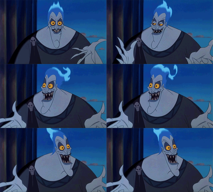
- "foolish mortals" Yeah, Ghost Host. I would have liked more jabs at Disney, since you took so many elements from their different properties to make this happen.
Summary @Zweiland
Overall, I liked how original the concept was (even though I jabbed at it, execution wise). NOT going with a direct IP was a nice touch. I think, however, this wasn't a very amusing show at all. It wasn't comedy, but it could have been (and tried at points), it wasn't amazing visuals, though it could have been (and was a points). It felt a bit...mashed up. Like it needed some clearer focus.
I like the concept of having a "Poseidon's" style walkthrough that doesn't take itself so seriously, and I really think you missed out by not having MORE jabs at Disney. Had those comedic points been fleshed out, this could really work well...both as entertaining to guests, but also fans of both Uni and WDW.
Project Link Here
- Like Vipraa, nice musical choice.
- I think a title would have worked at the top...I shouldn't have to read two paragraphs in to find the name of the attraction (which is only mentioned in full once) sortof tossed off to the side. Title, or logo...or both. Something to bring front and center WHAT you are doing.
- Hah...hell joke. Funny.
- Nice map. Fits in there pretty well.
- I'm not sure how you'd fit a mountain in there? Granted, Poseidon's Fury has a rather large facade, but...mountains take up a lot of space... Perhaps if you had described it more as "cliffs" and had some detail on the map to show it's a "front", it would work better? But, as stands, this description needs a bit of clarification/work.
- This sounds very similar to Poseidon's so far...in terms of mechanics. While a realistic thing, it's not also necessarily a good thing, as they are so close?
- You could have done more with the queue...in fact, aside from saying one exists with a short description, you do nothing...considering this is a walkthrough, interactive queues (like em or not) make PERFECT sense here.
- Are these live actors or animatronics? Or a blend? Nevermind, you clarify it a paragraph later.
- I'm having trouble picturing the "ferry boat". Again, some more clarity here would be nice. I get the "metaphorical" transition, but considering it's just a walkthrough, this smacks of a ride? Couldn't this just be done with lighting?
Poseidon's does this...
- Cerebus needs to be it's own scene (and it's a great one). You should have transitioned out of it quickly and into the judges AS A SEPARATE SCENE.
- I find the script...confusing. The visuals are great...but, the script...well...it could have used some work. The story thread is convoluted and elements are out of place. At least as I read so far...that could change by the end (only on Scene 5)
- No reason to say it's "boring" and "cut short"...no need to put that in the presentation at all. Had you not said it, I wouldn't have thought it.
- While I am rather familiar with Greek mythology (though more familiar with Roman, as I've read Bullfinch's several times), I do think a few definitions would be a nice addition to your presentation.
- I like the jab at Small World! That's the first "gag" and this is the first scene where I really feel the comedy you promised towards the beginning of the presentation comes to fruit.
- I get that, in some ways, you are trying to make Hades the "Ghost Host"...but I feel his character would have worked better, in that regard, had you introduced his dialogue (even if voice alone) earlier in the experience...creating more consistency across the opening vs later scenes.
- Hades as comic is done...

- "foolish mortals" Yeah, Ghost Host. I would have liked more jabs at Disney, since you took so many elements from their different properties to make this happen.
Summary @Zweiland
Overall, I liked how original the concept was (even though I jabbed at it, execution wise). NOT going with a direct IP was a nice touch. I think, however, this wasn't a very amusing show at all. It wasn't comedy, but it could have been (and tried at points), it wasn't amazing visuals, though it could have been (and was a points). It felt a bit...mashed up. Like it needed some clearer focus.
I like the concept of having a "Poseidon's" style walkthrough that doesn't take itself so seriously, and I really think you missed out by not having MORE jabs at Disney. Had those comedic points been fleshed out, this could really work well...both as entertaining to guests, but also fans of both Uni and WDW.
Zweiland
Well-Known Member
The mountain is in the back, on the top of the show building, and the entrance is an extension of the rockwork (like an arm).- I'm not sure how you'd fit a mountain in there? Granted, Poseidon's Fury has a rather large facade, but...mountains take up a lot of space... Perhaps if you had described it more as "cliffs" and had some detail on the map to show it's a "front", it would work better? But, as stands, this description needs a bit of clarification/work.
Is it? Uh-oh. I don't know the least thing about Poseidon's, so I hope they could both co-exist.- This sounds very similar to Poseidon's so far...in terms of mechanics. While a realistic thing, it's not also necessarily a good thing, as they are so close?
It's like a stretching room, and it is pretty much just done with lighting. It doesn't actually travel... this is not a ride.- I'm having trouble picturing the "ferry boat". Again, some more clarity here would be nice. I get the "metaphorical" transition, but considering it's just a walkthrough, this smacks of a ride? Couldn't this just be done with lighting?
No, but it is. The Asphodel Meadows are supposed to convey a sense of boring eternity. I want the guests to understand that it is boring, but I don't want them to BE bored themselves, which is why I "cut it short".- No reason to say it's "boring" and "cut short"...no need to put that in the presentation at all. Had you not said it, I wouldn't have thought it.
Yeah, I wrote the introduction first (not a good idea). It ended up having a more serious tone than I wanted, but I did manage that one gag.- I like the jab at Small World! That's the first "gag" and this is the first scene where I really feel the comedy you promised towards the beginning of the presentation comes to fruit.
Thanks for the review!
englanddg
One Little Spark...
@tcool
Project Link Here
- Ok, first...the rights for Uni Japan are limited to Wicked and the Frank Baum books (as I noted) NOT the movie. If you watch video of the park, you can quite clearly see that they made design choices to KEEP themselves from infringing on the Judy Garland movie, which is a Warner Bros. property.
You'll note they SPECIFICALLY don't use any of the music. This is the same Public Domain loophole that Disney used to get around making Oz the Great and Powerful.
So, yeah, RM gave you the right to use the property, but I'm still iffy about how MUCH you used the Judy Garland movie vs what is possible.
I think your presentation would have been smarter and more cohesive in this regard had you specifically chosen imagery and music that was NOT from the Garland film, rather than say "it exists in Uni Japan, so it's fair game"...because, with respect to it existing in terms of the Garland film imagery and music, the ONLY theme park where it exists in the world (for the time being) is HS. And, that's a carryover contract from MGM before Warner Bros took over the rights.
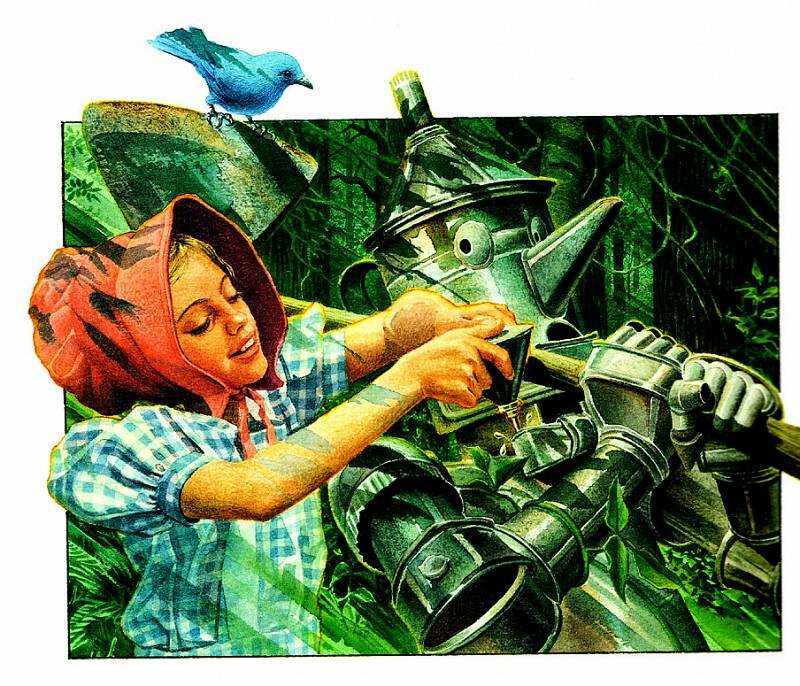
For example...this...

Instead of this...

Or, this...

Instead of this...

Point is, with a property like Oz, doesn't take too much googling to find alternative images.
And, I wouldn't even have made it a point to make the point, unless you hadn't made it a point (RIGHT AT THE BEGINNING) of your presentation. Rather, you could have left that for the discussion thread alone, and or as a footnote. Rather, now, you are starting off defensive.
Anyhow, moving on.
- Nope, can't, since you brought the point up... "The scarecrow will be singing the song If Only I Had A Brain to Dorothy, and talking to her." Nope, can't sing that. The scarecrow, however (and this would have been more unique) sing THIS...with new lyrics (and I know you can write lyrics!)
- The scent addition was a nice touch.
- "Twisted and gnarled trees surround the room as eerie looking figures watch with menacing piercing eyes making ones skin crawl." This is a GREAT description!
- So far this just feels like an uninspired walkthrough of the movie (which...Uni doesn't have rights to, since you brought it up)...
- I really, REALLY liked the angle to include Wicked in Room 6, and I wish you had done more along these lines with the other scenes.
- The whole experience here seems to stray into a Wicked attraction (which I am fine with, had that been the angle the entire time). The play uses a scrim backlight effect for the melting scene, and I would have nodded to that (I know, I just saw the play two days ago). Wasn't impressed, but that's my opinion. I can see why people liked it when it first came out.
- Nope, can't use Over the Rainbow. I'd have just cut this scene...rather stuck with the Wicked story and had something more akin to the ending reveal.
- Didn't get much from the ending room, but the graphic is nice.
Summary @tcool
I really think you hit on something here. A Wicked inspired walkthrough is an AWESOME idea. But, I think you missed on several key points. First, you shouldn't have jumped to defend your IP. Yeah, you knew it was going to come up...so, you should have done research so that when those shots were fired, you knew what you were talking about and could defend your choices better. It didn't belong in your presentation, and since you mentioned it, it made it hard for me to forget it during reading it. Better to have left that for another venue (like the discussion thread).
The first few scenes are tired, and didn't grab me at all, but the ending seemed to really pick up and I liked it a lot. This is one where, instead of an area map (like a large ride, as you did), a more detailed map of the actual attraction could have helped visualize what it was going to look like in final form.
Really solid ideas, in core concept, and unique, but I'm not sure you polished them very well.
Project Link Here
- Ok, first...the rights for Uni Japan are limited to Wicked and the Frank Baum books (as I noted) NOT the movie. If you watch video of the park, you can quite clearly see that they made design choices to KEEP themselves from infringing on the Judy Garland movie, which is a Warner Bros. property.
You'll note they SPECIFICALLY don't use any of the music. This is the same Public Domain loophole that Disney used to get around making Oz the Great and Powerful.
So, yeah, RM gave you the right to use the property, but I'm still iffy about how MUCH you used the Judy Garland movie vs what is possible.
I think your presentation would have been smarter and more cohesive in this regard had you specifically chosen imagery and music that was NOT from the Garland film, rather than say "it exists in Uni Japan, so it's fair game"...because, with respect to it existing in terms of the Garland film imagery and music, the ONLY theme park where it exists in the world (for the time being) is HS. And, that's a carryover contract from MGM before Warner Bros took over the rights.
For example...this...

Instead of this...

Or, this...

Instead of this...

Point is, with a property like Oz, doesn't take too much googling to find alternative images.
And, I wouldn't even have made it a point to make the point, unless you hadn't made it a point (RIGHT AT THE BEGINNING) of your presentation. Rather, you could have left that for the discussion thread alone, and or as a footnote. Rather, now, you are starting off defensive.
Anyhow, moving on.
- Nope, can't, since you brought the point up... "The scarecrow will be singing the song If Only I Had A Brain to Dorothy, and talking to her." Nope, can't sing that. The scarecrow, however (and this would have been more unique) sing THIS...with new lyrics (and I know you can write lyrics!)
- The scent addition was a nice touch.
- "Twisted and gnarled trees surround the room as eerie looking figures watch with menacing piercing eyes making ones skin crawl." This is a GREAT description!
- So far this just feels like an uninspired walkthrough of the movie (which...Uni doesn't have rights to, since you brought it up)...
- I really, REALLY liked the angle to include Wicked in Room 6, and I wish you had done more along these lines with the other scenes.
- The whole experience here seems to stray into a Wicked attraction (which I am fine with, had that been the angle the entire time). The play uses a scrim backlight effect for the melting scene, and I would have nodded to that (I know, I just saw the play two days ago). Wasn't impressed, but that's my opinion. I can see why people liked it when it first came out.
- Nope, can't use Over the Rainbow. I'd have just cut this scene...rather stuck with the Wicked story and had something more akin to the ending reveal.
- Didn't get much from the ending room, but the graphic is nice.
Summary @tcool
I really think you hit on something here. A Wicked inspired walkthrough is an AWESOME idea. But, I think you missed on several key points. First, you shouldn't have jumped to defend your IP. Yeah, you knew it was going to come up...so, you should have done research so that when those shots were fired, you knew what you were talking about and could defend your choices better. It didn't belong in your presentation, and since you mentioned it, it made it hard for me to forget it during reading it. Better to have left that for another venue (like the discussion thread).
The first few scenes are tired, and didn't grab me at all, but the ending seemed to really pick up and I liked it a lot. This is one where, instead of an area map (like a large ride, as you did), a more detailed map of the actual attraction could have helped visualize what it was going to look like in final form.
Really solid ideas, in core concept, and unique, but I'm not sure you polished them very well.
Zweiland
Well-Known Member
It's blatant that the first one is a ripoff of the second. The books do not once mention a red brick road to go along with the yellow one.For example...this...

Instead of this...

englanddg
One Little Spark...
True. It is called "Munchkin Country" as well, and blue (as used in the Wicked play) is the overarching theme.It's blatant that the first one is a ripoff of the second. The books do not once mention a red brick road to go along with the yellow one.
My point is merely that other images could have been found, and some research done, considering he knew, obviously, that the IP was contestable. And, as he knew that, he shouldn't have then so blatantly dismissed it.
His presentation, had he done so, and core concept, would have been immensely stronger as a result, imho.
Zweiland
Well-Known Member
I'm sure you could file it under "parody" by Wicked, so no IP issues there, but it turns out witches are only portrayed as green-skinned because of the Judy Garland movie.
http://boingboing.net/2014/10/29/why-are-witches-green.html
http://boingboing.net/2014/10/29/why-are-witches-green.html
englanddg
One Little Spark...
My point, firstly, is that, if he knew the IP would be called into question (as he clearly did), he shouldn't have addressed it right at the beginning and then relied so heavily on imagery that he knew was out of bounds already (even with RM approving it...the issue is that the IP is owned by a variety of people, depending on the iconography and images used)...
It wasn't that it made his concept any worse, but it certainly didn't make it stronger. So, it's a minor point, but one which became a major one because of how he addressed it in his project (right at the beginning), which brought it to the readers attention.
It wasn't that it made his concept any worse, but it certainly didn't make it stronger. So, it's a minor point, but one which became a major one because of how he addressed it in his project (right at the beginning), which brought it to the readers attention.
englanddg
One Little Spark...
The Green Skin choice from Wicked would clear any IP concerns...they...sortof make a rather large point of it. And, in a way that isn't handled in the source nor the Garland movie. She's a child of the emerald city man himself...the Wizard.I'm sure you could file it under "parody" by Wicked, so no IP issues there, but it turns out witches are only portrayed as green-skinned because of the Judy Garland movie.
http://boingboing.net/2014/10/29/why-are-witches-green.html
Register on WDWMAGIC. This sidebar will go away, and you'll see fewer ads.

