CrossMagic
At Disney’s WonderDome
Intro: good. Presentation: good.
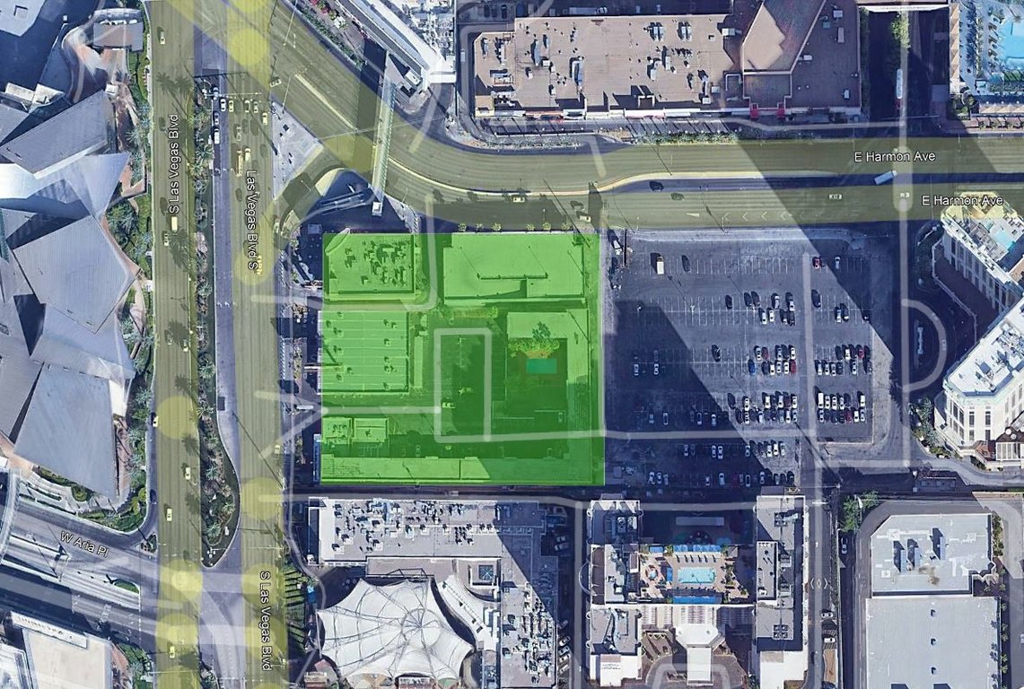
Venue description – Brief single page, largely overshadowed by the live show within. This could’ve been a fun section for players without an interest in live theater, sad to see it touched upon so briefly. Comparisons to Disney’s New Amsterdam Theatre are nice, though accompanying visuals are lacking. Some of the venue description addresses the existence of expected spaces – entry, lobby, seating, backstage – with little added detail. What’s the architectural style? Colors? What’s the proscenium look like before the show starts? Anything like a grand mural to great guests upon entry? Even with a basic Broadway-style theater venue, there is a ton of untapped potential here.
Would’ve enjoyed some talk about, e.g., how often the shows play. Are they nightly, more frequent, or what? Las Vegas allows for a great many different formats. And what – if anything – does your venue offer up when shows aren’t playing? You’re working with a grand corner location right on the heavily trafficked Las Vegas strip. Foot traffic is constant. Other Vegas venues offer casual passerby attractions – thinking like the Bellagio fountains, the tiger exhibit alongside Siegfried & Roy’s (back in the day), the old Treasure Island pirate shows – which provide great curb appeal. What more could be added to draw guests into your venue, and what more could you offer them (beyond the show) once they’re there?
Onwards to the show itself!
The risk with a variety show such as this is that it can feel formless. It’s a “greatest hits” assembly of Disney concepts, mixed with different show types. This is sheer spectacle! That’s very fitting for Vegas. You need something to stand apart from the dozens of other multimillion dollar entertainments. The Disney brand alone would be eye-grabbing on the Strip, and the show itself is fittingly frenetic. It’s a sort of chaotic grab bag approach – the show brainstorm was the very definition of project creep – but it works fine in this setting. Kinda a Vegas version of Mickey and the Magic Map, or whatever.
The frame story with Alex and Quinn helps ground the madness to come. The drunken premise is very “Vegas,” and a fusion of adult and Disney sensibilities which works for me. Each segment is fully fleshed-out; the depth of detail is at times staggering. Reading through the show’s meat & potatoes, I have little to say. I’m simply enjoying the experience…and much appreciating the transition notes between set pieces. The highlighted properties
mostly fit Vegas’ somewhat more “adult” tone (Disney Princesses not so much), and the staging is decidedly Sin City.
The prompt was set up so that the venue and the show were each 50%. Even if it weren’t, I’d still personally enjoy more theater description. Would recommend careful rereading of the prompt early in the next brainstorm so that you don’t miss anything.
Nintendo Entertainment Center
Hollywood Pictures functioned like the mirror image of Touchstone Pictures this week. With a 50:50 split in the prompt between the show and the venue, while Touchstone ran roughshod on the show itself, Hollywood’s attentions went almost entirely into the venue. An entertainment center is certainly not where my mind went when anticipating this prompt, but Vegas is the place for big, bold, brash concepts. Like Touchstone, once settling on the Nintendo concept, Hollywood suffered from a bit of scope creep. So many ideas bandied about! At one point, there were like a dozen escape rooms for each major Nintendo property planned! Let’s see if the final product feels more reined in…
As with last round’s project, you open on a winning note with a good-looking website and a carefully worded introduction. Once again I believe we have
@spacemt354 to praise. He has a real talent for explaining a project’s mission statement – in this case, catering to Vegas’ unique mix of family and adult audiences via Nintendo’s cross-generation appeal – succinctly and clearly.
The exterior description is great, aided immensely by the visual aid of the stacked cartridges. This is absolutely the sort of “go for broke” post-modern nonsense architecture which would be right at home in the Nevada desert. The entertainment center concept, I cannot think of another prominent Vegas venue which does
exactly this sort of thing, yet I can see this fitting in quite nicely with all the other entertainment options surrounding it. Since the Switch is your venue’s hub, reckon it could’ve appeared here alongside the exterior description before we then moved on to the individual shows/attractions.
I am only lightly familiar with
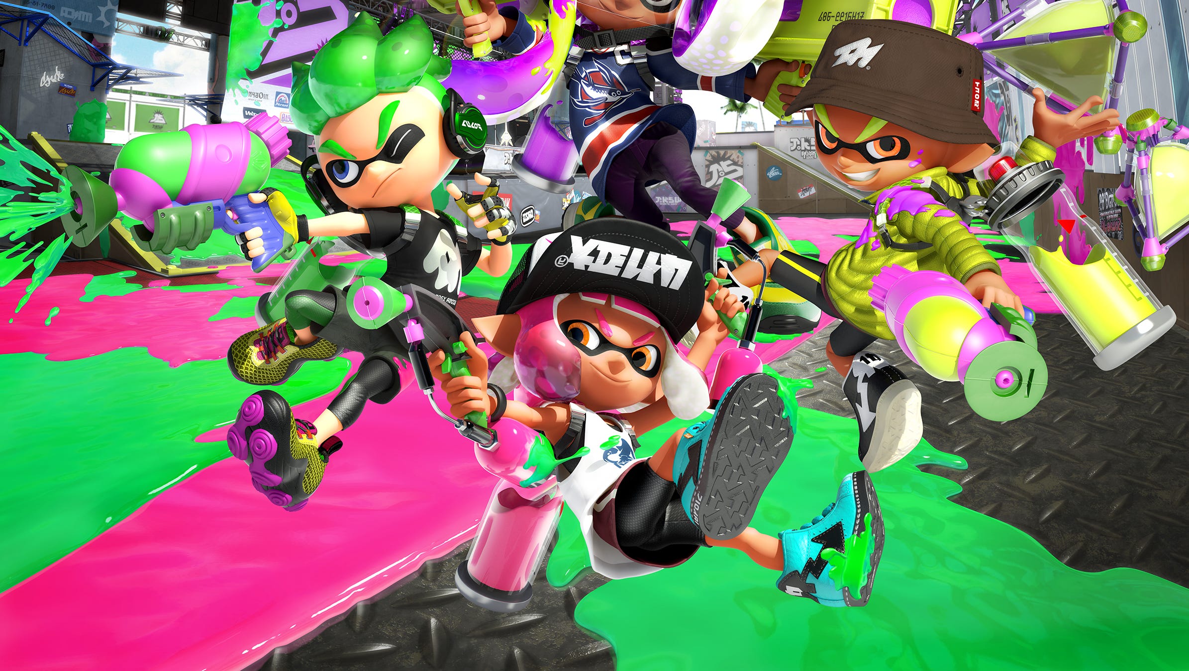
Splatoon, as I’m sure many of your would-be guests would be. The brief intro to the IP is greatly appreciated. This show – was this a last-minute thing? If so, well done – is a strange beast. Part WWE display, part spectator paintball, part stunt extravaganza, part I’m not even sure what, it has the potential to either blow the roof off of the Strip or fall flat on its face. I’m not sure if this works or not. Either way, you’ve sure gone all-in on the Splatoon live show premise, trying your best to account for myriad things like ink cleanup and ticketing packages.
That Splatoon live show was always second fiddle to the vast collection of other attractions you had planned for the Nintendo Entertainment Center. Half a dozen or more attractions were planned. Two got completed: Luigi’s Mansion, and Metroid. I’ll briefly consider both on their own merits.
Luigi’s Mansion answers a question I’ve often pondered: What would an escape room on a DisneyVersal budget look like? While a great many Nintendo games were debated for this genre, Luigi’s Mansion is quite fitting. I love the consistently evocative descriptions, the placemaking, the special effects, and the overall pacing of the “playthrough.” This feels like a proper attraction.
Metroid Laser Tag (Tegan’s baby of course!) works similarly. It too elevates its chosen walkthrough genre to A-tier. Really, I don’t have much to say…except for a few Metroid references which are over my head. Both this and Luigi’s combine good writing with appropriate visuals. Neither really has a whole lot to do with the prompt (at least the live show portion of it), but I’m heartened to see a few engaged players having fun anyway!
Looking back over the intro page, I see there are several planned attractions which didn’t get completed, from the Zelda Challenge to Wario’s Casino. (I was especially intrigued by the latter for Vegas.) At the very least, you addressed their absence with a “Future Expansions” section. Thanks.
Both teams saw some uneven activity this week, particularly in these final days. Sadly, Team Hollywood seemed to suffer from this more. Despite the engaged brainstorming, a few crucial players (no names!) went radio silent a few days ago, meaning this final project is the creation of only three players. I worry about active player burnout. Please, guys, if you’re going to be absent for a few days, if you cannot complete your section for whatever reason, let your teammates know early on. Some players have done a good job with this.


