Sirwalterraleigh
Premium Member
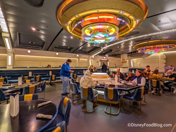
You gotta admit it’s a huge downshift from what they portrayed it to be in the concepts. Very “cafeteria with neon”. But that’s not unusual…just sticks out more here.Small correction. It looks like crap in pictures (which I agree, it does) but the people who have actually been there have pointed out many times that it didn't look nearly as bad in person. Doesn't mean it shouldn't have been better but it likely gets called out unfairly because it just doesn't photograph well.
If you take a close look at be our guest…it kinda sucks too. Why do you think the lights are so low?
It was better in every way except one but let's face it, quality doesn't win out in most cases. People want cheap and easy first and foremost with quality being a distant third in most cases.
I think it’s a balance between value and price…
And that’s what often missing with this completely stupid “luxury” tact that Bob has said non-committal for years. They’re saying it…not building it. Hefty budgets not bringing back the delivery of value.

