I am leaning towards all black as I do not want any shading and the official colors of the symbols I am using do not go well together.IMO, for a simple logo like this, doing all black with really crisp clean lines is the way to go. However it all depends on what the design your getting looks like. The more intricate the design the more you're going to want color and shading to really make it pop.
-
Welcome to the WDWMAGIC.COM Forums!
Please take a look around, and feel free to sign up and join the community.
You are using an out of date browser. It may not display this or other websites correctly.
You should upgrade or use an alternative browser.
You should upgrade or use an alternative browser.
So I got a new tattoo
- Thread starter PurpleDragon
- Start date
WishingOnAStar
New Member
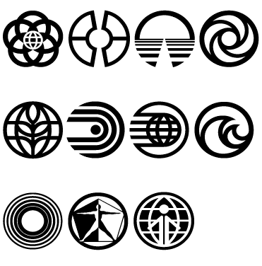
I think that this is most of the classic Epcot symbols. Some are pretty cool and would be a good possibility, even for me. I really like the WoM symbol and the the Living Seas (without Nemo).

Which attraction was the third from the left on the top row from? Looks just like the Obama '08 campaign symbol
Horizons.Which attraction was the third from the left on the top row from? Looks just like the Obama '08 campaign symbol
UberMouse
Active Member
MattyDrums
Member
Very cool! I just got these in March:

These are AWESOME.
I think that this is most of the classic Epcot symbols. Some are pretty cool and would be a good possibility, even for me. I really like the WoM symbol and the the Living Seas (without Nemo).

For those that are wondering the logos in the image above are as follows:
TOP ROW: Epcot, Communicore, Horizons, Imagination
SECOND ROW: The Land, World of Motion, Spacreship Earth, The Living Seas
THIRD ROW: Energy, Wonders of Life, World Showcase
MattyDrums
Member
I was thinking about getting a Mickey skin rip tattoo. Just need to get back near my tattoo artist, the only guy I trust to do it.
UberMouse
Active Member
For those that are wondering the logos in the image above are as follows:
TOP ROW: Epcot, Communicore, Horizons, Imagination
SECOND ROW: The Land, World of Motion, Spacreship Earth, The Living Seas
THIRD ROW: Energy, Wonders of Life, World Showcase
Thanks! I should have done that. :hammer:
Foolish Mortal
Well-Known Member
I'm 34, this is my 8th tattoo but my one and only Disney themed one. :animwink:
Betcha can't get JUST one :lol: I couldn't. Currently contemplating my 3rd
Foolish Mortal
Well-Known Member
And one of these days I'll grow a set and get it done. I am still up in the air on color vs. no color.
I say go color. They stand out more. I love when people compliment/comment on the coloring on 1 of my 5. I hate to sound like I want the attention, but people with tats will understand
Betcha can't get JUST one :lol: I couldn't. Currently contemplating my 3rdCongrats on your 1st Disney tat. Looks good.
LOL, if you scroll to the top of the 2nd page you'll see I'm already contemplating getting the logo for SSE or Imagination on my other foot. :lol::hammer::lol:
UberMouse
Active Member
OT, kinda, but my brother was looking at tattoos online and came across this because I thought about getting some sort of spider in the future. (I'm scared to death of spiders...Like Indiana Jones is with snakes). I figure that placing the only thing on my body that scares me would give me power over it..probably not though. I digress...He found this pic, which may be one the the best tats I have ever seen...


Here is my favorite tattoo I've gotten to date. This partial sleeve took a total of 8 hours to get finished. If you saw the content of most of my tattoos, then my screen name makes a little more sense. :lol:


UberMouse
Active Member
Here is my favorite tattoo I've gotten to date. This partial sleeve took a total of 8 hours to get finished. If you saw the content of most of my tattoos, them my screen name makes a little more sense.

Really nice! Awesome detail!
MattyDrums
Member
Here is my favorite tattoo I've gotten to date. This partial sleeve took a total of 8 hours to get finished. If you saw the content of most of my tattoos, then my screen name makes a little more sense. :lol:

Nice! this is my favorite that I have. Something Disney is next.

Register on WDWMAGIC. This sidebar will go away, and you'll see fewer ads.
