Repainting of Epcot Central Plaza?

matt9112

Well-Known Member
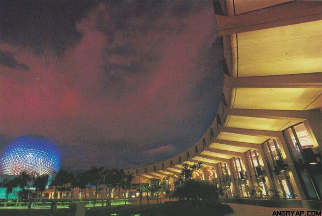
Yes. The entire EPCOT parklike hub has been replaced the way they have and are now replacing the MK park-lke hub.

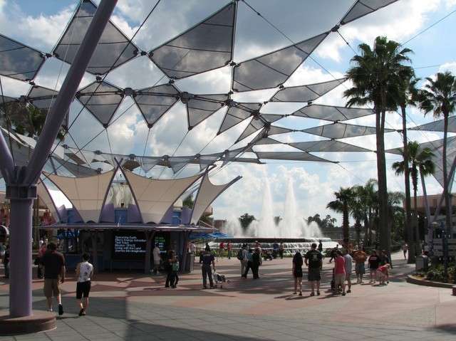
The CC/Innoventions buildings should be subdued colours, set in a park-like plaza, with water and fountains and trees. Then their subdued colours and repetitive facades become elegance. On their own, having to carry an otherwise empty plaza, the restraint and repetition of the architecture turns into boring. The plaza is too large, the architecture too restraint. So this then has to be remedied. But each subsequent attempt to remedy that boring look then only adds clutter and tackiness, from those trianges to cutting the Innoventions buildings in half to those swirly things to current (possible?) polychrome paintjobs.

Communicore_Future_World_front.jpg


i never got to see this =( looks nice
 

aladdin2007

Well-Known Member
Yes, I doubt that too.

The EPCOT hub does not need kinetics. That is alien to its design. It was not build for it, it resists it. The result is nervous unrest at best, crossing over into tackiness at worst.

CC/Innoventions Plaza, the center of EPCOT Center, the spiritual heart of the entire Florida resort, is build for Zen, for calm inspiration. Lively and in motion, but tranquil and subdued. A place of simplicity of design - which is the height of elegant good taste, not the absense of it.

FW in many ways felt like a Japanese garden. Very restraint, every plant and rock and water part serving a purpose. Adding to the harmony, from which the beauty was derived.
Wild colours and 'kinetics additions' feel like taking a Japanese rock garden and adding a statue of Ronald McDonald blowing on a vuvuzela to it, to 'liven it up a bit'. It is buffoonery.


Fountain-Of-Nations.jpg


commmain.jpg

Wow check out those sweeping lush palms, rich green grasses, and flowers in the first pic. They really have massacred these parks.
 

matt9112

Well-Known Member
i would love those damn triangle shade things aforementioned to disappear ..add some more trees and small gardens and tear down these shade/poles. granted not sure if im on-board with zen garden or not. i think Epcot should look advanced. it should resemble a real tommorowland not one of fantasy like in the MK. some good RGB lighting.

edit....more cooling fans and or mist.
 

aladdin2007

Well-Known Member
Most of the main Communicore exhibition spaces were below ground level. The walkways and through routes were at outside ground level but main internal display areas were about six foot below this level, accessed by steps and ramps.

Centorium was a multi level paradise.

Yes I remember all of that myself, was fantastic and so well designed. What I cant recall is some of that landscaping but I remember it being beautiful. Sad.
 

aladdin2007

Well-Known Member
i would love those damn triangle shade things aforementioned to disappear ..add some more trees and small gardens and tear down these shade/poles. granted not sure if im on-board with zen garden or not. i think Epcot should look advanced. it should resemble a real tommorowland not one of fantasy like in the MK. some good RGB lighting.

edit....more cooling fans and or mist.

Im with you, but its probably going to take a hurricane to come through to break those down. Seriously would it really cost that much to take them down and restore some lushness to the place? I know in TDO's words, "yes it would". :banghead:
 

The Empress Lilly

Well-Known Member
I remember reading a comment from John Hench stating that the outdoor portions of Epcot were designed to be a place of calm reflection to counterpoint the intensity of the shows in the pavilions. That matches very well the Zen idea.
That is exactly it!

I never heard of that Hench comment. It is spot on. Precisely why iFW worked so well, why it left such an indelible impression on those who visited it. This counterpoint with the shows inside the pavilions was magnificent.
FW was a spiritual experience. Not in any religious sense, but in the way of a zen garden, or of being overwhelmed with a grand natural vista. Niagara Falls, Hudson Valley in fall, Grand Canyon. If you've seen them, it never leaves you.


@marni1971 - trust you to have the best overview picture! Splendid, thanks. :)
 

steve2wdw

WDW Fan Since 1973
The old Communicore design was built with respite from the heat...it's long curving corridors in both east and west providing needed relief from the Florida climate. The plaza was both visually appealing and it's trees provided needed shade, but it's pathways were also smaller since many guests seemed to use the indoor routes. With the removal of these east and west "streets" through Communicore, more capacity (and shade) was needed in the plaza to move guests through Future World. Sadly, this resulted in the concrete expanse we see today, as well as the well meaning, but visually intrusive shade canopies. The old Communicore was brilliant in design, showcasing the many exhibits to guests as they passed through these inspiring spaces, easily inviting those interested to step into those spaces and explore. If today's Innoventions was hugely successful, I could see it difficult to undo what has been done to the area, but the fact that Innoventions is mostly a huge waste of space now, should dictate a return to the old floor plan, re-introducing those huge indoor avenues, and allowing the central plaza to be returned to it's "zen-like" state.
 

The Empress Lilly

Well-Known Member
The old Communicore design was built with respite from the heat...it's long curving corridors in both east and west providing needed relief from the Florida climate. The plaza was both visually appealing and it's trees provided needed shade, but it's pathways were also smaller since many guests seemed to use the indoor routes. With the removal of these east and west "streets" through Communicore, more capacity (and shade) was needed in the plaza to move guests through Future World. Sadly, this resulted in the concrete expanse we see today, as well as the well meaning, but visually intrusive shade canopies. The old Communicore was brilliant in design, showcasing the many exhibits to guests as they passed through these inspiring spaces, easily inviting those interested to step into those spaces and explore. If today's Innoventions was hugely successful, I could see it difficult to undo what has been done to the area, but the fact that Innoventions is mostly a huge waste of space now, should dictate a return to the old floor plan, re-introducing those huge indoor avenues, and allowing the central plaza to be returned to it's "zen-like" state.
Yes, fantastic!

CommuniCore's walkways served as the first ''DLP MS Arcades', performing the function of providing a sheltered pathway from the front to the back of their area. They worked so well too, with their tall glass windows providing great views, and the sunken floors neatly separating the exhibit space.

I guess it is the law of unintended consequence that the disuse of the CC pathways indirectly should result in a new paintscheme two decades later. As in, walkways no longer used -> increased traffic pressure on hub -> hub turned into open plaza -> architecture's aesthetics lose functionality and setting -> needs to be revved up -> kinetics and colourful paintjob to compensate.
 

Soarin' Over Pgh

Well-Known Member
If I may, the project I did comparing Communicore to Innoventions, including the plaza


Hey, who's that attractive guy with the camera?! ;)

Your videos look amazing on my 44 inch tv.

And I feel like I am visiting the "real" Epcot with your videos. Sadly, I would much rather remember your videos over my Epcot experience last year. I wish I was able to experience YOUR Epcot when it was reality.

Because that is one beautiful park. That thing there now... Yeah not so much.
 

Register on WDWMAGIC. This sidebar will go away, and you'll see fewer ads.

Back
Top Bottom