-
Welcome to the WDWMAGIC.COM Forums!
Please take a look around, and feel free to sign up and join the community.
You are using an out of date browser. It may not display this or other websites correctly.
You should upgrade or use an alternative browser.
You should upgrade or use an alternative browser.
Repainting of Epcot Central Plaza?
- Thread starter Donald96
- Start date
willtravel
Well-Known Member
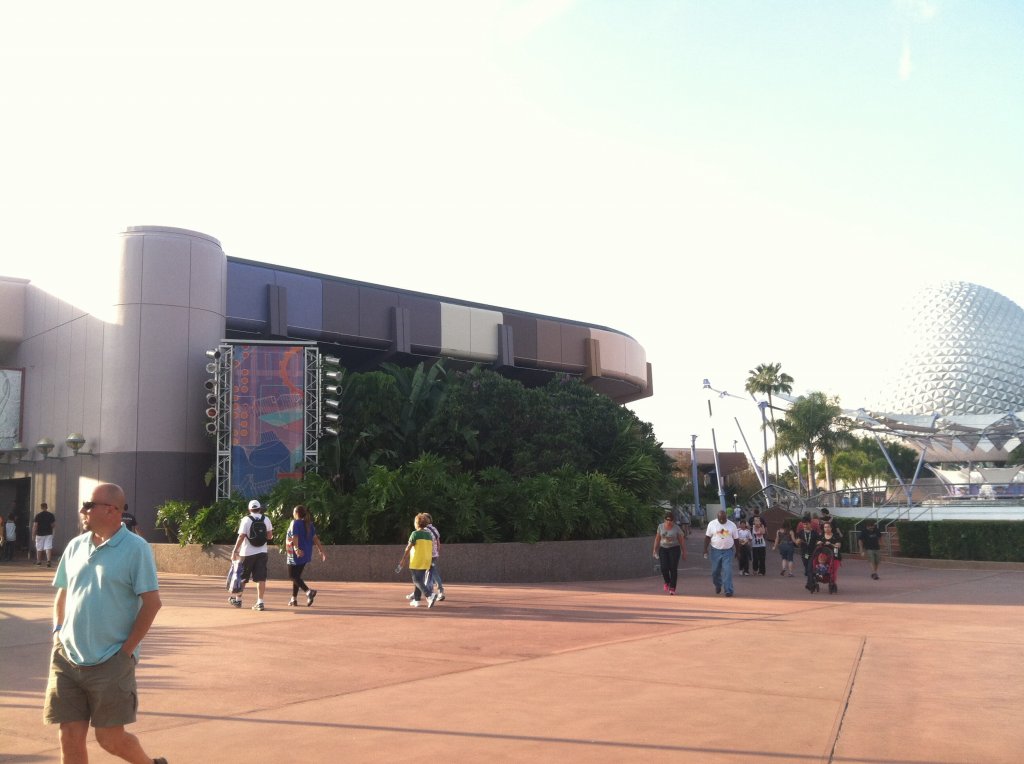
I think you are right. I think the painting of Fountain View was only the beginning of the painting in that area. Or after they painted Fountain View they decided the rest of the area needed painting with a cohesive color schemes.Those "test colors" (if thats what they are) appear very similar to the ones used for the new Fountain View Starbucks. I wouldn't be opposed to Innoventions adopting it.


Above pics from
http://www.wdwfacts.com/2013/09/08/...ide-the-new-fountain-view-starbucks-at-epcot/
CDavid
Well-Known Member
That color pallet just doesn't work.
Who came up with it, an intern?
A blind intern, perhaps.
Goofnut1980
Well-Known Member
At least they are painting. We might not like it, but it is possible it could lead to something more cohesive. One never knows.
MOXOMUMD
Well-Known Member
Agreed. Windows are for looking through otherwise they're basically glass walls.Thanks for the pics.
You're right, it does match those window covers nicely, ties it together much better then before. HOWEVER...
Those windows should not have covers. They should be WINDOWS!
Figment2005
Well-Known Member
I think everyone is being a little to harsh on this paint scheme. If you look at the details, the different colors pull the whole place together. The windows should be see through and not walls, but since that is not the case, the paint pulls it together. The Mousegear sign also matches the new paint in the area. The whole area now looks like it was designed at the same time instead of having new things thrown in with the old.
Tom Morrow
Well-Known Member
^ yeah, the paint scheme does make more sense when you see it in person. The colors match what is below them. They do make the area more visually interesting and fresh. More subtle different color tones would have been better, though.
Michael koevoets
New Member
I Like the new colours!! its fresh
Figment2005
Well-Known Member
But what don't you hate? I'm sure it would be a much shorter list.Sorry. I just hate it. It just looks like a mess. Too busy. Too in your face. The green over the walkway between the buildings looks terrible. H-A-T-E it.
sshindel
The Epcot Manifesto
True, currently when Epcot is concerned, the list would be much shorter of things that I like:But what don't you hate? I'm sure it would be a much shorter list.
Living with the Land
Biergarten
...
Umm...
Via Napoli
1/2 of Spaceship Earth
I'm just glad to see they finally put those leftover gallons of used paint to good use....Sorry. I just hate it. It just looks like a mess. Too busy. Too in your face. The green over the walkway between the buildings looks terrible. H-A-T-E it.
sshindel
The Epcot Manifesto
We need to put someone on the task of looking at the most recent refurbs around the parks to figure out which projects they bought too much paint for, thus leading to the wonderful "design" we see today. I'll bet we can match up that neon green paint with some project or another.I'm just glad to see they finally put those leftover gallons of used paint to good use....
Perhaps, but I honestly think that someone came up with an idea for the cheapest and easiest way to "spruce up" Central Plaza without impacting the quarterly numbers....We need to put someone on the task of looking at the most recent refurbs around the parks to figure out which projects they bought too much paint for, thus leading to the wonderful "design" we see today. I'll bet we can match up that neon green paint with some project or another.
I am normally one that can look the other way when it comes to a choice I don't care for, but this paint scheme is a mess. I can not see a single redeeming quality in it no matter how hard I try. And this is coming from a guy whose bedroom is painted in a Monsters Inc inspired color scheme.Sorry. I just hate it. It just looks like a mess. Too busy. Too in your face. The green over the walkway between the buildings looks terrible. H-A-T-E it.
sshindel
The Epcot Manifesto
Yessss. Yessssss... Goooood. Let the hate flow through you!I am normally one that can look the other way when it comes to a choice I don't care for, but this paint scheme is a mess. I can not see a single redeeming quality in it no matter how hard I try. And this is coming from a guy whose bedroom is painted in a Monsters Inc inspired color scheme.
Yessss. Yessssss... Goooood. Let the hate flow through you!

Yessss. Yessssss... Goooood. Let the hate flow through you!

Register on WDWMAGIC. This sidebar will go away, and you'll see fewer ads.