-
Welcome to the WDWMAGIC.COM Forums!
Please take a look around, and feel free to sign up and join the community.
You are using an out of date browser. It may not display this or other websites correctly.
You should upgrade or use an alternative browser.
You should upgrade or use an alternative browser.
EPCOT Remy's Ratatouille Adventure coming to Epcot
- Thread starter wdwmagic
- Start date
Epcot82Guy
Well-Known Member
It's such an odd and poor (cheap?) design choice...
Even the ride in Paris has some very small bits of this. But, most of the facade is fully realized, making it work well. Let alone the side profile (which Paris doesn't have to deal with - but WDW very much does.)
Even the ride in Paris has some very small bits of this. But, most of the facade is fully realized, making it work well. Let alone the side profile (which Paris doesn't have to deal with - but WDW very much does.)
Sir_Cliff
Well-Known Member
Honestly, I didn't notice anything like this in Paris. That whole area is wonderfully themed. I'm kind of surprised they would go this route in World Showcase... or any Disney park other than circa 2001 DCA. Maybe from front-on it looks ok, but so far even from that perspective it seems uncharacteristically cartoony compared to the rest of the pavilion.It's such an odd and poor (cheap?) design choice...
Even the ride in Paris has some very small bits of this. But, most of the facade is fully realized, making it work well. Let alone the side profile (which Paris doesn't have to deal with - but WDW very much does.)
Epcot82Guy
Well-Known Member
Honestly, I didn't notice anything like this in Paris. That whole area is wonderfully themed. I'm kind of surprised they would go this route in World Showcase... or any Disney park other than circa 2001 DCA. Maybe from front-on it looks ok, but so far even from that perspective it seems uncharacteristically cartoony compared to the rest of the pavilion.
I had to go back and check. There is a little bit of it, but it is very much in the background at the very top. There is another layer of 3-D facades in front of the more "backdrop" types. And, the WDSP location's backdrops are never seen at profile. So, you don't see anything like this. That areas is very well done. And, I think doing realistic versions of the buildings adds to the integration of the character into "actual" France. So, again, very odd.
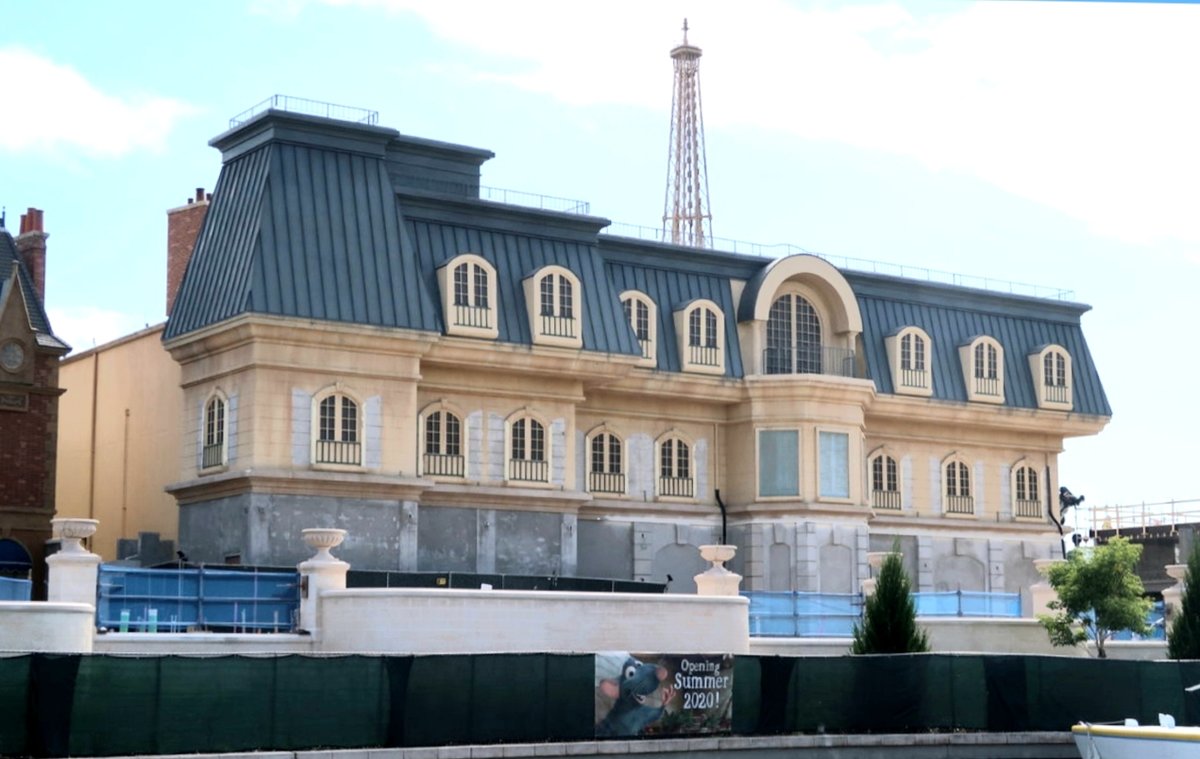
I loved the concept art. This is pathetic. Such a poor effort and something that could have been easily and cheaply rectifiedOuch. C'mon guys, these are CHIMNEY TOPPERS. They didn't need to be flat (and therefore require reinforcement on their backs). I could go down to Home Depot right now and replace each one with real toppers and make this problem go away.
View attachment 448338
Photo by from ResortTV1
Josh Hendy
Well-Known Member
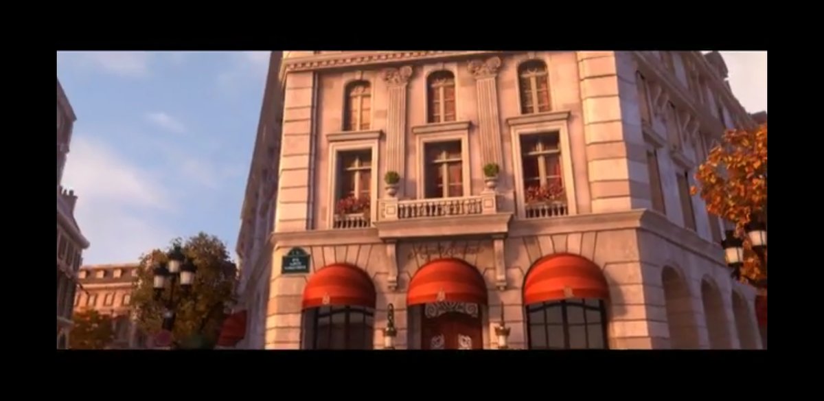
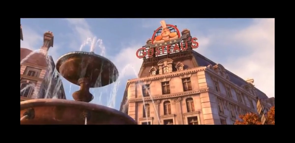
I saw the movie just once but remind me... isn't there a really good shot of the restaurant exterior they could use as a reference and starting point for the facade of the ride building?They need to add some street art to those building on the side and maybe a Disney inspired Space Invader or something. These buildings don't represent true Paris!
Josh Hendy
Well-Known Member
What am I, my youtube slave?


Edit ... for comparison:

Edit ... for comparison:
Last edited:
lazyboy97o
Well-Known Member
That’s the theater and has been there awhile. It’s not very good but it’s not the Ratatouille ride.What am I, my youtube slave?
View attachment 448427
View attachment 448428
Edit ... for comparison:
View attachment 448429
Josh Hendy
Well-Known Member
Thanks that looks much better 
wdwtopten
Well-Known Member
Ouch. C'mon guys, these are CHIMNEY TOPPERS. They didn't need to be flat (and therefore require reinforcement on their backs). I could go down to Home Depot right now and replace each one with real toppers and make this problem go away.
View attachment 448338
Photo by from ResortTV1
It's such an odd and poor (cheap?) design choice...
Even the ride in Paris has some very small bits of this. But, most of the facade is fully realized, making it work well. Let alone the side profile (which Paris doesn't have to deal with - but WDW very much does.)
I loved the concept art. This is pathetic. Such a poor effort and something that could have been easily and cheaply rectified
I'm very sorry, but I'm not following this conversation.
What is the issue being discussed here?
britain
Well-Known Member
I'm very sorry, but I'm not following this conversation.
What is the issue being discussed here?
It's the in-park visibility of the supports behind the chimney cut-outs.
Here's a shot from blogmickey of the reverse side.
Heck, they could even put paneling to wall-up the triangular open areas and that would do SOMETHING.
I'm sure it will all look wonderful from the point of view of those walking toward the new attraction, but walking toward the France pavillion in general should have been considered too.
Josh Hendy
Well-Known Member
What the heck are those things? Structurally or functionally.
Little Green Men
Well-Known Member
I would think they will plant trees or something to block the view, I'm sure they'll do it closer to opening.It's the in-park visibility of the supports behind the chimney cut-outs.
View attachment 448488
Here's a shot from blogmickey of the reverse side.
View attachment 448489
Heck, they could even put paneling to wall-up the triangular open areas and that would do SOMETHING.
I'm sure it will all look wonderful from the point of view of those walking toward the new attraction, but walking toward the France pavillion in general should have been considered too.
Missing20K
Well-Known Member
Flats!?!?!? What is this, Disney's/MGM Studios?
EPCOTCenterLover
Well-Known Member
It's the in-park visibility of the supports behind the chimney cut-outs.
View attachment 448488
Here's a shot from blogmickey of the reverse side.
View attachment 448489
Heck, they could even put paneling to wall-up the triangular open areas and that would do SOMETHING.
I'm sure it will all look wonderful from the point of view of those walking toward the new attraction, but walking toward the France pavillion in general should have been considered too.
^^^Unfortunately, this seems to be the new standard. The backs of SW:GE on both coasts, Pandora at AK, and Cars Land at DCA are all unthemed. Especially driving to these parks exposes all this- which should never be seen by guests. Never.
Missing20K
Well-Known Member
They look even worse due to their visual proximity to fully realized "chimneys".Ouch. C'mon guys, these are CHIMNEY TOPPERS. They didn't need to be flat (and therefore require reinforcement on their backs). I could go down to Home Depot right now and replace each one with real toppers and make this problem go away.
View attachment 448338
Photo by from ResortTV1
EPCOTCenterLover
Well-Known Member
Or DCA 1.0Flats!?!?!? What is this, Disney's/MGM Studios?
Register on WDWMAGIC. This sidebar will go away, and you'll see fewer ads.
