News Refurbishment coming soon to Disney's Polynesian Village Resort - Moana details to be included

castlecake2.0

Well-Known Member
Thanks- I didn’t think I’d dreamed it- something about he no longer deemed it worthy of a flagship resort if Im not mistaken. Maybe 2021-2022.
Yep that’s it exactly, I think after four seasons opened he realized how much it didn’t look flagship anymore. I think all three monorail resorts could do with upgrades to make them world class again
 

Gitson Shiggles

There was me, that is Mickey, and my three droogs
I'm interested when you went. For a time, it was actually a pretty solid place (and that's coming from an admitted food snob who typically has issues with a lot of Disney food). Quality has dropped as they try to cram more and more profit out of the place in more recent years.
It’s been about three years. ‘Ohana is impressive for a first visit and still works well as a total sum of its parts; but the meat service is lacking—the variety, quality of meat, and the frequency of service. I did not realize this until I went to a churrascaria near where I live. I wish Disney would take a note from one of these restaurants and not go halfsies on that particular part of the experience.
 

larryz

I'm Just A Tourist!
Premium Member
Gotta love online anonymity!! People say the darnedest things like this. Internet bravado at it's best!! 😂
Food critics are all alike... anonymous or not.
1599143579979.png
 

Epcot82Guy

Well-Known Member
It’s been about three years. ‘Ohana is impressive for a first visit and still works well as a total sum of its parts; but the meat service is lacking—the variety, quality of meat, and the frequency of service. I did not realize this until I went to a churrascaria near where I live. I wish Disney would take a note from one of these restaurants and not go halfsies on that particular part of the experience.

That makes sense. The time period I was speaking of is definitely prior to that. Believe it or not, it's a bit better than it was at one point (though not much). It's still tasty, but I think your assessment is a fair one. I don't think it has to go to the full currascaria level. But, what they offer should then be of quality. I think the nostalgia factor is preyed upon by Disney a bit much for 'Ohana (and a number of other spots).
 

Bocabear

Well-Known Member
With any refurbishment project at the hotels what I fear most is the design team that brought us the "Enchanted Rose Lounge" being in charge of the Poly renovation. The last refurbishment removed a lot of what was iconic about the Great Ceremonial House... If this design firm is involved in the next renovation, the Polynesian is going to look a lot more like a Hampton Inn with framed Moana prints and the same modern furnishings you can see at any hotel in the US.
The excuse with the destruction of Mizner's Lounge was that "people don't want so much theme"...If that is truly the case, then no one would be staying at the Disney hotels... People stay more for the charm and immersion as well as the convenience....
Adding Moana seems a little pointless to me, but at least it fits theme...I am just hoping their interpretation of theme is not the way they interpreted Beauty And The Beast's French Rococo design at the Grand Floridian.
 

Epcot82Guy

Well-Known Member
With any refurbishment project at the hotels what I fear most is the design team that brought us the "Enchanted Rose Lounge" being in charge of the Poly renovation. The last refurbishment removed a lot of what was iconic about the Great Ceremonial House... If this design firm is involved in the next renovation, the Polynesian is going to look a lot more like a Hampton Inn with framed Moana prints and the same modern furnishings you can see at any hotel in the US.
The excuse with the destruction of Mizner's Lounge was that "people don't want so much theme"...If that is truly the case, then no one would be staying at the Disney hotels... People stay more for the charm and immersion as well as the convenience....
Adding Moana seems a little pointless to me, but at least it fits theme...I am just hoping their interpretation of theme is not the way they interpreted Beauty And The Beast's French Rococo design at the Grand Floridian.

That is my fear as well. There's absolutely a way to do this well - like the IP subtlety shown with Gran Destino. Enchanted Rose is a travesty IMHO. Having just been in recently, it's honestly just not well designed. And the theme is shoehorned and makes no sense. It's an odd blend of modern, Disney characters, mid century and some level of faux luxury. As one who honestly frequents the places and price point they are trying to invoke, I have no clue who the audience is. I really hope the Poly doesn't get treated the same way.
 

Haymarket2008

Well-Known Member
I think this has all been a little blow out of proportion. Room refurbishments are desperately needed and Moana "touches and references", (which are confirmed), are not a huge deal.

Nods to characters can be done in tasteful ways. Grand Californian and Wilderness Lodge, for example, do this beautifully.

Has there been any strong indication that the Ceremonial House will be totally Moana-ized?? I highly doubt they will be changing the overall vibe of the place. I can see Moana Mercantile and Bout-Tiki getting larger IP presences. The Maui logo/statue, the Rolly Crump tikis, and the overall vibe won't be going anywhere, I'd imagine. This isn't a full scale refurb.
 

Tinkwings

Pfizered Fairy
Premium Member
In the Parks
No
The announcement referred to details, patterns, and textures. I’m not going to assume more than that in the absence of evidence.

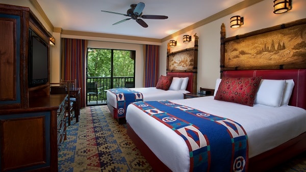
That is what I am thinking anyhow, when they redid the Wilderness Lodge last time they totally changed the color palette, textures, patterns, prior I had liked it but I LOVED the updated look top picture below.....so similar but BETTER.....I think I just read they had completed the club level refurb this past July.....but not read much on it. So here is to hoping their designers plus what is already there without taking away the charm, and not infusing too much obvious Moana theming.....It's better when its sort of hidden to be discovered and subtle.:cool:


Disney's Wilderness Lodge - The Magic For Less Travel


Disney's Wilderness Lodge, 901 Timberline Drive, Orlando, FL, US
 

Epcot82Guy

Well-Known Member
I think both sides of this most recent debate have merit. The last few posters are 100% right that there is a way to do this tastefully. Having a general tiki motif with little nods to Moana (and I'm sure a hidden Mickey, even) - maybe with a color palette of ocean blue, Tefiti green, red and tan - could be both fun and quite nice. If it's done tastefully, this could be a very nice upgrade that adds some small hints of Moana to stay in brand.

On the other hand, we've seen some recent abuses of these mandates and - frankly - really, really bad design choices (that also don't make sense where they are). So, the skepticism is also well founded.

I do think everyone would agree the tasteful, subtle approaches are all more universally enjoyed. So, I hope they trend in that direction. That seems to have the best reception.
 

Tinkwings

Pfizered Fairy
Premium Member
In the Parks
No
Photos of Wilderness Lodge Renovated Rooms (2020) - The Disney Journey There is a wonderful vid on youtube on the 2020 refurb done on club level but here is a sample, it is more modern but I am loving it, will grow on me.......still have subtle bambi and chip and dale muted images....loads of changes but off to explore more of my favorite resort..... https://www.youtube.com/watch?v=0LVFeHyTpW8 see the rest on this link and the bathroom is awesome, they shut off the sink with rolling barn door and light up stone panel.....what fun! I am geeked! They have been busy!!!:D
 

Club Cooloholic

Well-Known Member
Photos of Wilderness Lodge Renovated Rooms (2020) - The Disney Journey There is a wonderful vid on youtube on the 2020 refurb done on club level but here is a sample, it is more modern but I am loving it, will grow on me.......still have subtle bambi and chip and dale muted images....loads of changes but off to explore more of my favorite resort..... https://www.youtube.com/watch?v=0LVFeHyTpW8 see the rest on this link and the bathroom is awesome, they shut off the sink with rolling barn door and light up stone panel.....what fun! I am geeked! They have been busy!!!:D
I think what you said "it is more modern" is my problem with this refurb. The Wilderness Lodge is getting further away from the "national park lodge" vibe with this kind of room. I mean it's not terrible, it actually has a sort of Art Deco vibe, but again that is really not reflective of nature. Its an interpretation of nature instead of a connection to it. That said I do like that backlit art.
 
Last edited:

Tinkwings

Pfizered Fairy
Premium Member
In the Parks
No
I think what you said "it is more modern" is my problem with this refurb. The Wilderness Lodge is getting further away from the "national park lodge" vibe with this kind of room. I mean it's not terrible, it actually has a sort of Art Deco vibe, but again that is really reflective of nature. It's an interpretation of nature instead of a connection to it. That said I do like that backlit art.

I know I absolutely adored the previous furniture that was knotty pine and I can't remember the maker but it was authentic like that at Yellowstone.….darn now I have to find it.....it was quite special and I will miss it.....they best not change the LOBBY!!!! I started a seperate thread for WL refurb love.....I could not find pic of original room, there have been 3 refurbs before this one.
 

larryz

I'm Just A Tourist!
Premium Member
I think what you said "it is more modern" is my problem with this refurb. The Wilderness Lodge is getting further away from the "national park lodge" vibe with this kind of room. I mean it's not terrible, it actually has a sort of Art Deco vibe, but again that is really not reflective of nature. Its an interpretation of nature instead of a connection to it. That said I do like that backlit art.
Cheat sheet:

Art deco: Popular in the 1920s and 1930s; zigzags, sharp angles and stepped designs; influenced by jazz and skyscrapers. Think The Great Gatsby.
Art nouveau: Popular in the late 19th century; whiplash curves; nature-inspired designs; finely crafted metal and wood. Think Rivendell or signs for the Paris Metro.
Arts and Crafts: Popular in the mid-19th century; handcrafted and artisan-made wood, pottery, tile and stained glass; nature motifs done simply; rectilinear forms. Think William Morris and bungalow style.

From https://canvas.saatchiart.com/lifes...-nouveau-arts-and-crafts-whats-the-difference
 

LittleBuford

Well-Known Member
That is what I am thinking anyhow, when they redid the Wilderness Lodge last time they totally changed the color palette, textures, patterns, prior I had liked it but I LOVED the updated look top picture below.....so similar but BETTER.....I think I just read they had completed the club level refurb this past July.....but not read much on it. So here is to hoping their designers plus what is already there without taking away the charm, and not infusing too much obvious Moana theming.....It's better when its sort of hidden to be discovered and subtle.:cool:


Disney's Wilderness Lodge - The Magic For Less Travel's Wilderness Lodge - The Magic For Less Travel


Disney's Wilderness Lodge, 901 Timberline Drive, Orlando, FL, US's Wilderness Lodge, 901 Timberline Drive, Orlando, FL, US

The refurbished version in these pictures is, to my eyes, much, much better. I wonder if anyone here feels differently.
 

Club Cooloholic

Well-Known Member
Cheat sheet:

Art deco: Popular in the 1920s and 1930s; zigzags, sharp angles and stepped designs; influenced by jazz and skyscrapers. Think The Great Gatsby.
Art nouveau: Popular in the late 19th century; whiplash curves; nature-inspired designs; finely crafted metal and wood. Think Rivendell or signs for the Paris Metro.
Arts and Crafts: Popular in the mid-19th century; handcrafted and artisan-made wood, pottery, tile and stained glass; nature motifs done simply; rectilinear forms. Think William Morris and bungalow style.

From https://canvas.saatchiart.com/lifes...-nouveau-arts-and-crafts-whats-the-difference
I see a lot of angles, chevrons...
 

ImperfectPixie

Well-Known Member
The refurbished version in these pictures is, to my eyes, much, much better. I wonder if anyone here feels differently.
It is to mine, too. A lodge doesn't have to be all bark-less or rough-cut wood. The only thing that consistently bothers me about newer remodels of resort/hotel rooms is the faux folded blanket at the foot of the bed...it should be a REAL blanket.
 

LittleBuford

Well-Known Member
It is to mine, too. A lodge doesn't have to be all bark-less or rough-cut wood. The only thing that consistently bothers me about newer remodels of resort/hotel rooms is the faux folded blanket at the foot of the bed...it should be a REAL blanket.

Oh, I always took such blankets to be decorative, regardless of their size. I tend to just remove them from the bed.

ETA: I think the foot-of-the-bed blankets provide a cleaner and classier look. But I realise that's subjective.
 

Register on WDWMAGIC. This sidebar will go away, and you'll see fewer ads.

Back
Top Bottom