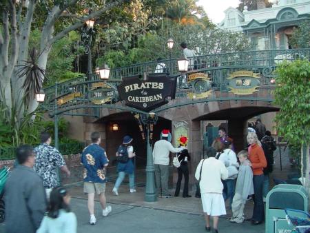
Pirates of the Caribbean: For those who visit Disney Parks often...

CJS-JFan

New Member
Original Poster
Greetings,

I have a question that I hope someone can answer with absolute certainty in relation to the entrance of the Pirates of the Caribbean attraction at the various Disney Parks. Or rather, the original from Disneyland...
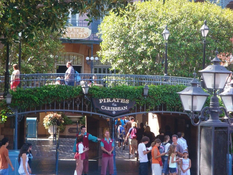
755

755

755

But first things first, some clarification. Not to dismiss all fans, but I would prefer an answer for those who visited the Disneyland ride enough to care about what I'm asking. I am an user at the POTC Wiki or whatever you like to call it. It is my intention to do a redesign of the Wiki, given it's been 5 years since the fifth film, Dead Men Tell No Tales, was released. One such detail I'm looking for is, of course, to the ride that started it all. I don't know for sure, but I'm debating whether to use the Disney ride's sign for either the Wiki-Wordmark/Site logo OR perhaps use it as the logo for the Main Page...depends on what works or not. Though it is very possible we may do film-based material, as I'm sure is what is to be expected.

My question is this: which of the two signs are more standout-ish or definitely POTC to you? Or is there another more worthy image to consider? Unless there are some facts that I'm missing. Before anyone answers, I know there are different parks (Magic Kingdom Florida, Disneyland Paris, etc) but my focus is, once again, to the original ride at Disneyland.

If you made it this far, thanks for your patience, reading, and please comment below! While I can't promise to make every fan happy, I'd love to hear everyone's say!

ETA:
Oh shoot, I didn't even specify the image sizes. One would be 250x65 (the wordmark mentioned above) and the other would be fairly larger with no specific size set (I'll use CotBP, OST, and current DMTNT logos as examples). Of course, I presume everyone's answer will remain more or less the same, but I figure I'd point it out!
 
Last edited:

mickEblu

Well-Known Member
Greetings,

I have a question that I hope someone can answer with absolute certainty in relation to the entrance of the Pirates of the Caribbean attraction at the various Disney Parks. Or rather, the original from Disneyland...
755

755

755

But first things first, some clarification. Not to dismiss all fans, but I would prefer an answer for those who visited the Disneyland ride enough to care about what I'm asking. I am an user at the POTC Wiki or whatever you like to call it. It is my intention to do a redesign of the Wiki, given it's been 5 years since the fifth film, Dead Men Tell No Tales, was released. One such detail I'm looking for is, of course, to the ride that started it all. I don't know for sure, but I'm debating whether to use the Disney ride's sign for either the Wiki-Wordmark/Site logo OR perhaps use it as the logo for the Main Page...depends on what works or not. Though it is very possible we may do film-based material, as I'm sure is what is to be expected.

My question is this: which of the two signs are more standout-ish or definitely POTC to you? Or is there another more worthy image to consider? Unless there are some facts that I'm missing. Before anyone answers, I know there are different parks (Magic Kingdom Florida, Disneyland Paris, etc) but my focus is, once again, to the original ride at Disneyland.

If you made it this far, thanks for your patience, reading, and please comment below! While I can't promise to make every fan happy, I'd love to hear everyone's say!

To the casual Disneyland fan and perhaps to most people the Black sign is more “POTC” as it’s the first one you see and much more visibile. The other sign however is probably preferred by more hardcore Disney/ POTC fans as it’s the original sign and was the only Marquee until they added the bridge.

I’d say the Black one is more recognizable for most people.
 

Californian Elitist

Well-Known Member
To the casual Disneyland fan and perhaps to most people the Black sign is more “POTC” as it’s the first one you see and much more visibile. The other sign however is probably preferred by more hardcore Disney/ POTC fans as it’s the original sign and was the only Marquee until they added the bridge.

I’d say the Black one is more recognizable for most people.
Exactly this.
 

el_super

Well-Known Member
Original sign all the way. I can't see the black one as anything other than just a Fastpass Overlay Sign. It's not even the original sign they put on the bridge.
 

CJS-JFan

New Member
Original Poster
Oh wow, I didn't think I was gonna get a definitive answer. I'll take this all into consideration. I may arrange for images to be made and shown here to see which would work best. Presuming such posts are allowed? I know I'm pushing it with this topic admittedly being about a Wiki rather than the theme parks.

Thank you, gentlemen...or women. Sorry, new to this forum.
 

180º

Well-Known Member
I’d say use the black sign for your purpose. The black sign has a strong graphic identity and might scale well to small sizes with its chunky letters. Also gotta love that vaguely pirate-hat-shaped crest it’s on.
 

CJS-JFan

New Member
Original Poster
^Very good point. As I said, I'll experiment with both and see. Perhaps I'll ask here further. Again, presuming it's alright within forum guidelines.

Oh shoot, I didn't even specify the image sizes. One would be 250x65 (the wordmark mentioned above) and the other would be fairly larger with no specific size set (I'll use CotBP, OST, and current DMTNT logos as examples). Of course, I presume everyone's answer will remain more or less the same, but I figure I'd point it out.

I'll edit the initial post to add this vital information.
 

britain

Well-Known Member
If you really want to speak to the Disneyland original, use the sign on the balcony. That’s more New Orleans Square-ish. The black sign is more generic “piratey”.
 

SuddenStorm

Well-Known Member
This spurred a thought- are there any other attractions that have two different 'attraction logos' used within the park?

Obviously there's variations across the different Disney Parks- Splash's WDW logo differs slightly from the Disneyland one- but Pirates is the only ride I can think of that actually uses two different styles for the attraction font.
 

TP2000

Well-Known Member
If your goal is to evoke Classic Disneyland, I vote for the original 1967 sign that is still on the balcony.

The black sign to me just says "Disney's Fastpass, Presented by Cynthia Harriss!" But I'm obviously dating myself. :cool:

The original 1967 sign is Disneyland USA. The black sign is 21st century Pirates BrandingTM.

55d4ae52eff38c4e5eb92b9e88afda78c394ea85.jpg
 

TP2000

Well-Known Member
Surely I can't be the only one who remembers when they installed that Fastpass marquee in front of the bridge back in 2001 or so? They've removed the Fastpass clocks and signage and digital readouts, but the structure and main sign is all still there.

The vines have also grown in over much of it, but when I see it I just think "Cheesy Pressler/Harriss Era Fastpass Crap". Or is that just me? It's probably just me. 🤣

0950-A.jpg
 

Animaniac93-98

Well-Known Member
If you really want to speak to the Disneyland original, use the sign on the balcony. That’s more New Orleans Square-ish. The black sign is more generic “piratey”.

Which is why the black one is worse.

Though not as bad as the 2006 WDW marquee with the Party City skeleton in the crow's nest.

It looks like it was taken from the Pirate mini golf at Crossroads shopping center.

1658528321561.png


vs the original WED typeface from 1973

1658528537519.png


Tokyo had the gold and white sign that Disneyland did, but changed theirs too to something that more blatantly says "PIRATE"

1658528620047.png


Paris has remained unchanged since 1992. I get why DLP, a park with 6 official languages, chose for a more obvious "Piratey" sign.

1658528684909.png
 

TP2000

Well-Known Member
Spot on observations @Animaniac93-98 ! Your point about WDW's sign looking like a mini-golf course is sad but true. What's even worse, so much of modern day WDW design and theme looks like it belongs on a mini-golf course.

I also agree that Tokyo took a step back by replacing their original copy from Anaheim, but Tokyo gains two steps forward by having a sign that says "Pirates Of The Caribbean - Presented by Kirin Beer" Yo Ho, indeed! 🍺
 

britain

Well-Known Member
Surely I can't be the only one who remembers when they installed that Fastpass marquee in front of the bridge back in 2001 or so? They've removed the Fastpass clocks and signage and digital readouts, but the structure and main sign is all still there.

The vines have also grown in over much of it, but when I see it I just think "Cheesy Pressler/Harriss Era Fastpass Crap". Or is that just me? It's probably just me. 🤣

0950-A.jpg

Didn’t there used to be a sign there right up against the terra-cotta archway? Before the fast pass framework was set up? For some reason I think I remember it being turquoise “rusted copper” letters?
 

Disney Analyst

Well-Known Member
If your goal is to evoke Classic Disneyland, I vote for the original 1967 sign that is still on the balcony.

The black sign to me just says "Disney's Fastpass, Presented by Cynthia Harriss!" But I'm obviously dating myself. :cool:

The original 1967 sign is Disneyland USA. The black sign is 21st century Pirates BrandingTM.

55d4ae52eff38c4e5eb92b9e88afda78c394ea85.jpg

Anytime I see this. Photo it shocks me. I can’t even fathom you used to just walk up to that door street level…

So wild how they dug out infront, sunk it, built stairs up.
 

PiratesMansion

Well-Known Member
Anytime I see this. Photo it shocks me. I can’t even fathom you used to just walk up to that door street level…

So wild how they dug out infront, sunk it, built stairs up.
I imagine the need for them to do what they did and create something resembling a proper queue became apparent pretty quickly after they got rid of the ticket books.
 

mickEblu

Well-Known Member
I imagine the need for them to do what they did and create something resembling a proper queue became apparent pretty quickly after they got rid of the ticket books.

I have no recollection of the pre bridge Pirates but I know I was around for it. When did it change? Some point between the late 80s and early 90s right?
 

PiratesMansion

Well-Known Member
Which is why the black one is worse.

Though not as bad as the 2006 WDW marquee with the Party City skeleton in the crow's nest.

It looks like it was taken from the Pirate mini golf at Crossroads shopping center.

View attachment 655025

vs the original WED typeface from 1973

View attachment 655029

Tokyo had the gold and white sign that Disneyland did, but changed theirs too to something that more blatantly says "PIRATE"

View attachment 655030

Paris has remained unchanged since 1992. I get why DLP, a park with 6 official languages, chose for a more obvious "Piratey" sign.

View attachment 655031
In fairness to Tokyo, perhaps they thought the PIRATE! sign might drum up some interest along with the movie changes. The ride just seems perpetually unloved out there compared to the others.

I remember the original WDW Pirate sign. So much classier.
I have no recollection of the pre bridge Pirates but I know I was around for it. When did it change? Some point between the late 80s and early 90s right?
I'm not sure of the exact year but that's roughly when it happened, yes.

EDIT: It was definitely in place by 1993. I think I actually prefer the black sign over the one shown in this picture. At the very least the color of the lettering on this one seems off to me:
1658597663606.png
 

mickEblu

Well-Known Member
In fairness to Tokyo, perhaps they thought the PIRATE! sign might drum up some interest along with the movie changes. The ride just seems perpetually unloved out there compared to the others.

I remember the original WDW Pirate sign. So much classier.

I'm not sure of the exact year but that's roughly when it happened, yes.

EDIT: It was definitely in place by 1993. I think I actually prefer the black sign over the one shown in this picture. At the very least the color of the lettering on this one seems off to me:
View attachment 655123

Same here. I don’t like the turquoise at all
 

Register on WDWMAGIC. This sidebar will go away, and you'll see fewer ads.

Back
Top Bottom